Finished Pencil Drawing of a Cabin

I sure do know how to stretch a story out. . . have you noticed how many people use the cliché “long story short”, and then proceed to make a short story even longer? I am sort of doing that here, except I break it into chapters for you, because of another cliché that applies to many blog posts: TLDR (Too long, didn’t read).

Here is scanned Minnesota cabin drawing before I scrubbed it up on Photoshop Junior.

Here it is converted to gray scale with all the chuds erased and the paper color also erased. Chuds are marks on the scanning bed—this word came from the days when I worked in a frame shop. Sometimes after you’d get a piece of art all sealed up under the mat and frame and backing, with paper secured over the back, you’d flip it over and there would be a little something under the glass. My co-workers called these little somethings “chuds”.

A few more thoughts. It was a thrill to have a stranger find me over the interwebs, because people are always contacting me to say that my Google ratings are too low and that they can help me. (No thanks, you creepy Stalking Strangers; how did you find me on Google if my ratings are too low??)

The customer was a pleasure to deal with. She mailed a check when I told her that PayPal takes a bite, she replied quickly when I asked for more information, and she even marked up the photos so I would know who was on first and what was on second.

Alas, I learned something the hard way. A few months ago, I raised my prices for pencil drawings. It had been years (decades??), and it just seemed like a wise move. BUT I DIDN’T RAISE THEM ON MY WEBSITE. Sigh.

Someone could use a business manager, an administrative assistant, a Girl Friday, a right-hand man. Hmm, I guess that’s the problem: my man is left-handed!

P.S. If you are curious about my prices, you can see them here: Pencil Drawing Prices. I only show the smallest and the largest, because sometimes it is all just too much information and too much work. (I’d rather be drawing.)

Drawing a Cabin in Pencil

Which of the three sketches of a Minnesota cabin did the two sisters choose?

They chose A! (The exclamation mark is because that was the one I was hoping for.)

I cropped all the extraneous cold stuff. The sisters asked if I could show a bit more porch, and the best I could say was, “I’ll try.” There just wasn’t much to work with.

I spent an entire hour struggling to place the cabin so that there would be room for part of the wings on either side of the gable, in order to squeeze in a hint of the porch. It took a very long time to get the angles exactly right. This sounds excessive, but architectural subjects are not forgiving, and if you don’t get the skeleton down correctly, the parts don’t fit.

Finally, I was able to begin. (The picture of the drawing below is accidentally cropped—it actually has a 1″ margin around the image on this sheet of 9×12″ archival smooth expensive paper.)

Oh no! When I look at the photo I am using, the window size in the winter photo doesn’t quite match the summer photo that shows the gable end. Further, on the summer view of the gable end, there are 3 rows of shingles beneath the upper window.

Time out. I need some instructions, please!

So, I emailed the sisters.

What happened next??

Tune in tomorrow. . .

Cabinart = Art of a Cabin

Drawing cabins in pencil is the way I started my art business. Now I spend 90% of my artmaking time as an oil painter, so when I get asked to draw a cabin, I am really happy about it!

Someone from Minnesota found me on the internet and asked if I could draw her parents’ cabin in spite of not having clear photos of the entire structure. I told her to send them to me, and I’d see if I could make sense of the photos.

Want to see the pictures she sent?

I knew you’d be interested.

These presented a real challenge. I did three little sketches and emailed the potential customer. She was delighted, and asked me to wait for an answer (yep, dealing with a deadline here) because she needed to consult with her sister.

Which one did they choose?*

Tune in tomorrow. . .

*If you read my blog on April 11, you know the answer to this question.

Another Interruption, This Time for Drawing


Once again, we interrupt our broadcast for this drawing.

Ever notice the annoyance of the English language, where a noun and a verb can be exactly the same word? And I didn’t actually mean “broadcast”, because we are in a series of posts about cabin life. This drawing fits the category of cabin life but it isn’t about cabin life; it’s about pencil drawing.

Get on with it, will ya??

An old friend (that seems to be where most of my work comes from, but new friends and young friends are welcome to commission me; even friends I haven’t met yet are welcome here) expressed an interest in a drawing from The Cabins of Wilsonia

Alas, it was gone.

We had a few options: 1. Oh well, sorry; 2. Buy another book, Sir, and rip out the page; 3. I can draw it for you again.

My wise friend chose option #3.

Have a look at the original photo that I used.

As always, working from a photo isn’t straightforward copying. Every photo has its indiscernible parts, because real life is messy. 

Because my friend was wanting the drawing from the book, I used that old drawing to help me make decisions. (I didn’t lie: although the original is gone, it’s still on my laptop.)

Then, I thought about it a bit more and decided that I ought to be able to do a better job now. That was 10 years ago, and I was cranking out those 272 (was that really the number??) drawings at a rapid pace. This time, there was no deadline. My friend’s only requirement was specific dimensions to go with another drawing, like a matched set.

Here is the other drawing.

And here is its new partner.

(The difference in darkness has something to do with the computer reproduction, not a change in pencils or pressure on the paper.)

This picnic table appears in the chapter called “Brewer”, which is the name of the road in Wilsonia depicted in that chapter. (I got clever that way.) The funny part is that I could not remember where this photo actually was, and I just put it on Brewer because I thought it looked good with the chaise lounge. 

Apparently my friend thought the same. He has actually had a strong influence over my art career, so this makes sense.

Thank you, DB!

Cabin Life, Chapter Two

Slower Pace

What in the world do people do at a rustic cabin up a difficult road in a place without electricity?

We slow down. We sleep more—go to bed earlier, sleep later (the sun doesn’t hit the cabin until around 8:30 a.m.), and some of us take naps. Could be the elevation, could be that it is cooler and there isn’t a great need to get up early to beat the heat.

We linger over coffee, usually while listening to the radio. (Remember those?)

The old wood stove provides heat until the sunshine hits; then the cabin doors get opened to the outside.

This stove is now history, because the oven didn’t work, and one time it tried to kill us. But that’s a digression, one I might share with you later.

In summary, at the cabin, we slow down. Or, as Trail Guy has often said, “We contemplate matters of consequence.”

Drawing Because I Can

If you receive these posts in email and the pictures in the post don’t show for you, tap here janabotkin.net. It will take you to the blog on the internet.

Sometimes I draw simply because I love to draw. I try to hold back, because my flat files are full. When I have a good reason and know the drawing will not simply be stored in my files, then get outta my way.

(“Outta” is like “prolly” and “liberry”: words I like in spite of being an editor and a proofreader.)

An acquaintance did me a big favor, so I am drawing her cabin. 

I started several months ago, then set it aside because of paid work. My work priority order is this: 1. commissions with a deadline; 2. commissions without a deadline; 3. building up inventory of subjects that will prolly sell; 4. reworking paintings that haven’t sold; 5. whatever I feel like painting or drawing.

This one is considered to be Category #2. The customer isn’t commissioning me because she doesn’t know she is a customer. I am commissioning myself.

What does commission mean? That’s another topic for another blog post.

This is the drawing before I tackled it with Photoshop Junior to prepare it for eventual printing, which most likely won’t happen.

And this is after I converted it to grayscale and erased any errant lines or spots, most likely the result of a scanner screen that WILL NOT come clean, which is most likely the result of scanning paintings that aren’t quite dry, which is most likely the result of being in a hurry, which is most like the result of any number of unfortunate incidents such as not planning ahead, pulling weeds or taking walks instead of working, or choosing to draw something without a deadline instead of painting to build up inventory.

Where were we?

Oh. The finished drawing.

Now I am outta here.

How to Draw with Graphite and Colored Pencils, Ch. 5

Today you will see what a piece of cake it is to add color to a little part of a pencil drawing. Since you have slept since I showed you how to complete the graphite pencil part, here it is again. The right edge is gray because either the scanner is lying about having a 12″ bed or the paper is lying about being 12″. 

ADDING COLOR: A decision about which set of colored pencils to use

The first step was to decide which set of colored pencils to use. Because nobody cares if I match the shade of red exactlY, I chose the simplest, easiest to use set of twelve: Blackwing Colors. 

On my laptop, I enlarged the photo so that I could study the darks and lights in the chair.

Darkest colors first: brown

My method of using color (and graphite) is to put down the darkest colors first. Because someone somewhere sometime chewed me out for using black (Pray tell, Mr. Chew-Out, why is black manufactured if its use is forbidden?), I started with brown. Using a sharp point and a light touch, with tiny motions in order to get it into all the cracks and crevices of the cratery paper, I put brown everywhere that seemed right.

Purple

Next, I added purple over the top of the brown, and put it in new places that seemed to want it. This might sound like mysterious gobbledygook, but if we were sitting together, I would point out which of those places need which color and why. However, I have other projects ahead. So, trust your instinct when you work on your own picture, because after all, it’s only paper!

Red

Now it is time for red. I covered over the brown and purple, and put red on the places that appeared to be solidly red without those other colors dulling or darkening it. This time I did more layers, because those other colors do make me wonder if I have wrecked the less red places. Even with experience, an artist can be full of doubt, because every project is brand new. I do much of this sort of thing under my magnifier in order to not cross over the lines and to try to fill in the dips a little better. I’ve never been this old before,  so I am relying more and more on my giant magnifying glass with a light bulb attached.

Pink

For the light red places, instead of trying to make my red pencil be less red, I chose pink. Why Blackwing considers pink to be one of the 12 basic colors is a mystery to me, but instead of trying to solve it, I just go with it.

More Red

Finally, I covered everything again with red, including the pink parts, changing pressure and amount of layering with how dark or light the photo showed. If I was really getting into the minutia here, I’d probably sharpen my pencil even more and work under the magnifier to really fill in those tiny craters. But as a cowboy once said to his fence builders, “This ain’t no piany yer buildin’”.

FINISHED!

In studying the metal chair legs, I decided that regular graphite pencil would do just fine. Again, I worked under the magnifer, sharpening the edges of the chair, adding a bit of darkness to indicate more shadow behind the chair and to separate the colored portion from the graphite, and generally just tidying up the whole little area. The shiny parts of the metal legs are plain paper, no pencil at all.

As I scanned the entire piece a final time, I realized that my scanner settings were still darker than normal for a pencil drawing. This final photo is the way it is supposed to be, complete with eensy little signature (done under the magnifier, of course.)

And thus we conclude my first tutorial, How to Draw With Graphite and Colored Pencils.

How to Draw With Graphite and Colored Pencils, Ch. 4

Conclusion of the graphite portion of the pencil drawing

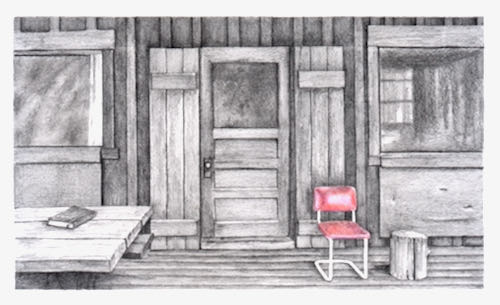
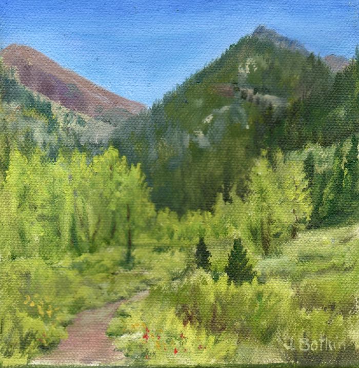
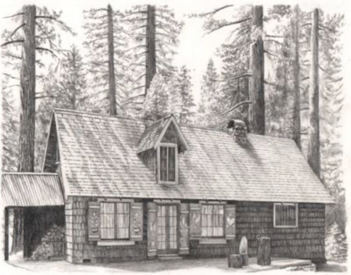
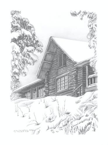
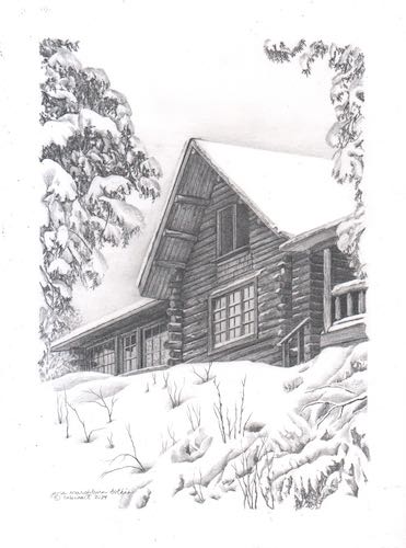
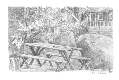
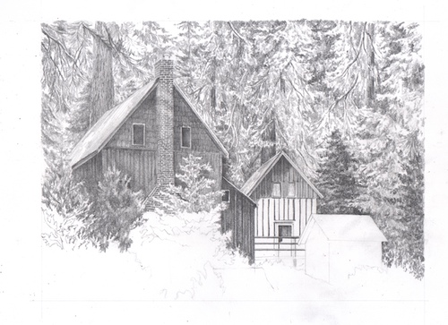
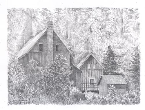
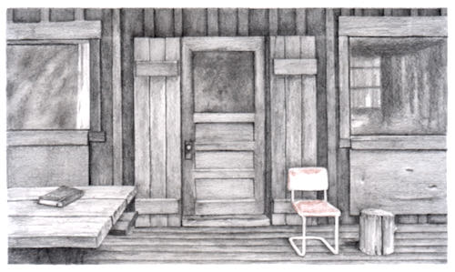
Today we will conclude the graphite part of the drawing tutorial. Tomorrow I will take you on a walk, or a cruise around the yard, or something to give your overworked minds a break from the minutia of pencil drawing. If you haven’t unsubscribed by Monday, you will see the steps of adding color to the drawing, last seen looking like this:

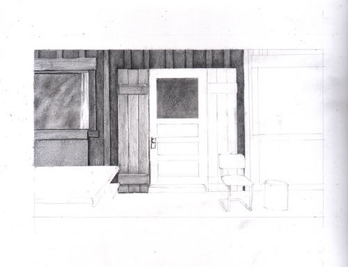
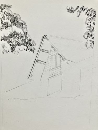
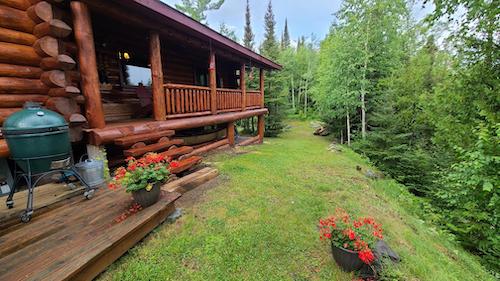
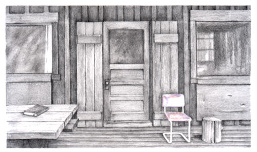
Step twelve: It is time to make a decision about the door and the shutters. In the photo, they are green and brown, and these shades are the same value (the same shade of gray if we turn the photo to black and white). I decided that the brown would be darker than the green when I did the shutter on the left. Now I want to be consistent with the green door and other green shutter, deciding which is darker and where it is darker, but in general, keeping the green lighter than all the brown. The way I do this is to only use 2B instead of 4B in the darkest cracks and for the darker edges, and do the bulk of the shading with HB. As I worked on the shutters and the door, the chair got smeary. I keep erasing it and cleaning its edges because it needs to be clean paper in order to take the colored pencil well later.

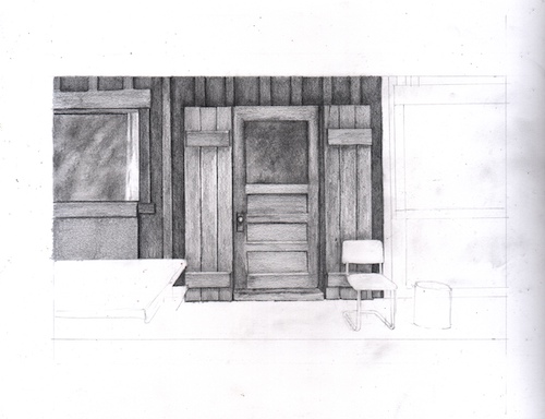
NOTES ABOUT FIXING AS YOU GO: As I shade, I find layout lines that need to be adjusted or erased. So, I take care of those as I find them while I am inching across the drawing.

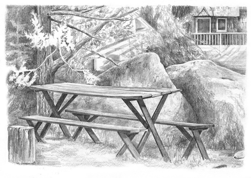
Step thirteen: Moving across the rest of the scene, I am ignoring the picnic table because it seems like a giant So What, unless I figure out how to put a place setting, a mug, a book, a something on it. I allowed stroke marks show on some of the wood, always going with the direction and appropriate length of the wood grain. In this window, I started with 4B, added 2B, and finished off with B, leaving a few places without pencil. Then I used the tortillon to smooth it. This time I left a little bit of paper color and also sort of followed the shapes that appeared in the photo for a hint of what is inside the cabin. After blending it with the tortillon, I added HB to the darker places to make them even darker.

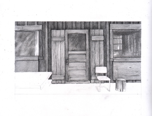
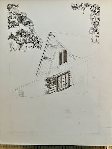
Step fourteen: A book on the table, but some confusion about what is beneath the table structurally. So, I will skip this for a bit and move next to the floor of the porch instead. Sometimes procrastinating gives my brain an opportunity to find a solution.

NOTES ABOUT CONFUSION: Even when working from one’s own photo, there are always areas of blurriness or seemingly irrelevant information. In spite of using a photo, some things just don’t make sense, so we have to make up things, cover them with darkness, or grow a shrub over the top.

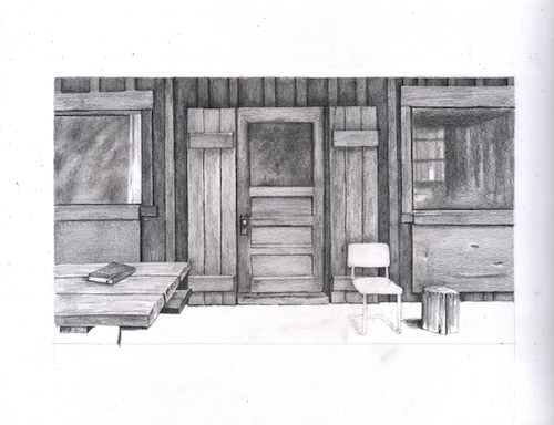
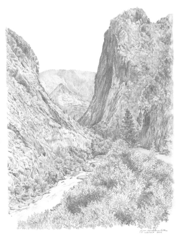
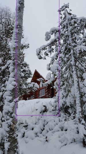
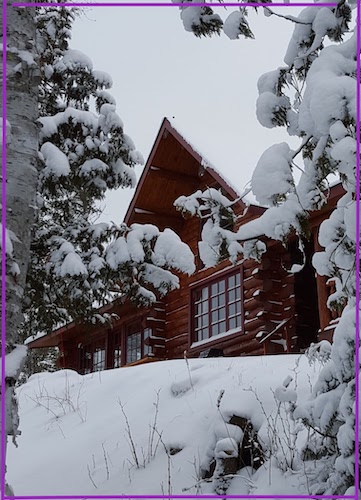
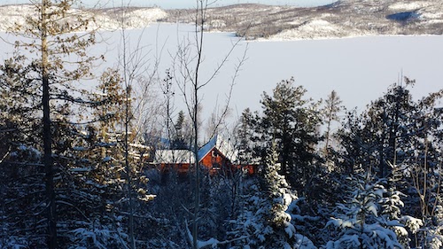
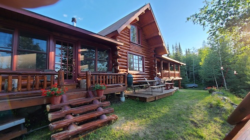
Step fifteen: Because I have changed the perspective on this picture, the floor boards will be parallel to the horizontal edge of the drawing. Here is the photo again so you can see the how they slope upward to the right:

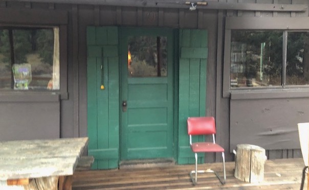
This is easy to do using my T-square, and I will guess the distances between the boards, simply eyeballing it and figure that closies count here (like horseshoes and hand grenades). Although I drew the lines using a straight edge, these boards are old and worn, so as I shade using a B, HB, and 2H, I made them a bit rough along the edges.

As I worked on the boards, my hand would have been resting on some of the completed parts of the drawing, so I put a piece of paper down to rest my hand on.

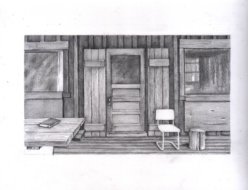
Step sixteen: All that is left to shade in pencil is the mysterious lower left corner. First, I looked at the uncropped photo to see if anything helped to explain the blobs: hmmm, some sort of legs. I could either make it all super dark (In which case I am telling my viewers, “Sorry, it was all in shadow, can’t be helped!”) or copy the blobs as I see them. This is the sort of problem that occurs when working with a photo one hasn’t taken oneself. Ahem. I think I did take this photo (unless Tracy or Dan did —thank you!), and I have actually sat at that table. But I have slept since then. . . End of excuses. I just picked up a 2B and started shading exactly what I saw, because unless it is really weird and distracting, nobody will notice or care.

Step seventeen: that lower left corner looked ugly. The bottom left corner was very light on the photo, and that didn’t look right either. So I just darkened the whole mess, burying it in 4B. And honestly, I was losing focus after drawing, scanning, and writing about it for 5 hours, so I just might have been getting careless and sloppy.

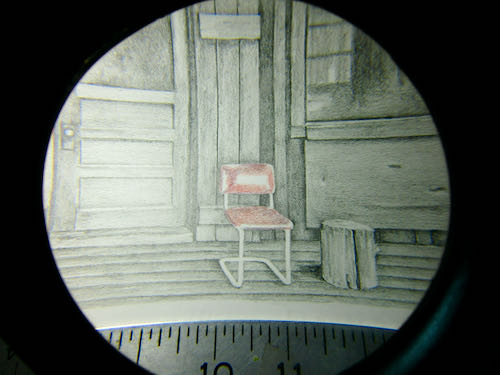
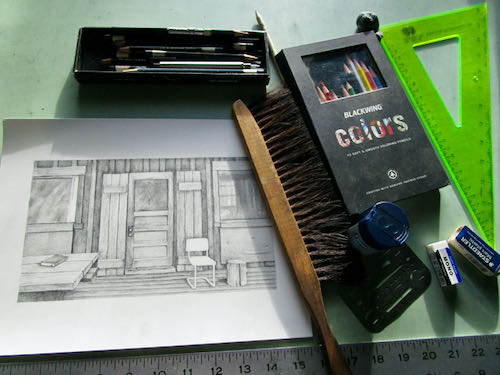
The final steps of the graphite portion of the drawing: erasing the margins, making sure there was zero pencil on the chair, looking at everything under that giant magnifying glass on my drawing table*, and then spray-fixing it with Blair Matte Spray Fix. This means (in theory, but sometimes not in reality and I don’t know why not) that you can still draw on the piece but nothing will either smear or erase. Yes, the spray stinks.

HOLY GUACAMOLE! I did this entire drawing without knowing where my real eraser is. I used the kneadable and the Tombow Mono Zero, a tiny eraser in a pen-like holder. It is best to be sure there are no pens lying around to be grabbed by accident when you use one of these—one of my drawing students did that once. Still, I sure would like to know where my Staedtler Mars white plastic eraser is hiding.

Oh for Pete’s sake. As soon as I unwrapped the stubborn cellophane off a new eraser, I looked in another pencil mug on the drawing table, and there was my old eraser. Were there trolls messing around in my studio over Christmas??

Next, we will add color. Nope, I don’t have a mouse in my pocket. This is the royal we speaking.

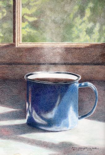
*See the giant magnifying glass? Also, note the mug of tea. NEVER do this. 
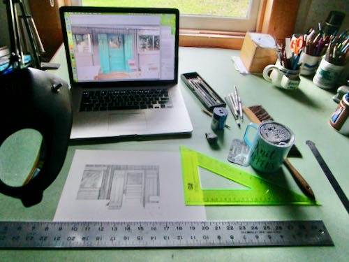
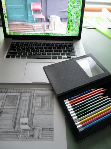
How to Draw With Graphite and Colored Pencils, Ch. 3

Today we continue the tutorial that takes you step by step through drawing with pencil and eventually, colored pencil.

EDGES OR OUTLINES? Real life has edges; coloring books and cartoons have outlines.  Rather than separate items with a black line, use different shades of gray. It is a constant questioning: is this darker or lighter than the thing it touches? Sometimes it will change as you move through a particular area—within a particular item, it can be against something lighter in one place and something darker in another.

Step eight: Keep layering. I used 4B for the shadows of the battens above the door, and added 2B on top of the 4B and over the boards and battens. You can see that this little area isn’t as dark as its neighbor on the left.

Step nine: I continued on the upper board and batten section, and this time added HB on top so it matches the previous shaded areas. I also placed the erasing shield over the top of these parts and erased my jagged lines that went over the border.

MORE NOTES: There are many little finessing techniques that I do automatically and if I called them all out and scanned each one, it would be 2026 before you read this tutorial. A few of those techniques are (1) erasing little pieces that cross over into other territory; (2) darkening areas slightly in order to separate them from their neighbors; (3) ditto #2, but lightening, sometimes tapping gently with an eraser; (4) using a straight edge to clean up edges.

ANOTHER NOTE ABOUT TOOLS: With old buildings like cabins, I first use a straight edge to draw a line, but when shading, I do it freehand so there is a touch of wobble, which gives the look of age and wear (sort of like my face these days).

Step ten: The window started with some 4B, then 2B, then B (yep, a new pencil I hadn’t used yet) over all the glass. I am just pantsing this part because I think the photo has some unimportant specifics, and I’d rather put my efforts into the parts that matter, things that are identifiable.

NOTES ABOUT COLOR: When working from a colored photo, you have to decide which colors are darker and which are lighter. We don’t use black outlines in realistic drawing, so the different colors in real life are depicted by different degrees of darkness in a monochromatic drawing (single color, in this case gray) called “values” in Art Speak. I choose to work from colored photos instead of converting to black and white because it sharpens my ability to see the values; it also helps me know when 2 items of the same value are actually 2 separate items and not one indiscernible blob of gray.

Step eleven: I decided that the glass on the windows looks too fuzzy, grainy, textured, so I used a tool called a tortillon, which is sort of a paper “pencil”, to smear and blend things. A Q-tip, tissue, or your finger will also do the trick.

MORE NOTES ABOUT VALUES: When one item is on top of another item of the same color, the one behind will be slightly darker where the two meet. That’s the way to separate them without the dreaded outline. 

Tomorrow: chapter 4, in which we complete the graphite portion of the drawing.

How to Draw with Graphite and Colored Pencils, Ch. 2

Happy Birthday, Trail Guy!

Hello, my guinea pig friends! Today I continue testing out my tutorial writing skills. 

The Next Steps

Step five: Straighten out the lines. It is NOT “cheating” to use straight edges. If it took a tool to build the actual item, it most likely will take a tool to draw it accurately. There is quite a bit of erasing at this stage, and I use the erasing shield to remove the tiny lines that are wrong. I want my work to be clean and accurate, without hairy or double (or triple) sketchy lines.

ANTI-SMEAR TACTIC: When you erase, you make crumbs. If you flick them with your hand, you will smear. If you blow, you might spit. (Yes, spit happens). Use a drafting brush, a soft paint brush, an antique shaving brush, whatever you have.

Step six: start shading. Shading is the fun part, the party! It is when things come alive with textures and depth. Because I am right handed, I start on the left and the top. This keeps me from dragging my hand across the shaded parts and smearing it. 

I start with a 4B, using the side of the lead. The photo has lots of indiscernible blobs in the window, so I chose to just do some fuzzy sloping strokes, almost a painting technique. Keep the pressure very light, because you can always add more, but it is a hassle to erase if you get too strong in the beginning. The scan looks much darker than the actual drawing because I want the texture to show.

PENCIL TALK: There is no industry standard, so the same pencils look different in different brands. “B” means black; “H” stands for hard. The higher the number with the B or H, the more of that particular quality. For example, 4B is blacker (and softer) than 2B; 6H is harder (and lighter) than 4H. HB is smack dab in the middle, and is the equivalent of a #2 pencil, which is a completely different pencil rating system.

Step seven: Continue layering. Over the 4B, I put 2B using the same type of strokes, and extended it to some new areas, then followed with HB layered on top of the previous layers, and ended with 2H, on top of the previous layers and on the rest of the glass on the window. I just kept layering, working on the glass and the wood surrounding it. I build my shades with many layers rather than pressure, and mostly use the side of the lead rather than the point. Then I come back with a point to sharpen the edges.

I think we will have about 2 more days of this tutorial, and then I’ll abruptly change topics so I don’t lose my readers who are bored with watching paint dry.