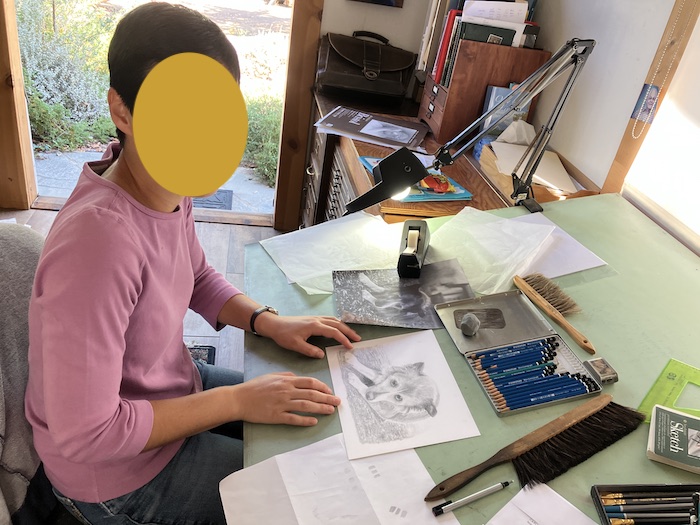
On a recent hot day, as I was preparing to go down the hill to teach drawing lessons, the gallery curator texted me to say the A/C wasn’t working. So, I immediately texted (almost) all my students* and cancelled.
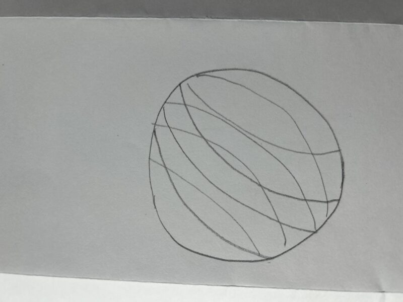
We had some chitchat, and one of my most motivated students said she had started a new drawing on her own of a golf ball on a tee. (I tell all my students to pick a subject they love because they’ll be looking at it for a long time.) She sent me the photo she planned to work from, and before I had a chance to stop and think, I found myself texting some instructions to her.
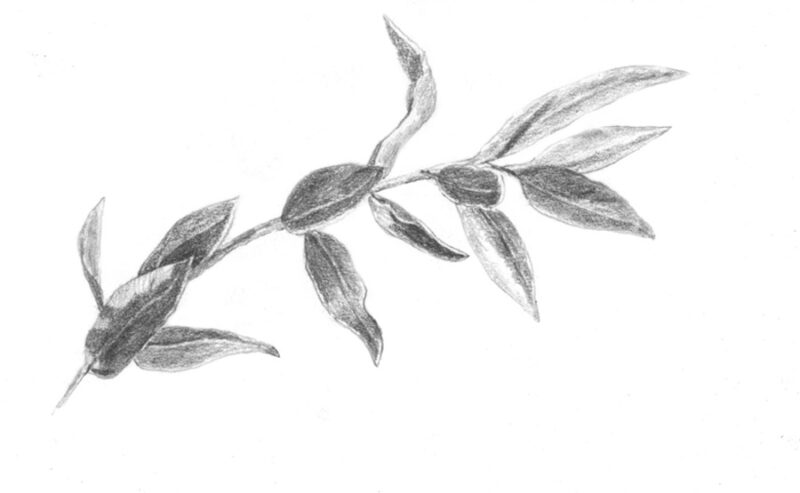
Drawing # 1
I told her to not make the drawing too small, because it would be hard to make all the dimples, that all the dimples would have soft edges, and to draw a grid on the sphere of the golf ball so the dimples can be lined up. Then I drew an example and texted it to her, because a picture is worth a thousand words.
Drawing #2
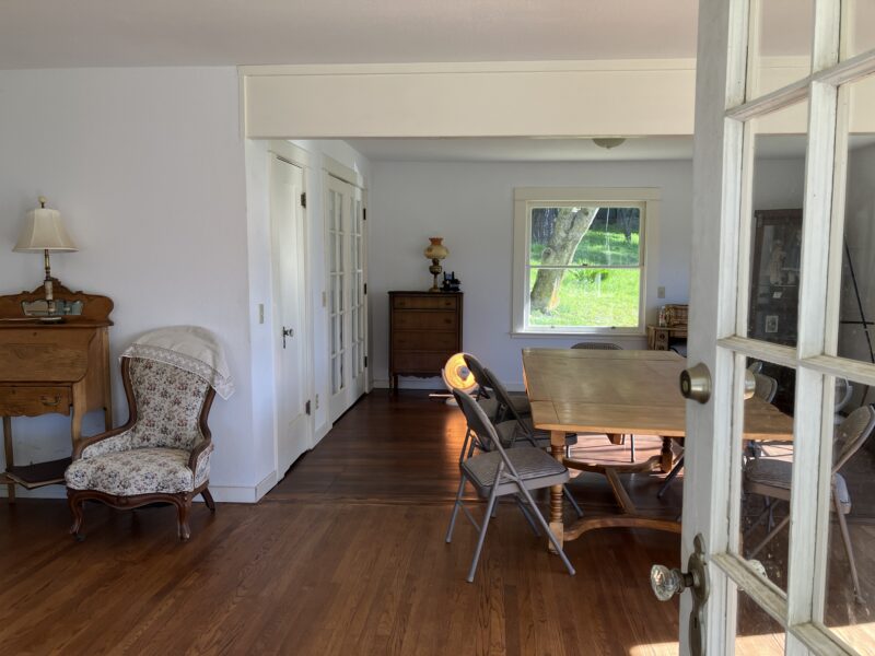
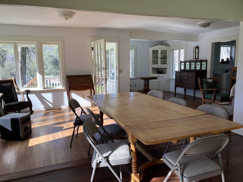
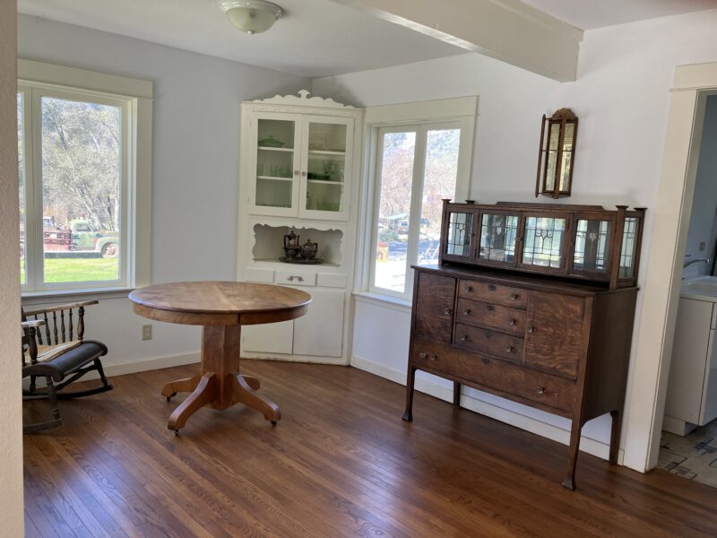
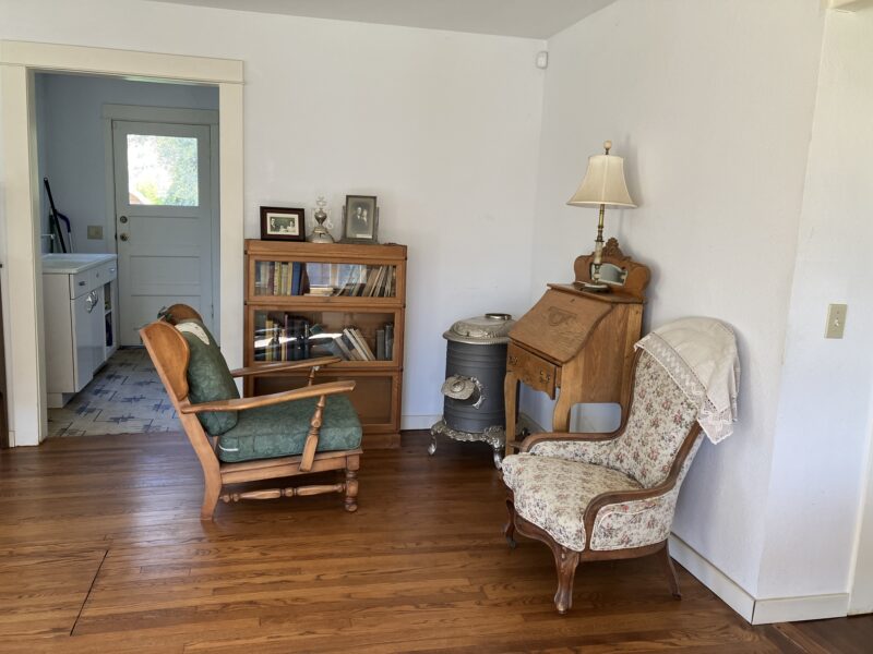
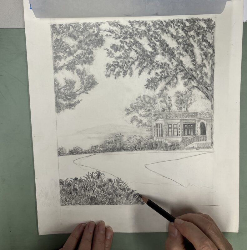
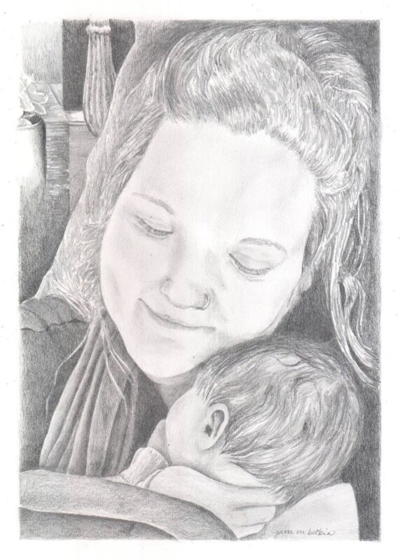
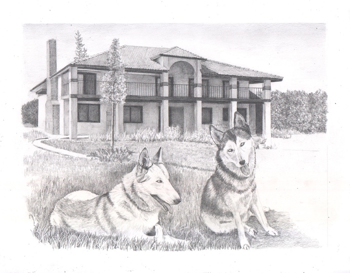
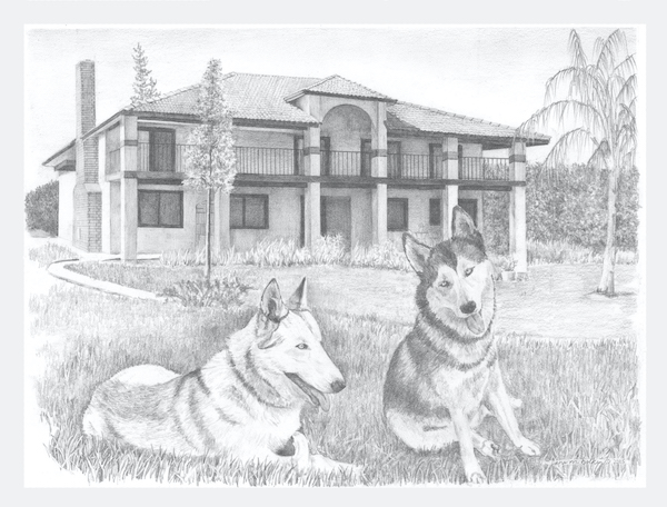
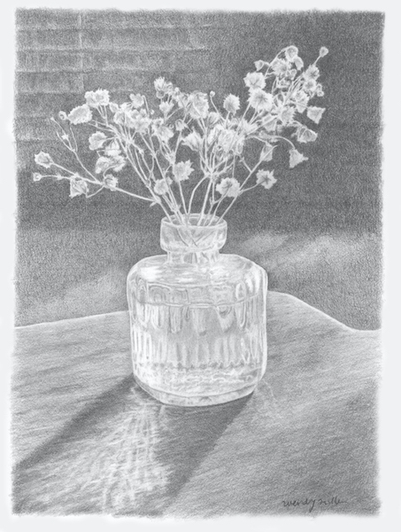
I’ve had a pencil drawing commission in the conversation stage for a couple of months. The customer is in the midst of selling her home and moving away, so she’d like a pencil drawing of it. She has sent me multiple photos, and we’ve had several conversations so I am getting an understand of what is important to her.
On my unexpected day off from teaching drawing lessons, I finally had a chance to compile and peruse all her photos. Instead of giving her a bunch of options, I sent her this sketch, which I think is the best possible way to gather all her important things into one piece of art.
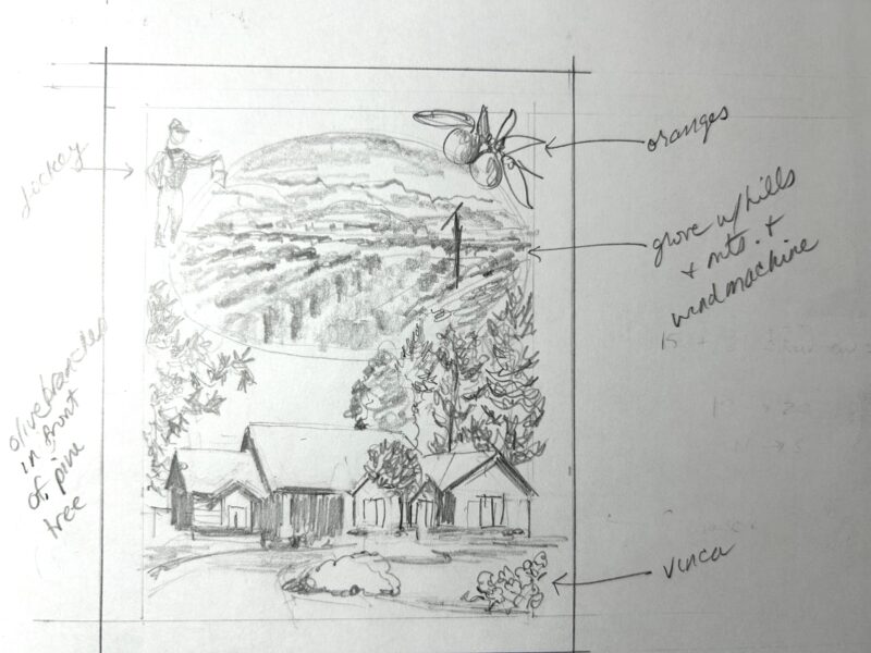
Drawing #3
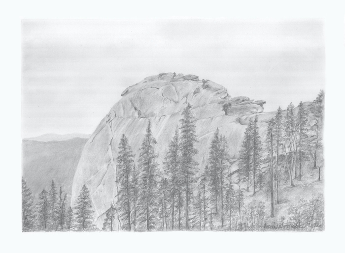
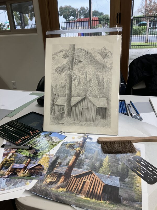
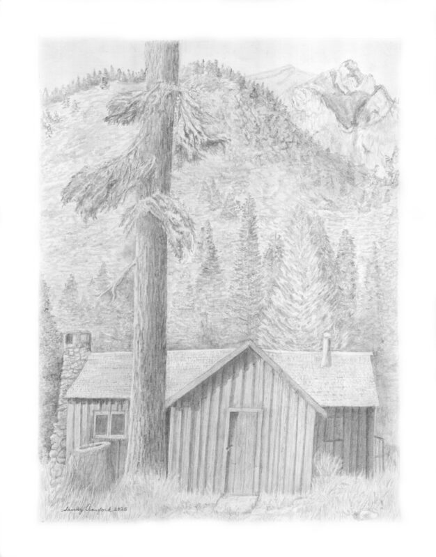
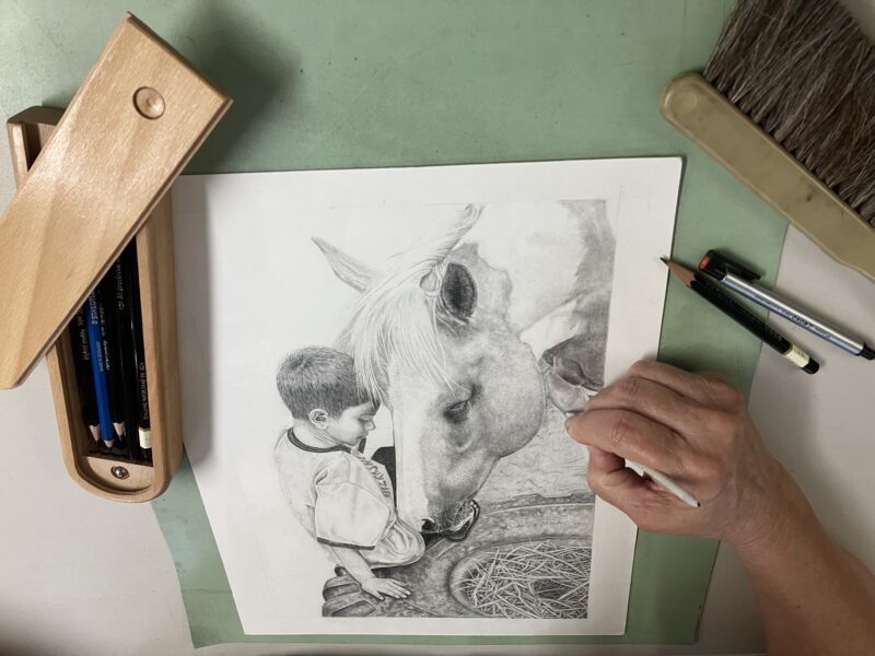
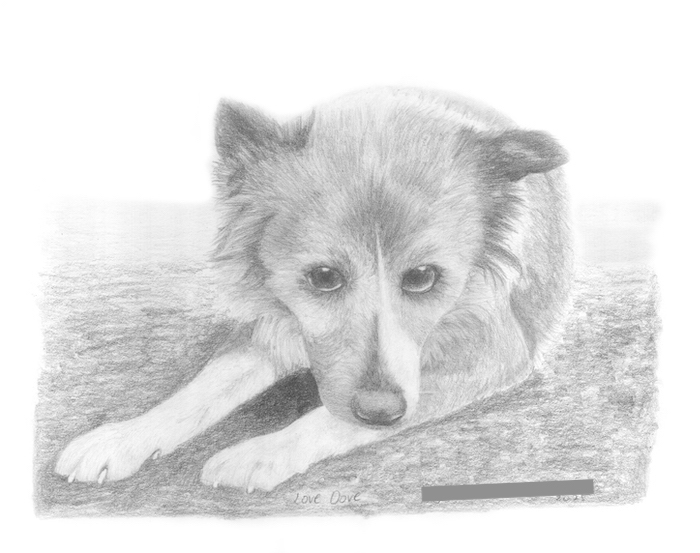
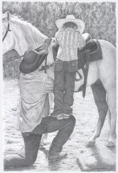
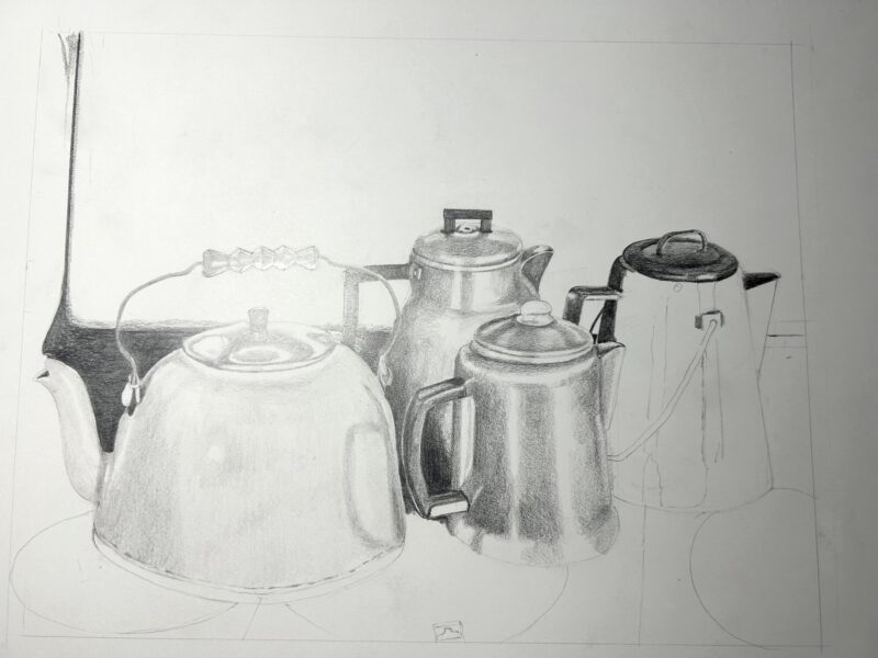
Finally, I pulled out a drawing that I started a few weeks ago and had a wonderful (almost) quiet afternoon with my pencils. The little wall unit A/C roars, but it is preferable to being in the gallery without any A/C.
*Getting a new phone meant that some texting groups didn’t land on my phone and I am SO EMBARRASSED that I forgot a longtime student and good friend.
P.S. I FINISHED THE DRAWING THE NEXT DAY.
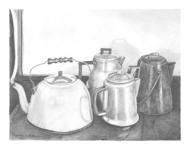
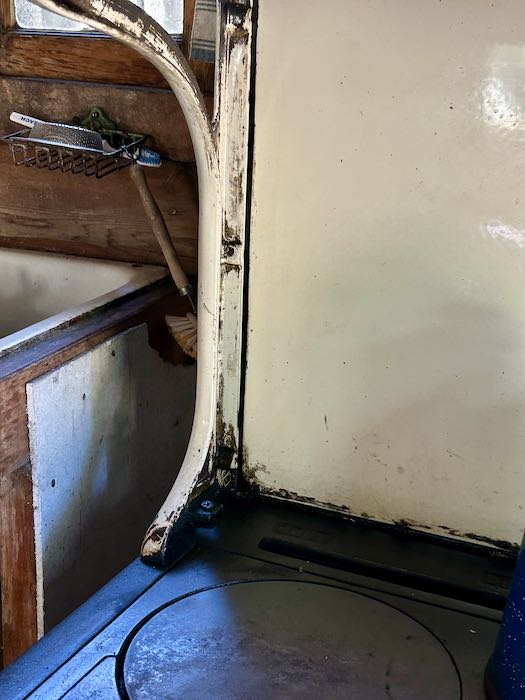
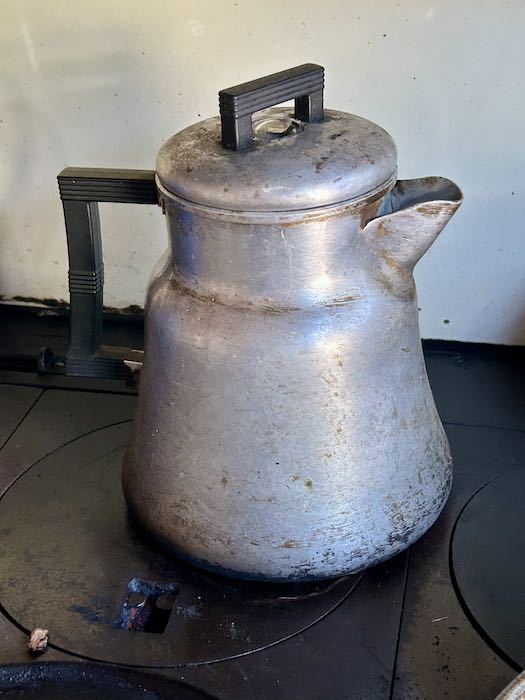
P.P.S. I had the opportunity to take a couple more photos for clarifying. It was a waste of film (JUST KIDDING—What’s film??) because the drawing is finished, and no one cares about whether or not things are exactamundo. Here are the photos anyway, and now that a little time has passed, I see the unfortunate alignment of the stove prop and the teakettle spout. Phooey.