Drawing a Cabin in Pencil, 2

The Minnesota customer replied quickly and thoroughly to my inquiry about the two different versions of the cabin. I couldn’t tell if there were actually two gable ends, slightly different, or if some changes had been made. She said the cabin has been a work in progress and changes get made regularly. The three rows of shingles beneath the upper gable window is the most current. She also sent this helpful set of color coded photos.

We had a rainy day, which is perfect for drawing. I went to the studio where the distractions are limited and the heater works well, and was psyched for a day of pencil, my favorite art medium, drawing a cabin, my favorite type of subject.

See the edge of my laptop? There is NO WAY I could have done this almost impossible drawing with this degree of detail without viewing the photos on my laptop. I lightened the shadows of the very dark places, enlarged the photos enormously, and even flipped the summer view of the gable end horizontally so I didn’t have to guess how all the angles would look. You can see the potential for tying one’s brain in a knot here:

I worked from top to bottom, left to right. This is the best method for a right-hander to not smear. (Left handers can work top to bottom, right to left.) Actually, smearing happens anyway, but it is less of a problem when the paper is covered in this systematic method.

And, I finished the drawing!

Come back tomorrow if you want to see it. Same Bat time, same Bat channel. (I never actually watched Batman because we only got 2 channels, not the third one that had Batman on.)

Cabinart = Art of a Cabin

Drawing cabins in pencil is the way I started my art business. Now I spend 90% of my artmaking time as an oil painter, so when I get asked to draw a cabin, I am really happy about it!

Someone from Minnesota found me on the internet and asked if I could draw her parents’ cabin in spite of not having clear photos of the entire structure. I told her to send them to me, and I’d see if I could make sense of the photos.

Want to see the pictures she sent?

I knew you’d be interested.

These presented a real challenge. I did three little sketches and emailed the potential customer. She was delighted, and asked me to wait for an answer (yep, dealing with a deadline here) because she needed to consult with her sister.

Which one did they choose?*

Tune in tomorrow. . .

*If you read my blog on April 11, you know the answer to this question.

Another Interruption, This Time for Drawing


Once again, we interrupt our broadcast for this drawing.

Ever notice the annoyance of the English language, where a noun and a verb can be exactly the same word? And I didn’t actually mean “broadcast”, because we are in a series of posts about cabin life. This drawing fits the category of cabin life but it isn’t about cabin life; it’s about pencil drawing.

Get on with it, will ya??

An old friend (that seems to be where most of my work comes from, but new friends and young friends are welcome to commission me; even friends I haven’t met yet are welcome here) expressed an interest in a drawing from The Cabins of Wilsonia

Alas, it was gone.

We had a few options: 1. Oh well, sorry; 2. Buy another book, Sir, and rip out the page; 3. I can draw it for you again.

My wise friend chose option #3.

Have a look at the original photo that I used.

As always, working from a photo isn’t straightforward copying. Every photo has its indiscernible parts, because real life is messy. 

Because my friend was wanting the drawing from the book, I used that old drawing to help me make decisions. (I didn’t lie: although the original is gone, it’s still on my laptop.)

Then, I thought about it a bit more and decided that I ought to be able to do a better job now. That was 10 years ago, and I was cranking out those 272 (was that really the number??) drawings at a rapid pace. This time, there was no deadline. My friend’s only requirement was specific dimensions to go with another drawing, like a matched set.

Here is the other drawing.

And here is its new partner.

(The difference in darkness has something to do with the computer reproduction, not a change in pencils or pressure on the paper.)

This picnic table appears in the chapter called “Brewer”, which is the name of the road in Wilsonia depicted in that chapter. (I got clever that way.) The funny part is that I could not remember where this photo actually was, and I just put it on Brewer because I thought it looked good with the chaise lounge. 

Apparently my friend thought the same. He has actually had a strong influence over my art career, so this makes sense.

Thank you, DB!

Cabin Life, Chapter One


How I Got a Cabin

Welcome to Cabin Life, my way of staying in touch during this odd summer of Mineral King being closed to the public and my accidental stepping into a sabbatical (or something akin to it.)

Thirty-eight years ago I met Trail Guy. In a rash moment of bald honesty, I said, “I’d kill for a cabin in Mineral King”.

He replied, “There is another way”. (Maybe he said “better” or even “easier”.)

We got married the following year (in Mineral King, of course), and nobody has gotten killed.

This was all pre internet, pre personal computers, pre continual connectivity. (The first summer of marriage, we got a landline at the cabin, since we were living in two different places. Fancy.)

Nowadays (isn’t that a classic Old People word?) we live in an era of total convenience, instant gratification, continual connectedness, and complete comfort. 

So why do people go to a rustic shack up a terrible road to spend time without conveniences, ultra-comfort, electricity, cell phones, or the internet? What in the world do people do??

This series, called “Cabin Life”, will give you a glimpse, maybe a few answers to those questions, or maybe just more questions.


How to Draw with Graphite and Colored Pencils, Ch. 5

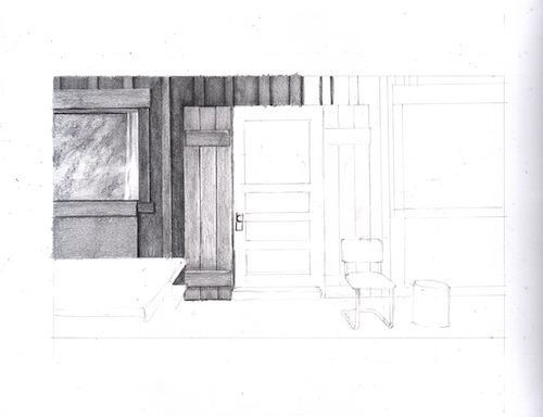
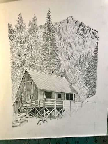
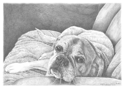
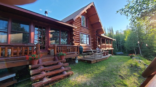
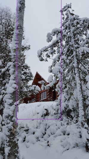
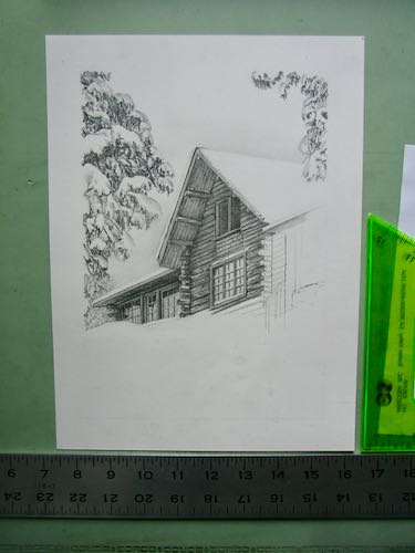
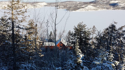
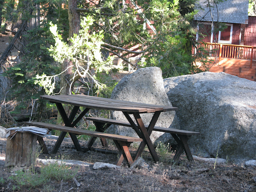
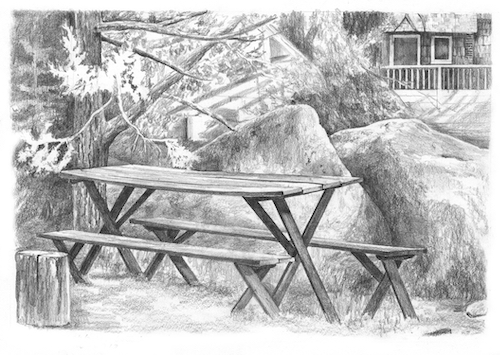
Today you will see what a piece of cake it is to add color to a little part of a pencil drawing. Since you have slept since I showed you how to complete the graphite pencil part, here it is again. The right edge is gray because either the scanner is lying about having a 12″ bed or the paper is lying about being 12″. 

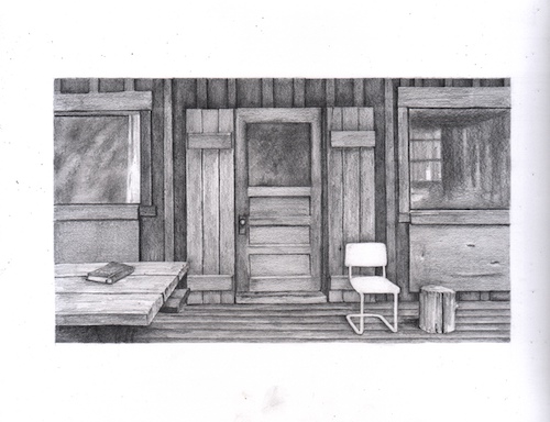
ADDING COLOR: A decision about which set of colored pencils to use

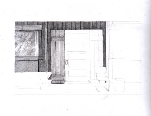
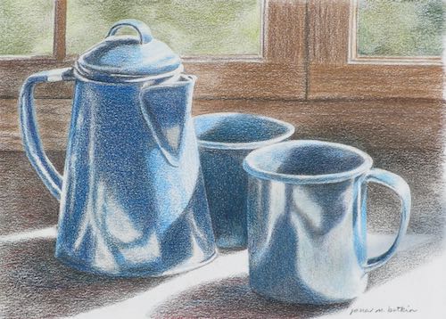
The first step was to decide which set of colored pencils to use. Because nobody cares if I match the shade of red exactlY, I chose the simplest, easiest to use set of twelve: Blackwing Colors. 

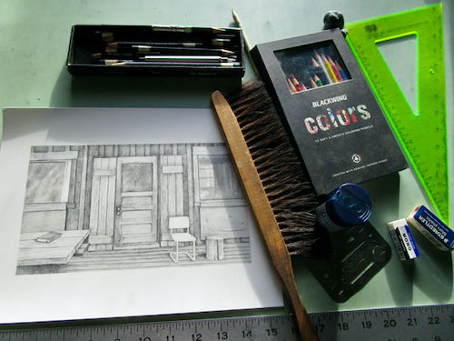
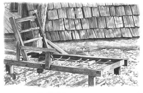
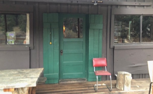
On my laptop, I enlarged the photo so that I could study the darks and lights in the chair.

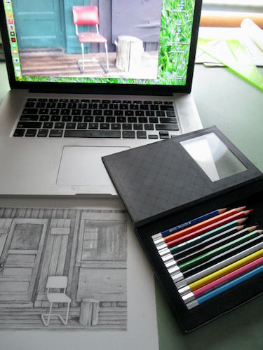
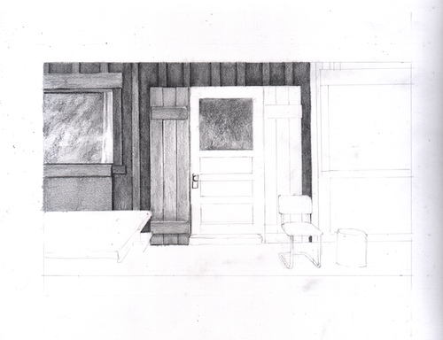
Darkest colors first: brown

My method of using color (and graphite) is to put down the darkest colors first. Because someone somewhere sometime chewed me out for using black (Pray tell, Mr. Chew-Out, why is black manufactured if its use is forbidden?), I started with brown. Using a sharp point and a light touch, with tiny motions in order to get it into all the cracks and crevices of the cratery paper, I put brown everywhere that seemed right.
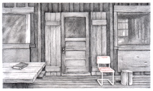
Purple

Next, I added purple over the top of the brown, and put it in new places that seemed to want it. This might sound like mysterious gobbledygook, but if we were sitting together, I would point out which of those places need which color and why. However, I have other projects ahead. So, trust your instinct when you work on your own picture, because after all, it’s only paper!
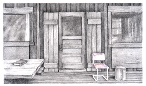
Red

Now it is time for red. I covered over the brown and purple, and put red on the places that appeared to be solidly red without those other colors dulling or darkening it. This time I did more layers, because those other colors do make me wonder if I have wrecked the less red places. Even with experience, an artist can be full of doubt, because every project is brand new. 
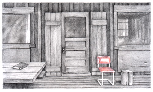
I do much of this sort of thing under my magnifier in order to not cross over the lines and to try to fill in the dips a little better. I’ve never been this old before,  so I am relying more and more on my giant magnifying glass with a light bulb attached.
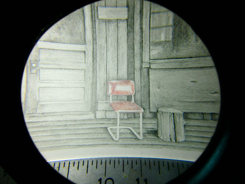
Pink

For the light red places, instead of trying to make my red pencil be less red, I chose pink. Why Blackwing considers pink to be one of the 12 basic colors is a mystery to me, but instead of trying to solve it, I just go with it.

More Red

Finally, I covered everything again with red, including the pink parts, changing pressure and amount of layering with how dark or light the photo showed. If I was really getting into the minutia here, I’d probably sharpen my pencil even more and work under the magnifier to really fill in those tiny craters. But as a cowboy once said to his fence builders, “This ain’t no piany yer buildin’”.
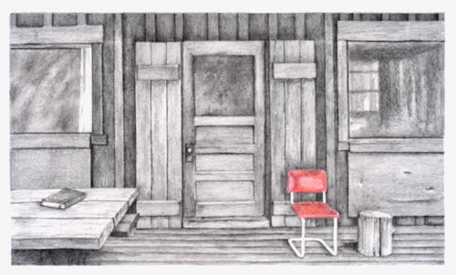
FINISHED!

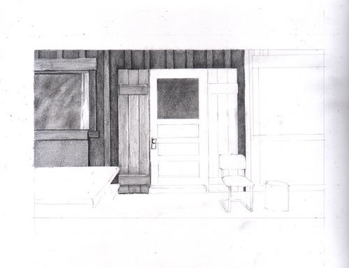
In studying the metal chair legs, I decided that regular graphite pencil would do just fine. Again, I worked under the magnifer, sharpening the edges of the chair, adding a bit of darkness to indicate more shadow behind the chair and to separate the colored portion from the graphite, and generally just tidying up the whole little area. The shiny parts of the metal legs are plain paper, no pencil at all.

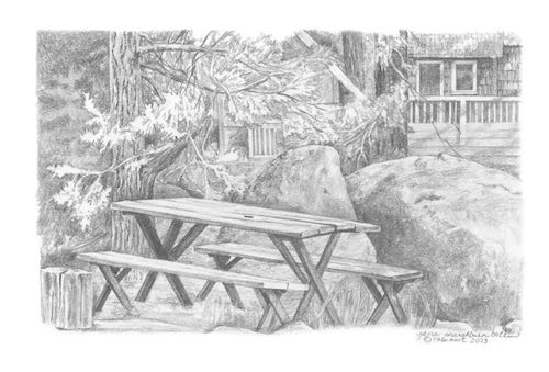
As I scanned the entire piece a final time, I realized that my scanner settings were still darker than normal for a pencil drawing. This final photo is the way it is supposed to be, complete with eensy little signature (done under the magnifier, of course.)

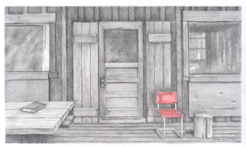
And thus we conclude my first tutorial, How to Draw With Graphite and Colored Pencils.

How to Draw With Graphite and Colored Pencils, Ch. 3

Today we continue the tutorial that takes you step by step through drawing with pencil and eventually, colored pencil.

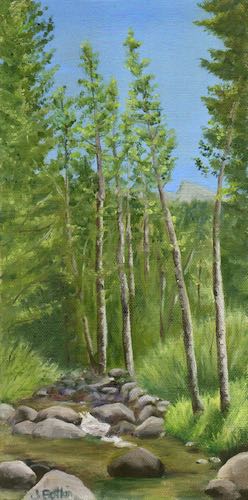
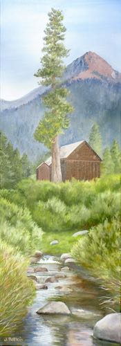
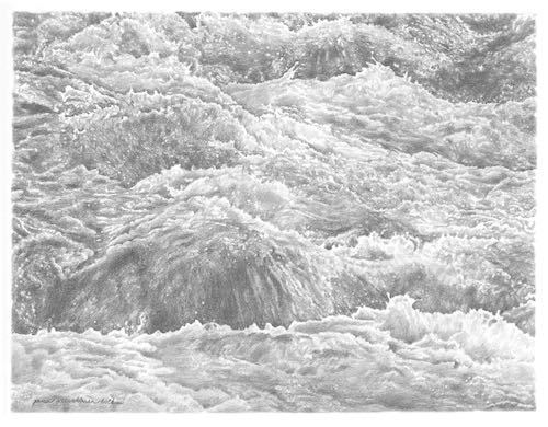
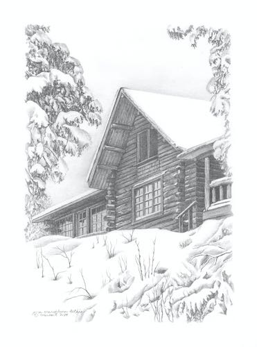
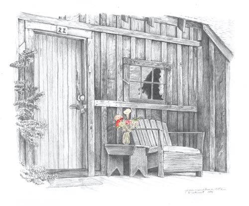
EDGES OR OUTLINES? Real life has edges; coloring books and cartoons have outlines.  Rather than separate items with a black line, use different shades of gray. It is a constant questioning: is this darker or lighter than the thing it touches? Sometimes it will change as you move through a particular area—within a particular item, it can be against something lighter in one place and something darker in another.

Step eight: Keep layering. I used 4B for the shadows of the battens above the door, and added 2B on top of the 4B and over the boards and battens. You can see that this little area isn’t as dark as its neighbor on the left.

Step nine: I continued on the upper board and batten section, and this time added HB on top so it matches the previous shaded areas. I also placed the erasing shield over the top of these parts and erased my jagged lines that went over the border.

MORE NOTES: There are many little finessing techniques that I do automatically and if I called them all out and scanned each one, it would be 2026 before you read this tutorial. A few of those techniques are (1) erasing little pieces that cross over into other territory; (2) darkening areas slightly in order to separate them from their neighbors; (3) ditto #2, but lightening, sometimes tapping gently with an eraser; (4) using a straight edge to clean up edges.

ANOTHER NOTE ABOUT TOOLS: With old buildings like cabins, I first use a straight edge to draw a line, but when shading, I do it freehand so there is a touch of wobble, which gives the look of age and wear (sort of like my face these days).

Step ten: The window started with some 4B, then 2B, then B (yep, a new pencil I hadn’t used yet) over all the glass. I am just pantsing this part because I think the photo has some unimportant specifics, and I’d rather put my efforts into the parts that matter, things that are identifiable.

NOTES ABOUT COLOR: When working from a colored photo, you have to decide which colors are darker and which are lighter. We don’t use black outlines in realistic drawing, so the different colors in real life are depicted by different degrees of darkness in a monochromatic drawing (single color, in this case gray) called “values” in Art Speak. I choose to work from colored photos instead of converting to black and white because it sharpens my ability to see the values; it also helps me know when 2 items of the same value are actually 2 separate items and not one indiscernible blob of gray.

Step eleven: I decided that the glass on the windows looks too fuzzy, grainy, textured, so I used a tool called a tortillon, which is sort of a paper “pencil”, to smear and blend things. A Q-tip, tissue, or your finger will also do the trick.

MORE NOTES ABOUT VALUES: When one item is on top of another item of the same color, the one behind will be slightly darker where the two meet. That’s the way to separate them without the dreaded outline. 

Tomorrow: chapter 4, in which we complete the graphite portion of the drawing.

Drawing in My Little Studio

This is my studio when the flowering pear tree (a leaning tree) was at its peak fall color. The smaller building in the back is where I draw; the closer one with the open door is the workshop where I paint (and where the cats are fed and kept safe at night).

Where was I before all that irrelevant information?

Drawing. Drawing in the studio, using pencils. Drawing a cabin. Drawing a Mineral King cabin. Drawing a commissioned pencil drawing of a Mineral King cabin.

(There. That should satisfy that greedy search engine’s demands for short sentences and repetition.)

Remember this?

It morphed into a real drawing. Here are the steps, some of which you have already seen (but I understand that you actually have a life, and may have slept since then or perhaps even drank a bit.)

Meanwhile, the rains came down outside the studio, pingety-ponging off the metal roof. How’s that for a description of the blessed, life-giving, relief-bringing, green-making, dust-removing rain?

P.S. The drawing will be better when it is scanned, rather than photographed in low light with a substandard camera. Thanks for bearing with me on this process.