Today we continue the tutorial that takes you step by step through drawing with pencil and eventually, colored pencil.
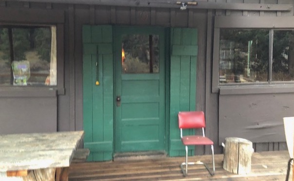 EDGES OR OUTLINES? Real life has edges; coloring books and cartoons have outlines. Rather than separate items with a black line, use different shades of gray. It is a constant questioning: is this darker or lighter than the thing it touches? Sometimes it will change as you move through a particular area—within a particular item, it can be against something lighter in one place and something darker in another.
Step eight: Keep layering. I used 4B for the shadows of the battens above the door, and added 2B on top of the 4B and over the boards and battens. You can see that this little area isn’t as dark as its neighbor on the left. 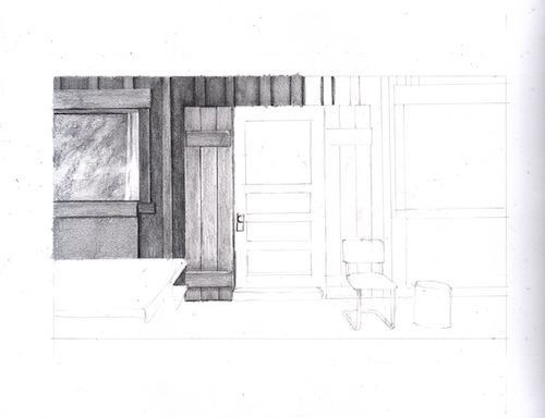
Step nine: I continued on the upper board and batten section, and this time added HB on top so it matches the previous shaded areas. I also placed the erasing shield over the top of these parts and erased my jagged lines that went over the border. 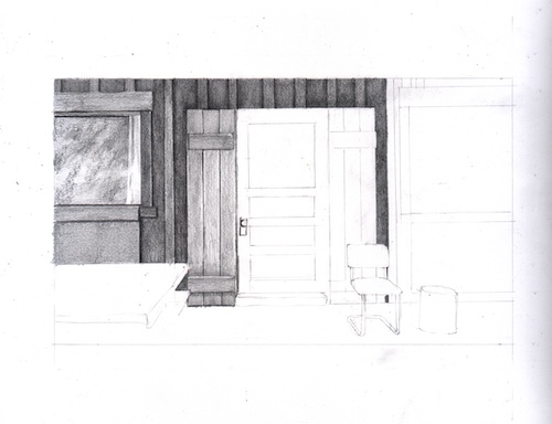
MORE NOTES: There are many little finessing techniques that I do automatically and if I called them all out and scanned each one, it would be 2026 before you read this tutorial. A few of those techniques are (1) erasing little pieces that cross over into other territory; (2) darkening areas slightly in order to separate them from their neighbors; (3) ditto #2, but lightening, sometimes tapping gently with an eraser; (4) using a straight edge to clean up edges.
ANOTHER NOTE ABOUT TOOLS: With old buildings like cabins, I first use a straight edge to draw a line, but when shading, I do it freehand so there is a touch of wobble, which gives the look of age and wear (sort of like my face these days).
Step ten: The window started with some 4B, then 2B, then B (yep, a new pencil I hadn’t used yet) over all the glass. I am just pantsing this part because I think the photo has some unimportant specifics, and I’d rather put my efforts into the parts that matter, things that are identifiable. 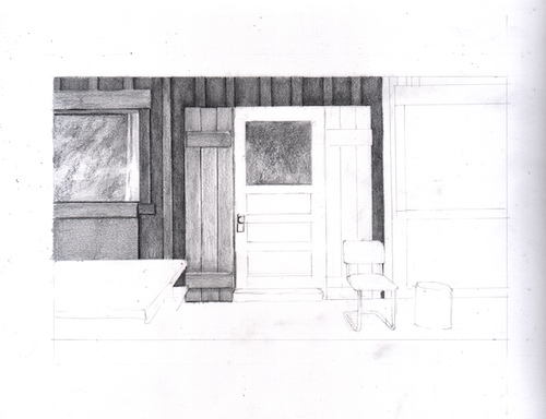
NOTES ABOUT COLOR: When working from a colored photo, you have to decide which colors are darker and which are lighter. We don’t use black outlines in realistic drawing, so the different colors in real life are depicted by different degrees of darkness in a monochromatic drawing (single color, in this case gray) called “values” in Art Speak. I choose to work from colored photos instead of converting to black and white because it sharpens my ability to see the values; it also helps me know when 2 items of the same value are actually 2 separate items and not one indiscernible blob of gray.
Step eleven: I decided that the glass on the windows looks too fuzzy, grainy, textured, so I used a tool called a tortillon, which is sort of a paper “pencil”, to smear and blend things. A Q-tip, tissue, or your finger will also do the trick. 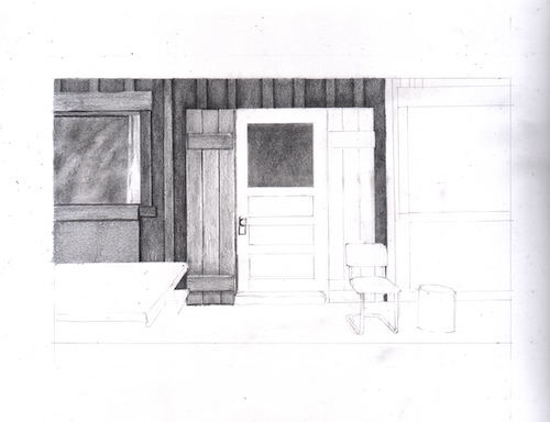
MORE NOTES ABOUT VALUES: When one item is on top of another item of the same color, the one behind will be slightly darker where the two meet. That’s the way to separate them without the dreaded outline.