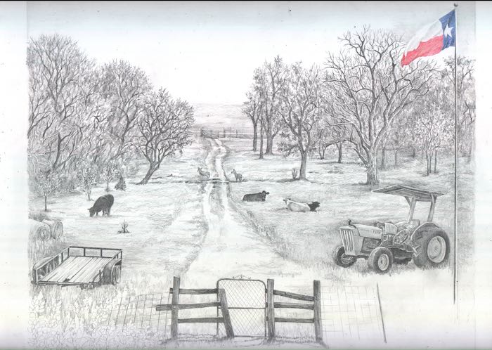
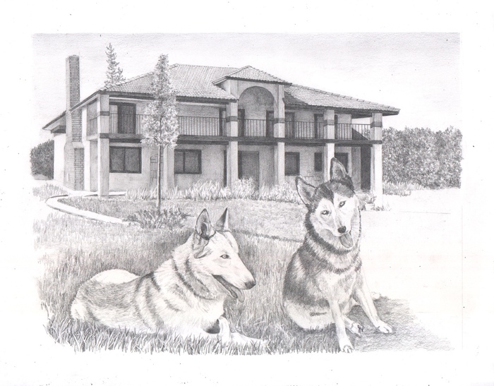
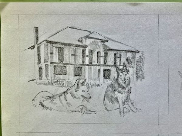
I told you that I have a very challenging drawing commission. Well yippee skippee, I finally had a pair of minutes to concentrate on the project. It is almost more of a design problem than an is-this-even-possible problem, like those tiny faces back in the winter. (Visible as Item #10 on Ten New Things Learned in February)
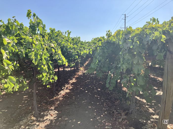
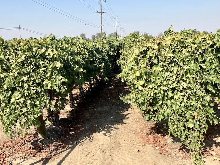
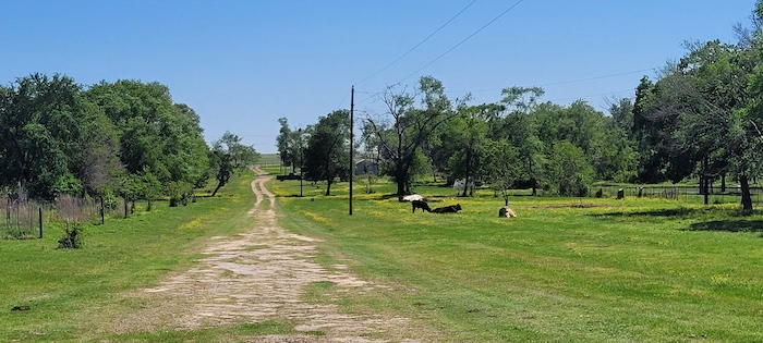
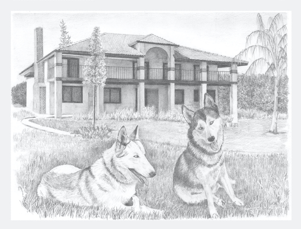
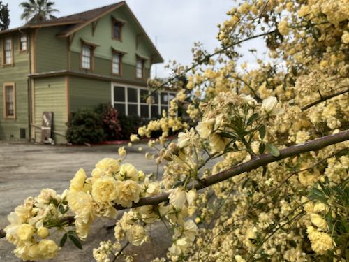
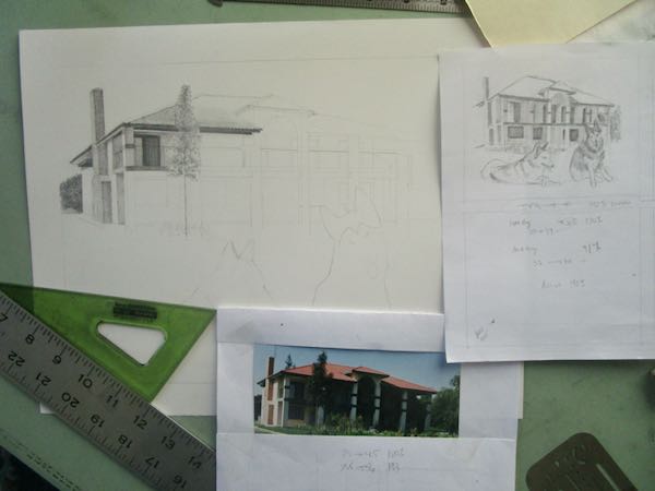
This is one of several many photos provided by the customers.
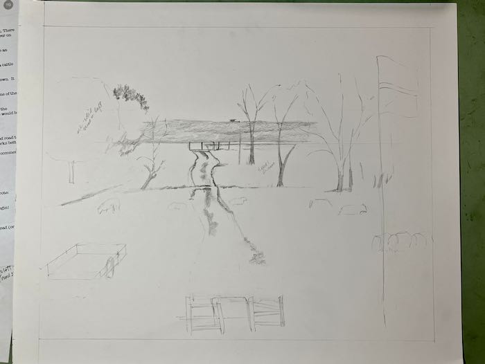
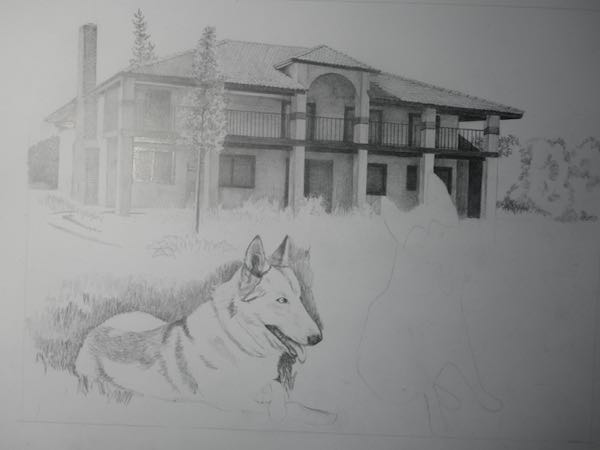
Nothing to do but just pull out some pencils, a sheet of 14×17 “ paper, and see if I can lay out the basics. (Crying or pulling out my hair would have been unhelpful.)
This commission would not be possible without the extensive communication with the customers. I am combining about a dozen photos, adding and moving all sorts of things, figuring out sizes and placements that are believable and pleasing and make sense to the customers.
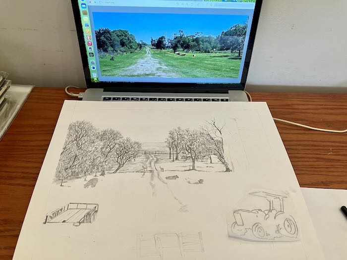
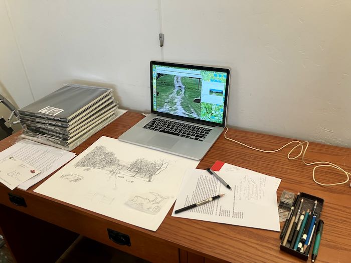
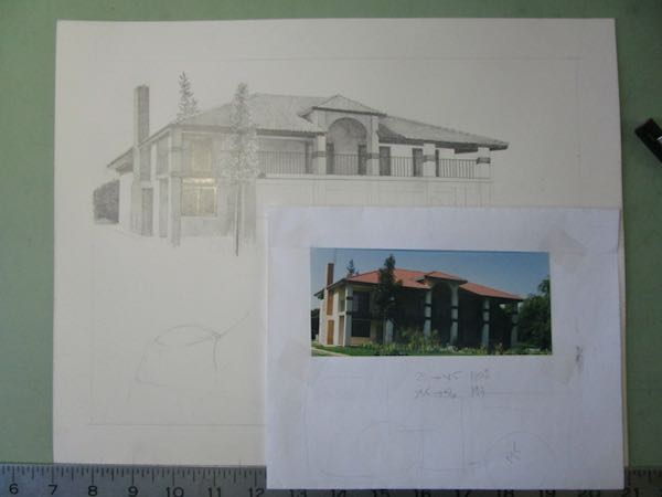
I moved from my drafting table to the desk behind me because the morning light coming in the window made it impossible to see my laptop screen. Yeppers, this techno-resister now draws more from her screen than from paper photos. (I even drive an automatic car now, but still prefer manual and do NOT own a microwave, so there.)
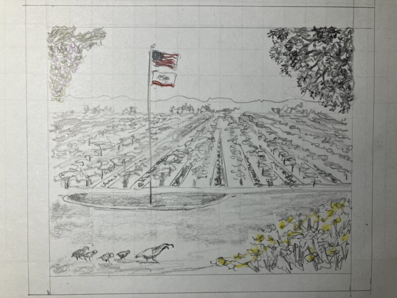
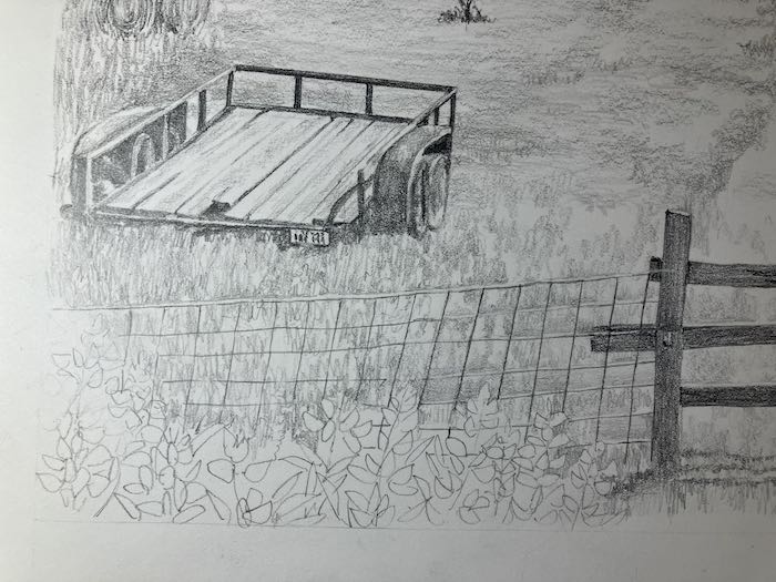
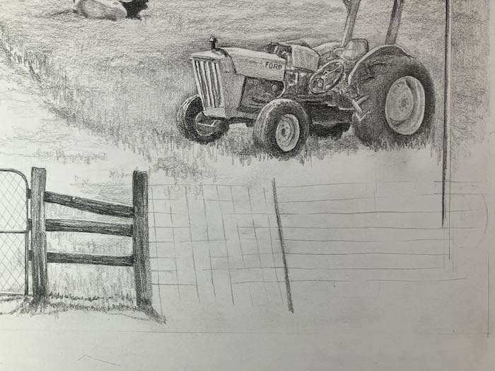
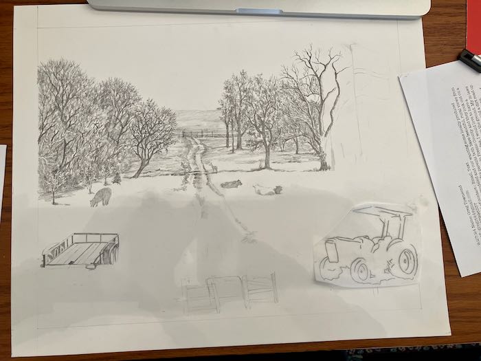
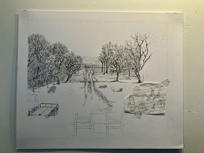
In figuring out how to make sense of the tractor size and placement, I outlined it on tracing paper and then started moving it around the drawing to see where the size and placement made the most sense.
A friend used to visit me regularly in my studio and ask, “How in the world do you do that?” My answer was usually, “One quarter inch at a time.” This drawing might be more like an eighth inch at a time.
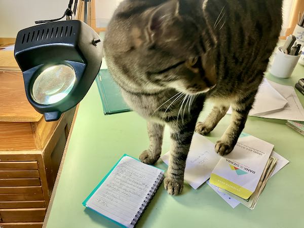
Yep. Those are Wilsonia books on the desk. Want one?
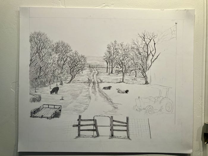
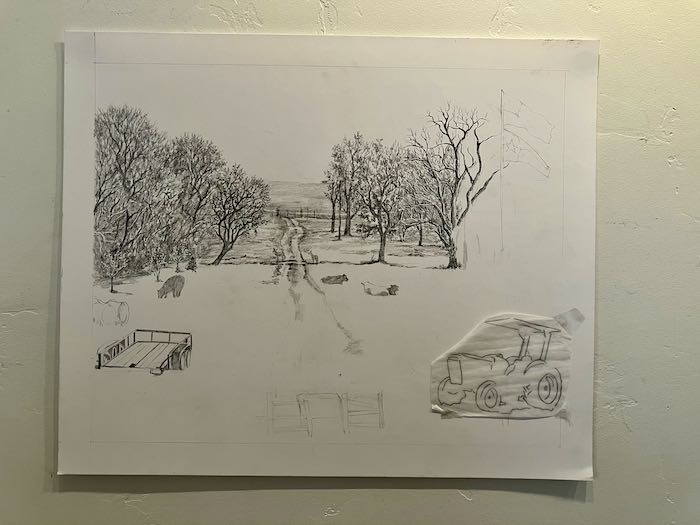
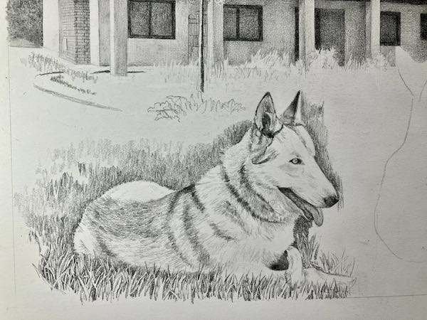
Because all my art was in Tulare while I was working on this commission, I was able to stick it on the wall for taking photos to send to the customers with each new batch of questions.
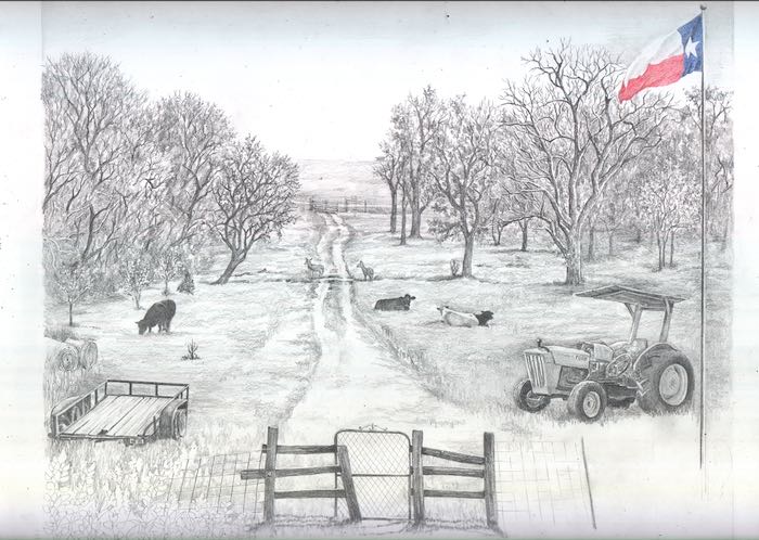
The gate in the foreground looked too small so I did the tissue thing, making it bigger, and then sending it to the customers for their approval. I also asked about the flags because they had asked for the American flag on top and the Texas flag below. While in Texas last year, I learned that Texas is the only state that flies its flag at the same height as the American flag because they used to be a sovereign nation. Texans are very proud of their state, and I posted about how that lone star appears in all sorts of unexpected places.
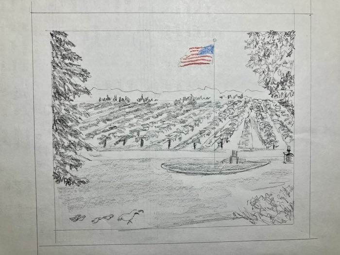
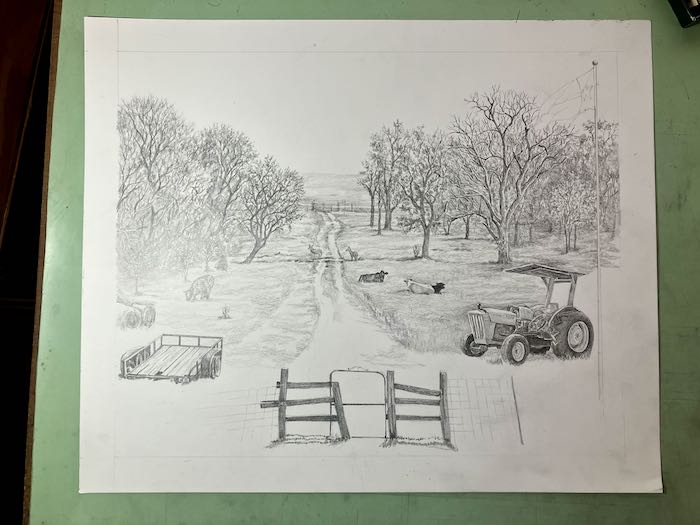
The bigger gate was better (because this is Texas? Nope, because it looked correct). And the American flag got ditched for just the lone star flag, now flapping into the scene.
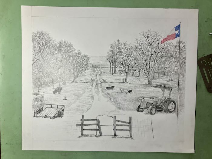
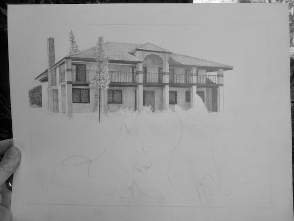
This was the result of a long uninterrupted (HALLELUJAH!) day at the drawing table.
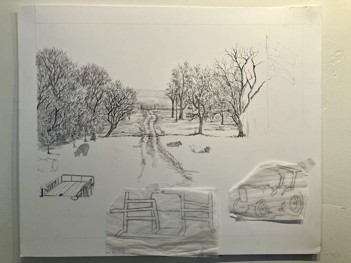
Who knows when I’ll have another day like this? Looking forward to it. . . there are trees, a tractor, grass, a flag, and Texas bluebonnets waiting for my attention, but these lovely customers are not pressuring me at all. And after drawing for about 8 hours straight, (okay, a couple of breaks, and a lot of staring and questioning), it was time to stop before I got careless and did something stupid. (You are shocked?? Sorry to disappoint you, but I do stupid things sometimes.)