If you receive these posts in email and the pictures in the post don’t show for you, tap here janabotkin.net. It will take you to the blog on the internet.
A woman contacted me via my connection with the Arts Consortium This is Tulare County’s designated arts council, an active and helpful group.
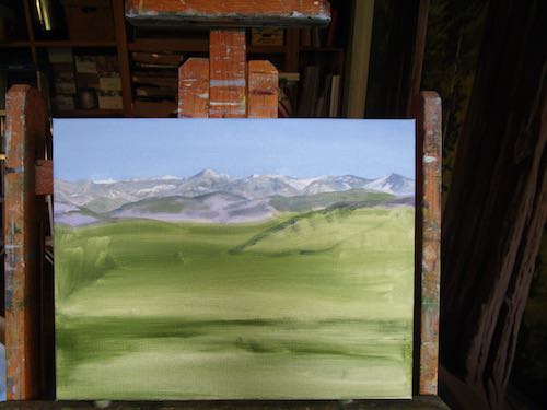
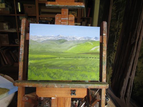
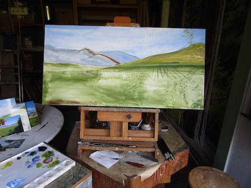
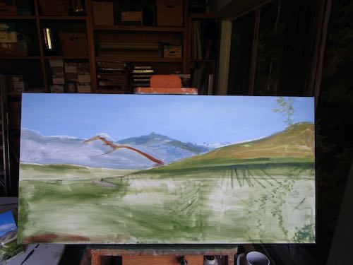
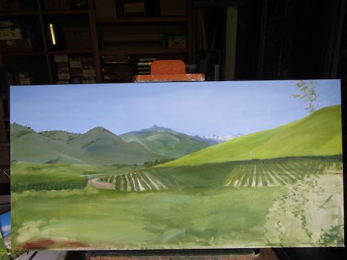
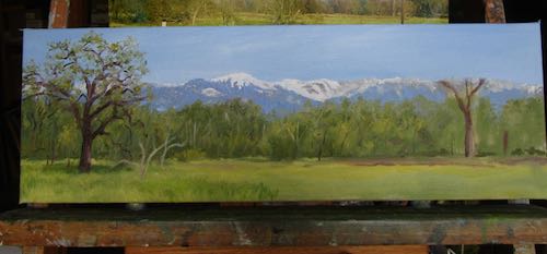
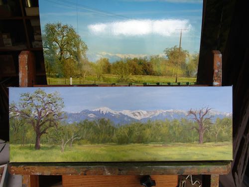
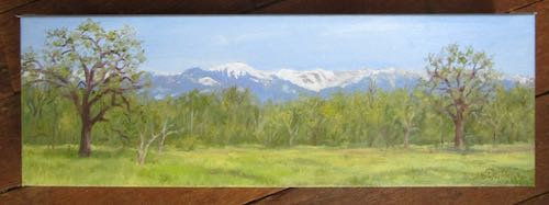
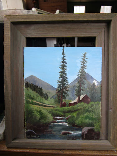
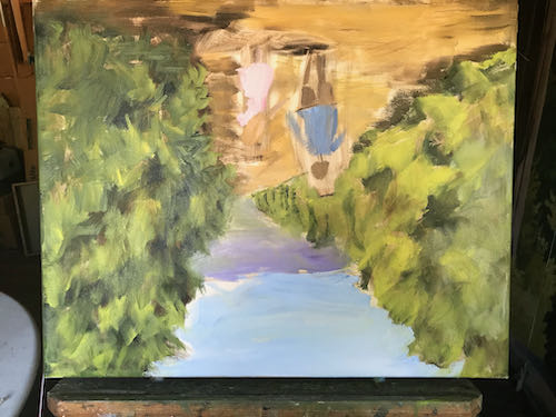
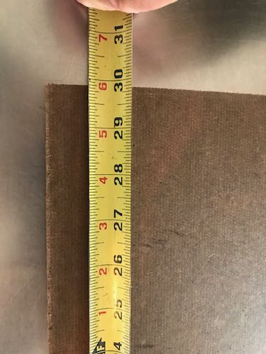
She had a request for a custom oil painting, which on the surface sounded normal. We began discussing via email, and eventually I learned the odd particulars of her job. She has a window in her home which looks out onto the neighbor’s wall, about 1 yard away. The window is a very specific measurement, and she would like a painting to exactly fill the space, 16-3/8 x 29-7/8″.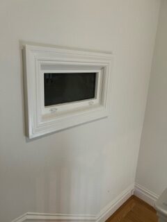
That is not a standard size. (Bet you already guessed that one.)
The customer, living in a city, has access to many businesses, such as a place that makes custom canvases.
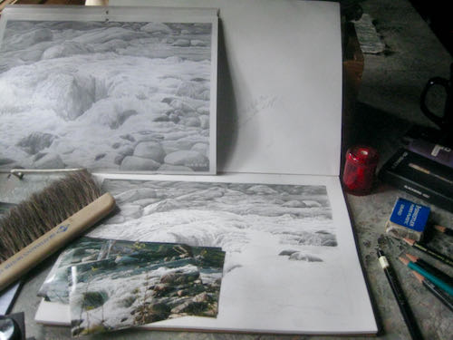
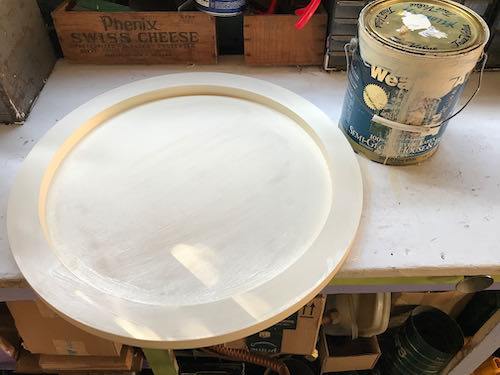
Before she called the company, I remembered that when I first was learning to oil paint, I painted on Masonite, primed with many coats of flat white house paint. Back in 2006, I bought a sheet of 4×8′ Masonite (also called “panel board”), along with a table saw (which I put in the front passenger seat of Fernando*), and then Trail Guy cut the boards to the sizes that I requested. (Nope, I’m not risking my fingers on that machine.)
I looked through my scraps, but none were large enough to cut to size.
So, I took the pick-em-up truck to Vise-grip (AKA Visalia) to buy a sheet of Masonite, hoping I could buy a 1/2 sheet. At the least, I was hoping they’d be able to cut the full sheet into 4 pieces, but just in case they couldn’t, I left Fernando at home.
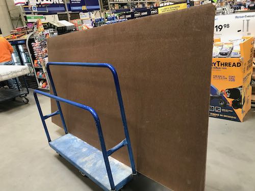 Alas, the correct saw at the big box store was broken. So, I bought the giant sheet and some really helpful guy with a really foul mouth helped me load it after he saw me wrestling with it in the parking lot. (He was not an employee: remember this was a big box store, not known for helpfulness).
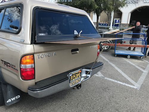
Trail Guy figured out how to cut it to the exact dimension.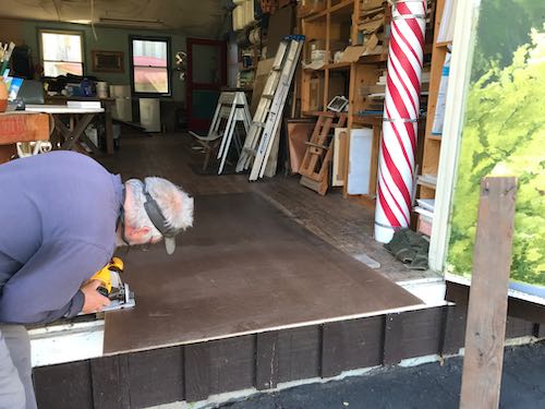
Then, when he was figuring out where to store the excess, HE FOUND A SCRAP FROM BEFORE THAT WAS BIG ENOUGH!!
Phooey.
*Fernando is my ’96 Honda Accord coupe. “Coupe” means two doors. You’re welcome. I try to expand people’s vocabularies here.