Did Mineral King need a paint job?
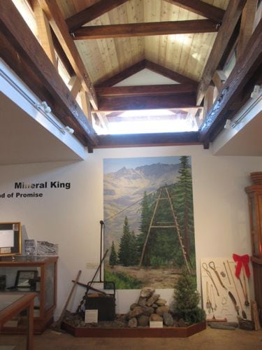
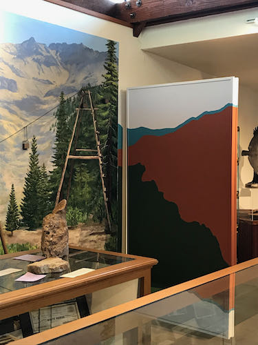
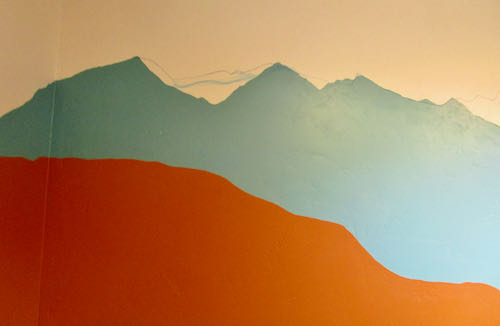
No, but the Mineral King Room at the Three Rivers Historical Museum did. The blue didn’t match the murals in the room, and the mountaintops weren’t recognizable. (You can see the murals here.)
First, I was determined to mix the right shade of blue using whatever paints I had on hand. Lightfastness isn’t a problem on indoor murals, so I was able to use a can of indoor white paint that came from who knows where, along with my 2 mural paint blues. Mural paints are highly pigmented and that makes them very useful for making my own interior colors.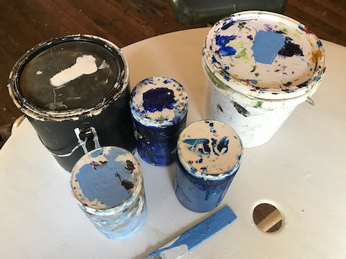
Second, we taped all the parts that needed protection. (This was not the royal we—I had great help from MKPS Sandi).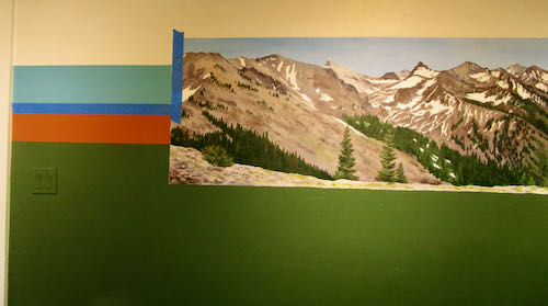
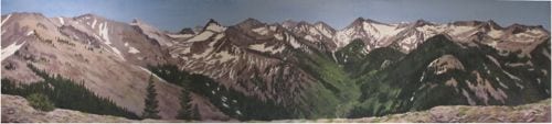
Next, I traced the tops of the mountains on the mural showing the peaks surrounding the MIneral King valley. This provided a guide to redraw the peaks to match reality. (This was based on the assumption that I painted the mountains accurately in the mural.)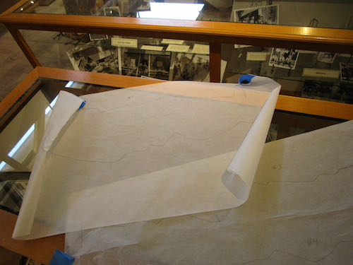
I drew the mountains on with chalk. (It wasn’t a Mineral King blue either but it matched my painter’s tape.) 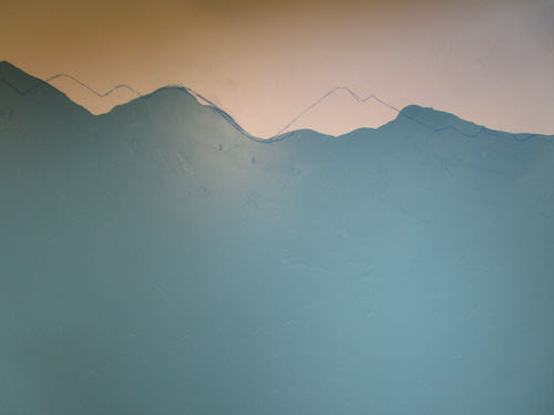
Then, I started painting and almost immediately, dripped onto the rust color.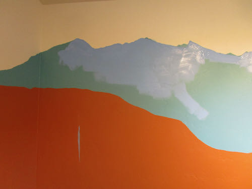
Good thing there is touch-up paint for all the colors involved. 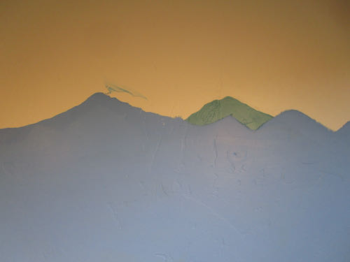
Here is an example of something weird that I have learned about acrylic paints, as opposed to oil paints: they are LIGHTER when they are wet. Doesn’t make sense, but it is true.
That teal color was great with the rust, but just not right for the subject matter. I told the Mineral King Preservation Society that if they are just going to waste the paint, I’ll be happy to take it off their hands. I’m sure I can find a use for it. (Weird how the rust looks like red here, and the white looks like light tan).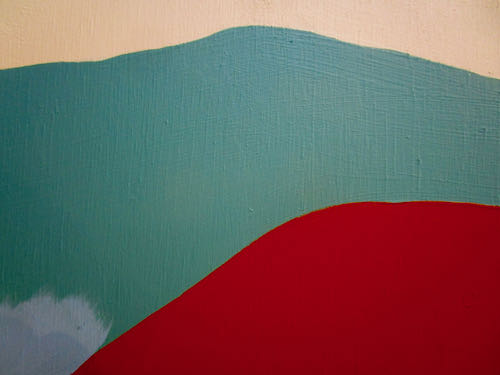
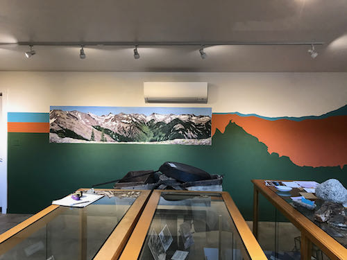
Now look at the room so you can see the corrected peaks and the color that matches the murals. (I’ll show a before and after on the 2nd shot for you.)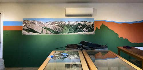
Before: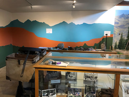
After: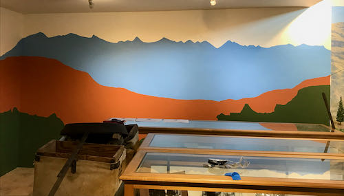
The mountains in the Before photo are more dramatic and more proportionally pleasing. However, the mountains in the After photo are realistic rather than stylized, match the murals and give more display space for whatever will be going on the wall.
Tomorrow I will tell you a few thoughts about this job.