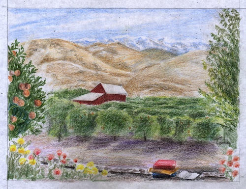
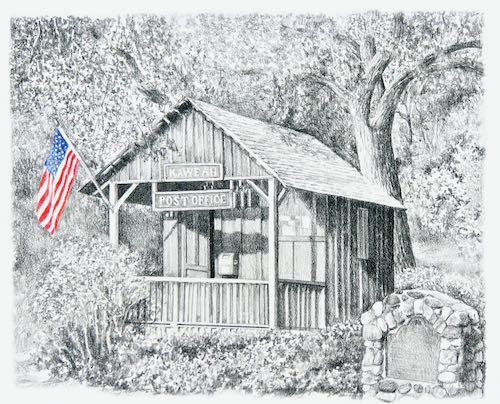
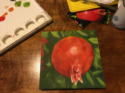
Remember all those oil paintings of Sawtooth Near Sunnypoint? Sunnypoint was a Forest Service campground in Mineral King closed in the 1970s (or was it the 1960s? I wasn’t there then.)
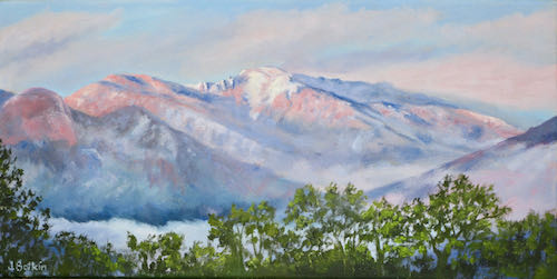
The view that has been so popular is a bit made up. When you are standing where I have stood to take so many photos, year after year, of the same scene, your eyes tell you that the barest tip of Sawtooth shows. When you leave the exact spot, you remember it as a place where Sawtooth, Black Wolf Falls, the stream, and wildflowers are all coexisting in beautiful harmony.
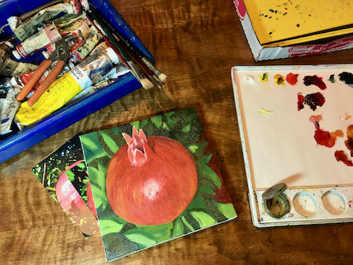
It is my job to gather up all those pieces of reality and combine them into a believable fantasy for you. This beautiful fantasy, which matches up with peoples’ memories, has brought me back to the easel once again.
After a week of messing around, taking walks, editing 2 books, and staying away from the painting workshop, I finally went back to work.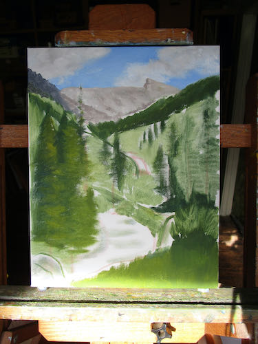
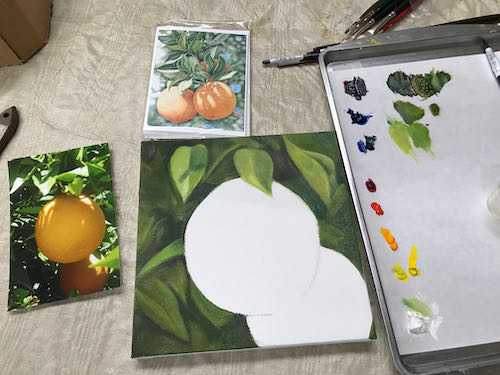
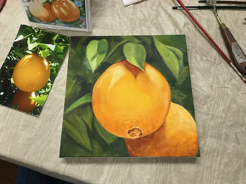
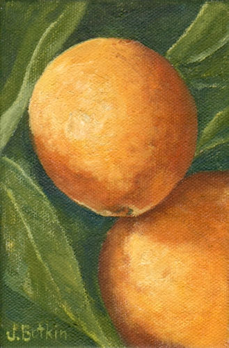
The work that remains after this dries:
- Add the wildflowers
- Fix whatever is wrong that I have noticed during the drying process
- Sign
- Let dry again
- Scan
- Varnish
- DELIVER!
There is more to the story of multiple iterations of the Sawtooth Near Sunnypoint paintings. Mañana. . .
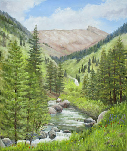
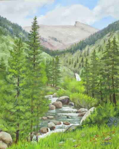
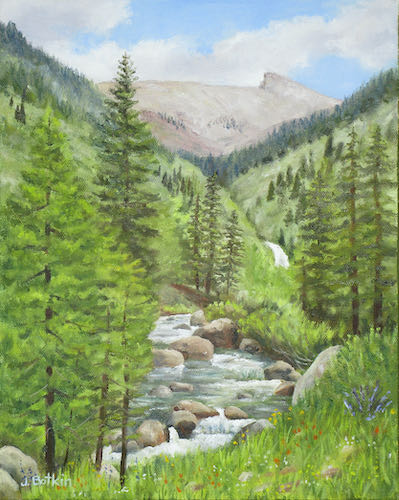

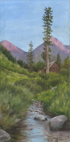
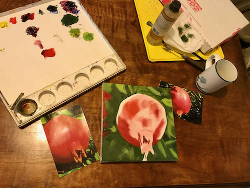
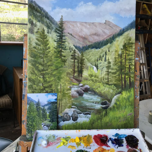
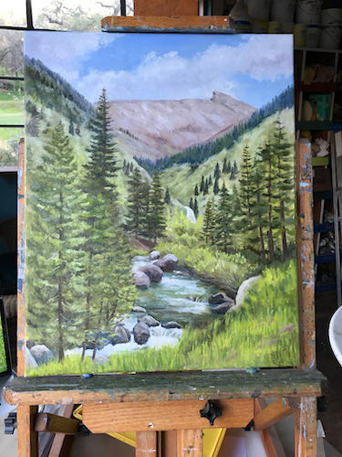
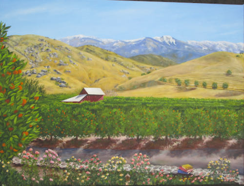
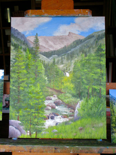
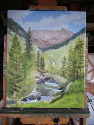
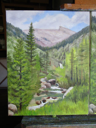
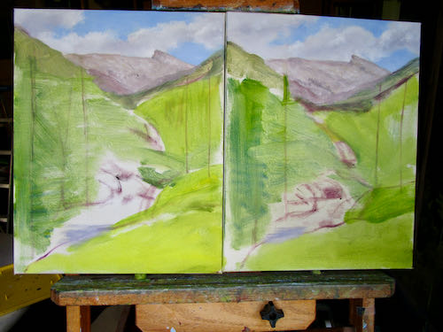
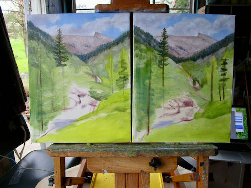
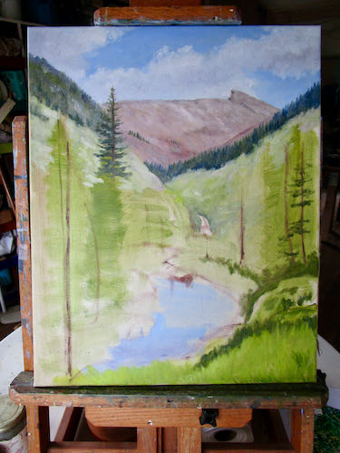
 The 16×20 is finished; the 11×14 beneath it isn’t – look at the trees on the right (middle) side.
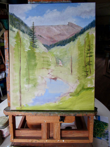
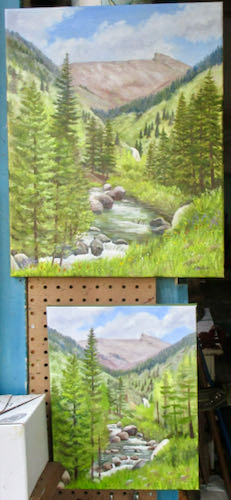 This one looks finished. I wonder if it is the 16×20 or one of the 11x14s.
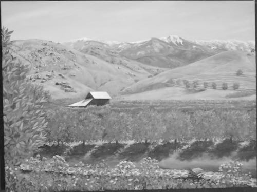
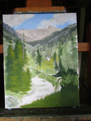
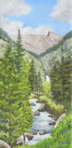
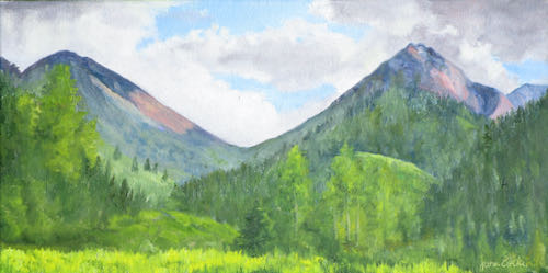
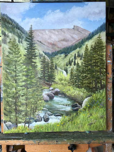
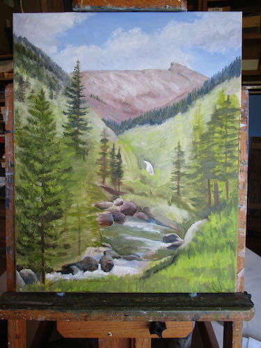
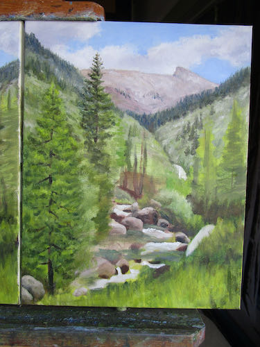
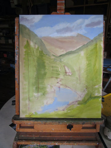
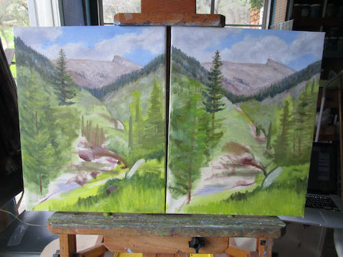
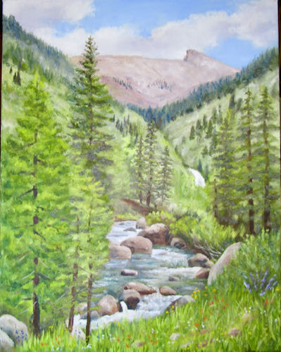 This one needs mid-ground trees and foreground grasses and flowers.
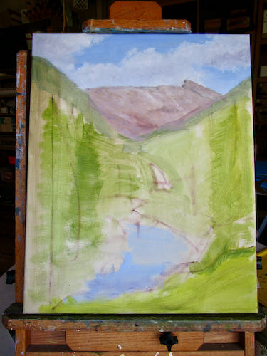
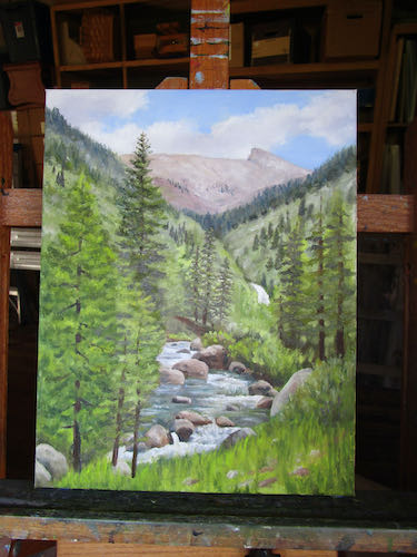 Definitely not finished.
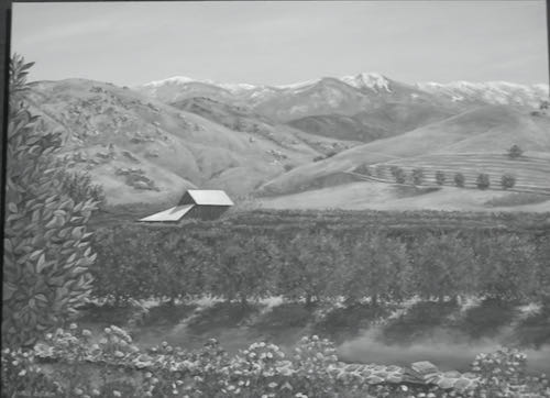
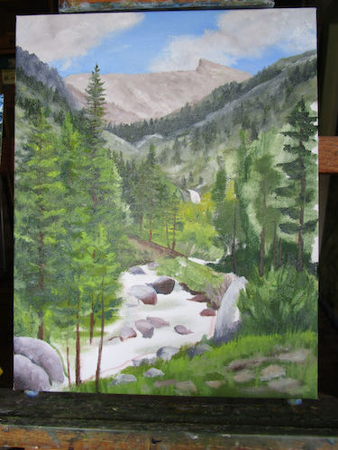
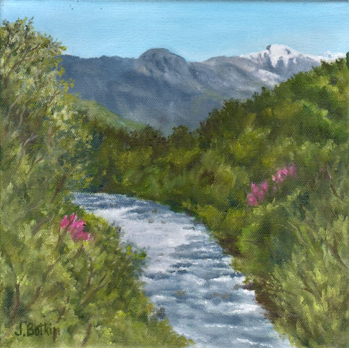
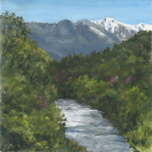
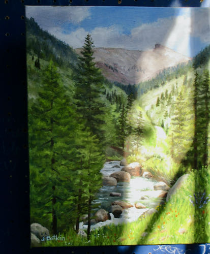
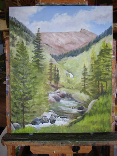
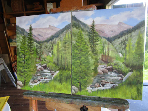
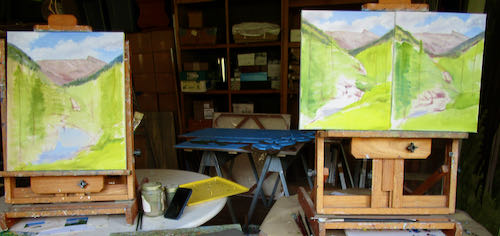
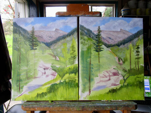
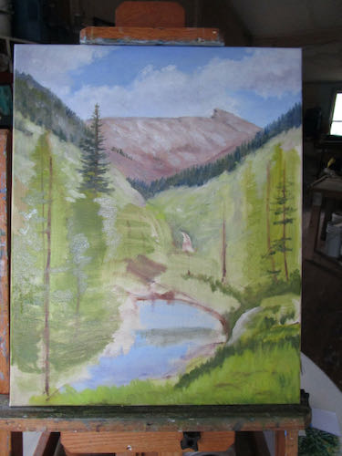
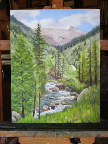 This one appears to be finished. When there are grasses and tiny colored dots for flowers, it is finished.
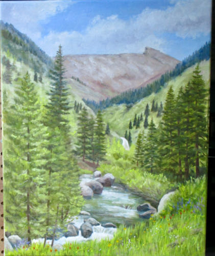
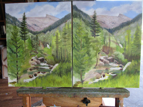
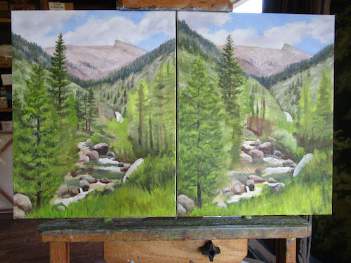
 It takes some discipline to not get too far ahead on each one. Even if I am on a roll, I have to move to the other 2 canvases to repeat a successful rock, tree, texture, or stretch of water. When all are finally finished, I will evaluate each part, decide which painting is the best in that area, and then bring the other two up to the level of the best.
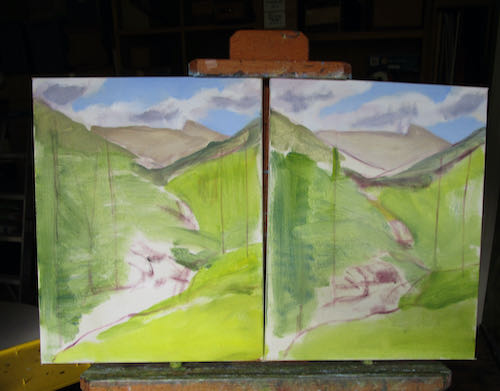
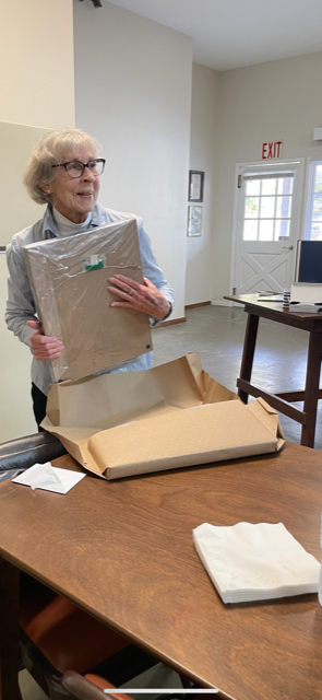
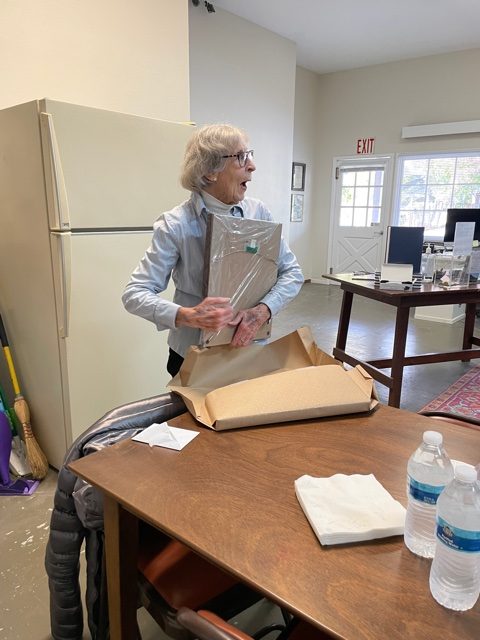
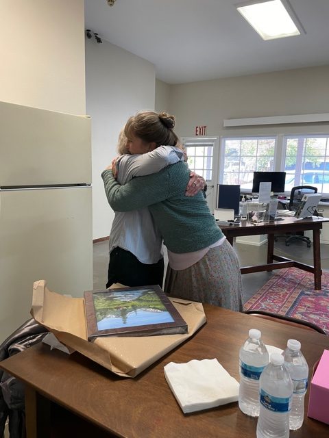
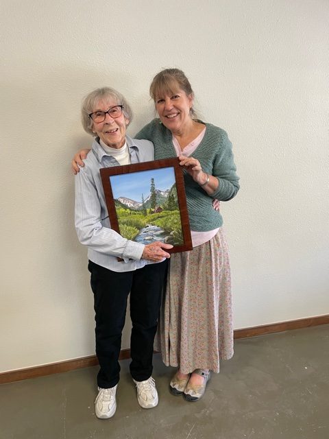 I love this lady.