Finding Information (Instead of Woo-woo Inspiration)

If you receive these posts in email and the pictures in the post don’t show for you, tap here janabotkin.net. It will take you to the blog on the internet.

I was procrastinating (and yardening) in order to think. Sometimes procrastination is simply waiting for inspiration. If you are a person of faith, that is a time of waiting for the Lord to show the way through some of life’s more puzzling situations.

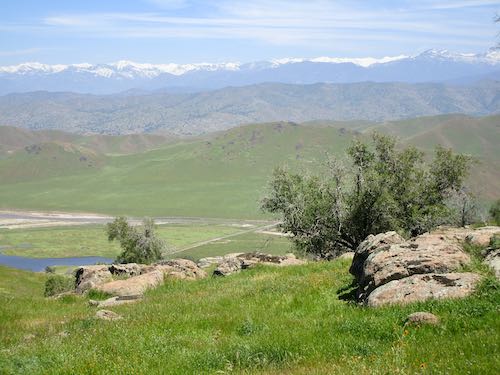
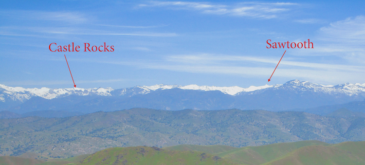
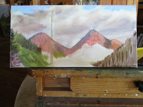
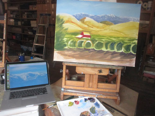
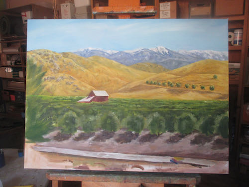
One of my puzzling situations was how to paint the mountains accurately on a commissioned oil painting when I didn’t have the right photos. Sure, Part A is in Photo A, Part C is in Photo C, but then Photo B doesn’t match or fit because it was taken from a different location or there is a tree blocking what I need to see.

I can fake mountains and foothills pretty well, but this particular painting is calling for accuracy. Well, actually, Mr. Customer is calling for accuracy in the mountains, and I fully understand and endorse his desire. The point of the painting for him, besides recalling a moment in time, is to be able to see specifically which peak is where. 

I had a good start, but there were some significant difficulties, such as what happens between Castle Rocks and Sawtooth. I could make a few white dabs, but when Mr. Customer and I try to name peaks, our efforts would be stymied by misleading information. (Heaven forbid that we participate in dis and mis information!)

The answer came while having lunch on Rocky Hill.

Let’s crop and enhance it.

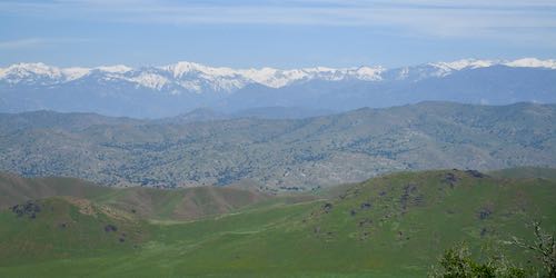
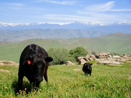
Nope, this isn’t the span of mountains I am seeking. It’s in this photo, but those beeves are in the way.

I cropped out the cattle, messed with the exposure so the mountains were very distinct against the sky, and VOILA! (That is French for THIS IS WHAT I WANT AND NEED! Maybe. I don’t speak French.)

Was I seeking inspiration?

Maybe. People who aren’t artists think there is some sort of woo-woo inspiration thing that causes artists to do our thing.

I am more practical. There is beauty everywhere, subjects that would make great paintings, but as a professional, I have to take into account what my customers (and potential customers) want.

So, more than inspiration, I was seeking information, but needed help to find it, and then, right on time, the Lord provided. (If you are not a person of faith, you might credit “the universe”. That’s too woo-woo for me.)


Seven More Photos of Progression

If you receive these posts in email and the pictures in the post don’t show for you, tap here janabotkin.net. It will take you to the blog on the internet.

The session began with the commissioned oil painting in an odd size on Masonite board looking like this. 

I planted a tree on the left and indicated where 2 small trees would go next to the larger one.

The distant shrubs got a bit more details. Maybe. Maybe I was just licking the painting with the brush at this point.

The pair of smaller trees has some form now. Trees are growing in the distance on the right side.

Now there are definitely trees with definition on the right side, definitively.

Now I have started cleaning the various greens from my paintbrush by spreading them on the lower shrubs, which I am sure are sagebrush. This place might be similar to Mineral King in elevation, because it shares many characteristics.

Now the meadow has more paint, and the log has more details.

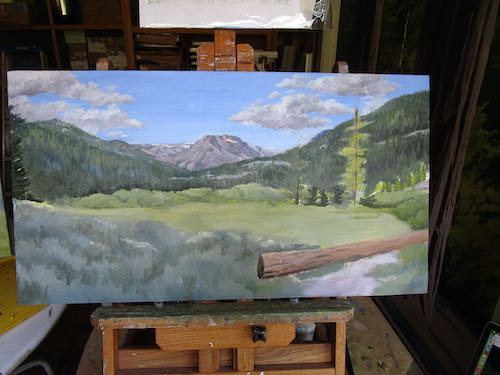
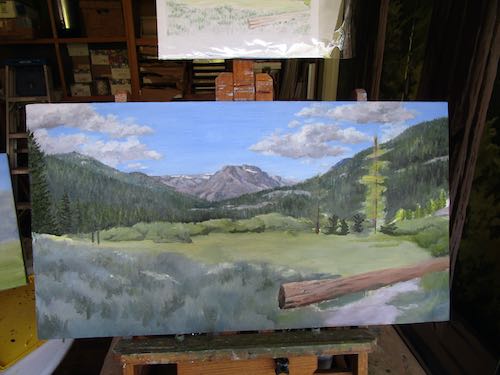
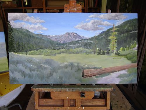
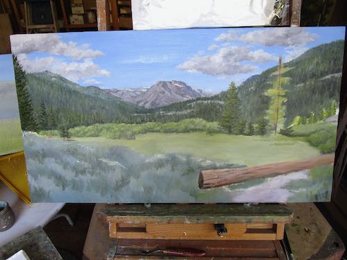
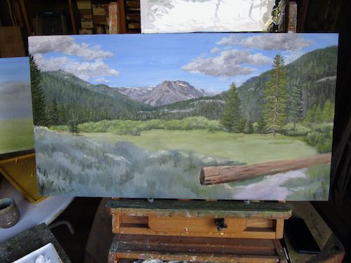
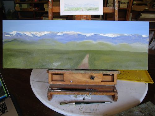
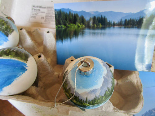
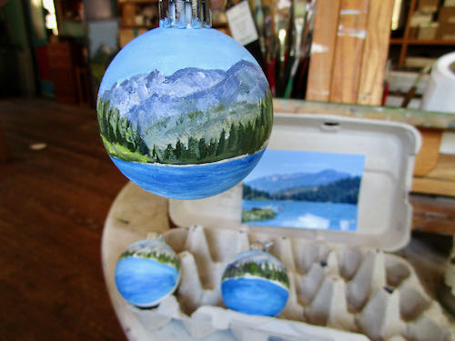
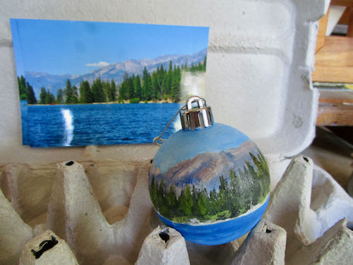
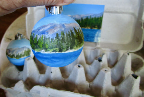
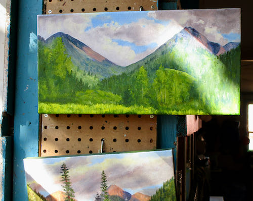
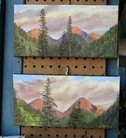
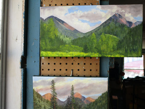
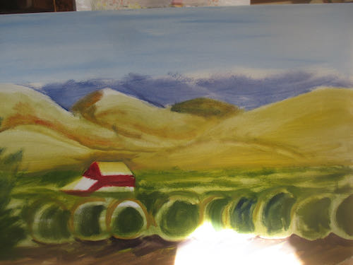
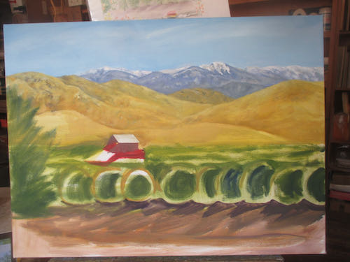
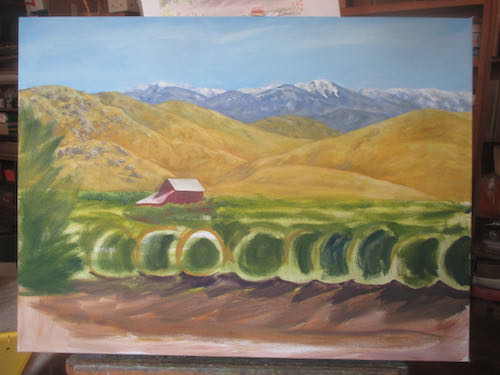
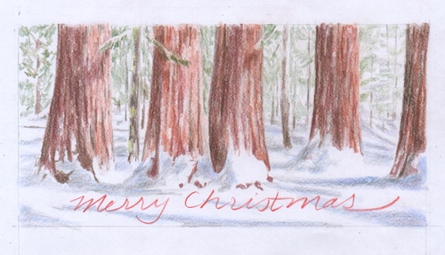
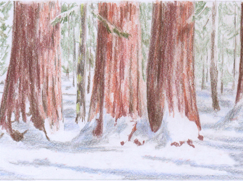
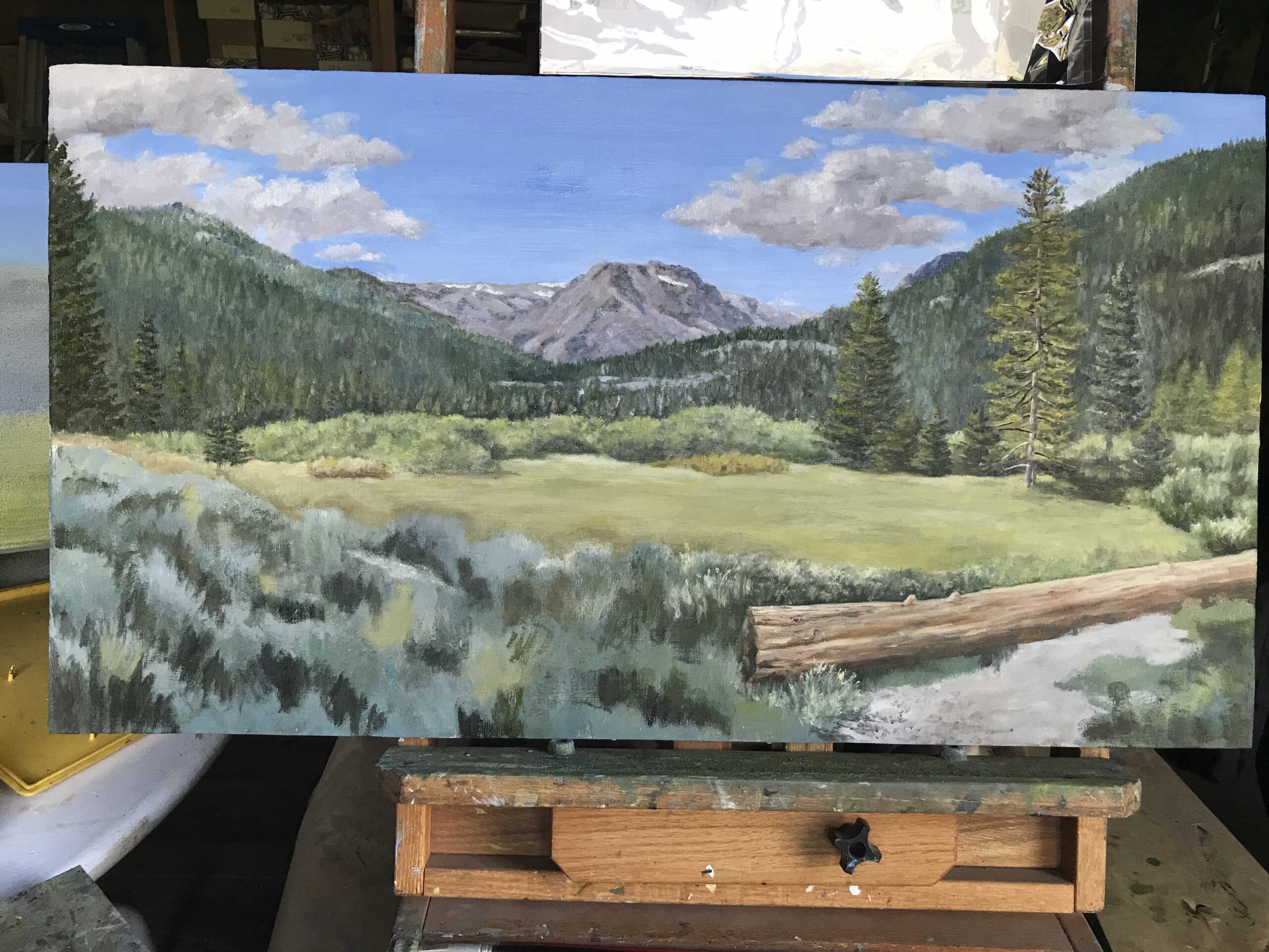
I am starting to really like this painting, which I have decided to call “Somewhere North of Tahoe”. Too bad I didn’t get my donkey in gear earlier this morning or I could have this painting finished now.


What Matters on a Commissioned Oil Painting

This wisdom about perfecting a painting is from Betty Edwards, most known for her book Drawing on the Right Side of the Brain. She also wrote a helpful book about color, helpfully titled Color.

  1. Do any of the lightest lights seem to pop out rather than staying anchored?
  2. Do any of the darkest darks seem to carve holes?
  3. Does any area that is not the main event seem to fight for attention?

Turn it upside down to evaluate for these next questions:

  1. Does it seem heavy on one side or the other, or on the top or bottom?
  2. Does anything seem out of place, either too bright or too dull?

I evaluated the anniversary bouquet painting using these questions. It went from looking like this:

to looking like this:

Then I incorporated the very apt suggestion from reader (and friend and former drawing student) Nikki to make the edges of the carnations more fringed. Here is better fringiness on the left side:

And the not yet fringed right side for your comparison:

Then I fixed the hanging ribbon, the patchy-looking background, the repaired coaster, a dab here and a touch there, and finally added in a little something on the bottom left quarter.

Now it will dry, I will continue to mull it over, study it, and eventually, I hope to find the courage to sign it and call it FINISHED. (Mr. and Mrs. Customer are no help in this finalizing and nitpicking because they have been thrilled with the painting at every stage!) 

P.S. It looks better in person; there are weird shiny spots because so many parts are wet.


Variety in the Working Life of a Central California Artist

There you go, Search Engines. Hope you like that ridiculously long title.

I had a day of great variety, all of it interesting, all of it productive

  1. This book, Adventures in Boy Scouting, will soon be available as an ebook through Bookbaby. It took a lot of learning, and a lot of proofreading. The print version is available at the Three Rivers Mercantile, Three Rivers Historical Museum, and BookBaby.com
  2. After enjoying the nice fire in the house (in the wood stove—no need to be concerned) while proofreading (we had a few cold days), I moved to the painting workshop to do a bit of polishing on the Fiftieth Bouquet oil painting. “Polishing” here means making some small corrections. The roses, red bow, vase, coaster and background are not finished.
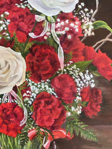
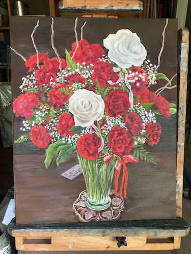
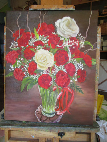
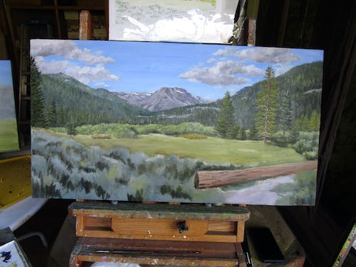
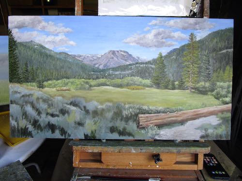
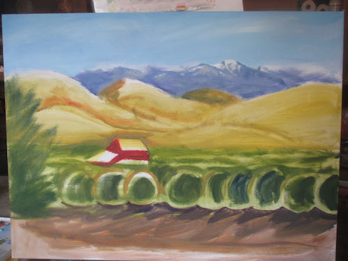
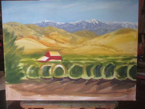
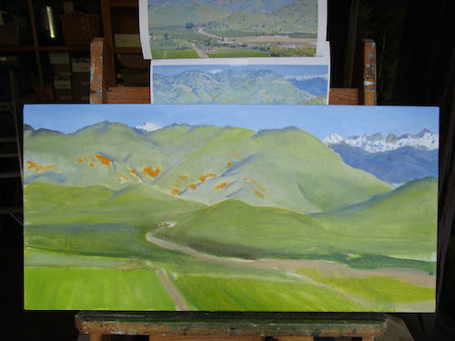
  3. I detailed the mountains and put a second layer on my favorite scene.

  4. Then I left the painting workshop and moved into the studio to finish a drawing. After scanning it, I sent it to the customer to get her approval before spray-fixing it and then adding color.

It was a good day of working on projects that are all presold. While it is fun to just paint and draw what I want, it is more satisfying to paint and draw for other people, particularly when they choose subjects that float my boat.

In case you have forgotten because I haven’t shouted this at you for awhile:

Using pencils, oil paint, and murals, I make art that you can understand, of places and things you love, for prices that won’t scare you.


Just Another Day at the Easels. . .

. . .in a barely cool painting workshop in early August, but thankful for the swamp cooler. The day before, I stood the entire time while painting. This day I sat the entire time. 

Thank you to Reader Anne for the suggestion of using an egg carton for the ornaments. It sort of worked, but I ended up holding each one in my hand. They are looking better, but still have many layers ahead. These photos are just more teasers about how they are moving ahead without revealing much except that Hume Lake will be on one side.

I touched up the 8×16″ of Farewell Gap in Mineral King, but you might have to see it in person to catch the improvements.

Since Kelly’s Sunset (also in Mineral King) has sold, I painted another one. I have altered the placement of trees from Kelly’s original photo, and altered them again in version #2. In these photos, I can see that the angle of the left flank of Vandever (peak on the right) is too steep. Will anyone else notice? Will the piece not sell? More will be revealed in the fullness of time.

P.S. UPDATE: the smaller sunset painting with the wrong angle on Vandever and a single tree sold immediately.

9 Steps on a Custom Painting, Chapter 5

That’s a title change from the story of a large and important commissioned oil painting, but the saga continues as I build up the layers of paint and try to figure out how to make this worthy of “large and important” as a description..

Here are some thoughts and explanations as I bumble along. (The numbers don’t correspond to the photos.)

  1. The first photo has bright morning sunlight at the bottom; I wish I knew how to duplicate this sort of contrast with paint.
  2. As always, I started with the farthest items first – sky, then distant peaks, foothills next, citrus grove, etc.
  3. The mountains are from a photo I took north of Ivanhoe, which isn’t too much different from the view seen from this place between Lemon Cove and Woodlake.
  4. I moved the barn higher, which might have been a poor decision. The light and shadow on the roofs of the barn look pretty good.
  5. I have some confusion as to how to arrange the trees, because I am working from photos of differing viewpoints plus envisioning whatever makes sense from my previous experiences painting citrus groves.
  6. When I took the photos, there was a wildfire putting a dull haze of smoke over the colors. I am exaggerating the brightness because it makes for a more pleasing painting.

Now it needs to dry awhile. Next, I will correct things that are not believable, correct colors, tighten up details, and then wait for more drying so I can add more details, wait for more drying, add even more details. . .

House on Canvas

The house painting looked like this at the beginning of this painting session.

This amount of specific detail without a lot of choices in reference photos requires that I resort to the dreaded “drawing with my paintbrush”. Why this is so despised in the Art World remains a mystery to me. In my little world, I want to provide what the customer wants, and if it requires drawing with my paintbrush, then so be it.

It’s getting there! I’ve got to figure out the details on the porch, do something with the landscaping, and then talk to my customer. She has some old home movies that she is converting to video, and then I will look through them to see if I can get to a better understanding of what she remembers.

Custom Oil Painting, continued

First, the sky, then the roof, and next, the details that I can see.

Greenery helps.

I’ll keep working at the details that I can see, then move to the parts that I have to make up, and finally, I’ll ask my Customer/Friend to help me understand the parts that she remembers.

Then, I’ll tighten up the details and correct the color and who knows? Whatever it takes to make it look the best I can make it. I can do this! (Like the Little Engine That Could – “I think I can, I think I can. . .”)

Ran out of daylight to paint during the last session. Hence, the darker photo.

Conversion to Winter

A friend from down south (that means Southern California or “Socal”) called to see if I could paint sequoias in snow for his company to use for their holiday card this year. (Companies aren’t allowed to send Christmas cards anymore.) We discussed sizes, timelines, and designs. After those preliminary decisions were made, I sent this sketch for approval.

The sketch vanished into the atmosphere, and another sketch of different proportions was requested. I sent this, but knew it wasn’t as good as the 18×36″ proportioned one, so I sent the first one again. (Did it vanish because I had the audacity to write the words “Merry Christmas”? Don’t be a conspiracist!!)
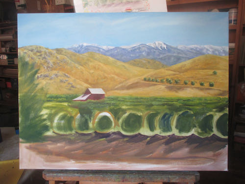
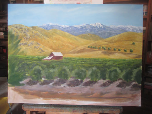
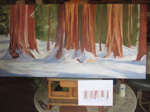
Then the requested time frame to receive the finished painting shrunk. People who don’t paint don’t know how long it takes for oil to dry; people who do paint don’t really know either but realize it isn’t an overnight situation. People who live in cities don’t know how long it takes for giant blank canvases to get shipped; people who don’t live in cities don’t really know either, but understand that time must be built in for snafus.

So, I looked at the 18×36″ painting of sequoias on the easel that was set aside because I have commissions, which always take precedence over the paintings I do to build up my inventory.
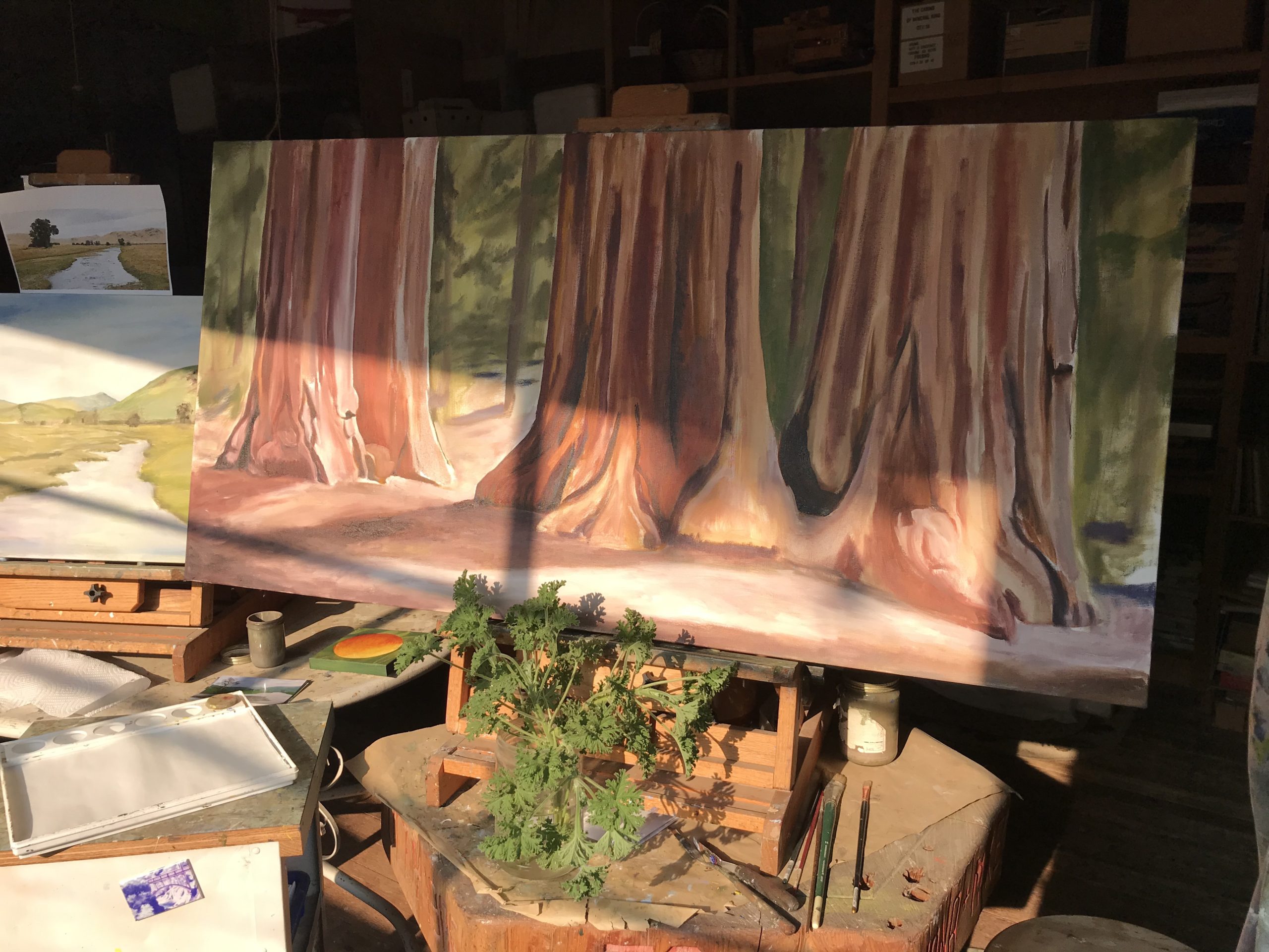
Necessity is the mother of invention and being innovative is part of living rurally. I decided that this unfinished summer scene could be converted to winter, because there isn’t enough time to wait for a new canvas to arrive.

White is the slowest drying oil paint color, so this will need a few days before the detail begins.

Yippee skippee, I can do this!! (Why didn’t I think to add on a rush charge? Does anyone out there want to be my business manager? secretary? coach?)


New Custom Oil Painting

Because I can’t start painting on the mural until afternoon, I can work on a new custom oil painting in the morning.

This is for a friend of mine. This house belonged to her grandparents, and she doesn’t have many photos other than the ones taken after the house changed owners. So, I am working from mediocre photos and verbal instructions from my friend/customer. Tain’t easy, but we can do this.