This wisdom about perfecting a painting is from Betty Edwards, most known for her book Drawing on the Right Side of the Brain. She also wrote a helpful book about color, helpfully titled Color.
- Do any of the lightest lights seem to pop out rather than staying anchored?
- Do any of the darkest darks seem to carve holes?
- Does any area that is not the main event seem to fight for attention?
Turn it upside down to evaluate for these next questions:
- Does it seem heavy on one side or the other, or on the top or bottom?
- Does anything seem out of place, either too bright or too dull?
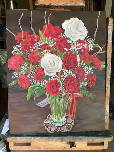
I evaluated the anniversary bouquet painting using these questions. It went from looking like this: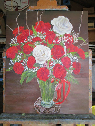
to looking like this: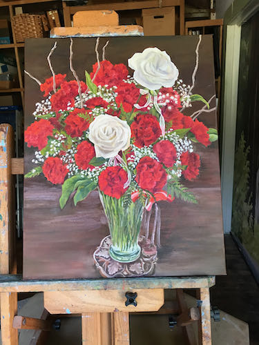
Then I incorporated the very apt suggestion from reader (and friend and former drawing student) Nikki to make the edges of the carnations more fringed. Here is better fringiness on the left side: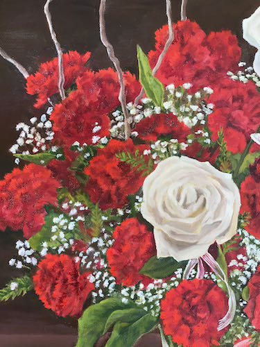
And the not yet fringed right side for your comparison: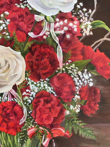
Then I fixed the hanging ribbon, the patchy-looking background, the repaired coaster, a dab here and a touch there, and finally added in a little something on the bottom left quarter.
Now it will dry, I will continue to mull it over, study it, and eventually, I hope to find the courage to sign it and call it FINISHED. (Mr. and Mrs. Customer are no help in this finalizing and nitpicking because they have been thrilled with the painting at every stage!)
P.S. It looks better in person; there are weird shiny spots because so many parts are wet.
2 Comments
Ah, so much nicer! They REALLY look like carnations now. Thanks for the note about my comment. The painting is really pretty.
It looks stunning! They will be even more thrilled than they have been, I’m sure.
Nice added touch “on the bottom left quarter.”
Happy 50th, Mr. and Mrs. Customer!
Comments are closed for this article!