And I Thought I Knew These Mountains

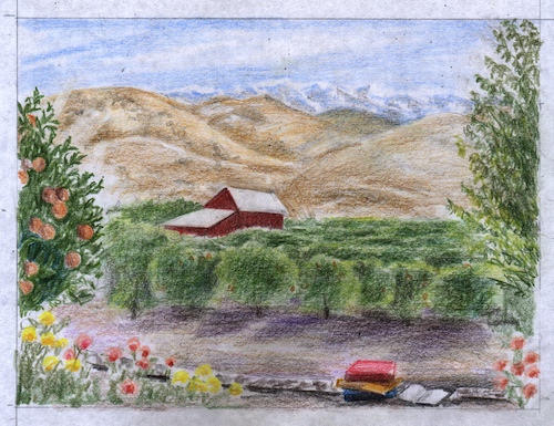
For awhile I had a link in these emails of my daily blog post to take you to the site on the internet so you could see the photos. Now there is some tomfoolery happening with my blog, so I am not putting the link in until it gets sorted out. If you would like to see the pictures, go to jana botkin dot net (written this way to confound the evil robots who are messing things up.)

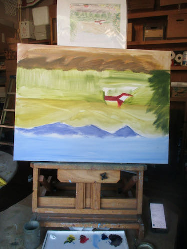
After figuring out how to get the right third of the mountains correct, I worked my way back across the canvas, using a darkish blue to delineate the parts I could see. I marked the center of the picture be able to gauge my progress.

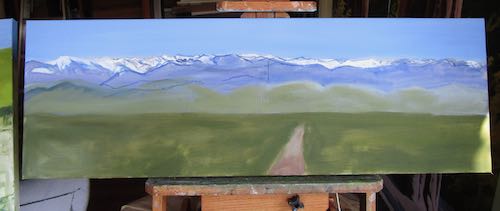
Wait! Where is Moro Rock?? It didn’t show up well from the top of Rocky Hill, and I forgot to be sure that it appears in the painting. I thought I knew these mountains. Recalibrating. . .

Why didn’t I know that the other 2/3 would be just as confusing?

Just my usual approach—the triumph of hope over experience.

Time to study all the photographs again and make some new sketches. I needed to see the section from Sawtooth north to Castle Rocks, and then the farthest north section from Castle Rocks to Moro Rock. Each photo had different information, and some were just useless. This made it easier, because there were fewer solutions to choose from.

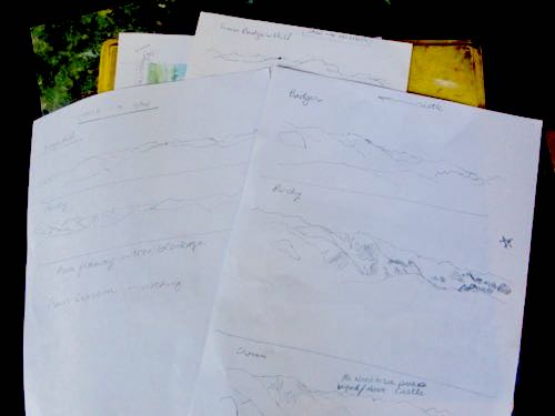
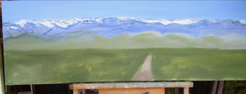
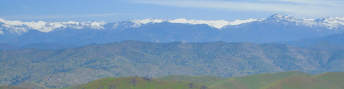
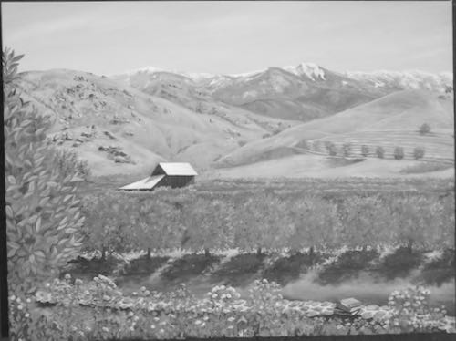
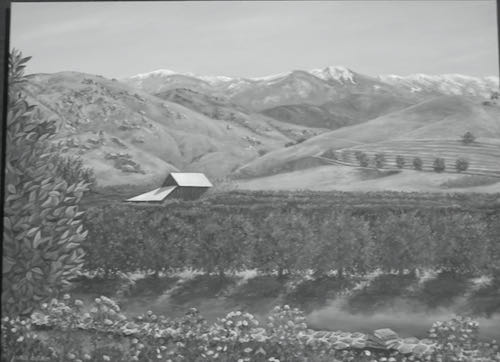
I made the contrast weirdly strong in order to see details, and also put a few lines on some of the photos. Here are just two samples of what I was working from:


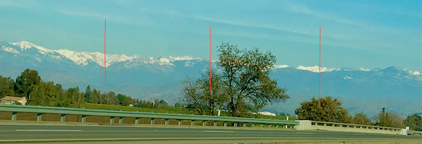
Sometimes there is a longer distance between Sawtooth and Homer’s Nose, sometimes Sawtooth barely shows, sometimes trees block peaks, and the light is always different, causing changing shadows that make it hard to recognize peaks.

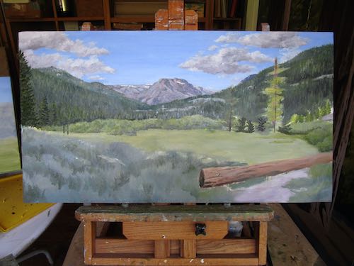
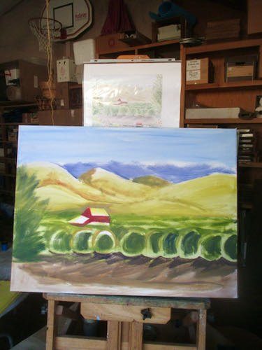
There comes a point when decisions have to be made and paint must be applied. So, suck it up, buttercup, and make some progress here.

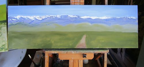
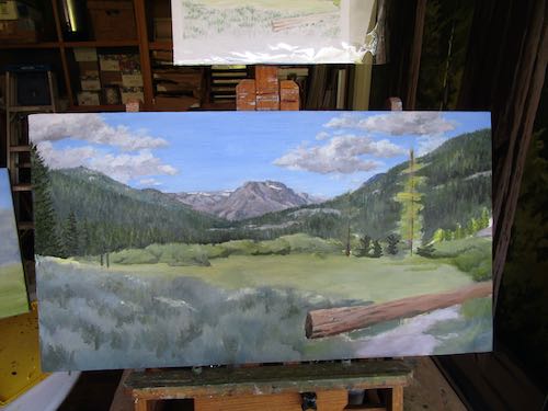
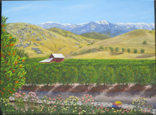
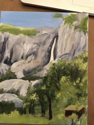
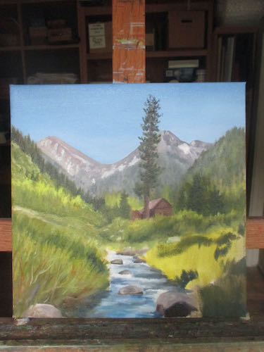
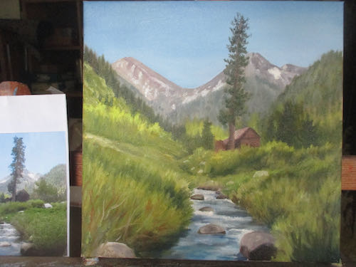
I believe these mountains are correctly placed, correctly sized, and accurately shaped. 

The next step could be either to detail the distant mountains or to get all the foothills accurately placed.

Accurately placed from which viewpoint?

I thought I knew these mountains.


Seven More Photos of Progression

If you receive these posts in email and the pictures in the post don’t show for you, tap here janabotkin.net. It will take you to the blog on the internet.

The session began with the commissioned oil painting in an odd size on Masonite board looking like this. 

I planted a tree on the left and indicated where 2 small trees would go next to the larger one.

The distant shrubs got a bit more details. Maybe. Maybe I was just licking the painting with the brush at this point.

The pair of smaller trees has some form now. Trees are growing in the distance on the right side.

Now there are definitely trees with definition on the right side, definitively.

Now I have started cleaning the various greens from my paintbrush by spreading them on the lower shrubs, which I am sure are sagebrush. This place might be similar to Mineral King in elevation, because it shares many characteristics.

Now the meadow has more paint, and the log has more details.

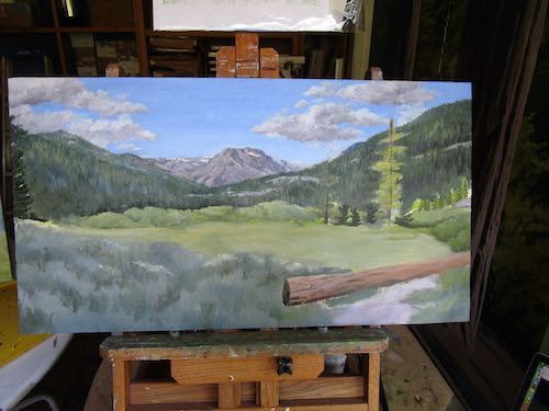
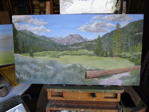
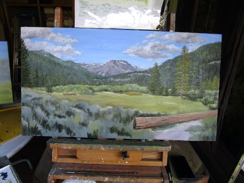
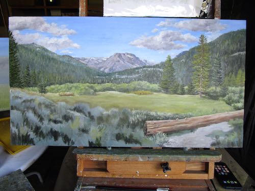
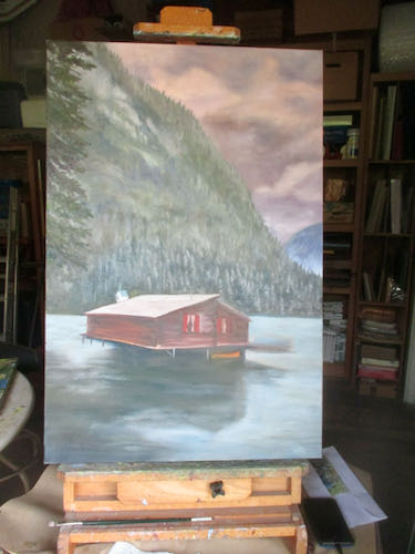
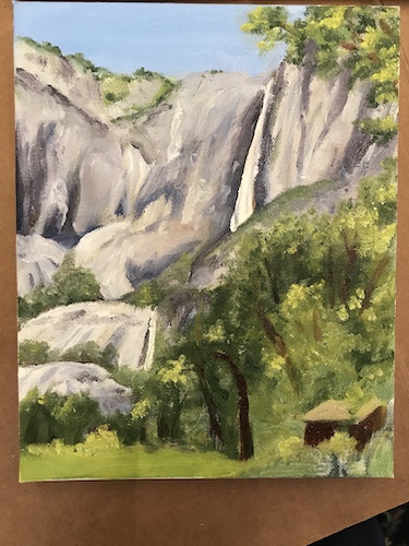
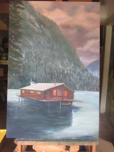
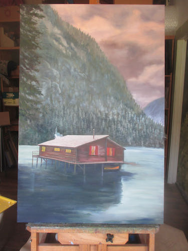
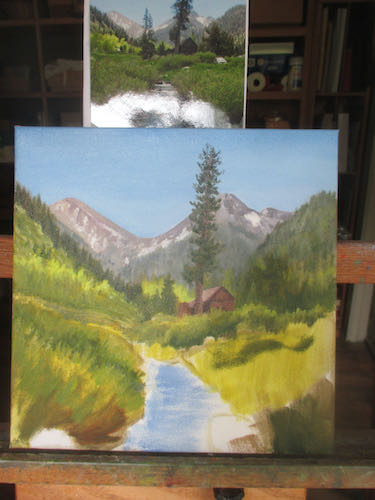
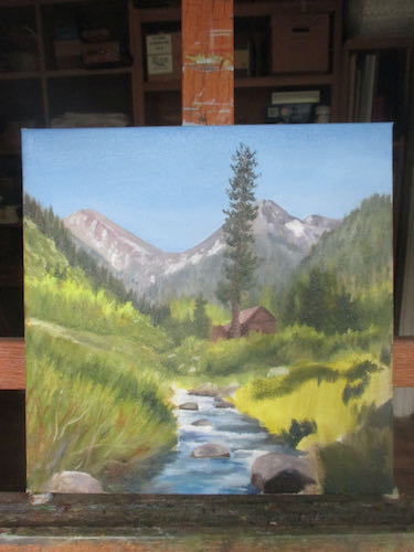
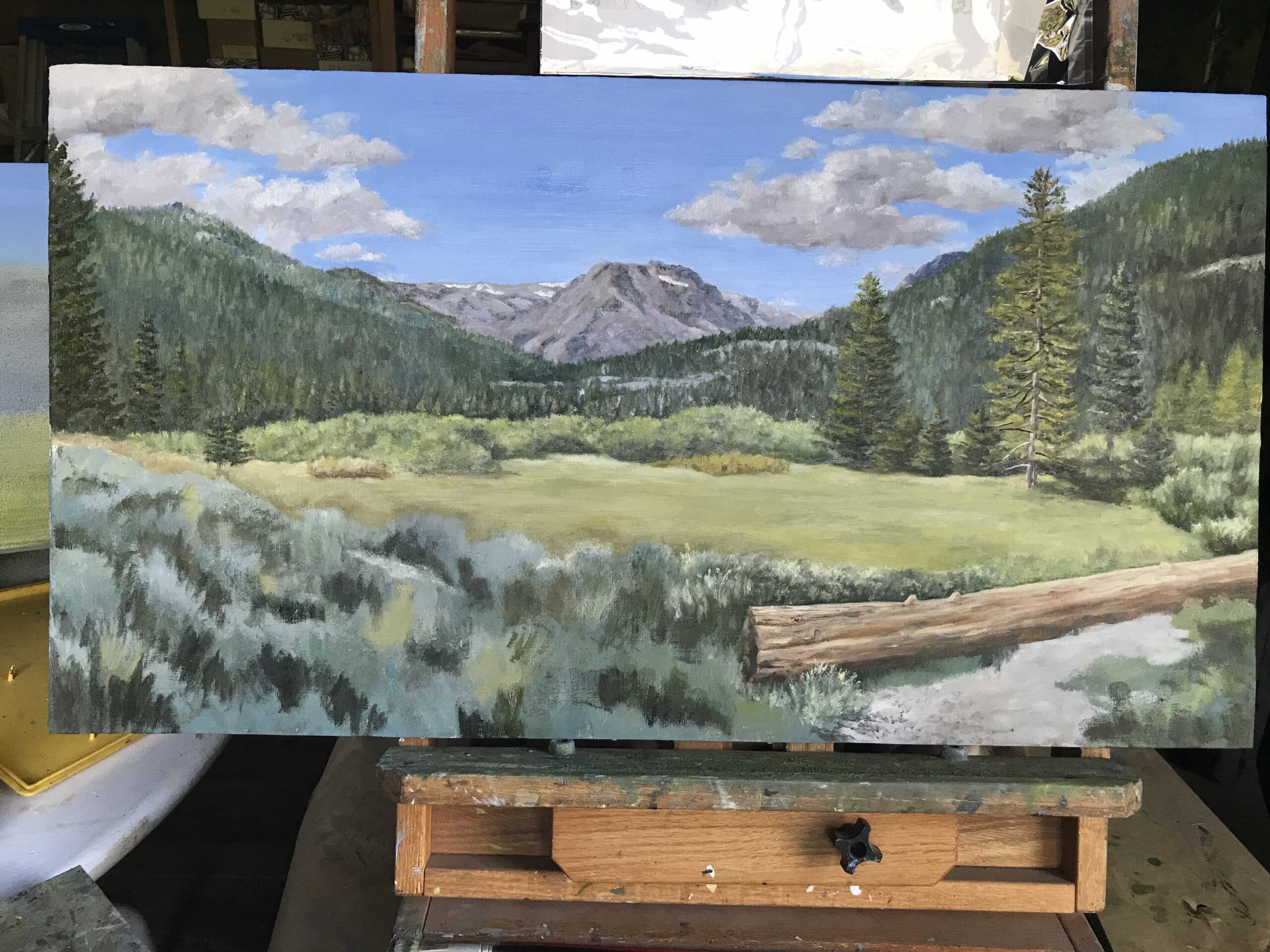
I am starting to really like this painting, which I have decided to call “Somewhere North of Tahoe”. Too bad I didn’t get my donkey in gear earlier this morning or I could have this painting finished now.
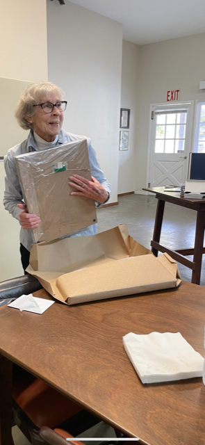
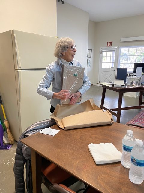
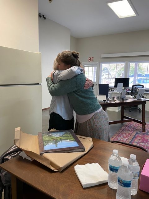
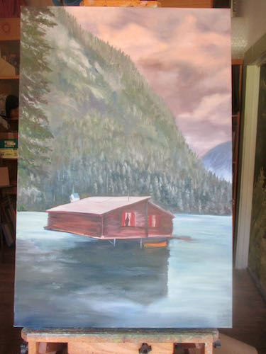
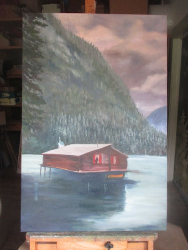
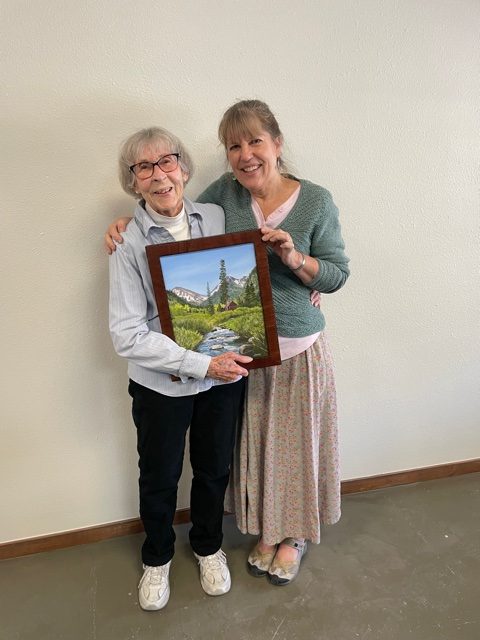


Special Painting for a Special Person

Remember when I painted a Farewell Gap oil painting and wouldn’t tell you why? I said it had to be the very best painting I had ever done. The Best Version of the Classic Mineral King Scene

The painting was commissioned by the Mineral King Preservation Society and the Mineral King District Association to be a gift for Louise, someone who has been very instrumental in both preserving the history of Mineral King and developing a good relationship between the cabin owners and Sequoia National Park. 

She also happens to be one of my dearest friends, someone who coached me through my first murals, got me my first paid public mural, and has been more encouraging than anyone I have ever known. She is also an author, and I had the privilege of editing and publishing two books for her: Trail of Promises and The Visalia Electric Railroad. We work together like a well-oiled machine, one that laughs a lot while producing good results.

Here are some photos of the presentation of the painting.

I love this lady.

P.S. These came via email:

1. What a beautiful post, beautiful painting, and beautiful lady.  How is Louise doing?  She looks well. – Jon S.

2. Your “Louise gift” in this morning’s post brought tears. what a touching tribute to my very special cousin.
three cheers for a beautiful exhibit! – Bev

Large Important Commission, Chapter 9

I left the oil painting alone for a week or so, in order to gain distance and objectivity. (Yes, wonky photo, because in spite of this camera’s superiority to its predecessor, the screen is still invisible in the bright sunshine).

Then I switched the photo to black and white, in order to study the contrasts.

This session of study resulted in a list.

  1. Make the snow brighter against sky
  2. The rock shadows on hillside are too dark
  3. Close leaves next to orchards need to be lighter
  4. Tree trunks look too uniform
  5. Too much contrast on wall rocks near books
  6. Need more roses below the wall
  7. Make shadows darker on front row of orchard
  8. Make oranges on the close branches brighter and more yellow
  9. The elephant on Alta Peak and the slope to the left of the elephant need to be fuzzier

All nine items have been addressed. Can we see the difference in this black and white version?

Maybe.

Here is the new color version (also taken in such bright sun, although filtered through a layer of smoke from the fire at Lake Isabella).

Obviously, this painting is going to be a challenge to photograph well.

Just for interest’s sake, here is the sketch (the post about it is here):

It has come a long ways since the beginning, first shown in this post.

And thus we conclude the ongoing saga of The Large Important Commission Oil Painting.

Maybe, maybe not. Maybe the books need to be less jarring. On the other hand, maybe they are supposed to pop out of the painting because it is for the Tulare County Library (Woodlake branch).

Large Important Oil Painting, Chapter 4

Are you wondering why I asked the library to pay a 1/2 deposit on the commissioned oil painting? I have learned that if a place or person doesn’t pay a deposit, sometimes they disappear. Not often, but it has happened enough that I believe in the importance of a financial commitment on the part of the customer. With a place like the library, someone could change jobs and then the newcomers have no idea what took place. (I didn’t get to year #27 as your Central California artist by making the same mistakes more than once, no twice, wait, . . . never mind.)

I asked the librarian if she wanted to see photos of the painting in progress; she politely declined. I asked if I could show them on my blog; permission was granted.

Upside down forces me to see the proportions and shapes. The first layer is very thin, loose, nay, downright sloppy.

It’s okay. I know what I am doing. (It’s about time, eh?) It has been awhile since I reminded you that:

I use pencils, oil paint, and murals to make art people can understand of places and things they love for prices that won’t scare them.

Large Important Oil Painting, Chpt. 3

This commissioned oil painting is important, because it is for the library, because it is dedicated to the memory of someone loved by her family, and because all my custom art is important.

It will be 18×24″, which is large for me. Not the largest oil I’ve painted, but certainly larger than my usual small works that sell steadily to visitors passing through, larger than most of my commissions (remember, we are poor in Tulare County), and large enough to put in the many details that the customers are requesting.

In order to be sure that I understood what the librarians wanted (and I am guessing they showed the family who donated the money for the painting), I had to do a sketch. I also had to do the sketch in order to see if I could fake all these details into something believable. Believability is what I aim for, because real life is messy and there are rarely photos that tell what we remember, or what we wish was there.

THEY LIKED IT!

I had quoted them prices for their requested 24×36″, but they chose 18×24″. I told them the price for this size, they requested an invoice so they could send me a check for half, and instead of waiting for the check, I ordered the canvas and started painting.

Next week Chapter 4: the beginnings on the canvas.

New Oil Commission

“Commission” is fancy talk for custom art.

A friend requested an 8×10″ oil painting from a photo she took in Yosemite.

I haven’t been to Yosemite very often and don’t really know it but somehow I knew to ask if this was Yosemite Falls, and doesn’t it have 2 parts? The oak tree in the foreground was obstructing the shapes of the cliffs, and I also needed to know if the barely visible cabin in the lower right mattered.

After a bit of back-and-forth, I went to the World Wide Web, found many photos that showed the dual nature of these famous falls, and proceeded to make up my own version. 

Since when have I become such a rogue painter??

Here are the steps (without showing you the photo from the WWW because I do not have permission.) I began the painting in the studio (the reasons are boring), where oil painting does not belong, but I was very very careful.  I worked from my friend’s photo on the laptop. You can see that I chose to keep and enhance the little structure, because I am into cabins (hence “Cabin Art”).

The next painting session was in the painting workshop, where it is not a tragedy to drop and spill things. The natural light is better there than in the artificial light of the studio, so it was a much better place to finish the painting.

The last photo was taken with the phone instead of the camera. Neither one is adequate, but will have to suffice until the painting is dry and can be scanned.


I Can Do Better

I thought the commissioned oil painting of a Giant Sequoia was finished. I photographed it, fixed the photo on Photoshop Junior (because there is no way to hold the camera perfectly aligned with the painting), and even varnished it.

Then I decided to compare it to the one that my customer saw and liked, painted back in 2012.

2012

The darks are darker in this one, and it just looks better. 

Back to the easel with my newest Big Tree oil painting, since I can do better, because. . .

. . .I make art that people can understand, of places and things they love, for prices that won’t scare them.

A Day at the Easels

Forrest’s Dream Cabin was ready for more work, so I flipped it over in order to reach the mountainside at the top of the 30″ canvas.

After finishing the mountainside, adding more detail to the distant chapel, straightening out the roof, adding more stilts and a railing, I put in a few windows and turned the lights on inside. Suddenly, I froze and was assaulted with “Yikes, this is too hard”, and “What do I think I am doing here??”

The cure for that is to go pull weeds.

Then I moved on to an oil painting where I KNOW the subject matter*.

That’s more like it. I know what I am painting and can just start at the beginning and finish at the end. With Forrest’s Dream Cabin, I am just fumbling along, so it is slow, requiring much thought and time. Forrest is not in a hurry, is appreciative and easy to work for.

Here are two last thoughts (visual thoughts): *
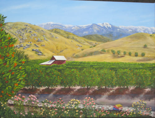
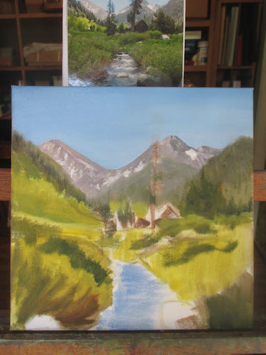
Mineral King, of course

Forrest’s Dream Cabin Flipped

Last time I showed you this oil painting commission it looked like this:

In this session, I began working on the water, first measuring to be sure the horizon line is horizontal. Then I repainted the water. This erased the hint of stilts that the cabin was resting on; now it is floating. 

I kept studying the photo until I discerned a hint of shadows and reflections from the cabin.

Then I started adding more detail to the snow covered trees. 

This is how it looked at the end of the painting session. As I add the detail, I realize that much is hidden in shadow or behind undefined blobs on the photo.

So I turned to the Duck! looked up the name of the lake on DuckDuckGo and found many photos to study for better detail. Turns out that this version has been flipped horizontally. Forrest doesn’t need me to copy the photo exactly because he is looking for a particular feeling that the scene evokes. However, I do need help to put something in place of vague black blobs, so I will just inch along, making decisions with each indistinct item and area.

Pippin is also flipped.