And the summer begins …
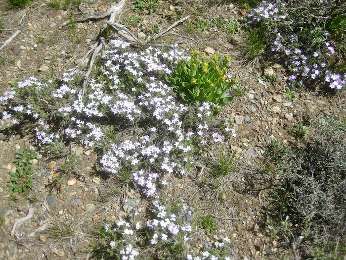
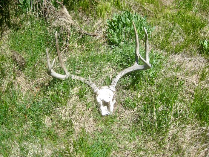
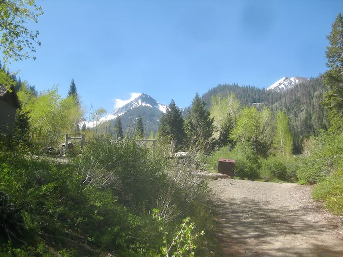
I didn’t take any of these pictures, which were all taken before I went up the hill, because living in two places comes soon enough without pushing it. Our cabin is a summer dwelling, for good reasons.
Hence, the Early Bird, AKA Trail Guy, took these photos. (You can tell because his camera makes sky spots).


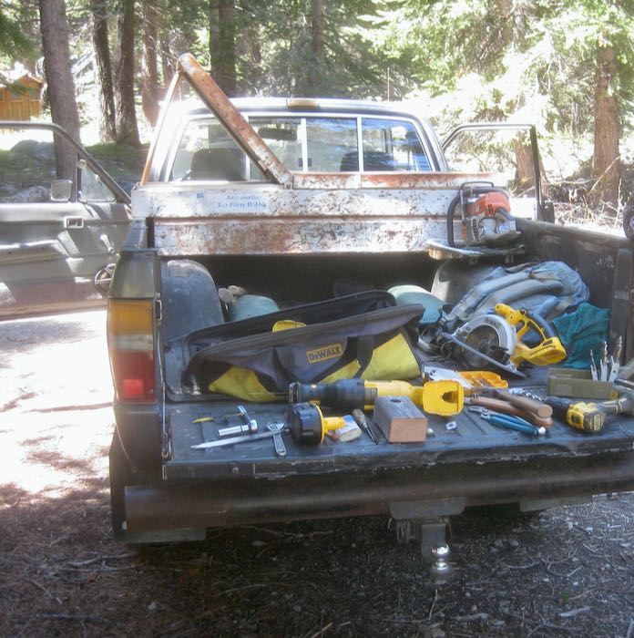
Opening the cabin is a big project, because Trail Guy and the Farmer open several people’s cabins, which requires many tools. The projects abound, the work never ceases, and yet wild horses cannot restrain these two good-hearted, hard-working gentlemen from serving the neighborhood.
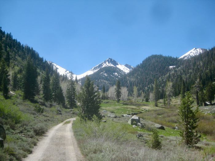
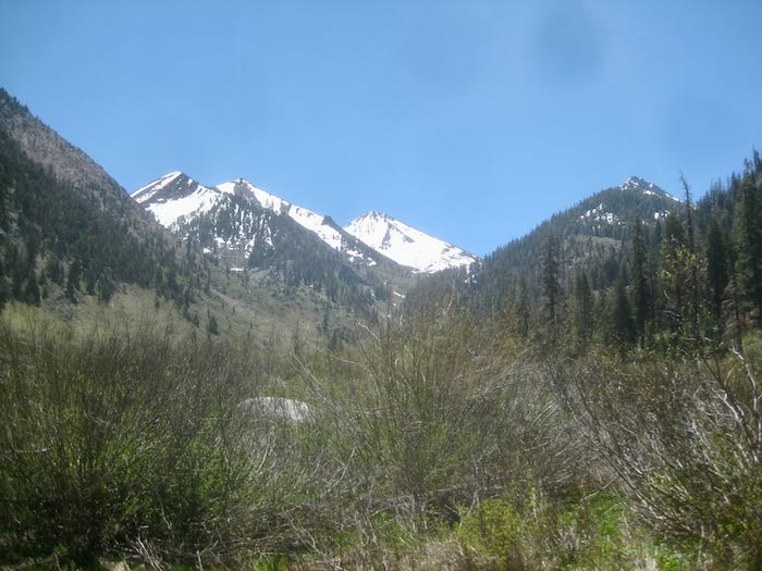
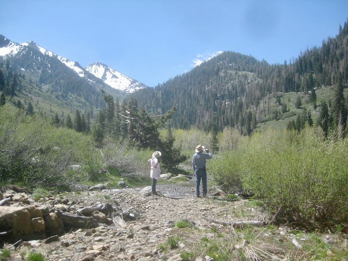
Two hardy souls marched (or perhaps simply staggered) up to Eagle Lake, BEFORE the Spring Creek Bridge was installed. One of the two generously shared her photos (and reported back that it was COLD.)


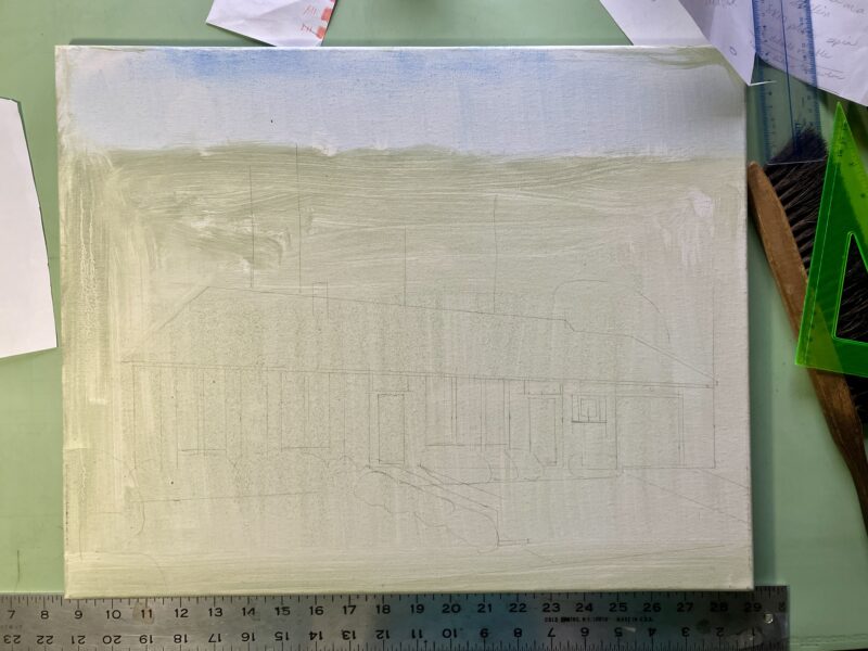
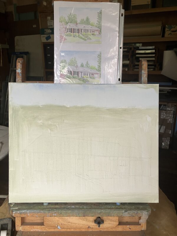
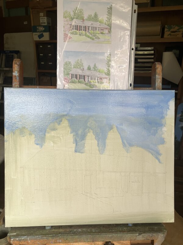
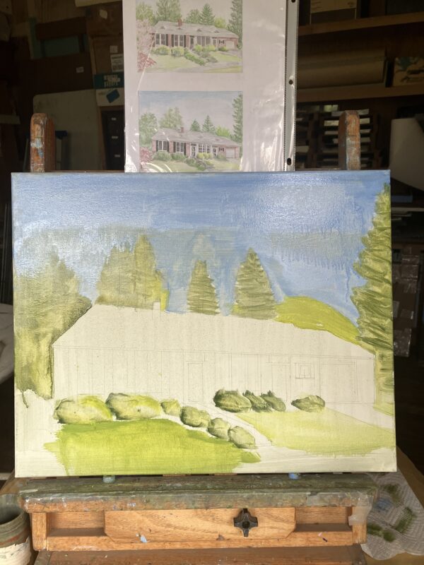
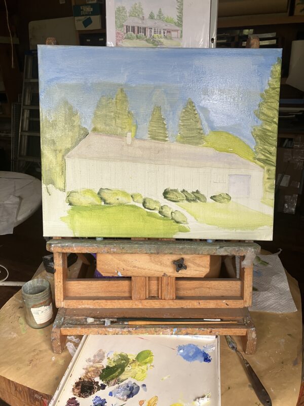
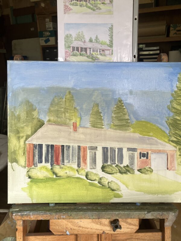
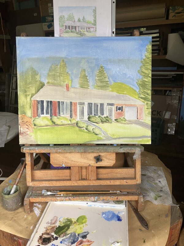
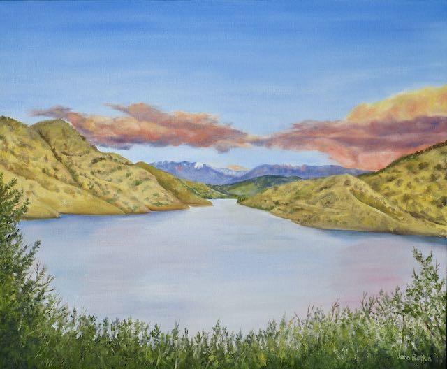
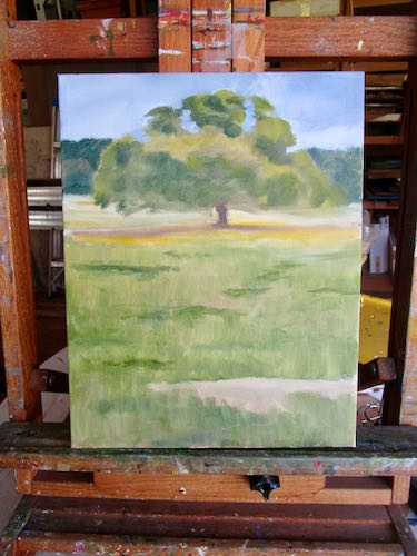
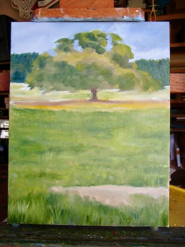
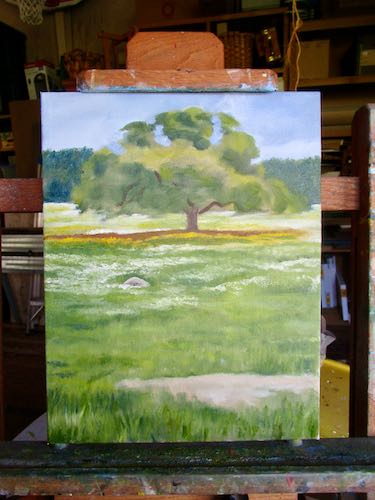
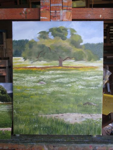
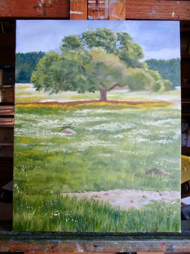
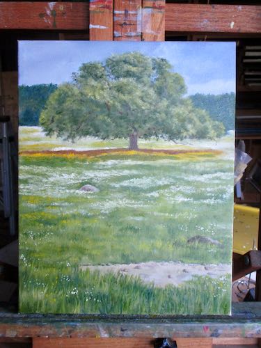
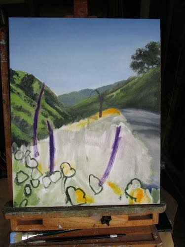
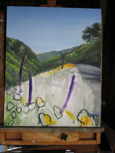
Since this is supposed to be a marketing and advertising “platform” (these words… sigh … what am I supposed to call this? A venue? An avenue? Media?), have another look at my painting of Eagle Lake from a similar viewpoint (I think I was on the dam itself.)

Ad over. Remember the fallen on this weekend because it isn’t supposed to be about getting away and fishing and hiking and boating and BBQing. However, because of the brave, we are free to do these things.
Admonition over.
Endeavor to persevere.
And remember, if you comment and it doesn’t appear, your comment will appear after I have returned from the Land of No Electricity or Internet or Phones to release it.