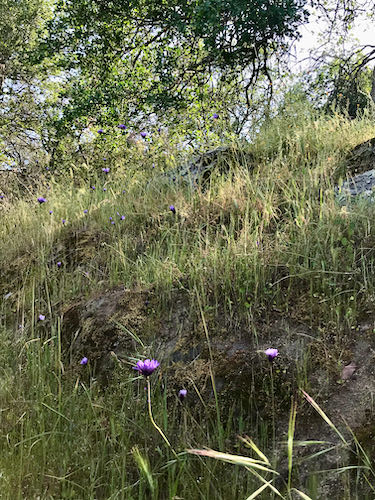
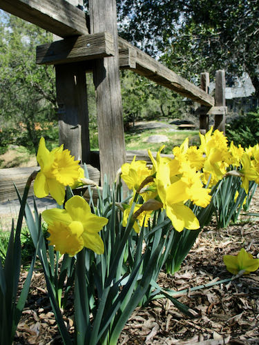
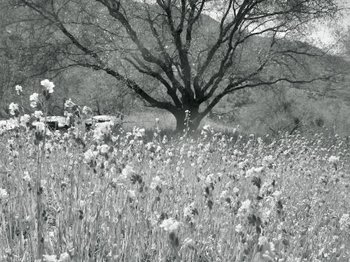
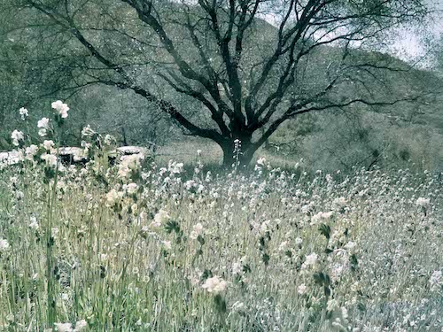
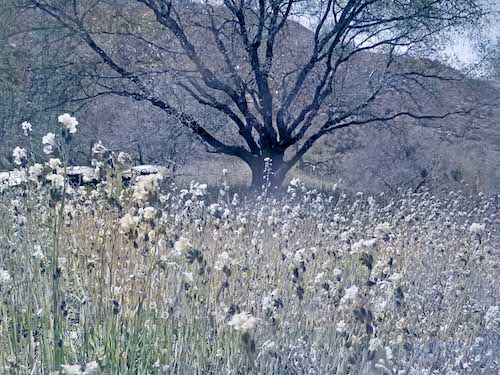
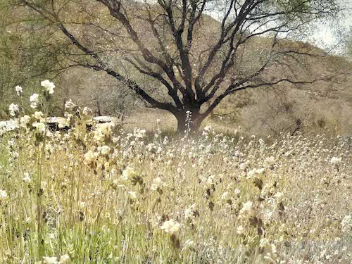
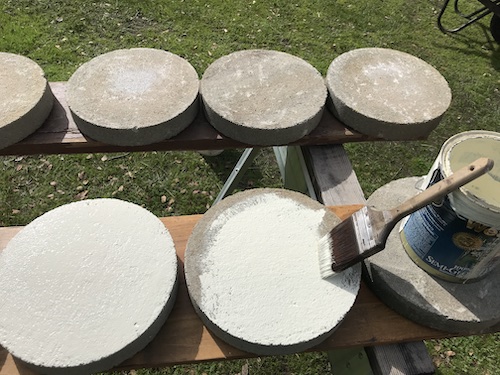
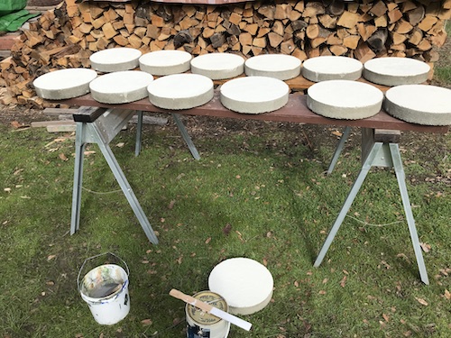
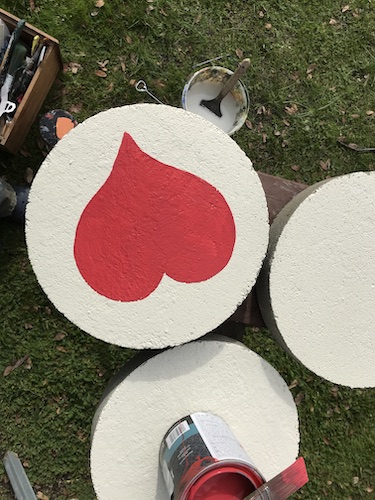
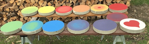
If you can’t see the photos, go here: cabinart.net/blog.
I have an artist friend in Kansas named Carrie Lewis. I found her on the internet some years ago while looking to see what other artists were blogging about, and how their blogs were working. Carrie works in colored pencil, and because I love to draw, used to use colored pencils, and still help some of my drawing students with colored pencils,I thought I could learn from her.
A few weeks ago she asked me to write a guest post for her. This is the link: Carpal Tunnel Syndrome and Colored Pencils.
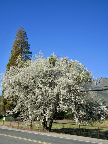
After she posted it, the ideas started coming for more posts. Along with those ideas came intense summer heat and a desire to cower in my air conditioned studio instead of painting in the swamp-(barely)-cooled workshop.
I own a tremendous number of colored pencils, and I seldom use them for anything except putting color on American flags in pencil drawings and lending them to my drawing students. (I have way way more than these, and this is after thinning them out a few years ago!)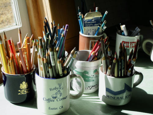
Because I paint using the primary colors, I’ve wondered why I think I need so many colors of pencils. I don’t. I really don’t need them all. Colored pencil manufacturers sell starter sets of 12 colors, and it is a great challenge to see if I can produce pieces using only those 12 colors.
My first set of 12 came from Aunt Shirley for my birthday in 5th grade (age 10, I think). I still have 2 pencils from that set. (I can tell by the typestyle.)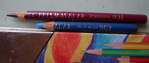
By looking on the internet, I learned the 12 colors that were originally in the Prismacolor starter box. (It was clear plastic and it finally cracked. . . wahhh. It was so cool.) I also learned which 12 colors are in the Polychromos starter set. Then I went through my pencils and filled a box with those 24 pencils, along with back-ups and pencil extenders (circled in photo). The back-up pencils are for Prismacolors, because they break and break and break and. . .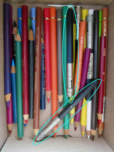
I started a colored pencil drawing using just the 12 Prismacolor pencils.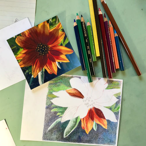
Colored pencils are difficult for me to get an exact match, but that doesn’t really matter. What matters is making beautiful, plausible, believable, realistic art. Because. . .


 I am proud of one of my drawing students!! (I don’t think this is a sin.)
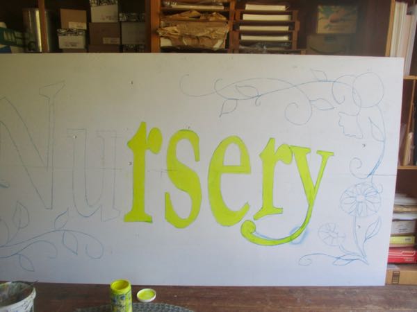
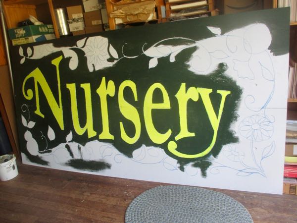
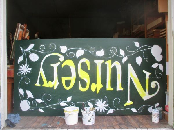
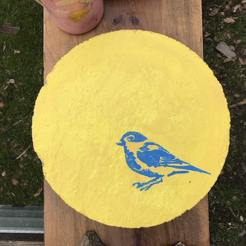
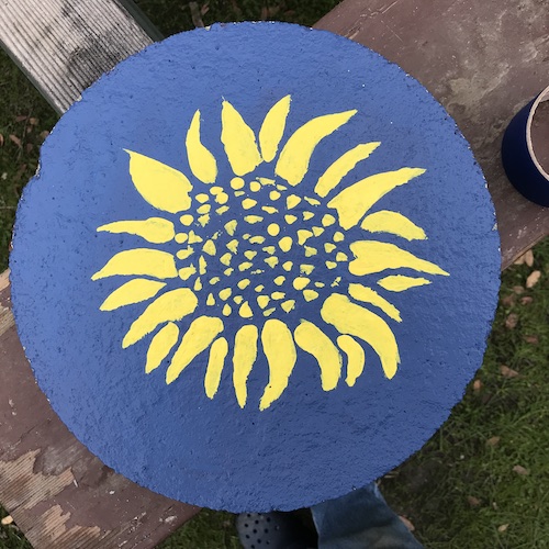
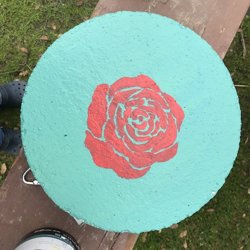
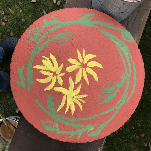
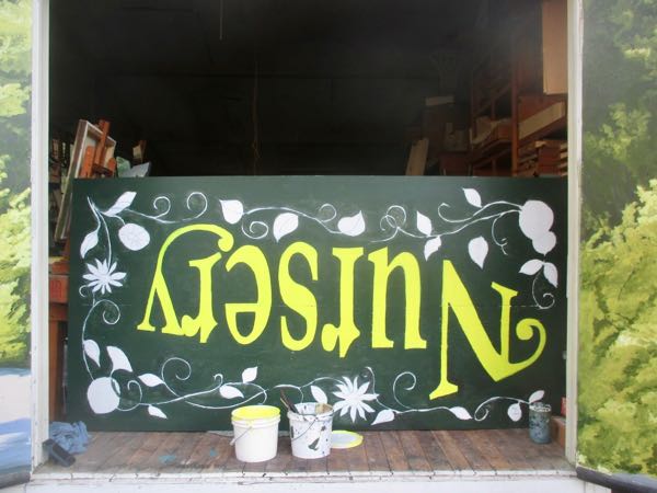 I finished the first coat of green on the bottom, leaving the “growies” for later, because I don’t know what colors I’ll use there. And I am still picking up blue chalk with the yellow paint.