Week of Wildflowers – Red

Reddish is a more accurate term for today’s Mineral King wildflowers. I am including orange and pinkish flowers too. Someone pointed out to me once that red is very uncommon in nature. It is used for accents rather than in large amounts.

Here are some oranges:

Much brighter orange in person than this anemic photo – I never noticed it before this year and have no idea what its name is.
Western Wallflower is a tricky one – sometimes it is orange, sometimes it is yellow.
This is a lichen, not a flower. The color was irresistible! (It might be a little smaller than a quarter, in case you were thinking of pouring some Cap’n Crunch into it.)

Now, reds.

Indian Paintbrush
Indian Paintbrush again
Penstemon, Goldenbeard penstemon, or California fuchsia? Beats me, it is striking. (You know you want to laugh at that. . .)
Crimson Columbine
More of the striking penstemon.

Pinks are sort of red, red plus white. They certainly don’t belong with white, blue, or yellow.

Elephant Head
Another penstemon, called “Pride of the Mountains”
Heather or Laurel? I’m going with Red Heather (ignore the phlox in the background – they already had their turn.)
I don’t know this delicate little pinkish thing that resembles manzanita but is very low to the ground.
Have I ever seen this before? It seems to be everywhere this year. I think it will turn into a berry.
Thistle
Shooting Star – often more purplish than pinkish, sometimes named “Jeffrey”
Pussy-paws. They have never been so tall!


Week of Wildflowers – Yellow

As I was thinking about a week of wildflowers (Mineral King wildflowers, specifically), it occurred to me that all the flowers can be categorized with the same colors I use for painting – white, yellow, blues and reds. (orange, pink, and purple pose a bit of a challenge – just work with me here. . .)

Here are eight yellow wildflowers I found recently in Mineral King:

Groundsel
Cinquefoil? Not shiny, so I don’t think it is cinquefoil. Yellow flowers and I don’t really understand one another very well.
Sulphur flower – this is new to me this year. Probably just blew past it in all the previous years.
Meadow Hosakia is also new to me this year. It’s been right there in my favorite book all along, but I disregarded it.
Monkey flower, actually “seepspring monkey flower”.
Western Wallflower (who comes up with these names??)
Dandelions qualify as wildflowers in Mineral King; what you do with them in your own yard is your own business.
I don’t know – another ubiquitous tiny yellow flower
Why is a yellow flower named “Violet”? (I just work here, but inquiring minds need to know.)

Week of Wildflowers – White

I’m able to spend lots of time in Mineral King this month. While hiking, I think. Sometimes I think about the blog, and the idea of a week of wildflowers came to me. Today, white! I’m doing my best to look at white flowers and learn some new names. Several blog readers have told me that they love white flowers, so out of respect for you, I will try to stop ignoring them. Here are 17 for you to enjoy: (there are more than 17 out there along the trails but I probably ignored them.)

Dandelion puff
Elderberry
Not sure – sort of looks like Pennyroyal, but I forgot to scratch and sniff
Cow parsnip
Wild Geranium
I don’t know and can’t find in any of my 4 books!
Morning glory (not the kind that plagues the farmers down the hill)
Rein Orchis (weird, I know)
Pennyroyal, for sure
Knotweed? Sort of looks like it, but not exactly and wasn’t growing in a wet area.
Phlox – sometimes these are lavender.
Mariposa Lily (pay no attention to the tiny yellows here)
Thimbleberry
Yarrow

Naked Buckwheat
Don’t know and can’t find – it is exactly the sort of white flower that I usually just pass by as if it is just another grass or leaf.

These might be Baby’s Breath. Who knew they existed outside of florists’ shops?

I Draw Better Now

Over a year ago, I was at a dinner and ran into someone who had bought a colored pencil drawing of oranges from me in the early 2000s. He mentioned that it was still hanging in his office.

I said, “I draw better now; can I have it back to fix it?”

Yes, I actually said that to a satisfied customer. He was sort of shocked, but he agreed; then, a year passed and I heard nothing.

Last week, one of my drawing students came to class with the original colored pencil drawing. She exercises with the customer’s wife, and I guess the man decided to take me up on my offer.

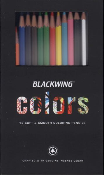
I’ve learned more about color than I knew back in my days of colored pencil. This is probably a result of learning to oil paint. (Last week I said that growth is good unless one is a cancer cell. . .)

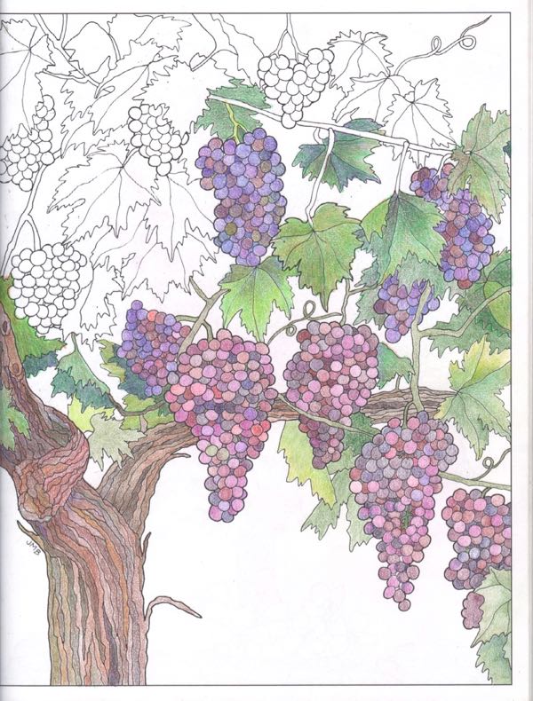
BEFORE: Central California Sunshine, a colored pencil drawing from 2001

AFTER: Central California Sunshine, revised in 2017

Here, let’s look at them small, so they show up on the screen at the same time (depending on your device):

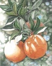
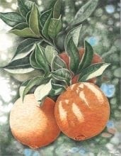
The upper one looks almost finished, the lower one looks finished. The difference is probably too subtle for normal people to notice, but it matters to me.

This drawing is available as a reproduction print, 11×14, $40. One time a potential customer told me she didn’t like it because the light on the orange on the left looked like frost to her. Ever since that time, whenever someone buys a print, I add color to it. It is time consuming, and it has made me wish to get the original back so I could fix it.

THANK YOU, DENNIS AND PATTY, for a chance to redeem my reputation!
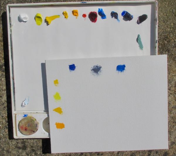
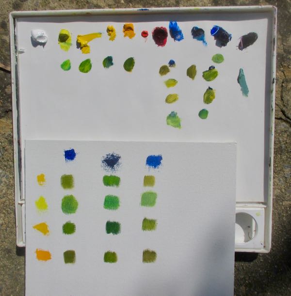
The Rain Stopped and The Sun Came Out

The rain stopped briefly and the sun came out, so I went for a walk here in Three Rivers. This was on February 12, but there were other things to blog about last week.

Look! The buckeye trees, always precocious, are leafing out already. 

Here is an unobstructed view of Alta Peak and Moro Rock.

The Red Maids are in bloom!

This ant hill is definitely a peculiar sight.

The narcissus are in bloom in my yard.

 And what does a Central California artist do for fun when the sun is out?

She mixes a paint color for her neighbor’s kitchen, of course.

Neighbor recently was in Italy and fell in love with a particular color. (Could there possibly be 2 color junkies in the same neighborhood??) The hardware store mixed a too-bright red, so together we figured out the color she wanted. This required adding tan from the gallon container, lightening it with white, and correcting the resulting pinkishness with yellow ochre. Then, we tried it on a kitchen cupboard door and declared it a winner. (It took 3 attempts with minor corrections each time.) Next, I had to match that exact color to convert the rest of the too-bright-red to our newly named “Red Pepper Cream Sauce”. (Last time we invented the color of “Orange Blossom Special” for her kitchen, which looks spectacular with the Red Pepper Cream Sauce.)*

*My own kitchen is blue and white, has been blue and white for 18 years, and probably will probably be blue and white for as long as I live here. Thanks for asking.

More From My Pencils

When deciding what to draw next, this particular subject seemed like a good compromise of my theme of Tulare County and what I want to draw because I want to draw it.

Strawberry fields have become a common sight in our area over the past 10 years or so in the springtime. That makes this drawing qualify as Tulare County art, yes?

strawberry

Using colored pencil for extended time periods hurts my wrist. This little bit of color is possible without injury, and it is very pleasing to see one item in color. Not every picture has a place for color, but this was an easy decision.

Orange is the Color of Tulare County

One might think that this Central California artist’s favorite color is orange. One would be wrong, but one would be forgiven for making that assumption.

Due to her continual paintings of oranges and poppies, this would be a logical guess. But, if one thinks about Central California and what we are known for here in Tulare County, then one would come to an understanding of the apparent excessive use of the color orange.

Here are the latest oil paintings in the continuing saga of this Central California artist’s representation of the best of Tulare County.

1611 poppy 46
Poppy #46, 6×6″, oil on wrapped canvas, $60


1610 Poppy 45
Poppy #45, 6×6″, oil on wrapped canvas, $60


1609 Poppy 44
Poppy #44, 6×6″, oil on wrapped canvas, $60


1608 Oranges 126
Orange #126, 10×10″, oil on wrapped canvas, $175

These paintings are all available through this link: oils

One More Look at Adding Blue

To continue yesterday’s dissatisfying post about color, here is an aspen painting before I added blue: 1530 Aspens n:c

Here it is afterward:

1530 Aspens
Aspens, oil on wrapped canvas, 6×6″, sold

Ahem. Why is it that I can repair photos quite well using Photoshop Elements but cannot get the same painting to scan the same way 2 times in a row?

Who cares? I have real work to do!

A Conversation About Color

A friend is learning about art, practicing diligently at watercolor, taking workshops and painting with a group in her town. She also reads about art, and has been kind enough to spend time with me, discussing various art related topics.

She told me about a book called “Breakfast at Sotheby’s: An A-Z of the Art World” by Philip Hook. Not only did she read it, she took notes. AND, she shared them with me!

Two main points interested me in our conversation about color.

1. In Breakfast at Sotheby’s, her notes say this: “Red and blue are the most important colors in modernist art.” (I’ll have to look up the definition of “modernist”. . . always something to be learned around here. . .)

2. One of her instructors believes that all paintings should have some cerulean blue. This is a lighter blue, leaning toward turquoise that I use when I mix colors. (I only use the primaries plus white to make all my colors with a few exceptions.)

While my friend and I sat together in my studio discussing color, we looked around together at the paintings hanging on my walls. We discovered 2 that had neither blue nor red. So, in a spirit of experimentation and adventure, I added some.

Artichoke before: arti 1309

Artichoke after: 1309 Artichoke

Now that is an unfair comparison. The scans turned out differently, although the size is supposed to be the same it is not, and I guess you’ll just have to see the painting in person. I promise that I didn’t mess with the greens. I did mess with the color and exposure on the computer, trying to get the 2 to match, but something just isn’t working.

Never mind. Have a nice day. Thanks for stopping by and making it to the end of this post. Perhaps I should just get to the easels and finish the Kaweah Post Office.


Long Way There

(Happy Birthday, Melissa!)

Anyone remember the Little River Band? Does the song “Long Way There” do anything for you? I loved it in 1978, and I still do.

Many people think of “Long and Winding Road” when it comes to driving to Mineral King. That is probably a more accurate theme song, but I used up that title on a pencil drawing many years ago.

So “Long Way There” is the title of this series of paintings. The first time I painted the Mineral King Road, it looked like this:

1317mkrd

I liked it a lot. A friend liked it too and commissioned me to repaint it in a much larger size than I was used to. It just flew out of my paintbrushes, and it may have been the first time I really felt as if I was painting, instead of struggling with paint.

MINOLTA DIGITAL CAMERA

When helping her move a few weeks ago, it surprised me to see that I still like the painting. That doesn’t always happen.

Because I was feeling so confident about this scene, I painted it again, just to have in inventory.

LWT #3

It didn’t sell. It didn’t sell. It didn’t sell.

So, I studied it carefully to see if I could figure out how to make it better. The usual things – brighter colors, more detail, higher contrast, cleaner edges – all seemed necessary.

IMG_1414

Long Way There, 12×16″, oil on wrapped canvas, $250

I love the blue with the orange. (Yeppers, I’m a color junkie.)