Looking For Color While Two Shades Under

A friend’s dad once described himself as being “two shades under” when he wasn’t fully recovered from some bug. 

While I wasn’t fully recovered from my bug, I felt good enough to briefly toodle around the yard, enjoying some color, some sunshine, some outdoors with tiny hints of green popping forth. Although it was mostly red that I was seeking, it was the green that I found the most life-giving. 

That sounds all woowoo. What I mean is that I love seeing Three Rivers green instead of crunchy brown and dusty.


Then I went back inside and created my own bright spots of color. These were 2 small paintings begun last year, set aside, and forgotten. Worked just fine to set up in the dining area of the house and put in a few hours of productive labor.

Of course it must be said that these will look better when dry and scanned, and even better in person. They are each a 5×7″ panel that will be sold with a mini wooden easel for $60 (yeah, yeah, plus tax, sorry, take it up with Sacramento).

Testing my Skills with a Sunflower

While you were reading about Mineral King, I may have been cowering in the air conditioned studio, testing my drawing skills with a sunflower. 

Does that make you curious?
My Kansas artist friend Carrie Lewis gives a colored pencil drawing challenge each month in her magazine Colored Pencil Magic.

The last issue had a few references to me, so she sent me a copy of the magazine. I proofread for her, and then asked permission to take that month’s drawing challenge, working from a sunflower photo that she provided. Of course it was a sunflower, the state flower of Kansas.

I cropped it significantly, because there was an odd-shaped scrap of good paper ready to go. (That means easy to grab.) I didn’t spend a ton of time drawing it because a sunflower is a forgiving shape, and I just wanted to start coloring. (Serious colored pencil artists call it “painting”, but I just can’t bring myself to call it that, not being serious about colored pencil and being an actual painter.)

I rotated it around multiple times, both while working on the shapes and while coloring. My printer is a bit weak, so I worked from Carrie’s photo on the laptop. See? Weak.

Yellow isn’t an easy color for me to use, probably due to the fact that I rarely draw (or even paint) yellow things, so I don’t know yellow colored pencils very well. Hence, a cheat sheet.

When it was finished, I scanned it.

Then I got the bright idea to test my drawing skills, since I accidentally drew it almost the same size as the weak print. Can I actually see proportions and shapes correctly? To find out, I traced the print and then laid the tracing over the completed drawing. 

Not great, wouldn’t work on something that really mattered such as a building or a face, but it’s not too bad for just sort of throwing it together while cowering in the air conditioning.

Next time, maybe I should warn myself that there might be a test and then try harder.

P.S. Thanks, Carrie!


Is 12 Enough Colors for these Little Projects?

If you can’t see the photos, go here: cabinart.net/blog. I wonder why colored pencil manufacturers chose to put twelve colors in their starter sets. Why not ten? Why not fifteen?

I wonder why they chose the twelve that they chose. Why this red and not that one? Why these particular blues? And greens?

Life is full of unanswered questions.

Here is my colored pencil drawing using only twelve Prismacolor colored pencils.

Here is my colored pencil drawing using only twelve Polychromos colored pencils (made by Staedtler).

Wait until you see what I tried next. . .


Is 24 Colors Considered Cheating?

If you can’t see the photos, go here: cabinart.net/blogBefore I started that sunflower drawing with 12 colored pencils, I started another drawing with a box of 24. This is because the box was handy, most of my sets of 12 were down the hill at the gallery where I teach drawing lessons, and I didn’t feel like looking up the 12 on the internet and digging through 4 mugs of pencils, along with 2 boxes PLUS a deluxe boxed set of 120. Who wants to dig through boxes and mugs and the interwebs when one could be drawing instead?

Told you I had a lot of colored pencils. . . I gave another deluxe boxed set of 120 to my nephew, and also cleared out many of the doubles and triples and then just gave them to any of my drawing students who wanted them AND left a bunch in Exeter for anyone to borrow. 

Where were we?

Oh. The drawing with the 24 colors. It was fun but not as fun as having to figure it out with only 12 colors.

It wasn’t as challenging as if there were only 12 colors, but less challenging than using a set of 240. I sort of quit. “Sort of” because I can go back to it if I want to.

But I don’t for now, because I want to draw some demonstration pictures for a new article for Carrie Lewis’s blog about using only 12 colors. (Good thing she isn’t sponsored by colored pencil brands who want to sell those giant boxed sets of 120 colors.)

Just Twelve Colors

If you can’t see the photos, go here: cabinart.net/blog.

I have an artist friend in Kansas named Carrie Lewis. I found her on the internet some years ago while looking to see what other artists were blogging about, and how their blogs were working. Carrie works in colored pencil, and because I love to draw, used to use colored pencils, and still help some of my drawing students with colored pencils,I thought I could learn from her. 

A few weeks ago she asked me to write a guest post for her. This is the link: Carpal Tunnel Syndrome and Colored Pencils

After she posted it, the ideas started coming for more posts. Along with those ideas came intense summer heat and a desire to cower in my air conditioned studio instead of painting in the swamp-(barely)-cooled workshop.

I own a tremendous number of colored pencils, and I seldom use them for anything except putting color on American flags in pencil drawings and lending them to my drawing students. (I have way way more than these, and this is after thinning them out a few years ago!)

Because I paint using the primary colors, I’ve wondered why I think I need so many colors of pencils. I don’t. I really don’t need them all. Colored pencil manufacturers sell starter sets of 12 colors, and it is a great challenge to see if I can produce pieces using only those 12 colors.

My first set of 12 came from Aunt Shirley for my birthday in 5th grade (age 10, I think). I still have 2 pencils from that set. (I can tell by the typestyle.)

By looking on the internet, I learned the 12 colors that were originally in the Prismacolor starter box. (It was clear plastic and it finally cracked. . . wahhh. It was so cool.) I also learned which 12 colors are in the Polychromos starter set. Then I went through my pencils and filled a box with those 24 pencils, along with back-ups and pencil extenders (circled in photo). The back-up pencils are for Prismacolors, because they break and break and break and. . .

I started a colored pencil drawing using just the 12 Prismacolor pencils.

Colored pencils are difficult for me to get an exact match, but that doesn’t really matter. What matters is making beautiful, plausible, believable, realistic art. Because. . .

Using pencils, oil paint and murals, I make art that people can understand, of places and things they love, for prices that won’t scare them.

What Matters on a Commissioned Oil Painting

This wisdom about perfecting a painting is from Betty Edwards, most known for her book Drawing on the Right Side of the Brain. She also wrote a helpful book about color, helpfully titled Color.

  1. Do any of the lightest lights seem to pop out rather than staying anchored?
  2. Do any of the darkest darks seem to carve holes?
  3. Does any area that is not the main event seem to fight for attention?

Turn it upside down to evaluate for these next questions:

  1. Does it seem heavy on one side or the other, or on the top or bottom?
  2. Does anything seem out of place, either too bright or too dull?

I evaluated the anniversary bouquet painting using these questions. It went from looking like this:

to looking like this:

Then I incorporated the very apt suggestion from reader (and friend and former drawing student) Nikki to make the edges of the carnations more fringed. Here is better fringiness on the left side:

And the not yet fringed right side for your comparison:

Then I fixed the hanging ribbon, the patchy-looking background, the repaired coaster, a dab here and a touch there, and finally added in a little something on the bottom left quarter.

Now it will dry, I will continue to mull it over, study it, and eventually, I hope to find the courage to sign it and call it FINISHED. (Mr. and Mrs. Customer are no help in this finalizing and nitpicking because they have been thrilled with the painting at every stage!) 

P.S. It looks better in person; there are weird shiny spots because so many parts are wet.


Sidetracked and Distracted

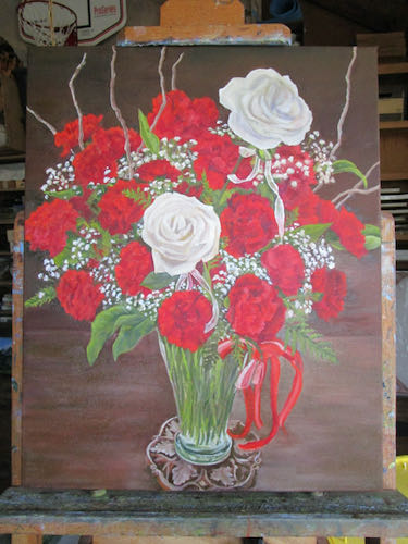
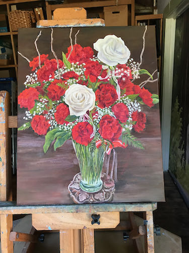
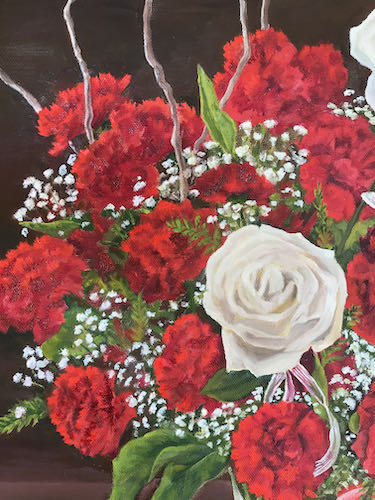
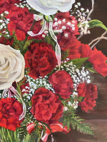
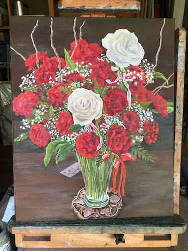
Since we are nearing the end of my favorite time of year, I thought I’d give you a break from watching painted flowers develop and show you a bit of the rest of my world at the time I was painting that bouquet. 

There are many distractions when one works at home. 

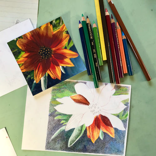
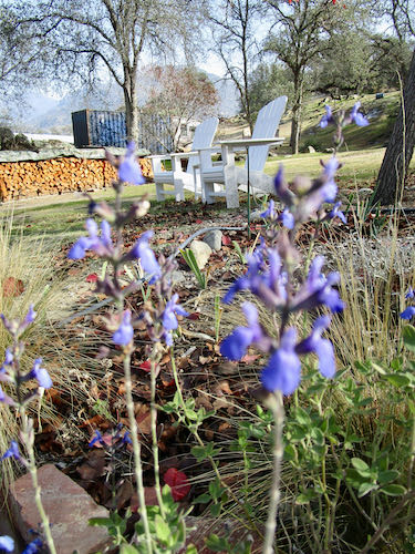
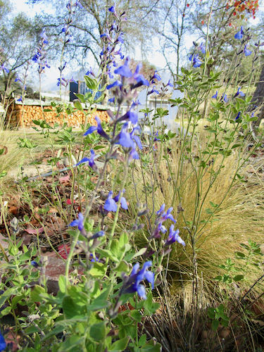
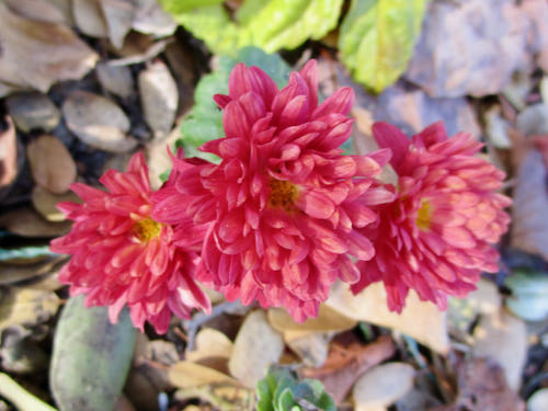
First, my neighbor has this incredible plant, and I don’t know the name, but the deer haven’t eaten it yet, so I NEED the name, because I NEED this color.

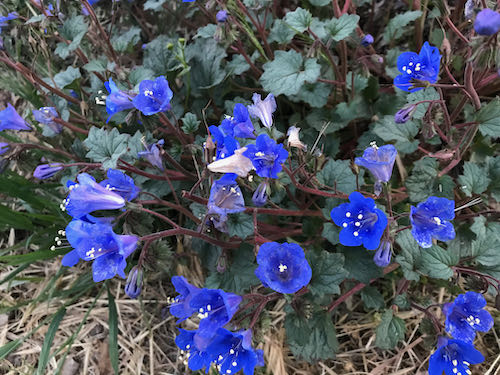
The mail came, and it contained a package of 2 new yarns. I haven’t talked about knitting for awhile; didn’t want to lose any more readers than I’ve already lost because the emailed subscriptions don’t show photos on people’s phones. (Still unsolved; my web designer is still too busy.)

The pinkish red yarn might exactly match the few remaining flowering quince. As a self-proclaimed color junkie, I had to check, and yeppers, it matches. (Destined to be a baby blanket).

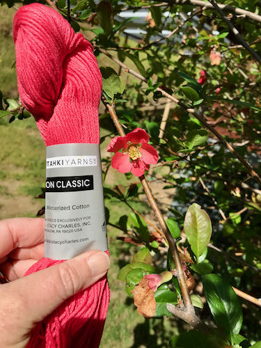
I also needed to know if the lavender matched my blooming lilacs.. Nope, not quite. This one is destined to become another sweater that I don’t need; my knitting is a continual triumph of hope over experience, just like my gardening efforts. Sometimes I get lucky and all the parts work out. Usually the sleeves are too tight or too loose, the buttons keep falling off, the ends don’t stay woven in, I find a dropped stitch after wearing it several times, the collar won’t lie down, it is too short and fat, it is too long and tight. . . you get the idea. (Baby blankets always fit their recipients.)

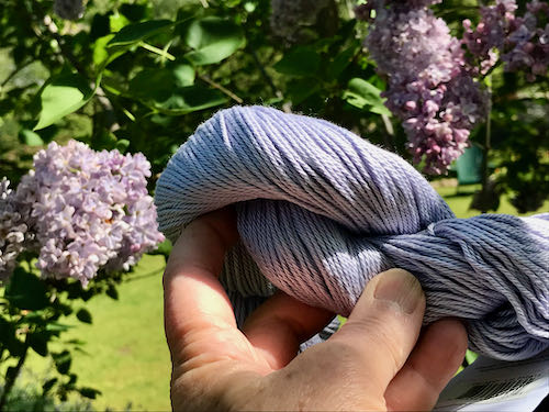
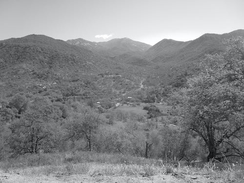
I really did have some work to do that day. When one is an artist in a small town (the sign for Three Rivers says 2600 but I don’t know if all those people really live here) where one’s life overlaps with friends on many levels, one is often privileged to help out. This was fun, but definitely best viewed from the back of a fast horse. (Would take too long to explain and I’ve already stretched your attention span by going on and on about color and knitting.).

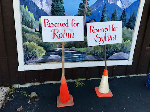
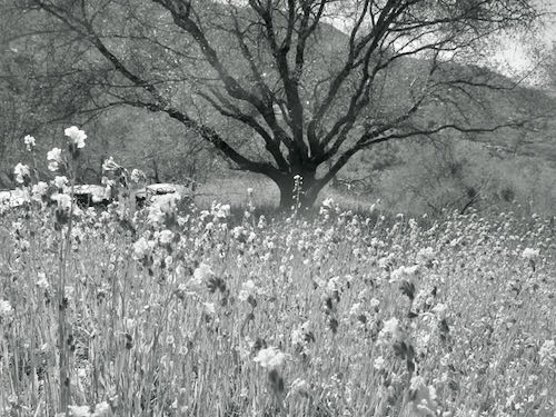
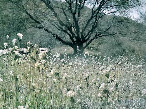
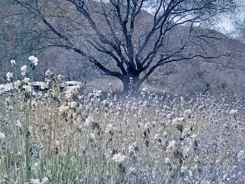
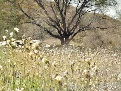
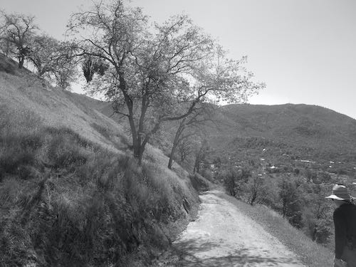
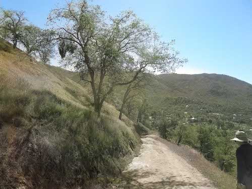
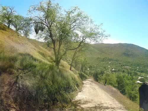
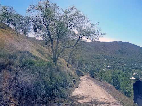
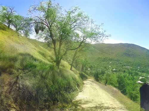
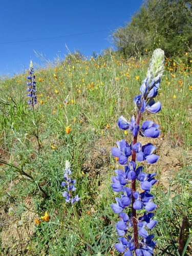
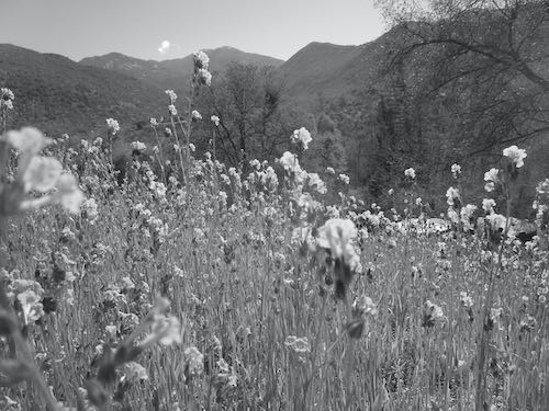
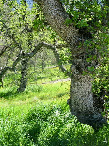
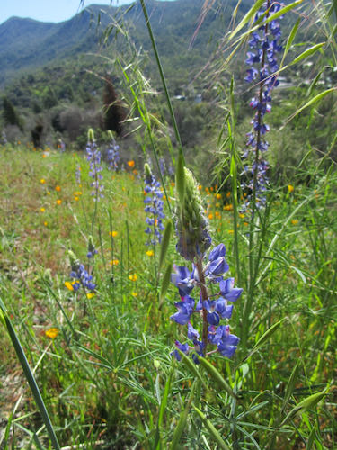
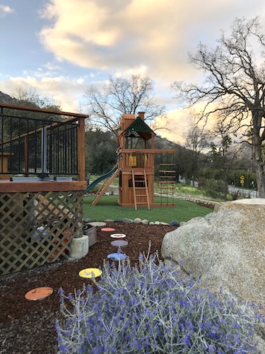
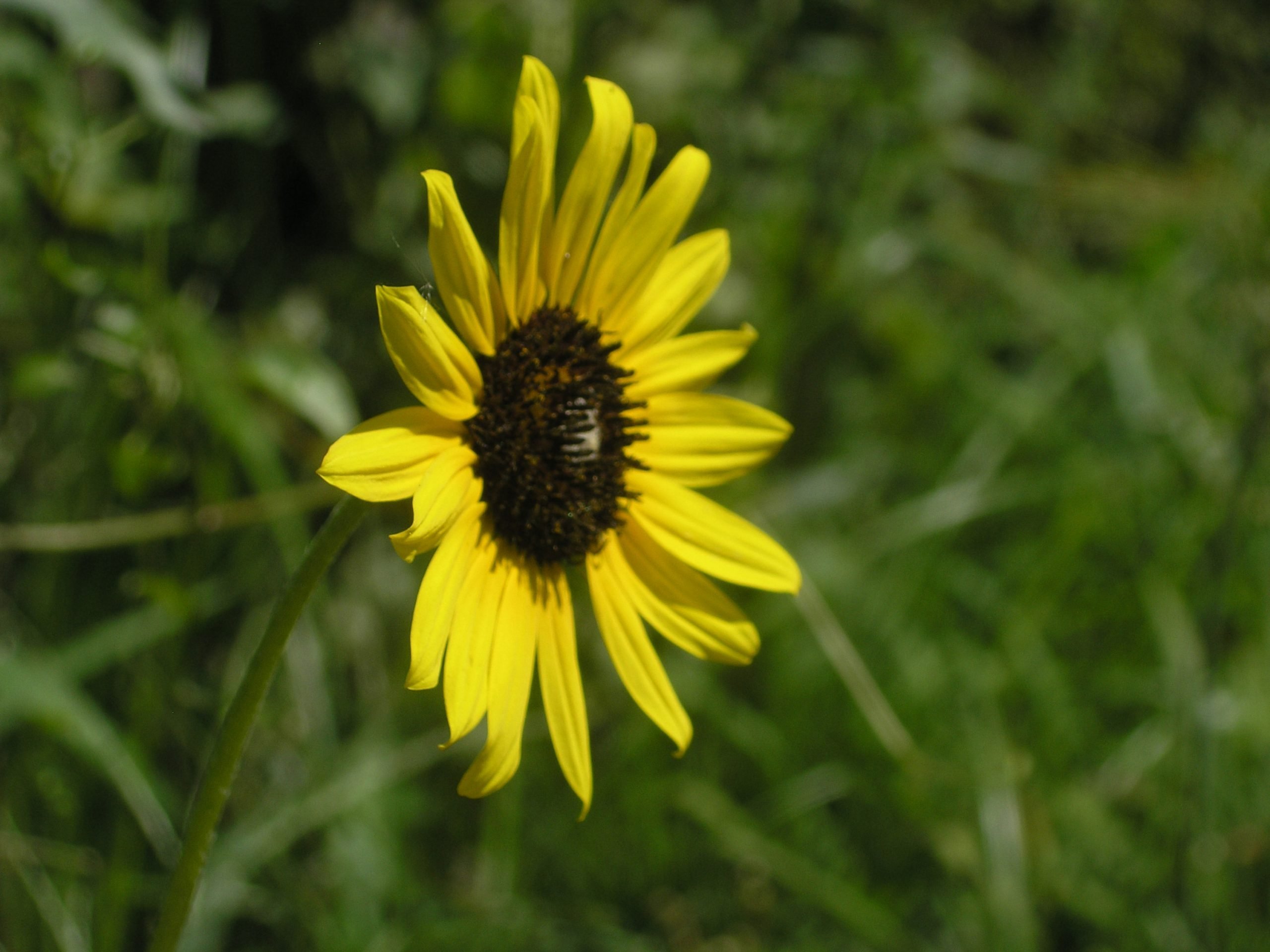
On one of my trips back to the house (a 30 second trip on the Zapato Express*), the light was beautiful on the hillside.

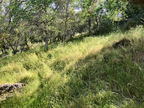
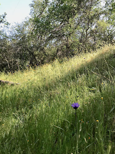
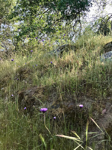
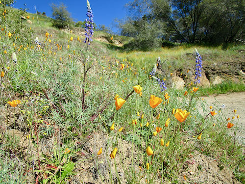
The green and the wildflowers are so fleeting; my daffodils no longer look like this.

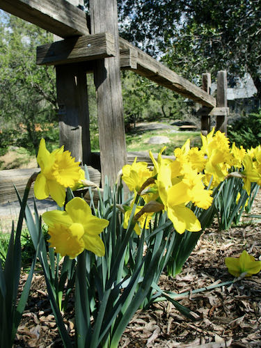
So, even though all this distraction and sidetraction (that’s a good word, don’t you agree?) is taking me from my real work, I believe that it is an artist’s obligation to absorb as much beauty as possible whenever it is available. That’s part of the business of art.

*Zapato Express means I walked.
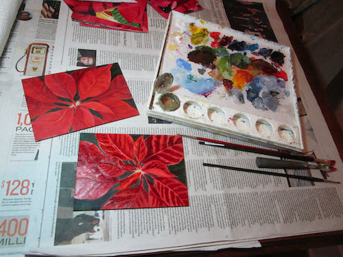
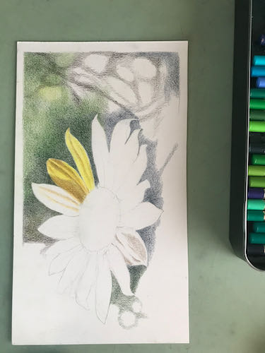
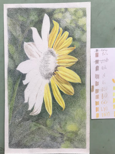
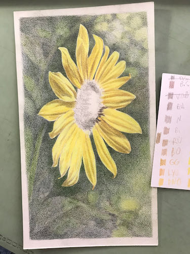
Learn, Schmearn

I accidentally took black and white photos on a day full of beautiful bright natural colors. This became an opportunity to learn how to use the colorize tool on Photoshop Junior (actually Photoshop Elements).

I am not impressed. 

Let’s try it with another photo.

Better, but still nothing to get excited about.

Now I will use the tool to adjust color.

This isn’t very good either.

What did I learn? That if I mess up and accidentally take black and white photos, it is a waste of time to try to make them look natural.

How about if I just stop messing up when the pictures are important?

Good idea.

Not on Purpose

Remember in the olden days when we took photos and didn’t see them until our film got developed?

We have gotten used to looking at them instantly, which is great in theory, but what happens when you are outside in the bright sun and cannot see the screen? Cameras rarely have eyeholes, and the ones that do are small, blurry, inadequate, scratched, or just dirty.

Additionally, if you cannot see the screen, you cannot see the controls on the screen. Sometimes this creates accidents.

A little over a week ago after a storm (not the snowstorm), everything was so beautiful that I laid down my paintbrushes and headed out with Trail Guy to see some natural beauty. The wildflowers!!

THEN, without knowing it, I had a camera accident.

How would I know? I couldn’t see the screen. When I put on some glasses and moved into the shade, I realized that the color was absent, so I randomly pushed the controls until color appeared again.

This flowering pear is the first to bloom in the neighborhood (mid-February) and the last to lose its color in the fall (sometimes late November). This photo might have looked okay in black and white.

It took quite a bit of button pushing when I got home to restore the normal settings. I don’t know how it switched to black and white and doubt if I could make it do that again, at least not on purpose.

Now I am going to experiment with something called “colorize” on Photoshop Junior. This is an opportunity to learn.

Odd Job Completed

As a working artist, I seem to attract odd art-related jobs. Each one is a challenge, usually quite fun to figure out. This odd job of painted stepping stones was completed for a vacation rental where I occasionally help with the yardening.

The colored stepping stones lead through the front yard around to the playset, absent in the photo above, present in the photo below.(Not magical – just unbuilt, and then built.)  And in case you are wondering, the purple blooming shrub is Germander. Looks fabulous now, looks scrappy in the summer. The shrubs in this front yard take turns looking good.