How I Designed a Logo, Final Chapter

We had a bit more adjusting and refining to do. This involved 4 more versions.

FINAL VERSION OF THE LOGO

Don’t worry if you can’t see the tiny differences. My customers and I can, and we are all quite happy with the results of this long collaboration on a logo. They were very patient and kept reminding me that they had been without a logo since the 1980s. 

It is Friday; do you know where your Central California Artist will be?

How I Designed a Logo, Chapter 8

The new drawing was in place, but I thought the type was overpowering to the drawing. The customers had a different thought, which really surprised me: they preferred the placeholder drawing to the new one!

I realize that what I consider to be a good drawing versus what people who don’t draw consider to be a good drawing differs. But, I could not not not let this drawing from the last century go into the new logo. NOT.

So, I drew it again.

Before:

Edited to:

After:

The road and the fence were what spoke to them in the old drawing. I did better mountains, better foothills, and because they grow both oranges and lemons, we included both. 

But wait! There will be more. . . stay tuned!

How I Designed a Logo, Chapter 7

My customers chose this version of their logo.

Now, it was time to do the original drawing to customize the logo for them.

They requested color, but before I added it to the drawing, I put it into the logo instead of the place holder.

Getting there, but more polishing and adjusting ahead. Logo design is tricky stuff, and there has to be clear communication between me and the customers in order to get it just right for them.

To be continued. . .

How I Designed a Logo, Chapter 6

I sent 3 rough-drawn logo options to my customers, and they chose this one for me to refine.

I downloaded the typeface that was closest to this, and then began manipulating it to fit around the circle. We began talking about what to do with “Orchards, Inc.”, whether or not to include it, how to make it look good.


Which one did they choose? Stay tuned. . .

How I Designed a Logo, Chapter 5

After looking at Western typestyles, sketching out some ideas, and turning a pencil drawing of a citrus scene into a circle, I began refining the five design ideas.

Time to mull it over, chose three, and show the customers. I sent the first three and scrapped the other two. They might have been workable, but enough already!

To be continued. . .


How I Designed a Logo, Chapter 4

After evaluating the sketchy ideas, I worked on the idea for a drawing. Because I have been drawing orange groves and citrus for most of my career, there were several token drawings to use as a place holder. This one seemed appropriate, because I was able to turn it into a circle.

This is what is called a placeholder in design. It serves the purpose of showing what might be able to work before the actual piece has been designed.

Photoshop Junior (actually Photoshop Elements) provided the tools to circularize the drawing. That means I cropped it into a circle, but “circularize” sounded good.


SHOW up now:

Images of Home

Exeter Courthouse Gallery, 125 South B Street

November 14 – January ?, 2022

Hours – Saturday,Sunday, Noon-4 p.m.

How I Designed a Logo, Chapter 3

After looking at Western typefaces, I started sketching. A sketch is not a drawing – it is a scribbly unrefined picture, a way to see an idea on paper. 

The customers did not see this part – way too sketchy. There was a stack of paper of many more little sketches, but these just aren’t meant to be public. (I have my professional reputation here to consider, along with some pride.)

After doing these sketches, I spent some time contemplating and evaluating them. 

To be continued. . .

In today’s Visalia Times-Delta online “paper” there was supposed to be an article about my art. Hang onto the link to check later. I was warned that their schedule was just maybe-ish. Visalia Times-Delta

Coming on Sunday:

Images of Home

Exeter Courthouse Gallery, 125 South B Street

November 14 – December 30, 2021

Opening Reception – Sunday, November 14, 1-4 p.m.

How I Designed a Logo, Chapter 2

When my customers told me that they liked Western type, I started digging through the internet to see what was available. In general, Western typefaces are very easy to recognize, but after studying them, I realized there are many variations. (Remember when I told you a list of the goofy names of some of the typefaces?)

Those websites selling typefaces allow you to put your info into them and see what it might look like. Here are a few:

This last one is the prettiest, and it has the surprising name of “Eastwood”. I don’t associate old Clint with the description of pretty.

To be continued. . .

Coming on Sunday:

Images of Home

Exeter Courthouse Gallery, 125 South B Street

November 14 – January ?, 2022

Opening Reception – Sunday, November 14, 1-4 p.m.

How I Designed a Logo

Logo design is not my strong suit. (“Suit”? Are we dressing up here? Where does this word come from? Are we playing a card game, perhaps?) Occasionally, someone asks, and if I have a good idea and a feel for the business, I say yes. (2 previous examples: Mineral King Preservation Society and Lemon Cove Community Church.)

Some friends have operated their farm business since the 1980s without a logo. They are customers who have become friends through the years, and I had an idea for a logo for them.

They commissioned this painting and I thought it might look great as a logo, or incorporated into a logo design. 

Instead of wanting to use the painting, they said they loved my pencil work, and they’d like the logo to have type with a Western feel to it. I asked the name of their business (it never came up in the past), and then I was off like a hot car with a teenaged driver.

Looks like this is the first post in a series. . . stay tuned.

Meanwhile, remember this:

Images of Home

Exeter Courthouse Gallery

November 14 – January ?, 2022
Opening Reception – Sunday, November 14, 1-4 p.m.

Dead Saloon and Western Bang Bang

Excuse me??

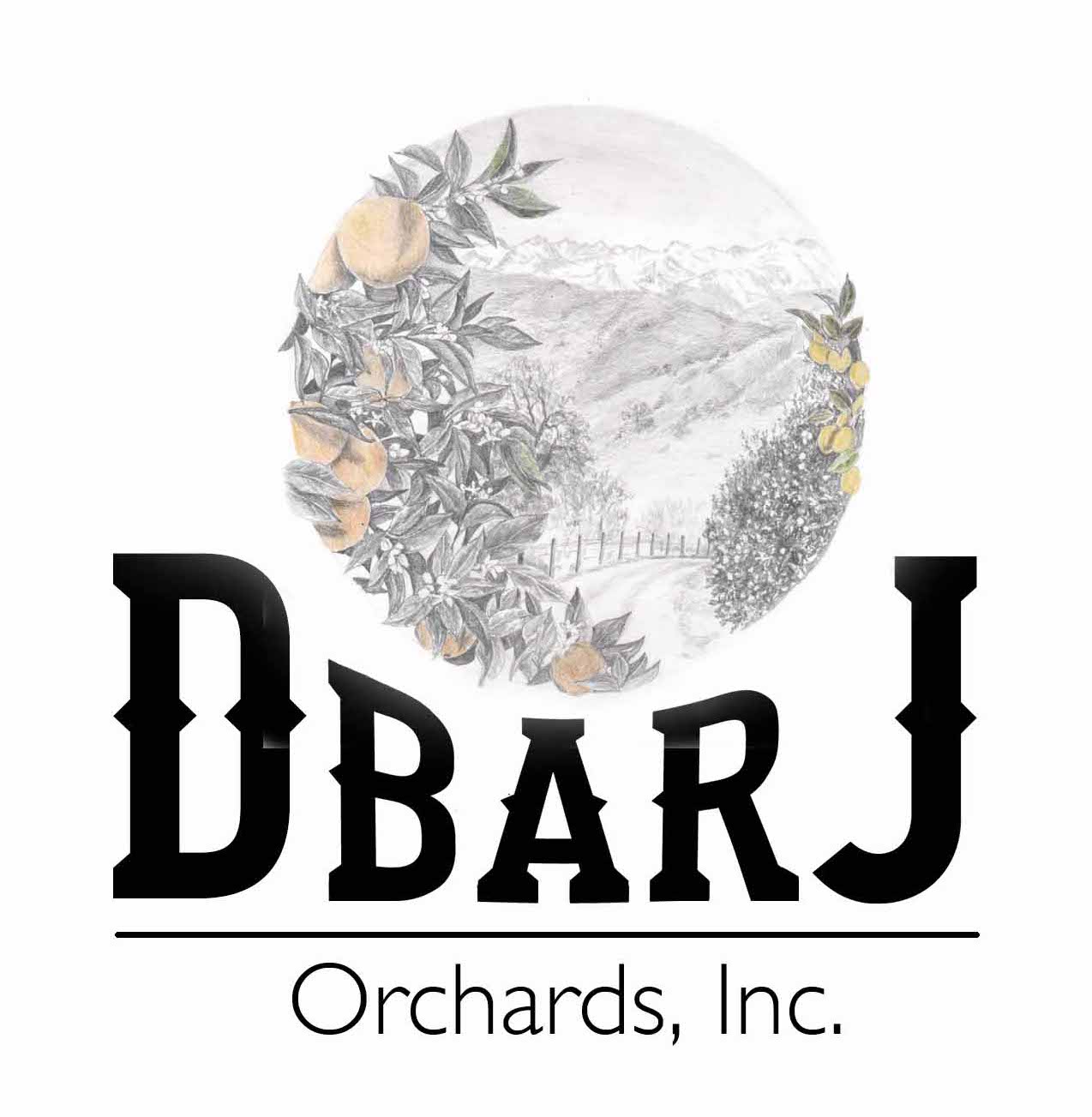
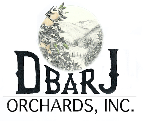
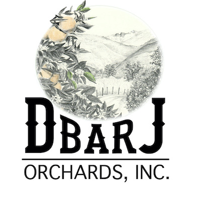
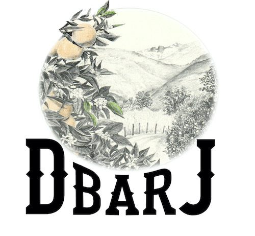
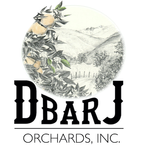
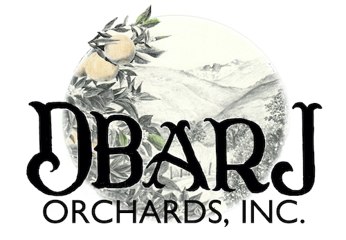
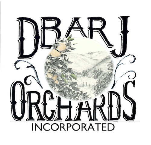
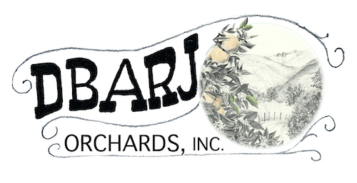
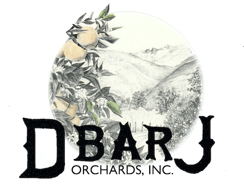
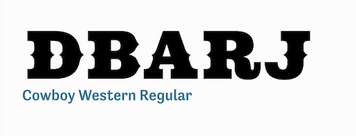
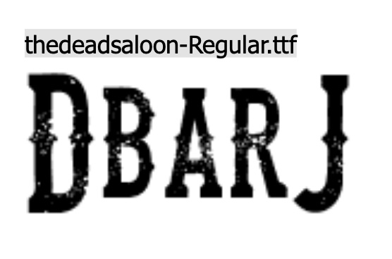
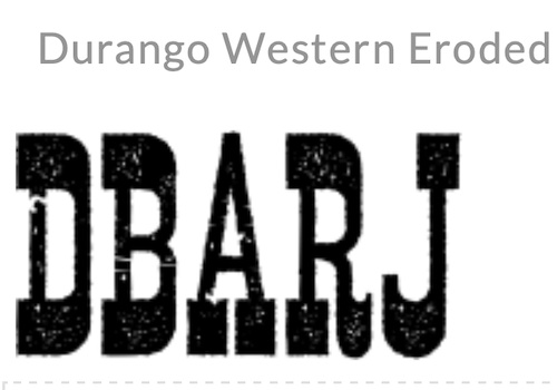
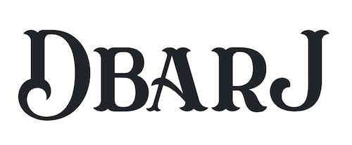
I am working on a logo design for a customer-friend (if it is business, “customer” is the right term, but they are friends too). He requested “western type”, so I went searching on the Duck. DaFont, actually.

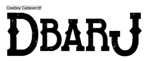
The names of those typestyles are hilarious! Look at these: Eastwood, I Shot The Serif, Bleeding Cowboys, Insane Rodeo, Boots and Spurs, Dust West, Confetti Western, Lost Saloon, Fort Death, Tequila Sunrise, Cowboy Cadaver, Poker Kings, Texas Tango, Macho, Western Swagger, Old Bob Junior, Dusty Ranch. . . they go on and on and on. Lots of them look alike, so I will just keep sketching, figuring out which type fits with which sketched logo design. 

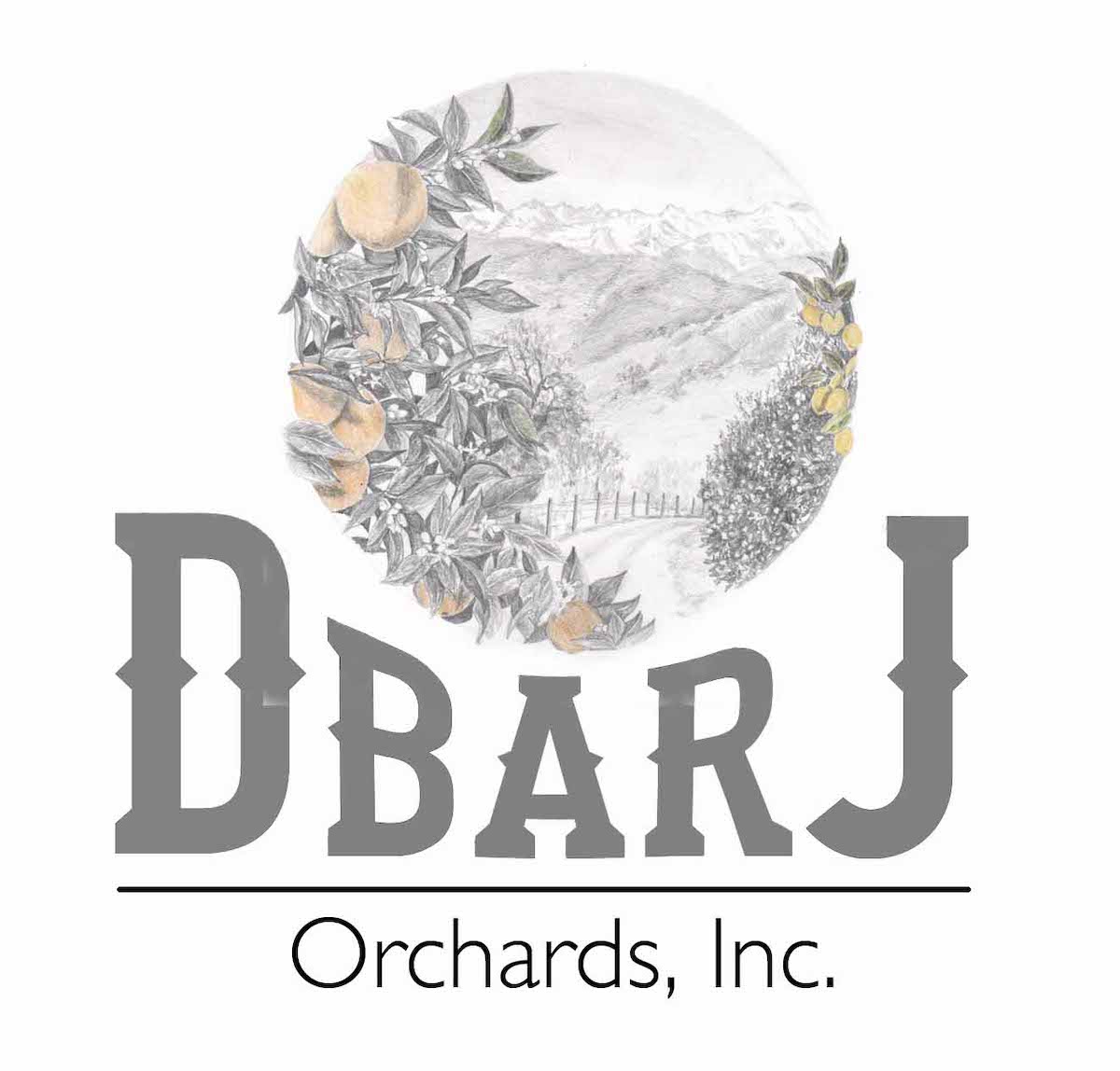
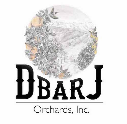
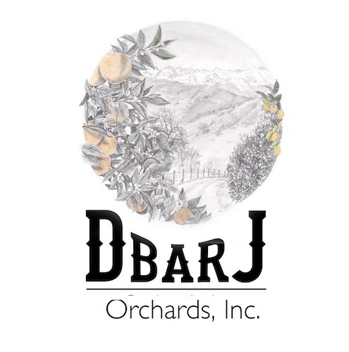
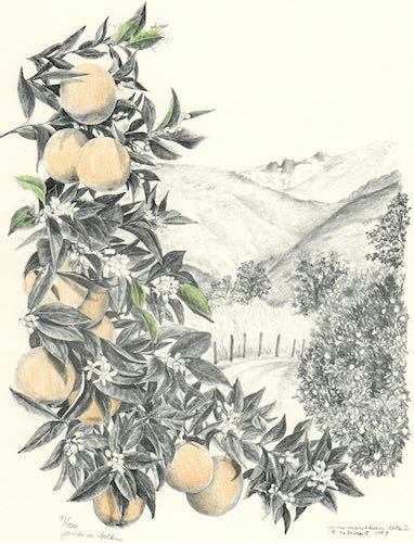
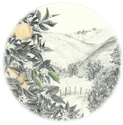
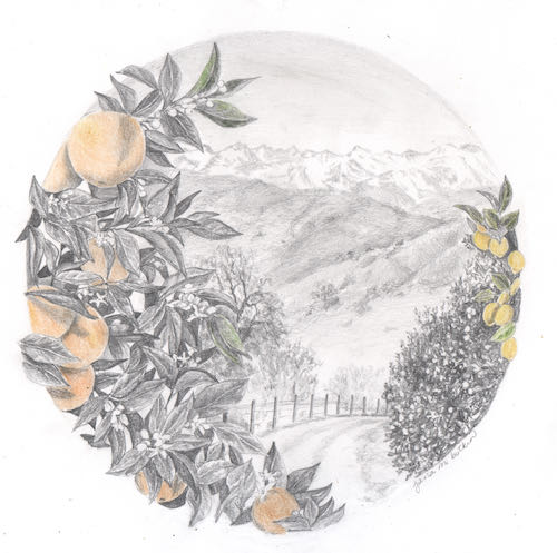
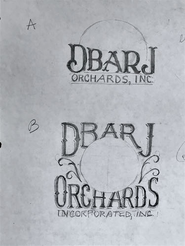
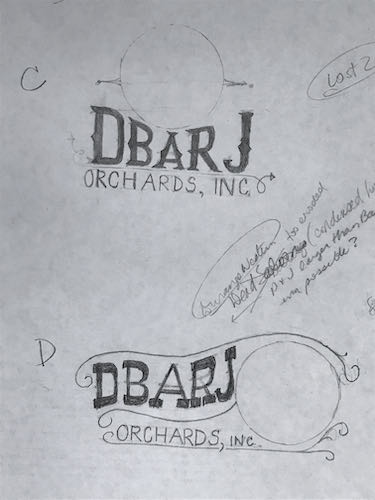
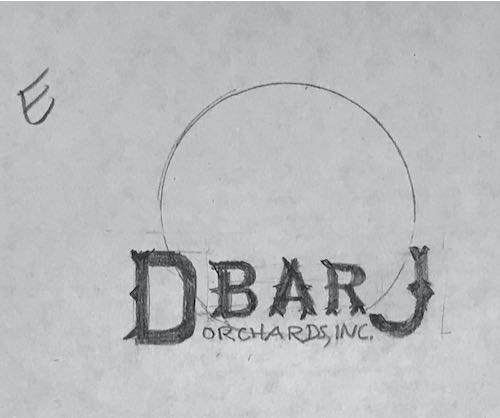
The logo will include something that looks a bit like this:

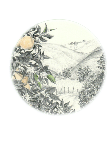
And that’s all I will reveal at this time. More will be revealed in the fullness of time, or as my dad used to say more succinctly, “Time will tell”.

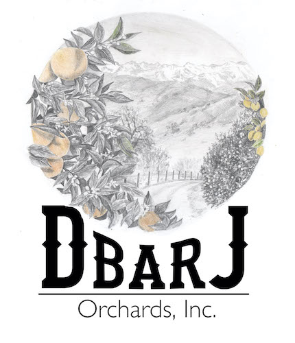
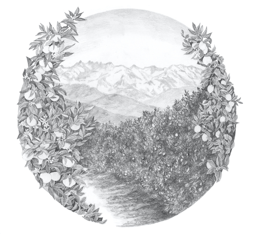
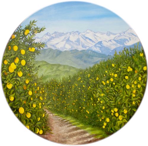
P.S. Logo design is not my strong suit, but pencil drawing is. I have done quite a bit of work for these folks, they are easy to please, and I have a lot of ideas for them. Remember this logo design? I like it a lot, and it inspired my confidence to offer to do this job for these folks.