After looking at Western typestyles, sketching out some ideas, and turning a pencil drawing of a citrus scene into a circle, I began refining the five design ideas.
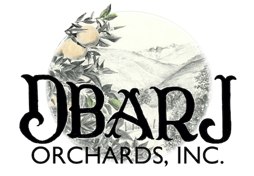
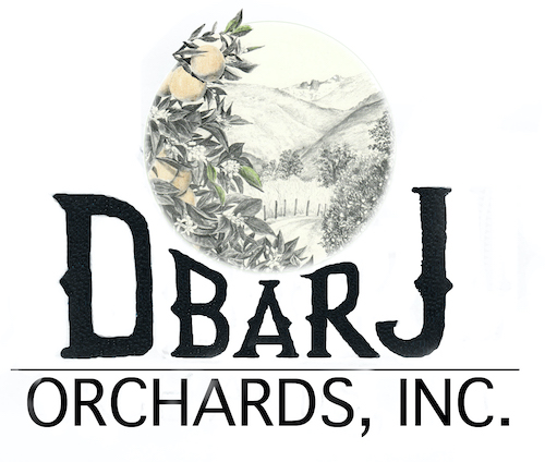
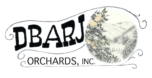
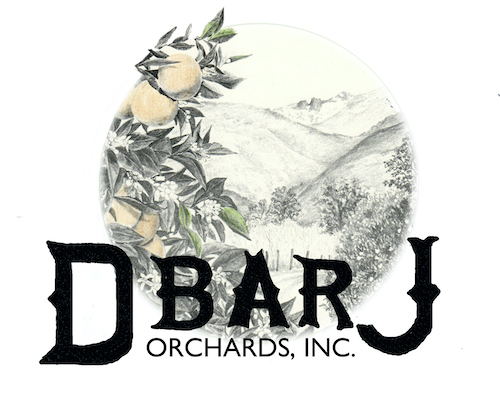
Time to mull it over, chose three, and show the customers. I sent the first three and scrapped the other two. They might have been workable, but enough already!
To be continued. . .
4 Comments
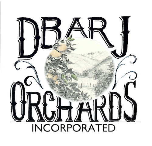
Oh, Jana, I was really struck by the 4th one where the logo and letters are side by side. The letters are not squished out of shape and the drawing is not covered. It is absolutely my favorite. Too bad my vote isn’t the one that counts, however! 🙂
Oh, Nikki, I thought that one was really pretty too. But there were other priorities than simply beauty here. Thank you for checking in!
I love the picture, but the type is so large that it dominates and minimizes the art. The first option almost completely covers the artwork. I guess if the client wants to emphasize their name that’s okay, but if it were my logo, I would want the artwork to stand out.
Marjie, OF COURSE you would want the art to stand out! 😎
Comments are closed for this article!