A side job is something I consider work, but not my main deal. Logo design is not my strong point, but sometimes I get asked to make a logo. Usually I have one good idea, and then the rest just get worse with every attempt. When I was asked last fall to design a logo for a church I used to attend (the only reason I have ever left a church is for geographical reasons so we were on very good terms, nothing awkward or difficult), I said I’d try.
I spent quite a few hours sketching out ideas, refining them in pencil, rejecting the weaker ones, holding on to the stronger ones, until I had 3 that I wasn’t too embarrassed of. They know I can draw, know I have a soft spot for their church and wouldn’t produce something second rate, so I wasn’t too worried about the rough presentation.
The pastor took them to a council, and they selected this one:
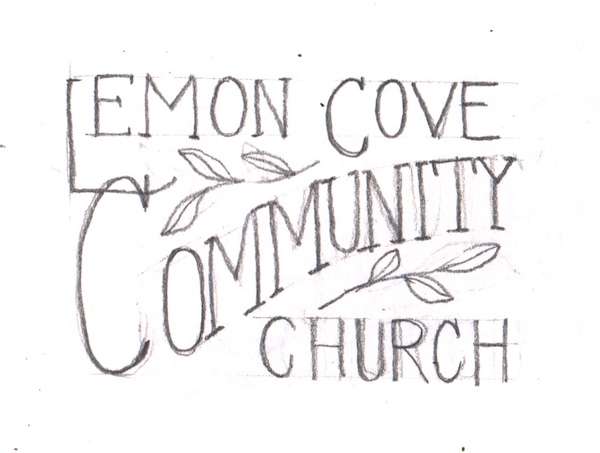
Oh boy, next I got to figure out how to turn my scribbles into something print worthy, using Photoshop Elements.
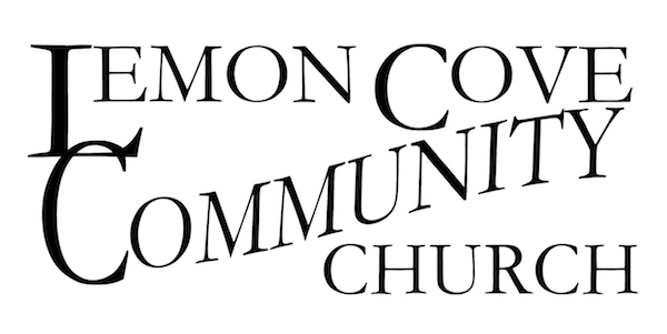
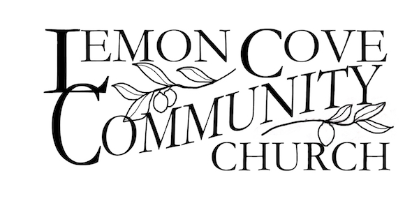
The council began making suggestions, and I froze. (Design By Committee is what produced a camel when a horse was desired.) They were kind and didn’t have a deadline, so I worked and worked to incorporate their wishes, which were a cross (to be expected in a Christian church) and some color.
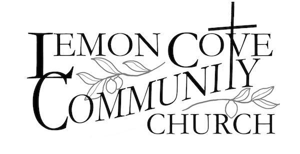
I called this one #4, but it might have been closer to #20. They are happy, so I am happy. (I don’t want to look at it too long, or I’ll keep finding ways to “fix” it.)