After looking at Western typefaces, I started sketching. A sketch is not a drawing – it is a scribbly unrefined picture, a way to see an idea on paper.
The customers did not see this part – way too sketchy. There was a stack of paper of many more little sketches, but these just aren’t meant to be public. (I have my professional reputation here to consider, along with some pride.)
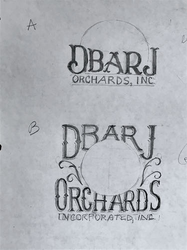
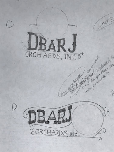
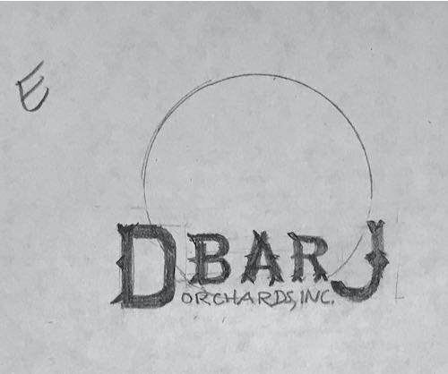
After doing these sketches, I spent some time contemplating and evaluating them.
To be continued. . .
In today’s Visalia Times-Delta online “paper” there was supposed to be an article about my art. Hang onto the link to check later. I was warned that their schedule was just maybe-ish. Visalia Times-Delta
Coming on Sunday:
Images of Home
Exeter Courthouse Gallery, 125 South B Street
6 Comments
I thought you would be interested in this website https://www.heritagetype.com/collections/bundle/products/vintage-font-bundle
Thank you, Don! We have always love type. 😎
I like B and E but I would want the entire artwork to show.
Thank you, Marjie! It is fun to hear other peoples’ opinions. I had some preferences too, but just had to wait until the customers expressed theirs.
Personally, I like any of the sketches where the circle does NOT cover up part of the letters (like B). Doing that makes it harder to read what the words are. I think sketch D is my favorite. It’s artsy, not blocky.
I clicked on the Visalia Delta link but couldn’t find your article anywhere on the main page. Maybe you could link directly to the article?
Sharon, I am giving my readers a chance to speculate and form an opinion while waiting to see what the customers chose, which is exactly what I did!
The reporter warned me that the Times-Delta’s scheduling can be sketchy. I will correct the info on the blog. Thanks for letting me know!
Comments are closed for this article!