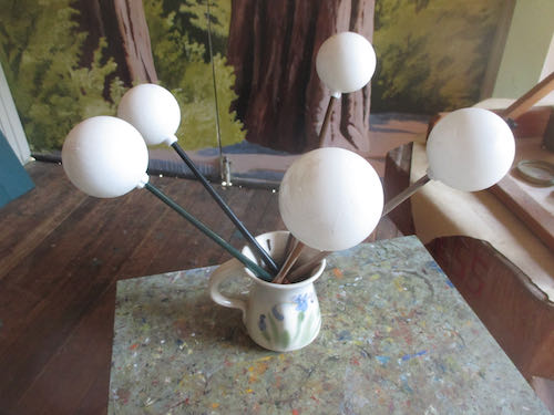
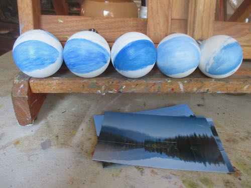
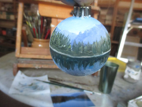
Painting on spheres the size of a tennis ball definitely qualifies as an odd job. Painting five of them means the odd job provides lots of opportunities to practice.
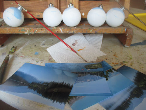
I photographed each ornament after putting the next segments on them. This has to be done in parts, because wet paint on a complete sphere is a messy situation. After seeing these photos, it is clear to me that I need to be doing this in better light rather than at the end of the day when the light is low.
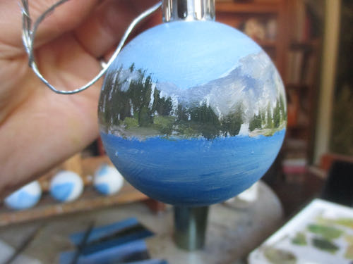
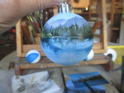
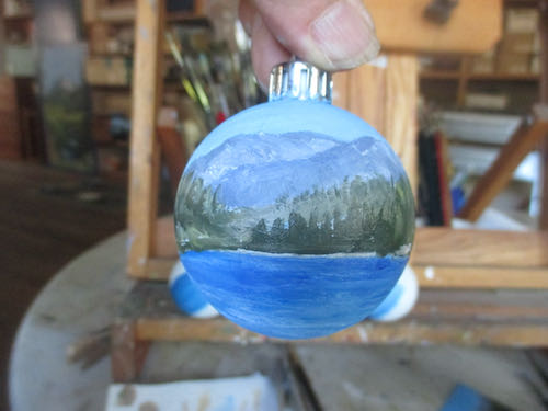
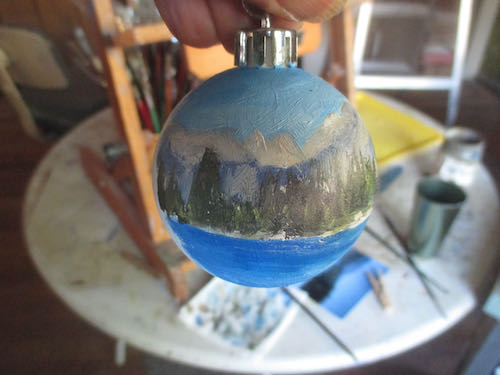
This time I had the foresight to attach a wire, dig out the clothespins, open the ladder, and clip each ornament to the clothesline/pulley arrangement above the easels and painting tables. (Trail Guy assembled this so our friend who grows lavender would have a place to dry her bunches a few years ago). 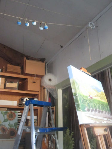
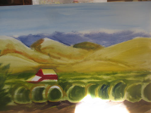
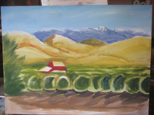
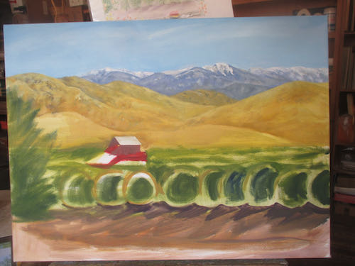
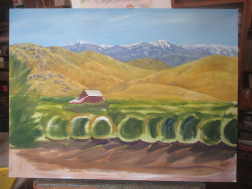
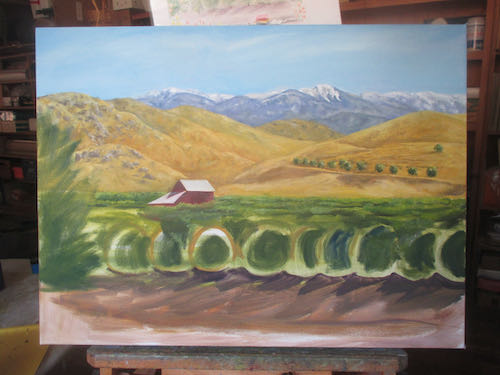
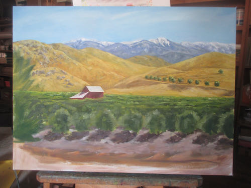
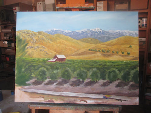
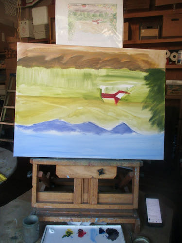
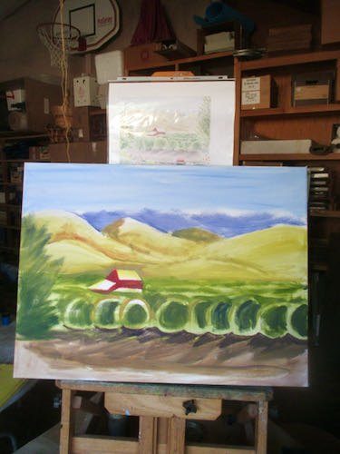
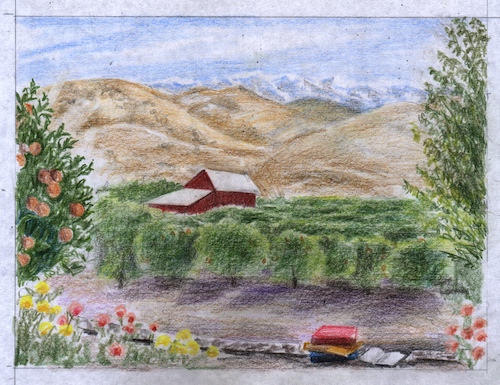
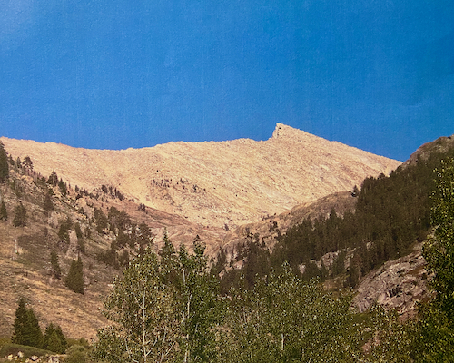
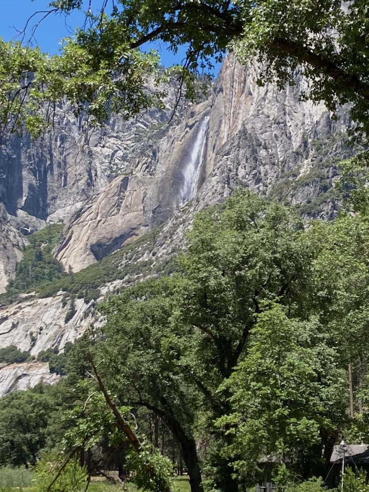
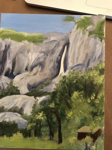
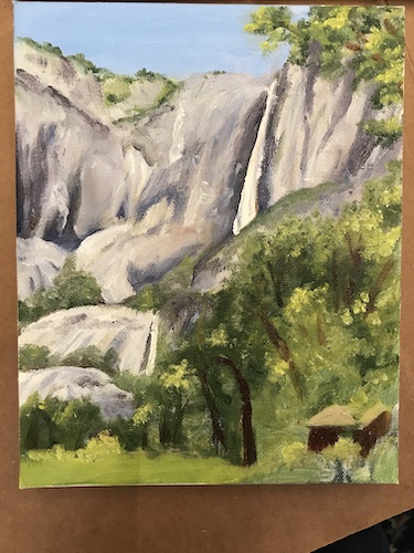
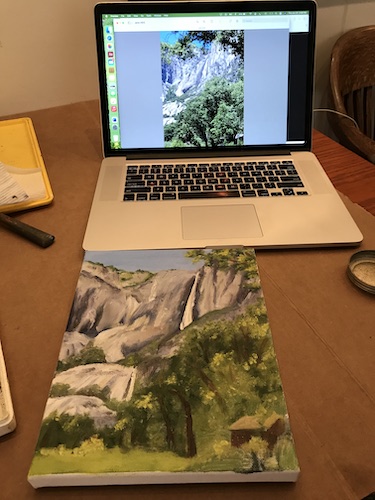
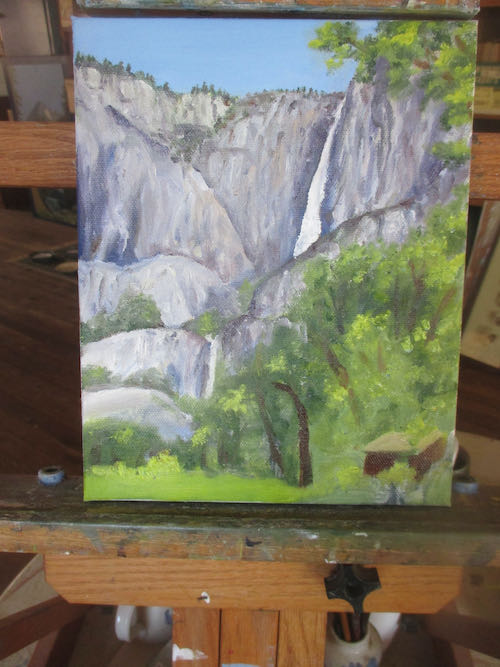
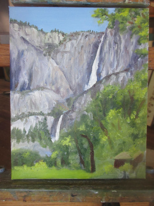
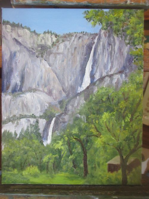
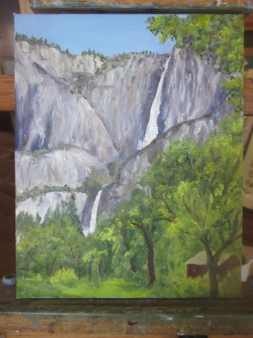
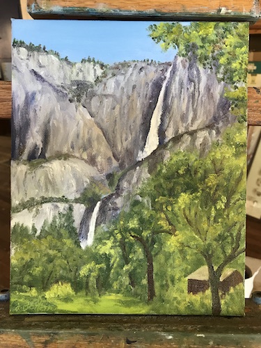
There was paint left on the palette, and it is a shame to waste paint. It will keep overnight, and it does okay in the freezer for awhile, but I was heading up the hill and wouldn’t have a chance to use the paint before it got too tacky. So, I got out a photo of Mineral King and a 6×18″ canvas, figuring I could stretch the scene into a panoramic format. 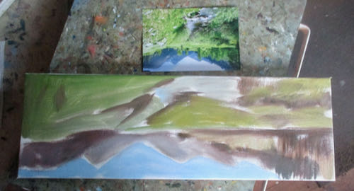
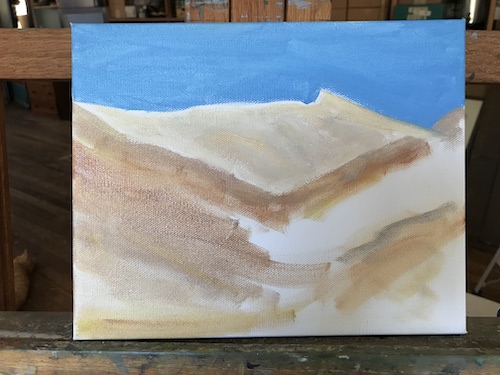
Upside down forces me to evaluate the shapes correctly, not that it matters when I am distorting a scene to this degree. You can see that the colors are wrong. However, those are the colors that were left on the palette, and it really doesn’t matter for the first layer.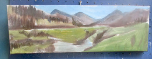
I can make this work. But first I need to finish the Large Important Oil Painting and make better progress on those five ornaments. Unless, of course, one of the four places that sells my work calls for more Mineral King paintings.