“Christmas Adam”?
Yep. Adam came before Eve.
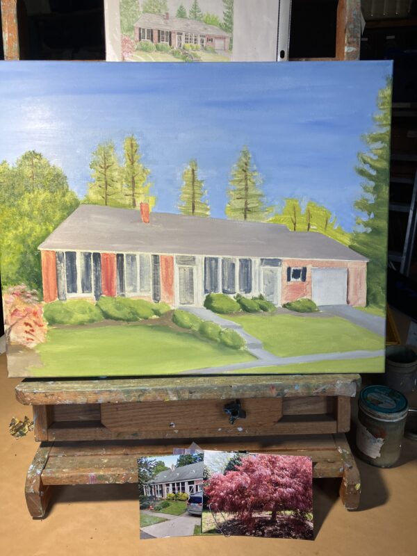
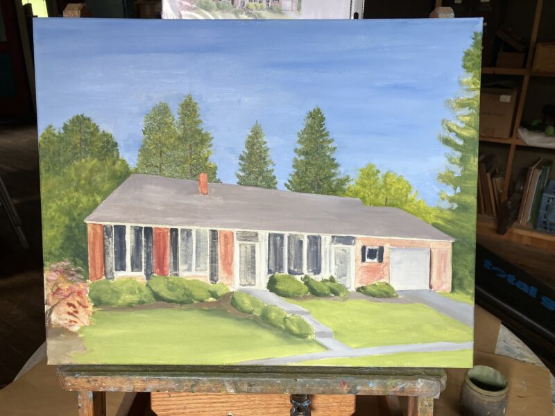
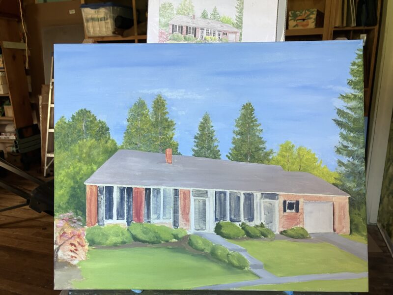
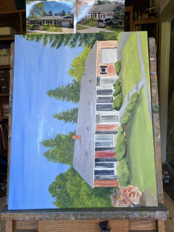
Today will be a peek into the variety of tasks required so far this week to maintain the business of self-employed artist.
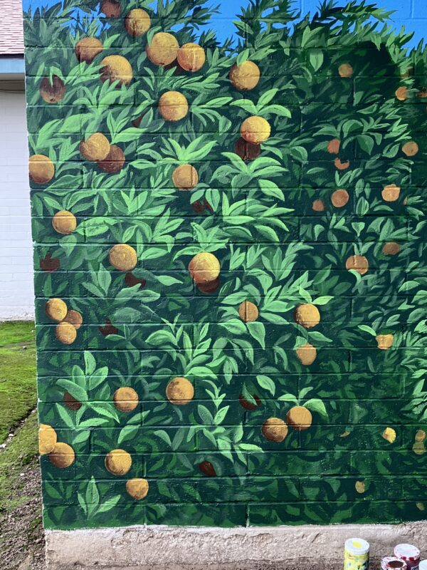
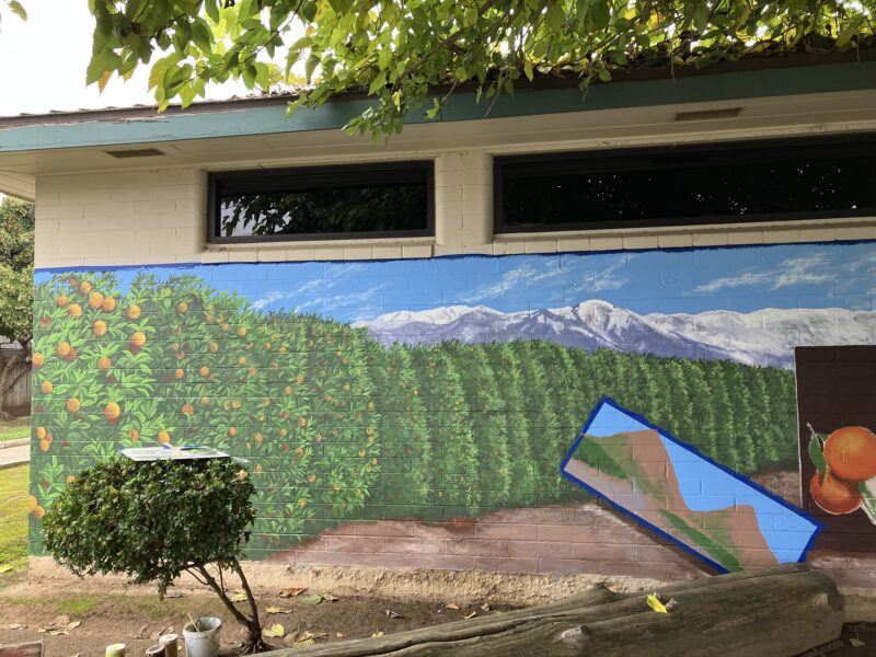
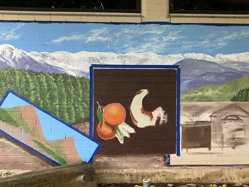
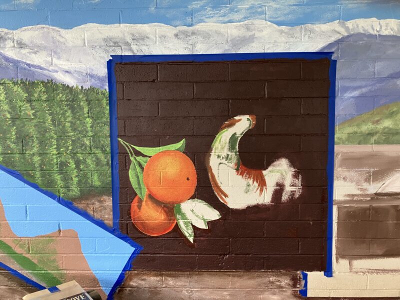
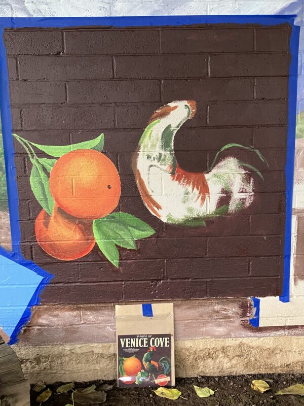
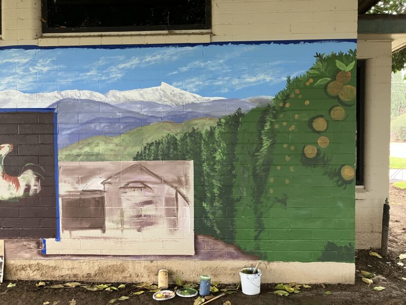
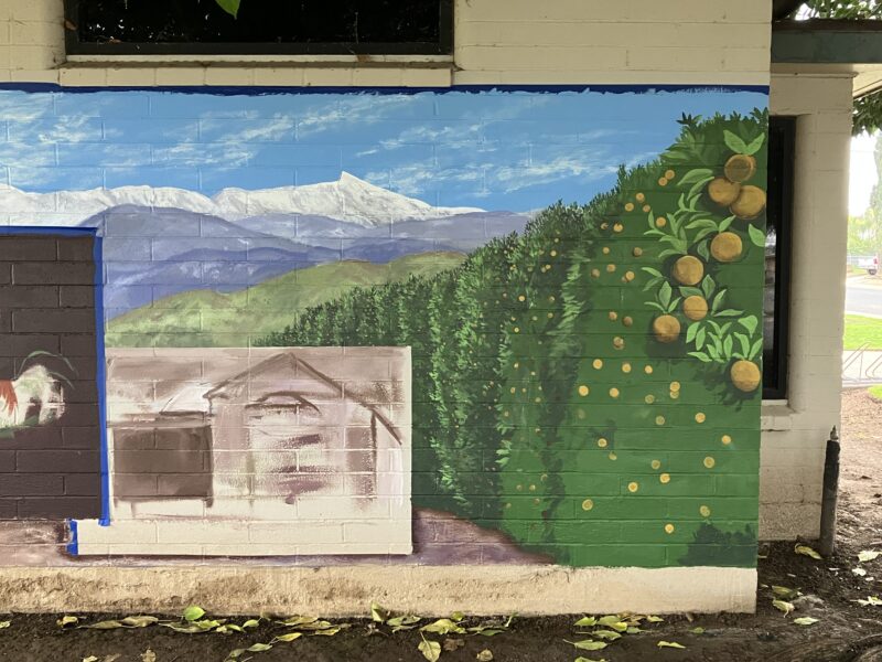
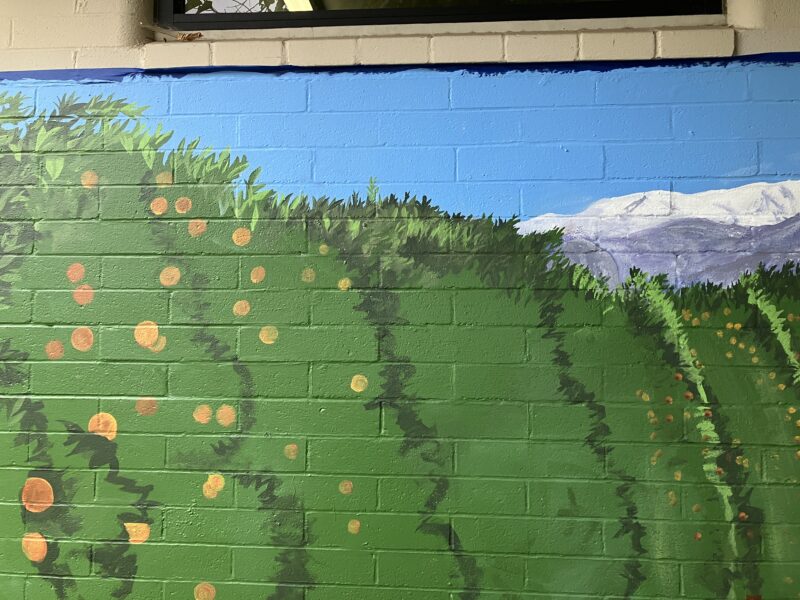
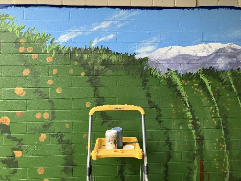
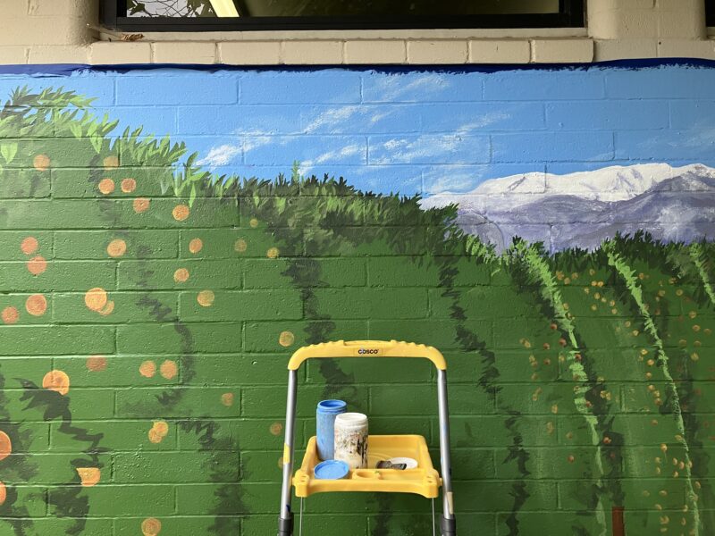
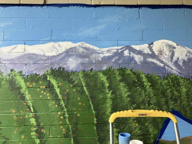
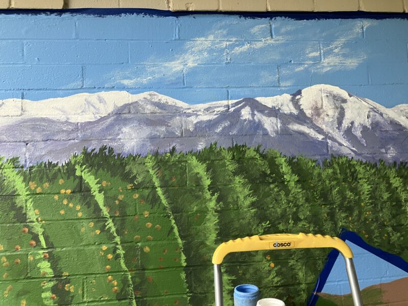
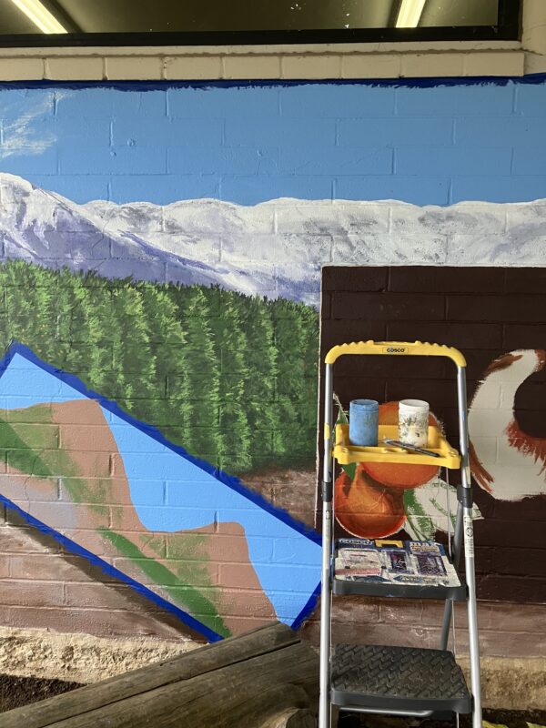
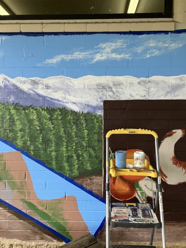
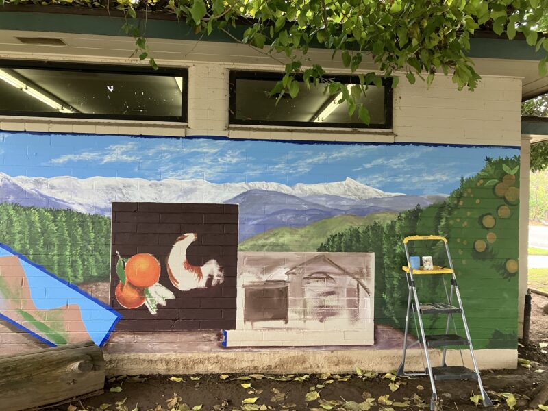
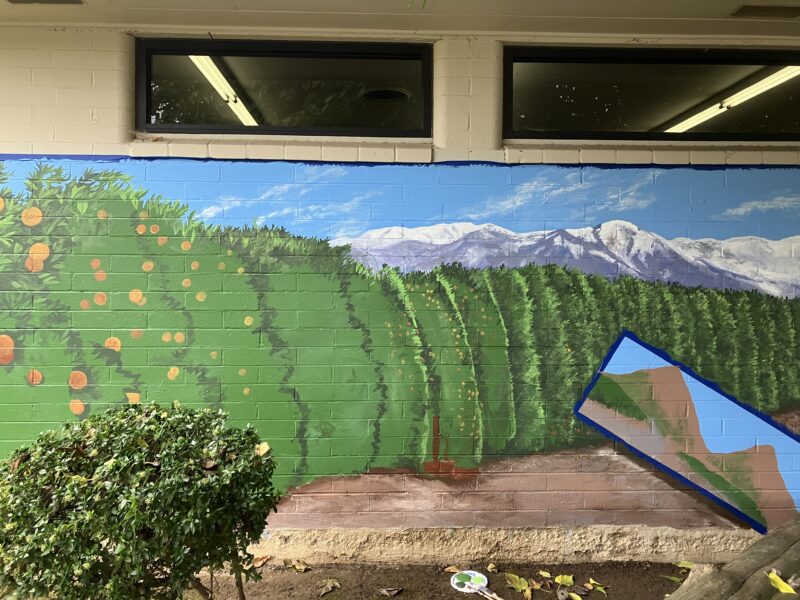
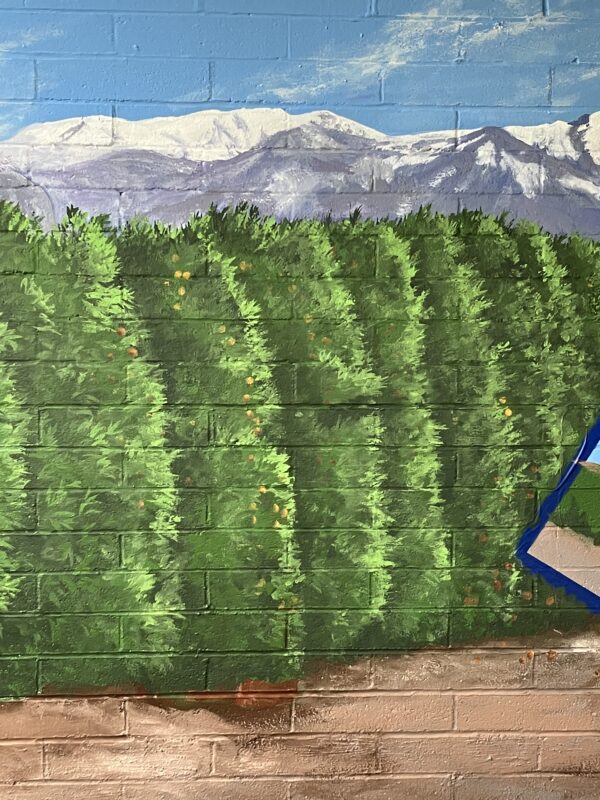
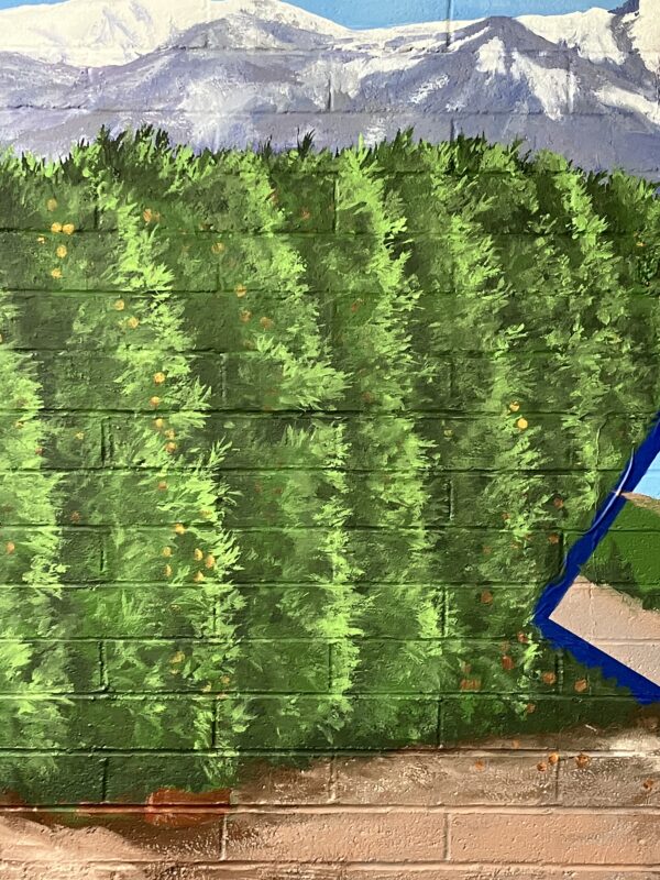
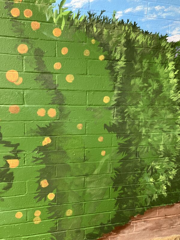
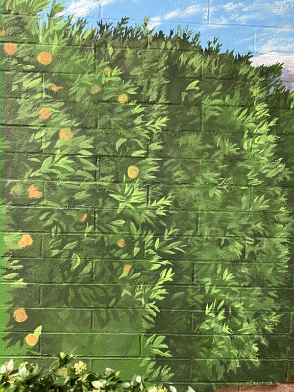
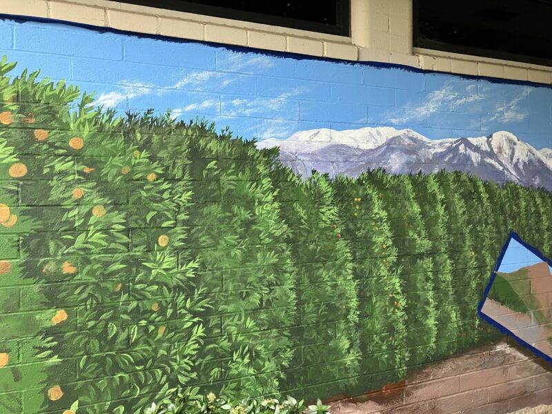
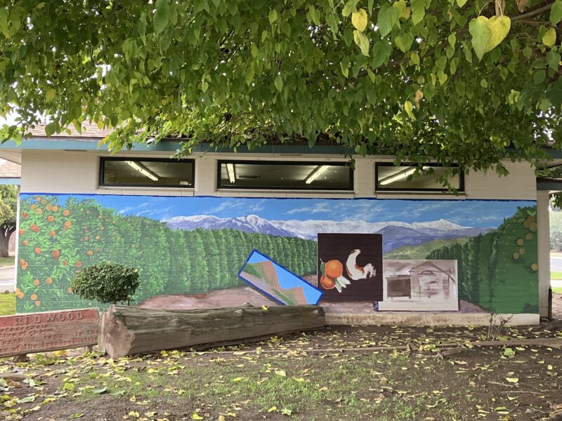
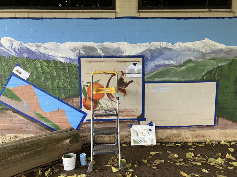
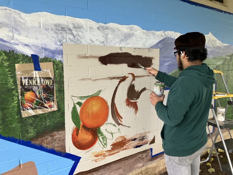
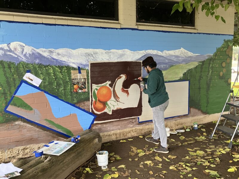
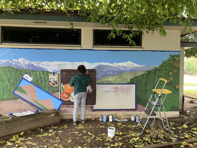
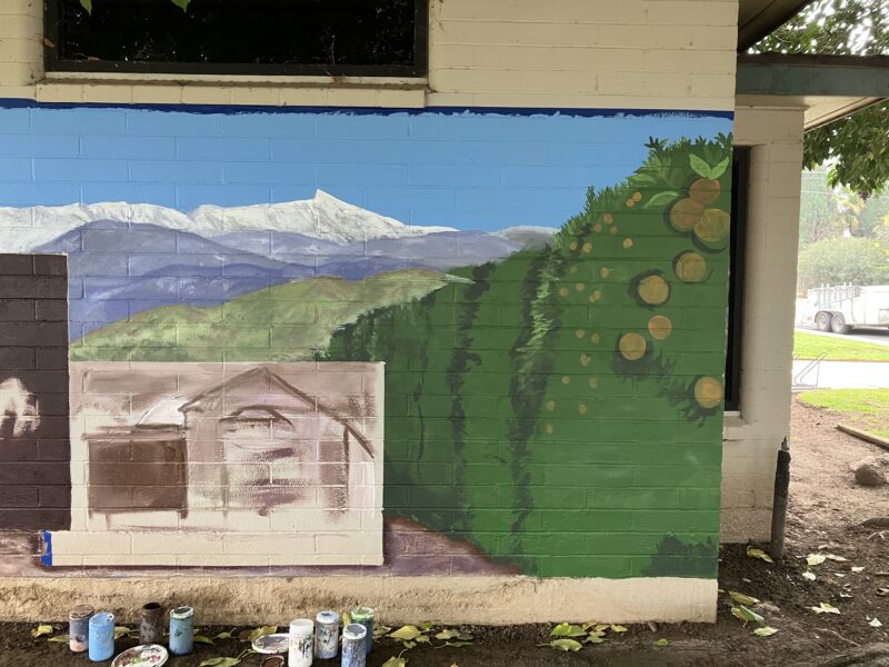
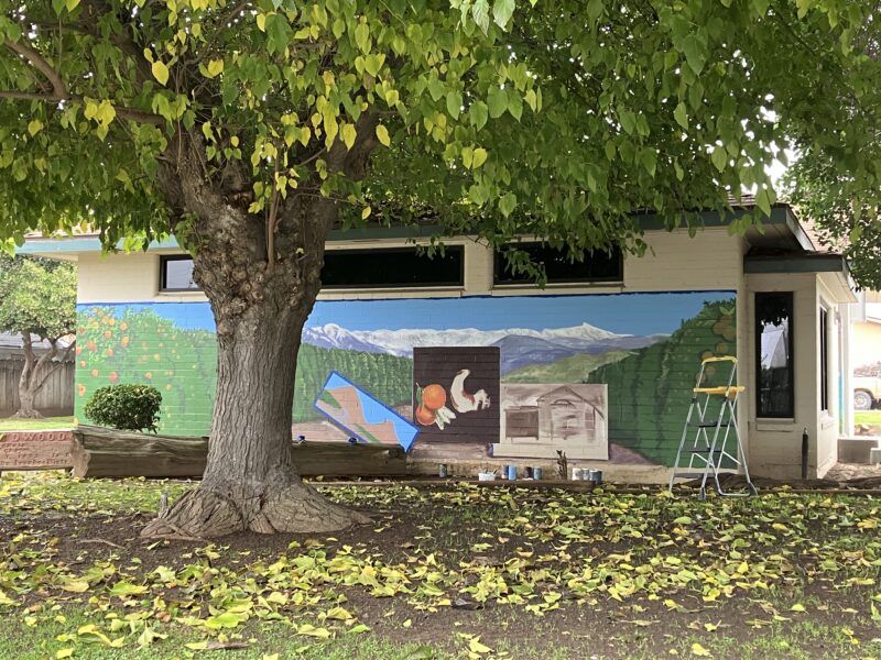
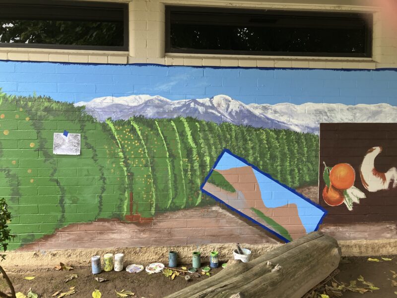
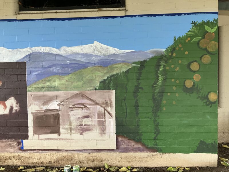
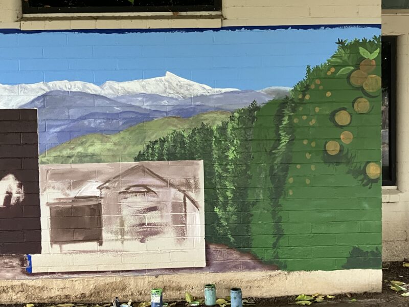
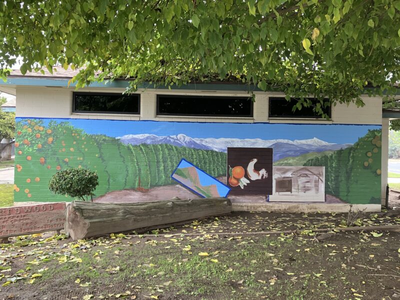
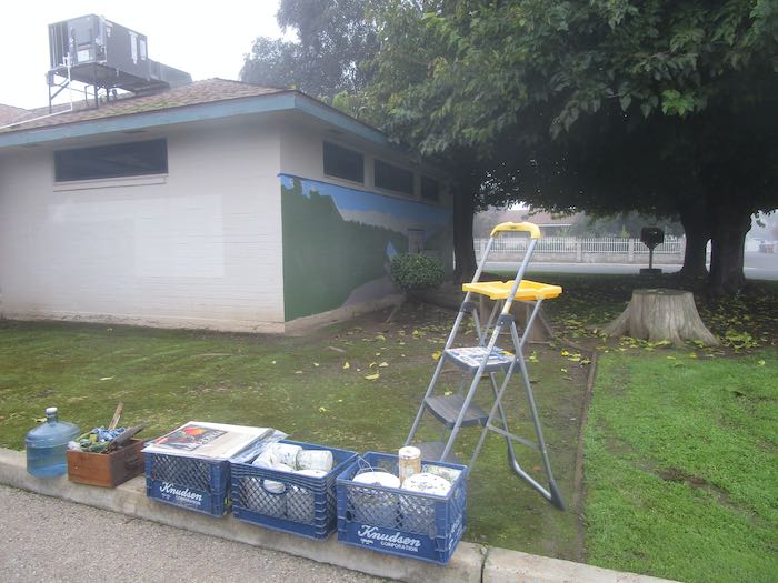
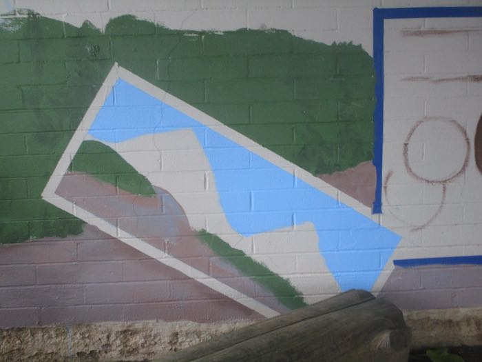
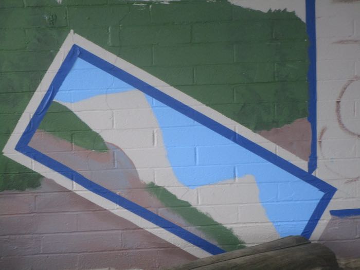
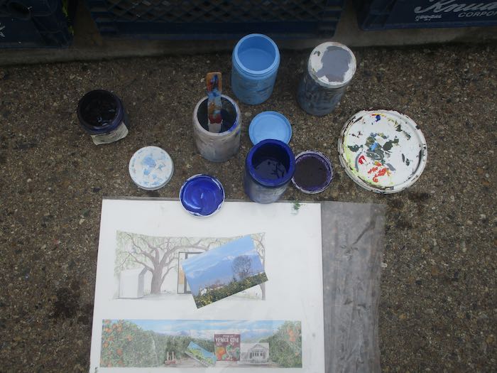
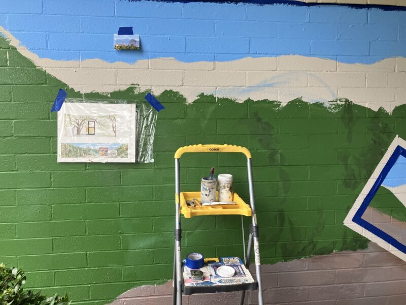
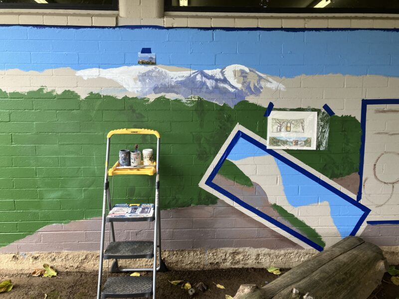
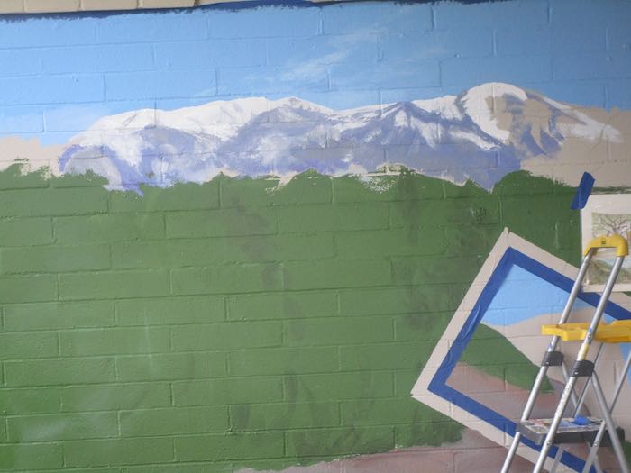
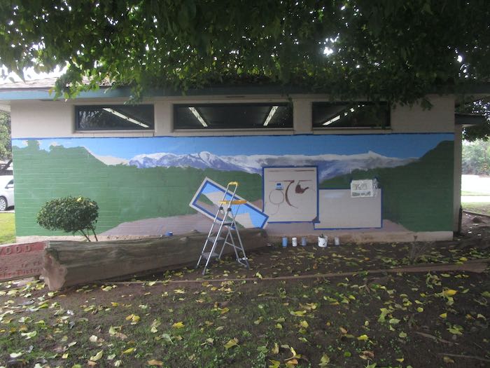
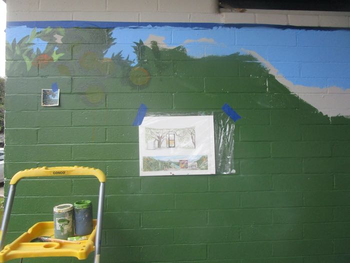
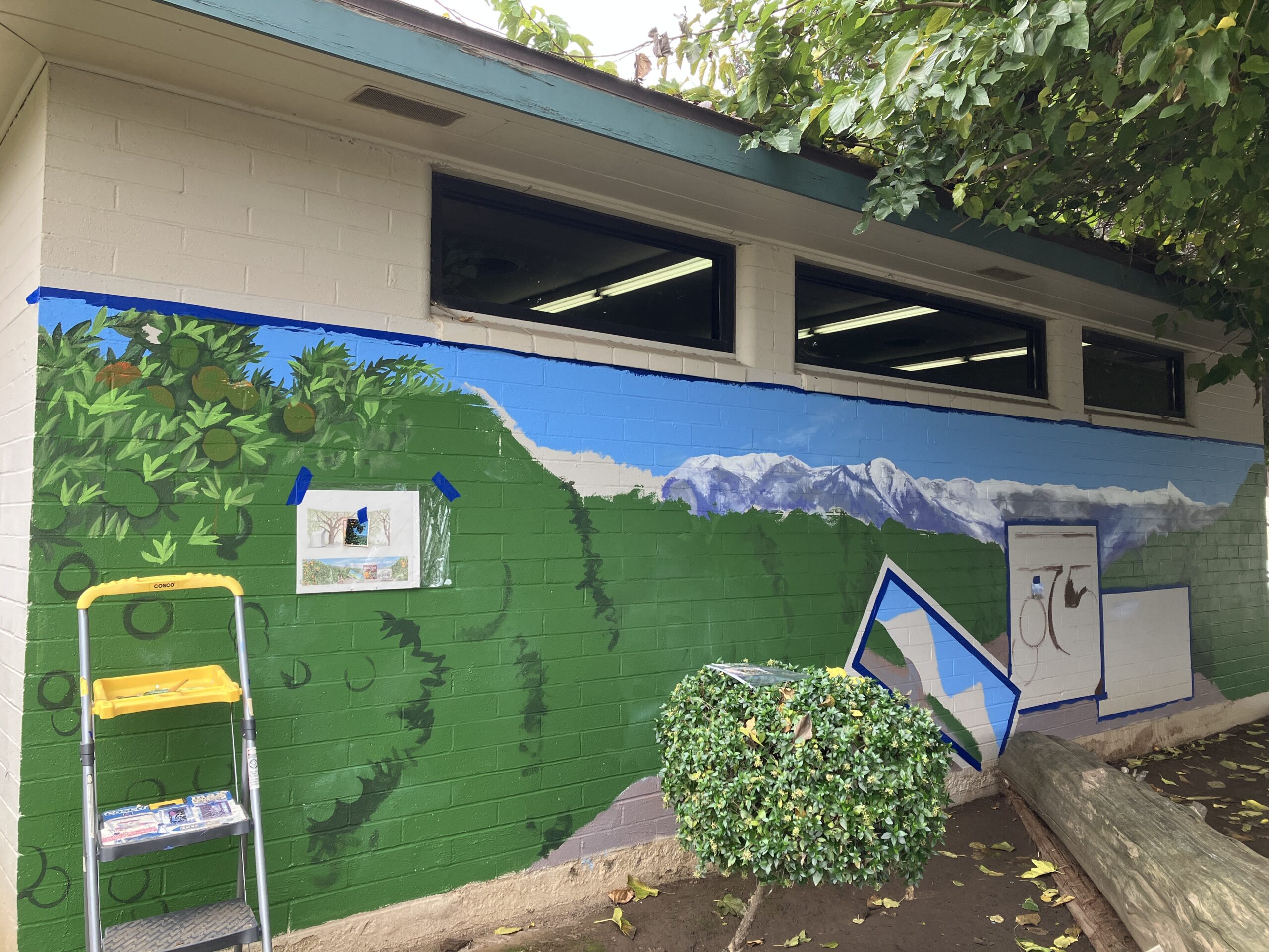
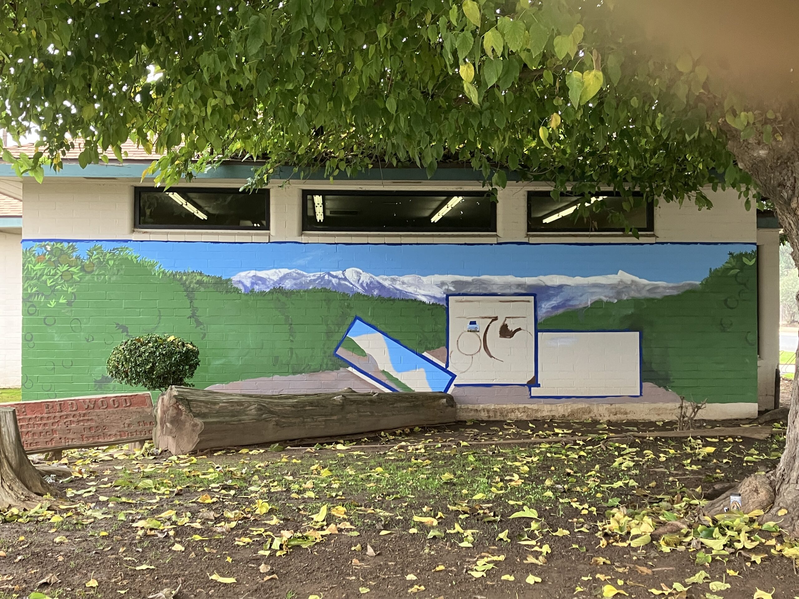
- I expected to paint on the Ivanhoe Library mural twice this week, but they are closed. Until/unless they provide a key to the building, I will only be painting on the days they are open. (I wonder if they regret not providing a key?) Good thing Rep found out for me, and that Intern is flexible.
2. The host of my website and blog billed me an enormous sum of $$$, an upgrade to Professional Hosting. Because I use DuckDuckGo, I couldn’t go onto my account and see what was happening. It took awhile, but when I figured out that I needed to use Safari to log on, I called the company and reached a helpful human. She said I’ve been paying for 20 GB of storage and am currently up to 46 GB. (I know, no speakie.) We worked out a compromise, where I pay about $250 less than the billed amount, which includes another year. I will begin deleting old blog posts and the photos in order to not exceed 50 GB. (I know lbs. but am unsure of GB, except that it is greater than MB, which is greater than KB. Took a couple of decades to get that far in my understanding.)
3. Deleting old blog posts is in my immediate future. Because I post 5 days a week and have been since 2008, that is a lot of material. Frankly, no one cares. Sometimes when I look at old posts, related to current post in order to link to them and perhaps get discovered by more readers, I then see that the photos are missing, or the format is wonky. 2008 seems new to me in terms of vehicles we drive, but in terms of the interwebs, it is just plain historical.
Well, that was a lot and kind of boring. Let’s look at an odd job that recently came my way. I get these from time to time because A. I am the only artist that many people know; B. I return phone calls and emails and follow up; C. My prices don’t scare people. Most people, that is.
But I digress.
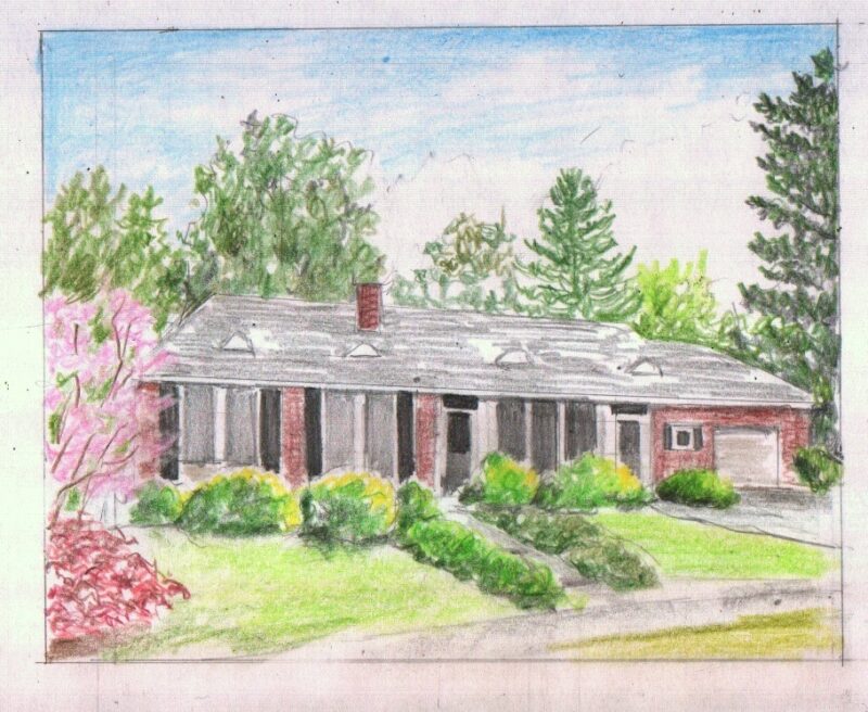
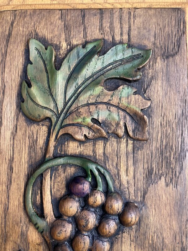
4. A friend has beautiful carved cupboard doors in his kitchen (I guess in his kitchen—I’ve not been inside his house). He had one extra, and decided it would look great as art on the wall. He asked me to enhance it.
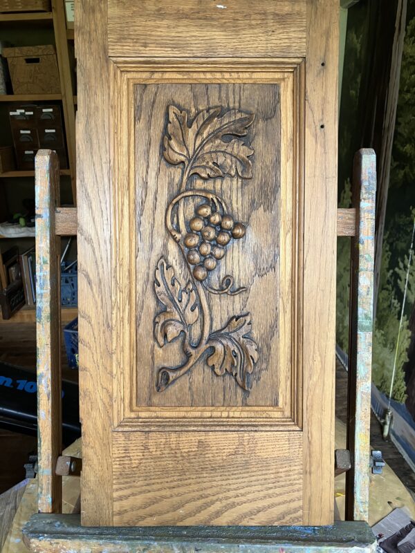
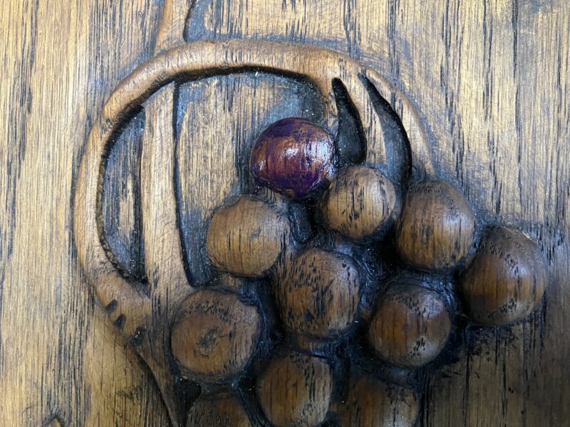
We weren’t exactly sure if this would work, so I sent some samples, in which I applied a little bit of oil paint, seeking his approval, and then wiped it off if it wasn’t fitting his vision.
First, a touch of purple was approved.
This green was too light.
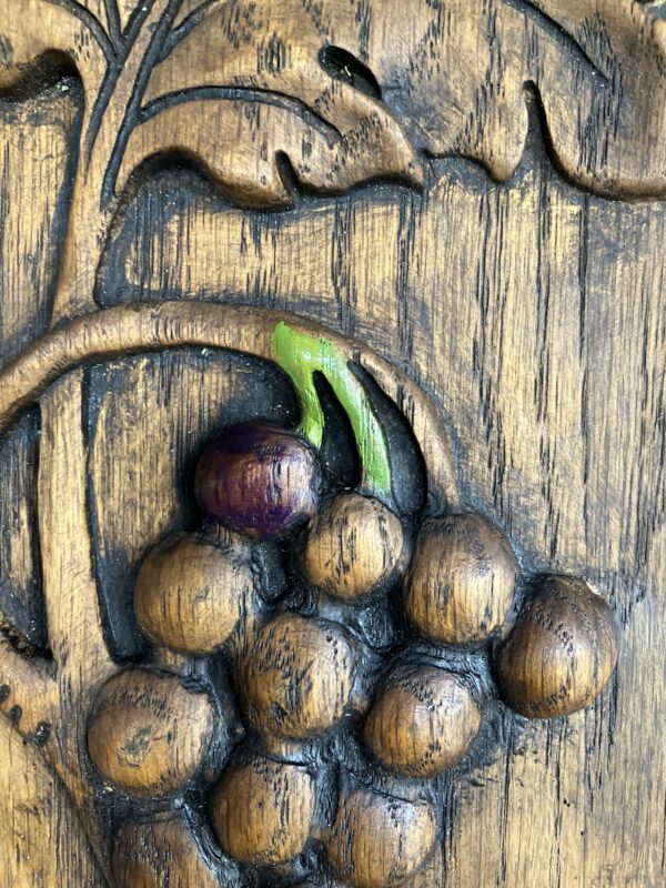
I wiped it off and replaced it with this one, which was approved.
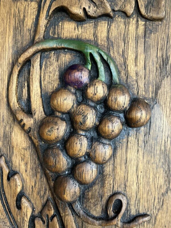
This was really fun—very subtle, transparent so the wood color and grain still comes through, and very forgiving.

5. My printer kept saying it was jammed. I practiced some insanity of following the unjamming steps over and over despite it not having any paper jammed in it, and then it began working again. I only had to go through the steps about seven times.
Tomorrow, on Christmas Eve (which follows Christmas Adam), I will continue the assorted thoughts.
Thank you, and Blessed Christmas Adam, Dear Readers.
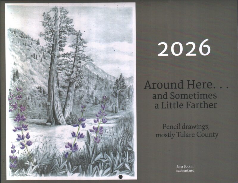
P.S. Calendars are still available. Look here for the info. Or email me here: cabinart [at] cabinart [dot] net. (Written that way because of internet gremlins.)
P.P.S. The Beginning Drawing Workshop is still open for registration. Look at this blog post from Monday for the details.