My Intern
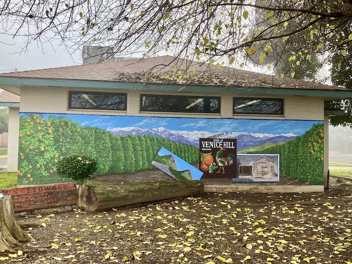
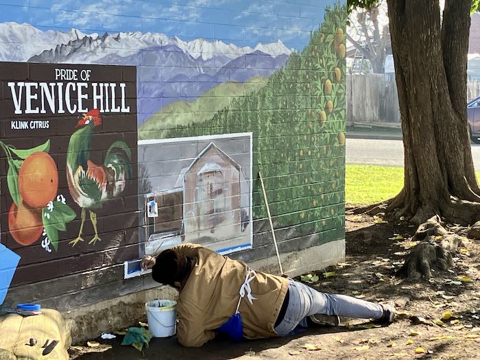
Today I am painting, progressing on the mural on the Ivanhoe library. I am writing this post before I have painted today, thinking ahead.
Each day I work on the mural, there are multiple decisions to make. In the past, when I’d get a little stuck, I’d pick a somewhat mindless task, such as taping off an area or applying a base coat. Since having Intern to help, I save those tasks for him.
Sometimes I invite him to step back with me to look at the whole picture. I ask him what he sees, we discuss the next steps, and often I ask him which task he thinks ought to come next. I ask him for 2 reasons: (1) to help him understand the thought necessary in the process of creating such a massive painting and (2) sometimes I have “decision fatigue”, which might be a euphemism for mental laziness.
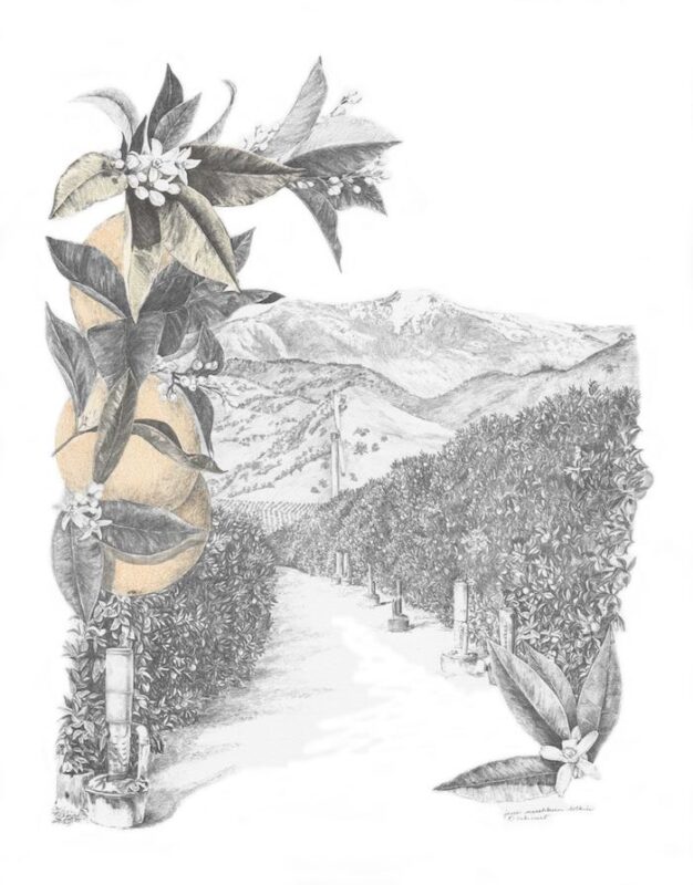
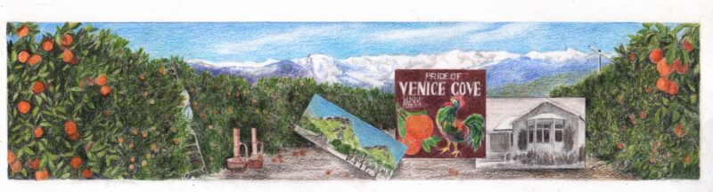
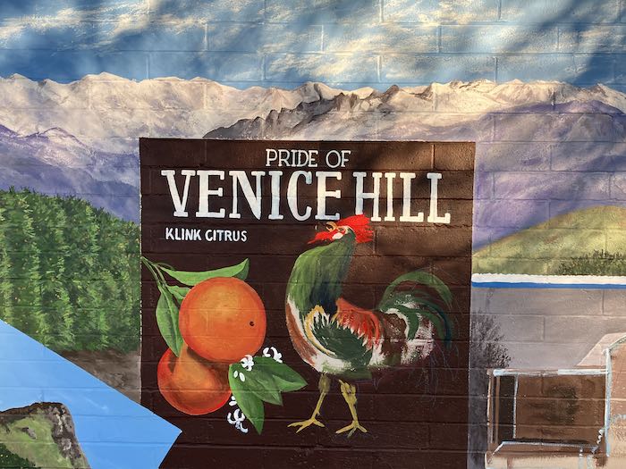
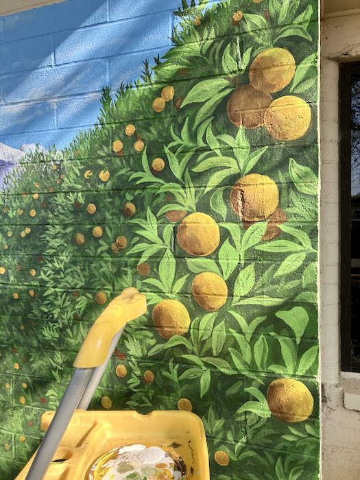
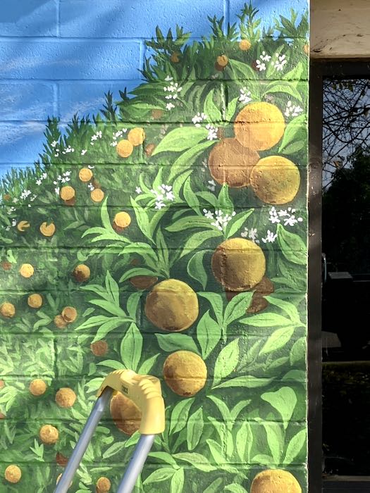
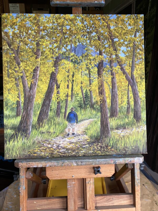
In anticipation of today’s work, I made a list of the next easy tasks, and in the process, I realized that his role as an active intern on this mural might reach an end today. What remains are tight detailing: the man on the ladder, some smudgepots, the rooster, tighter lettering, the auditorium, a wind machine, and perhaps a couple of surprises.
I wonder if he will still want to hang around while I work on these things. He might, he might not. More will be revealed in the fullness of time.
Someone Else’s Thoughts on Internships or Apprenticeships
The next two paragraphs are taken from Eric Rhoads, the prolific painter, writer, workshop and convention coordinator and leader—the man who led the weeklong plein air retreat in Monterey that I attended in October 2024.
“. . .that’s exactly how the masters worked. Apprentices would paint backgrounds, grind pigments, even paint entire sections of ‘the master’s’ work. Collaboration wasn’t a buzzword; it was how things got done. Raphael had an entire workshop of apprentices painting from his designs. Was it still “his” work? The Renaissance said yes. Our modern obsession with individual authorship would have confused them.
When I let those kids paint on my canvas, I wasn’t risking ruining it. I was enacting a centuries-old tradition. And more importantly, I was doing what those Renaissance masters did: passing it on. Because here’s the secret they knew and we’ve forgotten — art isn’t about the final product. It’s about the transformation that happens in the making. —From Eric Rhoads
In case you were curious, I kept track of Intern’s hours and paid him last week. I will pay him for his remaining hours of working, but not if he chooses to simply observe. He was shocked by the check, slightly insulted when I asked him if he knew what to do with a check, and felt unworthy, as if he owed me something in return.
I reminded him that he gave me some hours of his life, I gave him the equivalent of green pieces of paper with dead presidents’ faces on it in exchange, and we were even.
I Wonder
How many more Fridays will it take to complete this? Should Intern’s name go on the mural? Will I be able to do all those details without his excellent eye and honest input? Will I be able to help him find a steady job? Will he go on to paint a mural of his own? (He is into videography more than 2-dimensional art.)
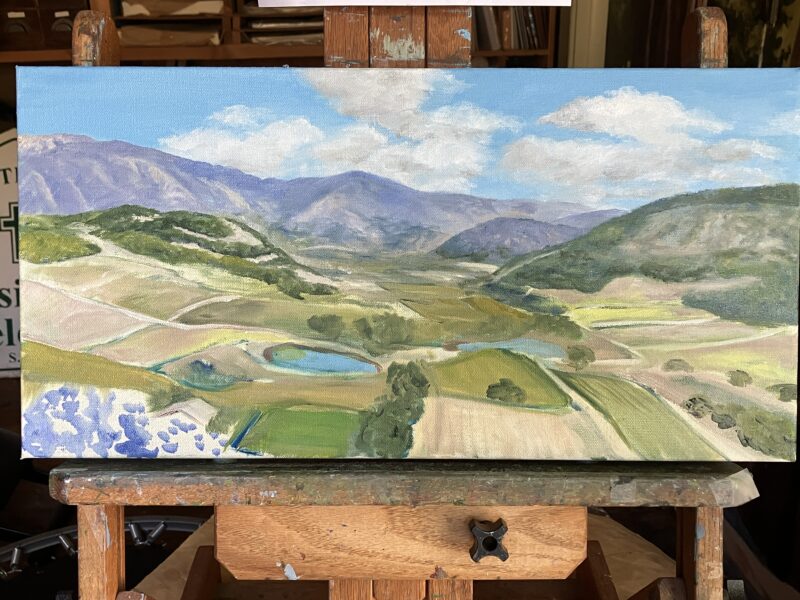
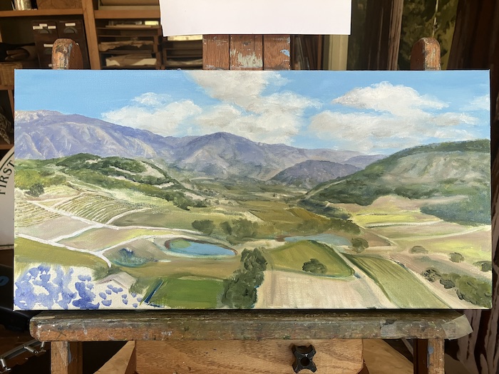
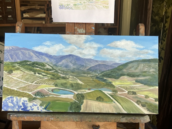
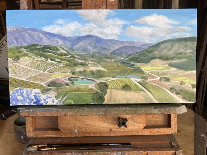
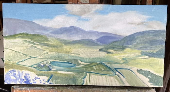
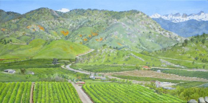
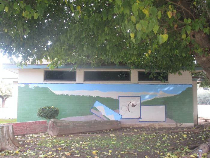
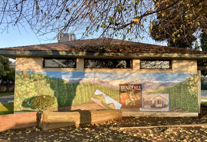
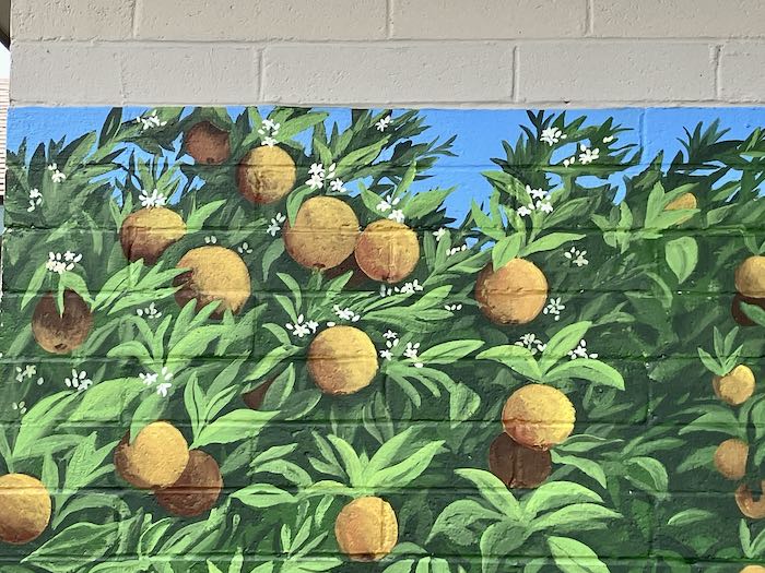
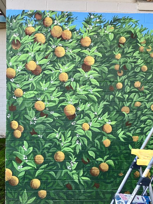
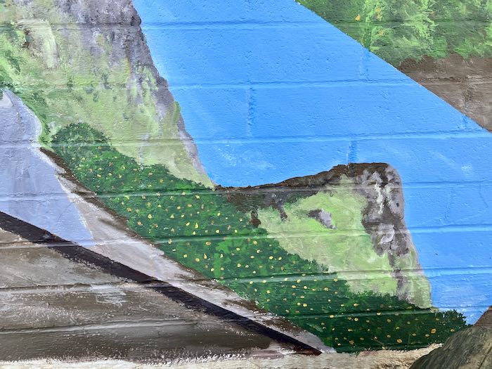
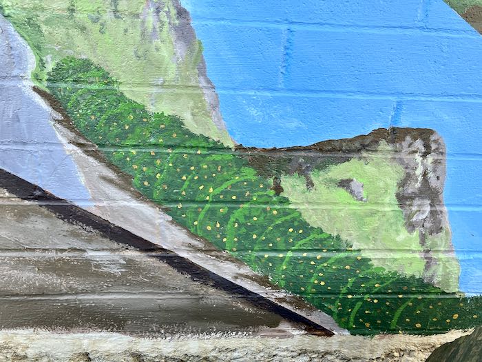
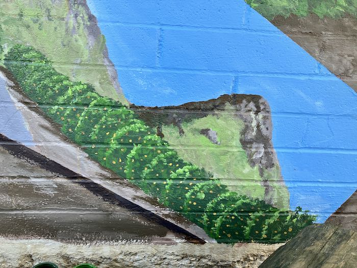
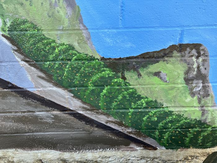
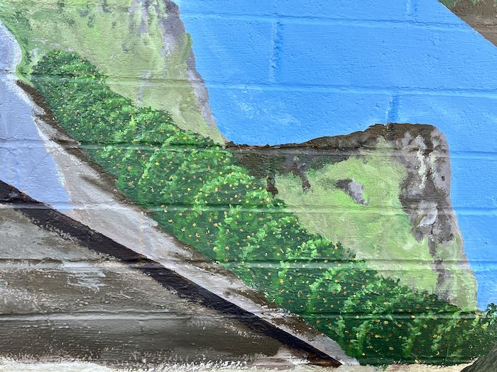
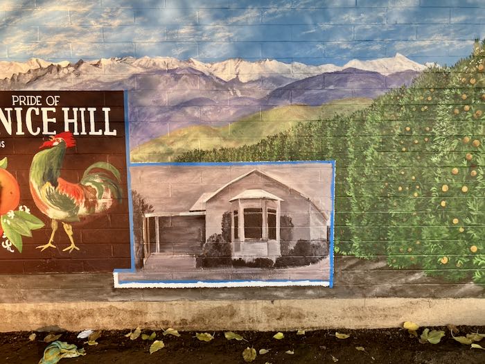
Look how far we’ve come in ten days of painting!
The end of Day One:
The end of Day Ten:
Enough bloviating for today. Come back Monday to see how close we are to the end of this most satisfying project.