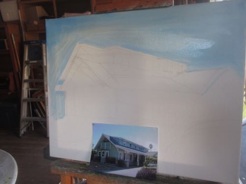
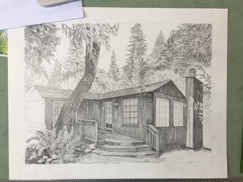
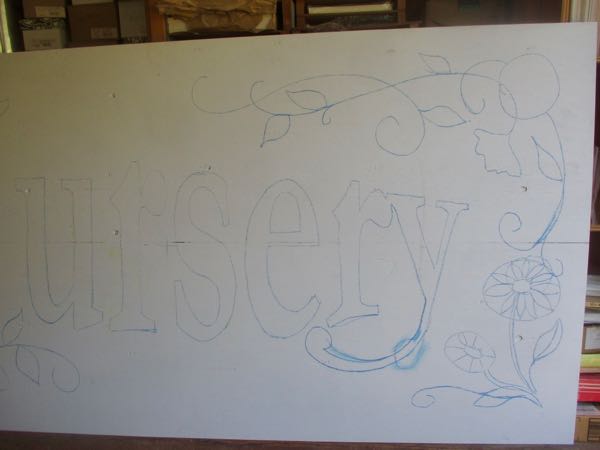
My friend/customer/web designer Forrest requested a large painting of a cabin. He searched for several months, until he came up with a photo that he declared to be “IT”. Alas, he was not the photographer, and I just can’t be copying people’s work without permission.
No no no no, I can’t copy no more, I’m scared of waking up in the courts. No thank you, please, it only makes me freeze (with fear), and then it makes it hard to face the Lord.
Forrest contacted the photographer and got permission!
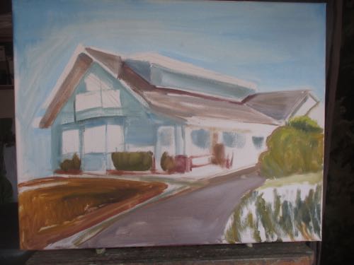
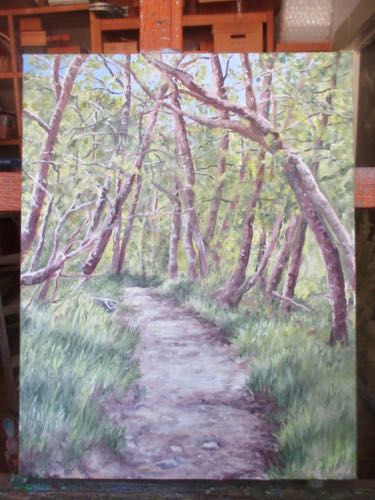
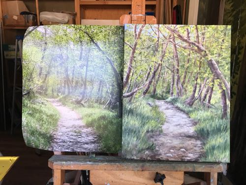
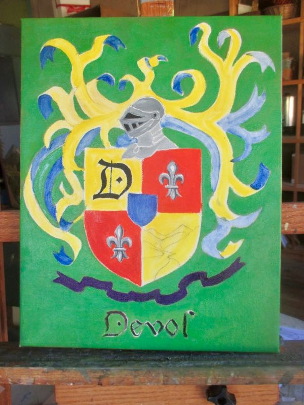
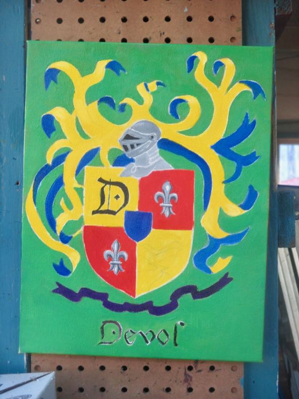
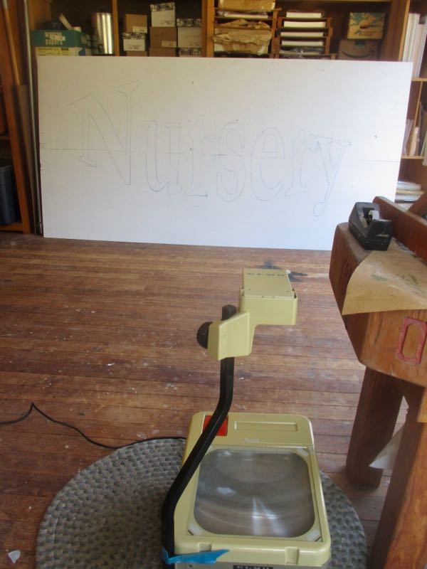
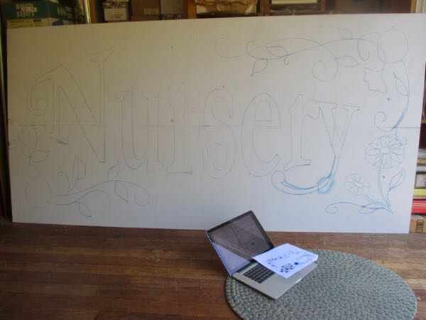
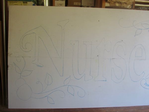
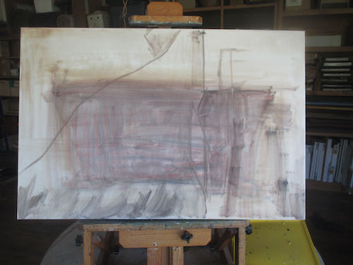
So, I started. He said it would be fun to see the progress, and I decided to include you all in on the fun. I also told him to not be scared, because they all start out ugly. Forrest’s Nightmare Cabin, perhaps.
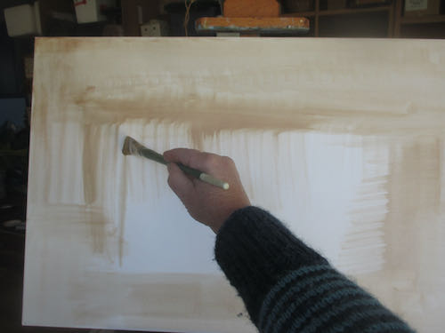
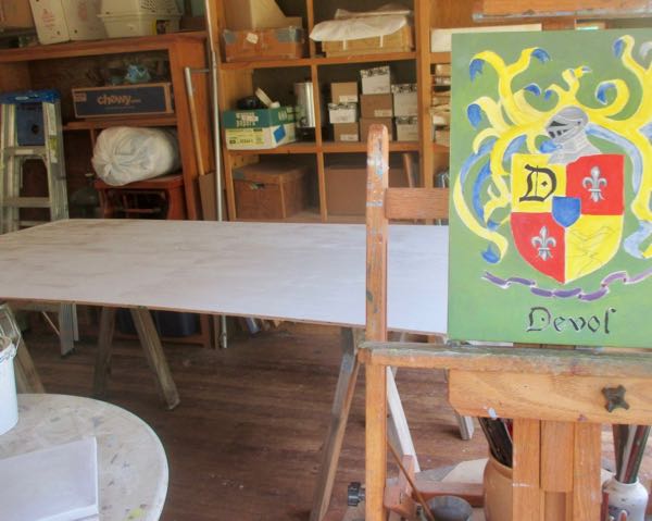
Yeppers, it is sideways. Easier to reach the top of this 20×30″ commissioned oil painting. Remember,
I use pencil, oil paint, and murals to make art that you can understand, of places and things you love, for prices that won’t scare you.
(except that the beginning stages might scare you.)