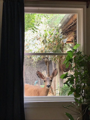
This sort of smoky light means it is hard to see to paint, but if I open the doors for better light, then it is hard to breathe. So, I get to spend another day in the studio with my pencils. (I love to draw – did you know that?)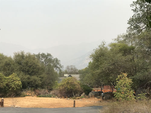
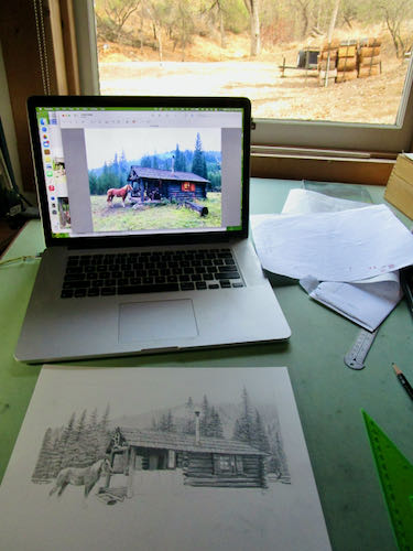
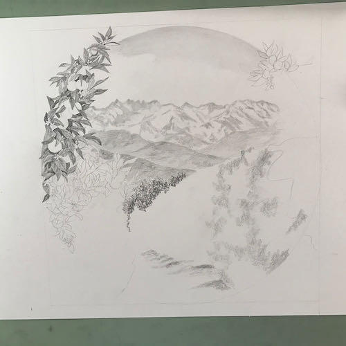
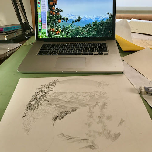
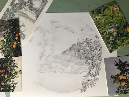
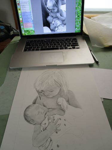
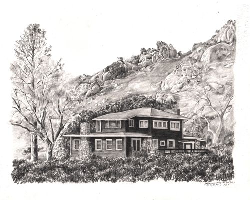
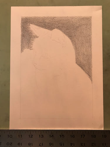
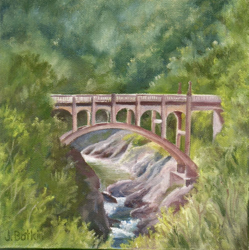
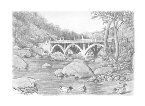
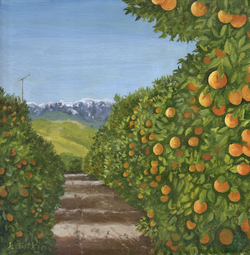
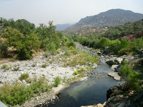
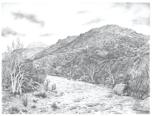
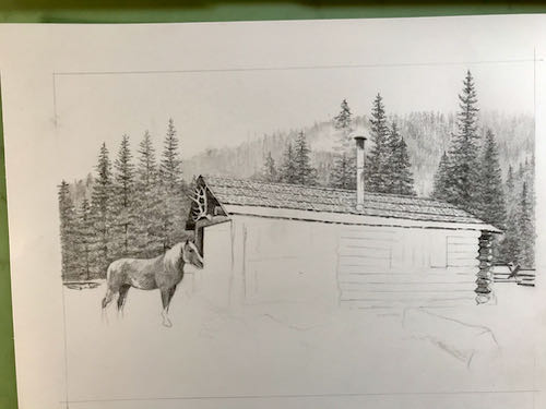
This is a large collage drawing, a commissioned piece 14×18″, that will incorporate 3 different scenes. In designing, I tried something new – I used photoshop instead of doing sketches. I sent the customer 2 versions and she chose this one.
Here you can see the faint outline where things will go. I started at the top on the left, because as a right-hander, this helps to cut down on excessive smearing.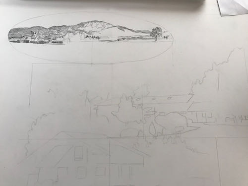
Setting it up took as long as getting it to this stage.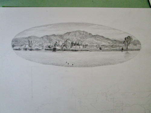
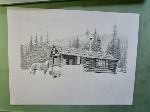
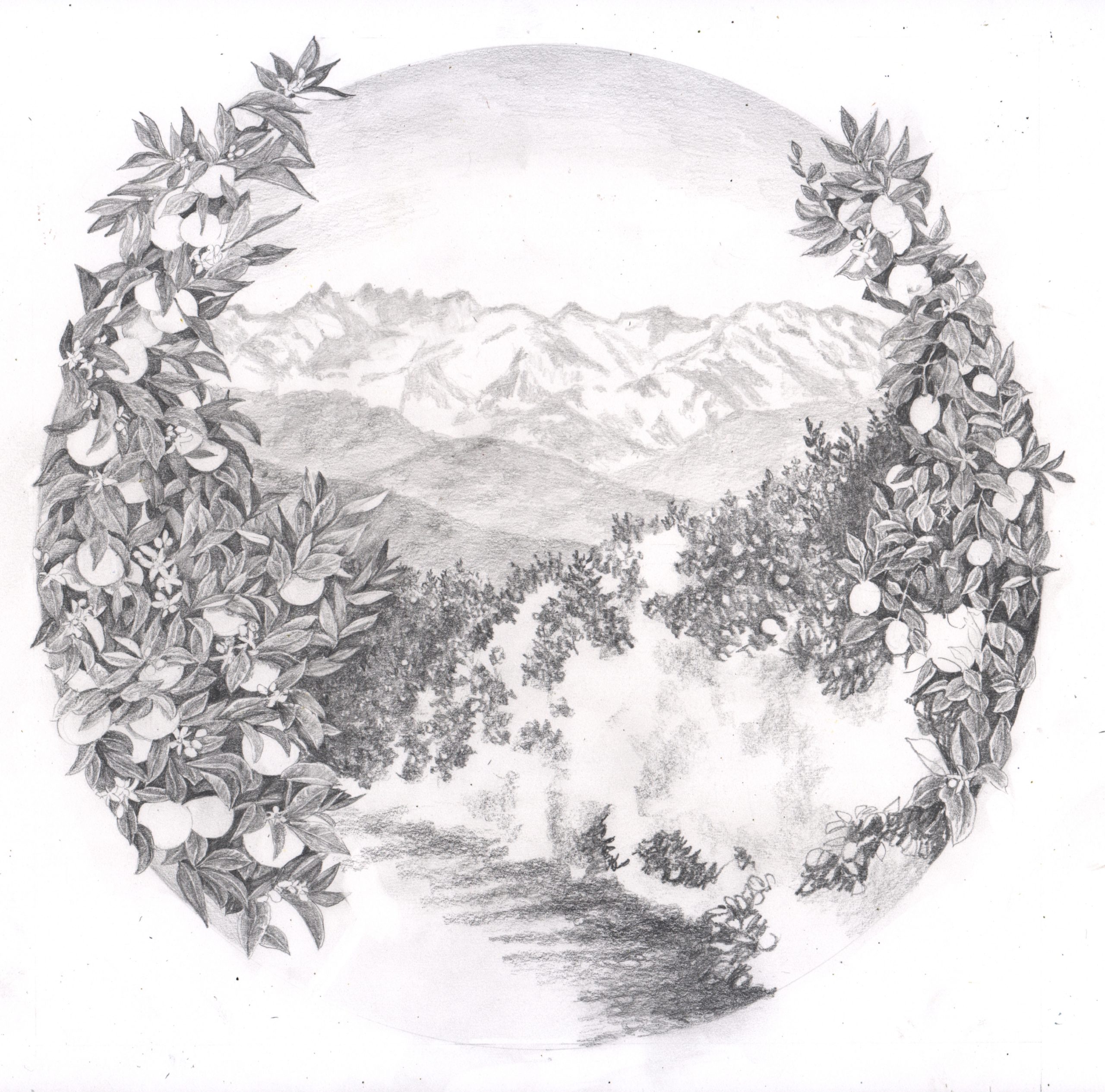
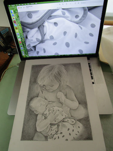
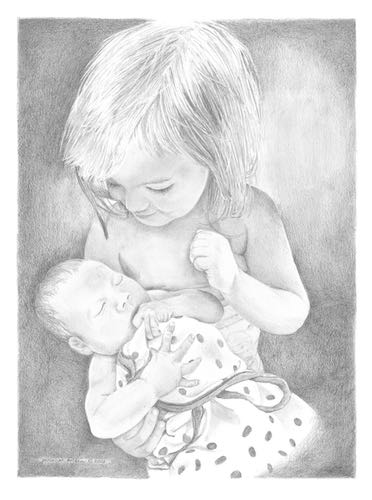
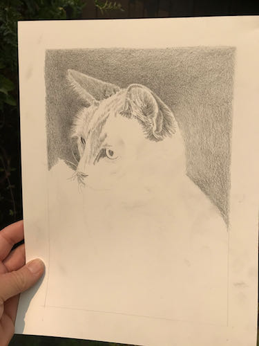
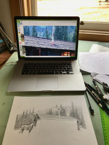
I had enough time to begin the next segment.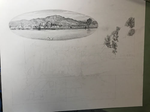
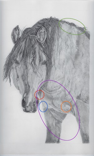
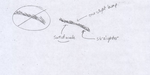
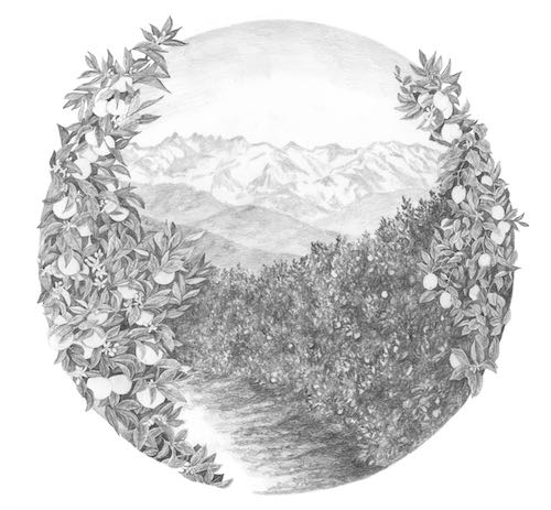
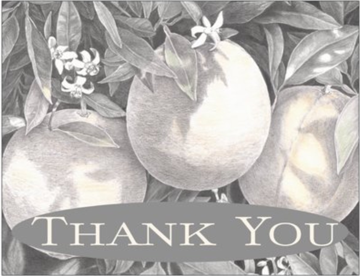
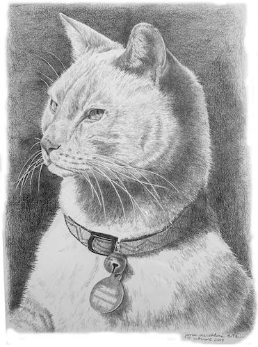
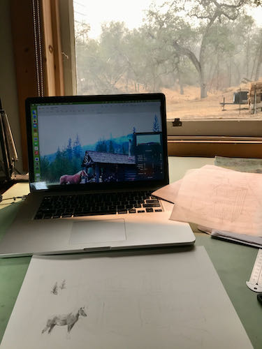
Next, I heard from the customers on the lengthy logo design project. Calling it “lengthy” is not an insult; this is a very challenging job, because the customers have been without a logo since 1980, logo design isn’t my strongest skill so I am slow, and together we are carefully working out the best design possible. This is the next piece in the puzzle.
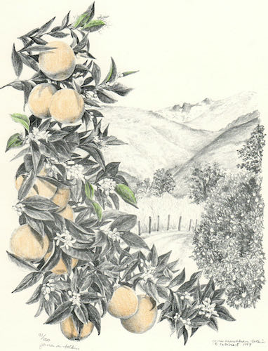
I used an old (1997) drawing as a place holder, drew a new picture for them, and then we discovered that the old drawing was a better match. Alas, it wasn’t very well done. Well, it was fine for back then, but I was barely out of my Primitive Era in the last century. So I drew it again, and this time I added lemons, along with other improvements that probably only my drawing students will be able to appreciate. But I want this to be The Very Best Possible for my customers and not an embarrassment to my artistic reputation.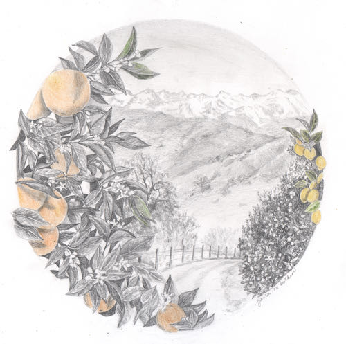
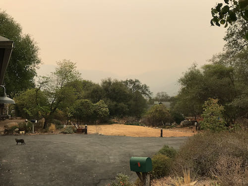
Hey look! It is clearing up! I could tell that something was taking place outside because there were some helicopters overhead, and they made the drawing table vibrate.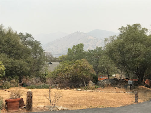
See? Clear as a bell!
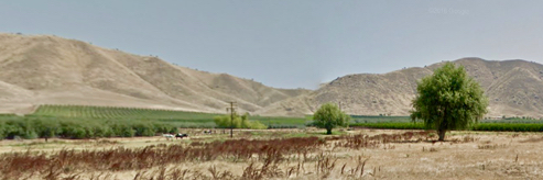
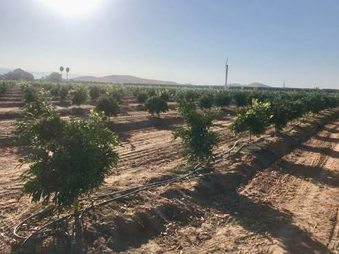
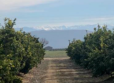
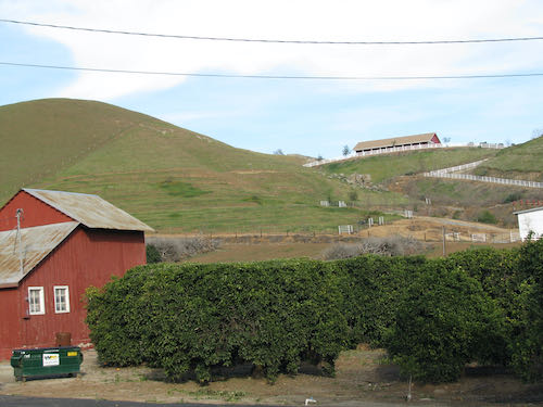
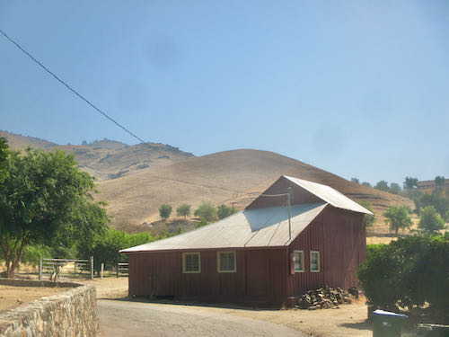
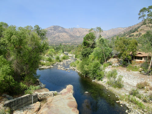
Not. But clear enough for air support as the fires continue to rage through Sequoia National Park and fill Three Rivers with worry, smoke, ash, fire equipment, and fire personnel.
If you are someone who talks to God, please keep praying for good slow soaking rain without any lightning.
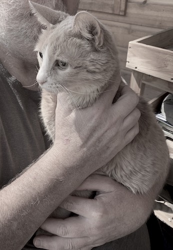
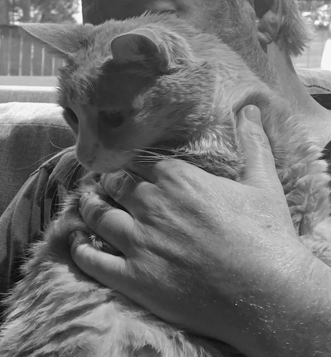
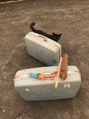
 That was one alert cat!! When I was taking his photos, I reached out to touch him. He pulled away in a very subtle but arrogant manner. Made me laugh.
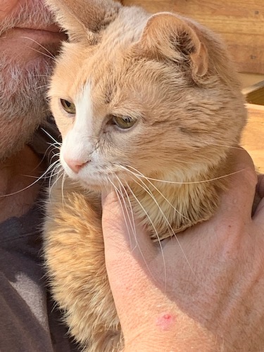
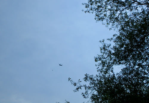
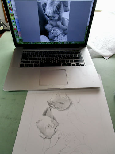
 I drew most of the afternoon while listening to helicopters overhead, a welcome sound after they were silent throughout the smoky and worrisome morning.