Happy Birthday, Shirley Goodness!
November is the busiest month of the year for my little art business called “Cabinart”.
This is a long post and it might make you tired. Better grab some coffee before settling in.
Here’s a little sampling for you.
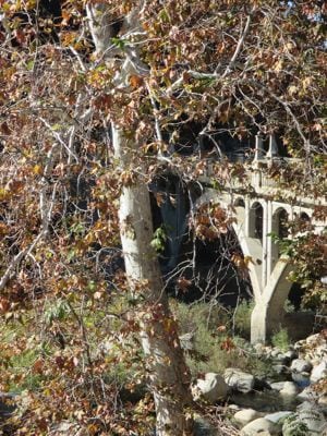
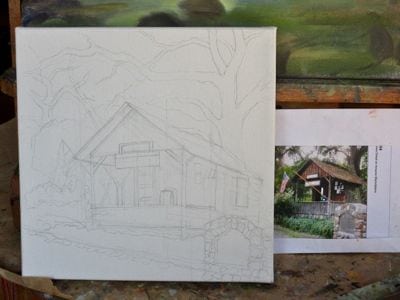
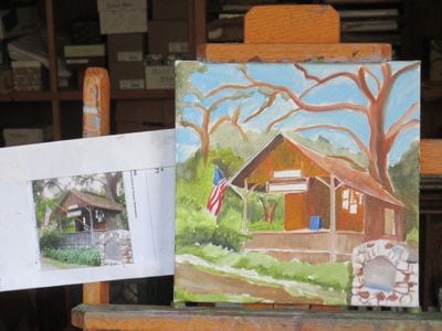
Friday a.m. was a meeting with our state assemblyman, Jim Patterson. It was at the Gateway Restaurant, which is just upstream of the Gateway Bridge. That bridge is the bigger brother of my favorite bridge (three arches instead of one), so of course I had to attend the meeting near it. It was sort of a family reunion to visit the Gateway Bridge; wouldn’t you agree?
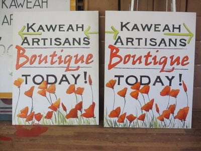
I got home with a little time to work on these signs. You can see the evidence of a minor paint accident.
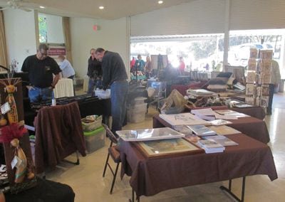
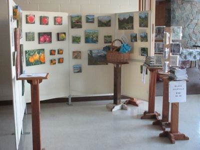 Then it was time to head over to the Remorial Building to set up for the Holiday Bazaar. “Remorial” is how we say “Memorial” at our house. We learned it from our neighbor when she was about 6 years old.
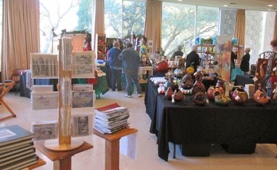
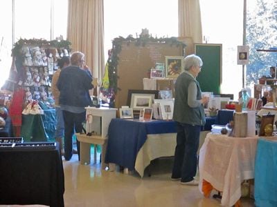
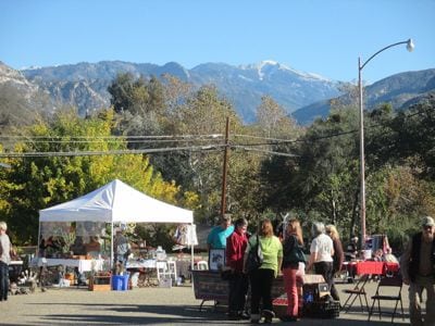
The show was a booming success on Saturday. You can see it was a gorgeous day in Three Rivers for this annual event.
I got home in time to shove everything into the workshop and studio and head to church for the annual Harvest Festival. Details aren’t relevant to the content of this blog, but suffice it to say that the overlap of dates really kept me running.
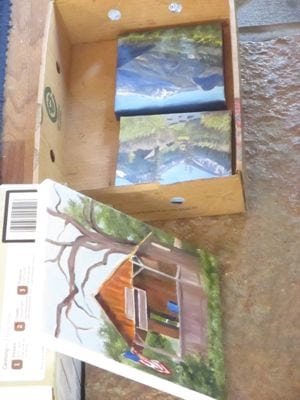
While shoving things into the workshop, I was reminded of work that awaits.
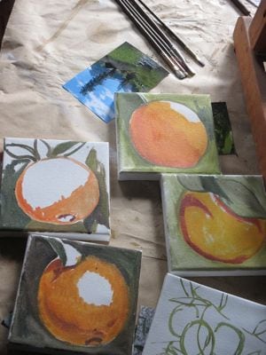
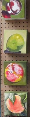
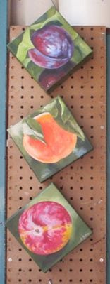
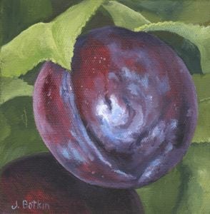
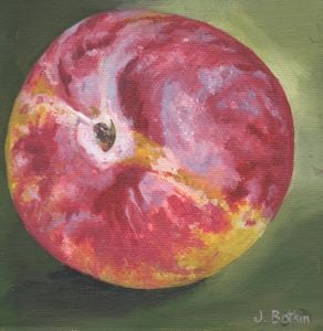
These paintings were drying in the house by the wood stove. They need to be ready for the next boutique in 2 weeks.
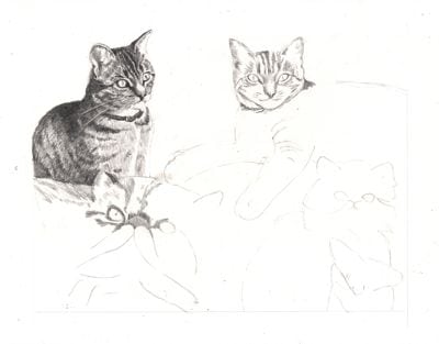
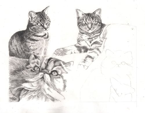
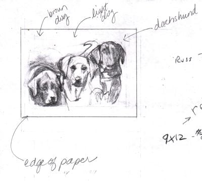
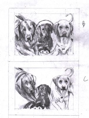
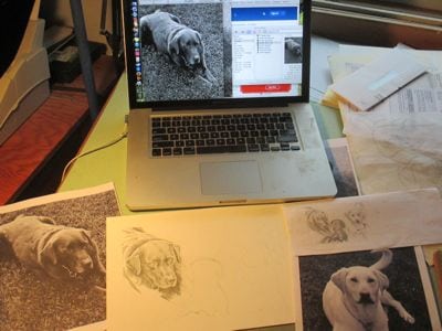
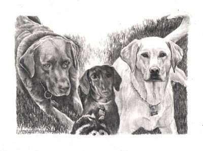
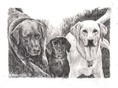
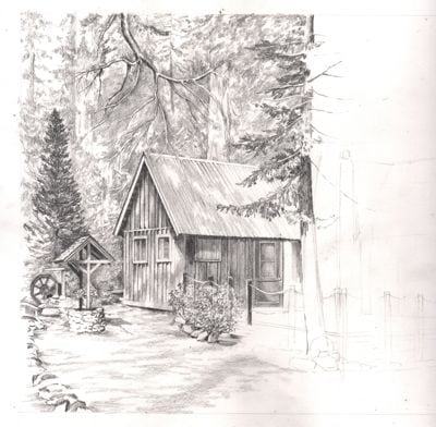
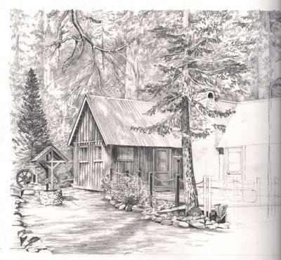
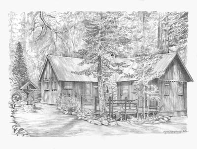
Meanwhile, a commissioned pencil drawing is ready to be started.
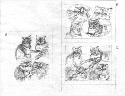
(The customer chose C. He already knows I can draw, so no one needs to call a veterinarian for these kitties.)
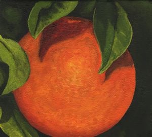
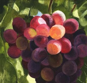
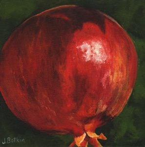
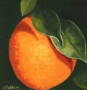
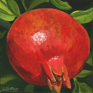
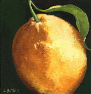
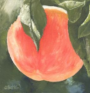
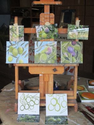
And, this is first time I have painted olives. These are commissioned oil paintings, as are the oranges. I think the olives are so beautiful that I ordered a 24×24″ canvas and plan to do a large painting of olives when things calm down a bit.
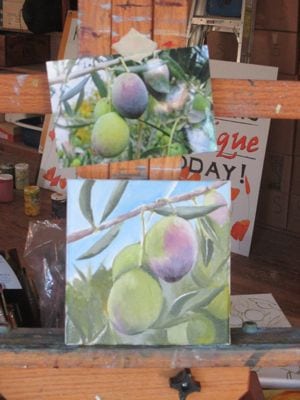
It won’t be this exact arrangement. Instead, after the other 5 paintings are finished, I will figure out the best parts of each and make a new design.
Meanwhile, I might need to go lie down for a bit.
NOPE. This is the harvest season, and during harvest, farmers don’t climb out of their pick-ups and go home for a nap. I am a farmer’s daughter, and I can and will push through. What’s more, I am really enjoying this season.
Is there any other job in the world with this much variety and activity and autonomy and chance for creativity?
P.S. Thanksgiving is coming quickly, I’m planning for an oil painting workshop for my advanced drawing students, have jury duty soon, am looking for a date to schedule private drawing lessons for 2 busy girls, got another commissioned pencil drawing to design and complete in time for the customer to have framed before Christmas, and practice for the church’s Christmas musical is heating up. (No, I don’t sing – I can read music, listen, and push buttons, so I run the sound board.) Also been asked to participate in a skit (I said no), judge an art contest (said yes, but keeping it anonymous) and go shopping for Operation Christmas Shoebox (just took the easy way out and wrote a check.) No nap for this little gray duck. Please pass the chocolate (the darker, the better.)