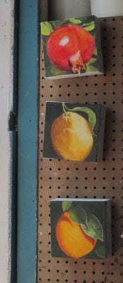
My friend/customer LOVED these paintings, including the extra thick canvases. Yea!
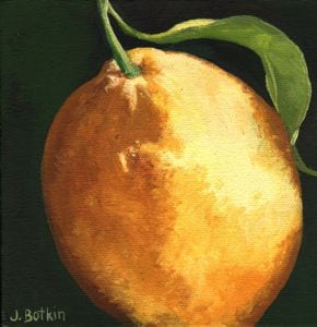
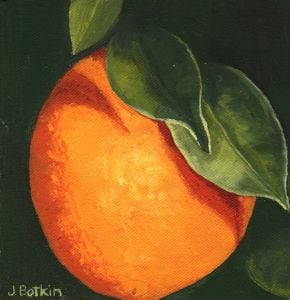
However, I studied the orange painting and realized it isn’t symmetrically round like an orange – it is squished on the left side.
Back to the easels. . .
My friend/customer LOVED these paintings, including the extra thick canvases. Yea!
However, I studied the orange painting and realized it isn’t symmetrically round like an orange – it is squished on the left side.
Back to the easels. . .
Do you ever wonder about the origins of sayings such as “jumping the gun”? That is an easy one – it refers to racers (horses? people?) who take off before the starting gun.
In commissions, the “starting gun” is when the customer pays 1/2 down and we decide exactly what she wants. A conversation alone is not the starting gun.
I have had a recent wonderful reunion with an old friend (we are actually middle-aged, not old, and think we met in 4th grade but can’t remember). She expressed an interest in some fruit paintings. We didn’t decide anything for sure, and I didn’t even have the right sized canvases.
But, I’m having a hard time focusing and pushing through and following up. Sometimes life is hard, and it robs one of the ability to do everything one normally would do. Sometimes when life is hard, one just takes the easiest route.
(LBWR, feel no obligation for these 3 paintings – I just felt like tackling the project even though the canvases are thicker than the ones you saw and we didn’t cement the final look. If they don’t suit you, I’ll schlep them around to my fall shows, and I will still paint yours however you would like.)
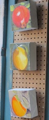 First pass – wow, these are thick canvases.
 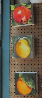 Next, effort into the orange because it got short shrift last time.
 Looks good, and the colors are easy to morph into lemon colors.
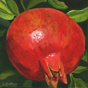
 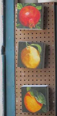 Wow, that pomegranate looks awesome, if I do say so myself.
“If I do say so myself” – where did that ludicrous saying originate? I did say so, myself.
LBWR, what do you think of these? I will be painting the sides dark green so they won’t need frames.
This is my real blog. The Cabins of Wilsonia is my other blog. Sometimes I am confused as to which posts belong on which blog.
After seven years of blogging, my default position remains here. Sometimes I have to remember that I have another blog, now that The Cabins of Wilsonia is a published book and I’m not obsessing about it daily.
So, today and next week you are invited to my Wilsonia blog to read about a commissioned piece.
The title is “Incompetence and Awkwardness”.
Does that pique your curiosity?
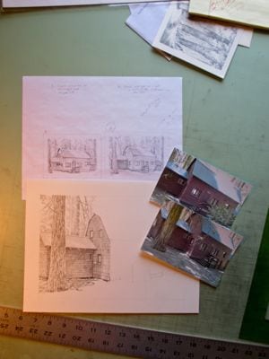
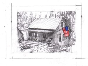
As I began the previous commissioned pencil drawing of a cabin, another customer notified me of his decision.
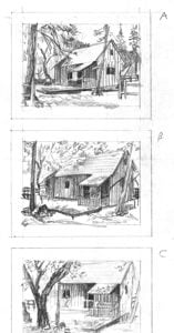
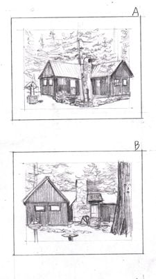
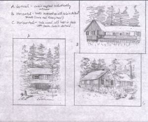
A, B, or C?
C!
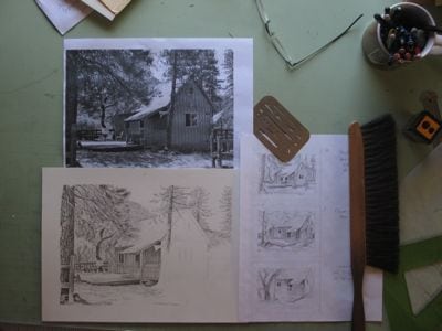
A pencil drawing commission customer made a decision about which view to have me draw of her cabin!
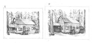
A or B?
B!
What appears to be a slight difference between the 2 views matters to the customer. I am here to make the customer happy. She knows her cabin; I do not.
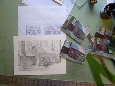
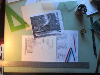
So many pencil drawing commissions are awaiting decisions. I’ve sent sketches and more sketches. Can’t start drawing until I know what the customer/commissioner wants!
Sketches, called “thumbnails” or “thumbnail sketches” were required in most of the assignments in art classes, both in high school and college (I went to 4 different colleges – a full-fledged Transfer Student) More often than not, I had one good idea, and the rest of the sketches were just a waste of time, mindlessly fulfilling the assignment. The reason for the sketches was never clearly articulated – just do it because the teacher said to do it. (As a Questioner, I despise that sort of “teaching”.)
Now that I am a professional artist, I know that customers need to see things sketched out because photos don’t do the trick. People also like choices, but not too many.
Too bad the “teachers” didn’t teach us how to guide a customer to a decision. My cynical mind says this is because those “teachers” never had any customers. They only had teachers, giving them time-filling assignments.
COME ON, PEOPLE, DECIDE, PLEASE? Please? pleeeeeeese? I really want to start drawing!
Remember these wildflower oil painting beginnings? First, I drew them with my paintbrush.
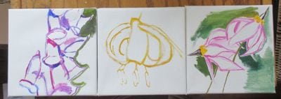
Stage two was to get the first layer of color down.
The real fun was putting in the detail.
It isn’t often that I get to paint with these colors, and it just makes my heart sing.
Lalalalalalala! LALALALALA!
Excuse me. Got a little carried away with that purplish-pink.
Now I just know you are singing too!
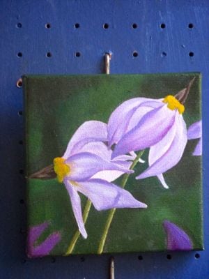
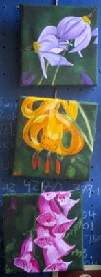
Top to bottom: Jeffrey Shooting Star, Leopard Lily, Foxglove. Yes, I know foxgloves are not native flowers around here, but they certainly go wild!
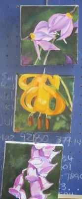
These are commissioned oil paintings of wildflowers. When they are dry, I’ll sign them, then scan them, then probably wrap and deliver. (It’s a wrap – another wildflower song in the can!)
Commissions – orders to make a custom item, following the wishes of the customer.
I’ve been asked to do 3 custom flower oil paintings, each 6×6″. Three makes it easy to find a place to hang, either vertically or horizontally. Or, they can be set here and there without having to locate wall space.
This is a special commission, but I am not free to share the details until some time in August.
Let’s get started!
Foxglove, Leopard Lily, Jeffrey Shooting Star.
I thought I’d just outline the shapes and wait until another painting session to begin the layering process.
I thought wrong. This is WAY too fun to wait!
These look almost finished, but if you saw them up close, you’d see that the paint coverage isn’t thick enough, the details (leopard’s spots and foxglove’s freckles) are still missing, and obviously, the edges of the canvas need to be painted.
The customer doesn’t need them until August 8. I want them to be PERFECT, signed, dry, scanned, and varnished.
I am not a procrastinator. Deadlines are best dealt with head-on, immediately and without delay. Then, if there is a snafu, there is time to fix things. Often there are snafus, but that is another subject for a different post.
Or not. I’ll just wait on that. . .
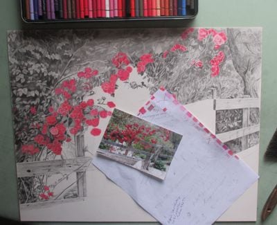
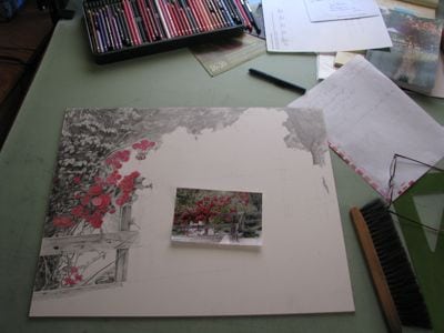
Progress? I’ve been drawing, so something must have grown here.
The gate! I did the gate! With all those intangibles and texture, I needed to try something that had a definite shape and edges.
I set up the drawing and stepped back. It needed a sense of a path beyond the gate, so I scribbled in where it should go. Also darkened a couple of things, which may or may not even show.
The fence boards – I can do those! They have a beginning and an end, with definite edges. They cover a decent amount of real estate on this 16×20″ claybord.
Yea. Progress. Cartwheels of joy.
P.S. I’ve never done a cartwheel in my entire 55 years. It is a figure of speech, an expression of elation. Feel the excitement?
P.P.S. I think this drawing is really pretty, and seeing it here on the blog helps me want to continue it to completion instead of procrastinating and daydreaming about the book I am reading right now.
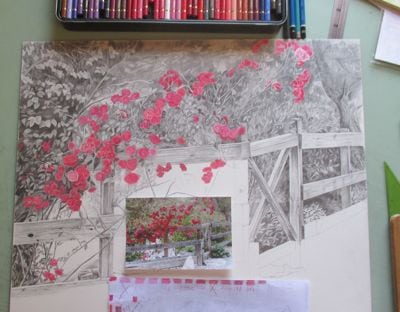
This project is difficult and slow, oh so v e r y s l o w.
I often tell my drawing students, “You can be fast or you can be good. I get to be both.”
Not this time. I am S L O W. Or perhaps it is the claybord that is slow. Or the drawing. Nothing ninja crazy here.
Want a closer look?
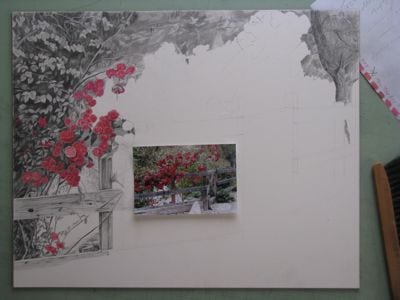
The good part is that I don’t have to duplicate every rose and every leaf. The bad part is that I can’t see very many individual roses and leaves, so I have to make up much of it.
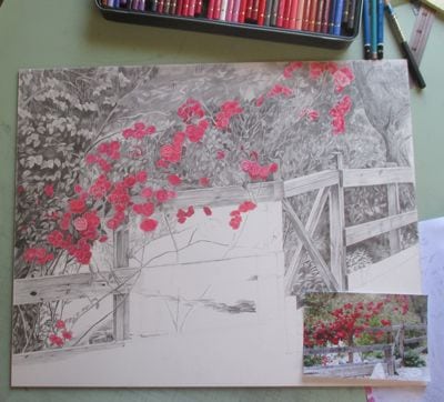
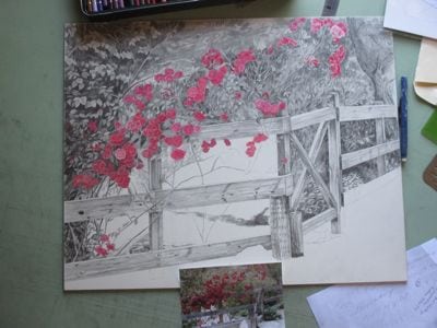
Not gonna quit!