After a chunk of time away from the easels, I was very happy to return.
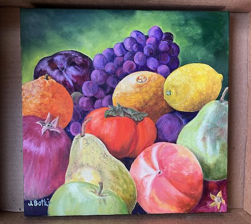
First I got to finish the fruit painting that will be a gift. (I will be GIVING it, not “gifting” it.)
This is wet, photographed here in the box I used to carry it into the house to dry.
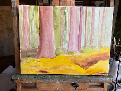
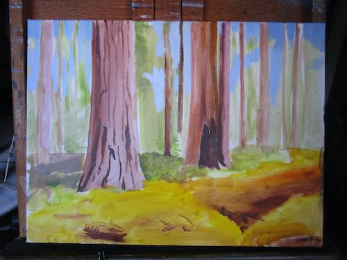
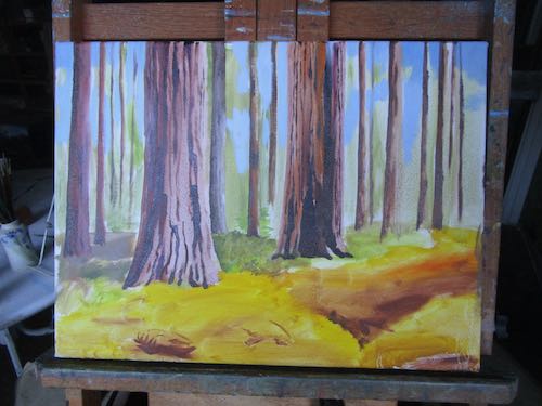
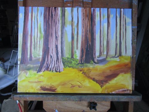
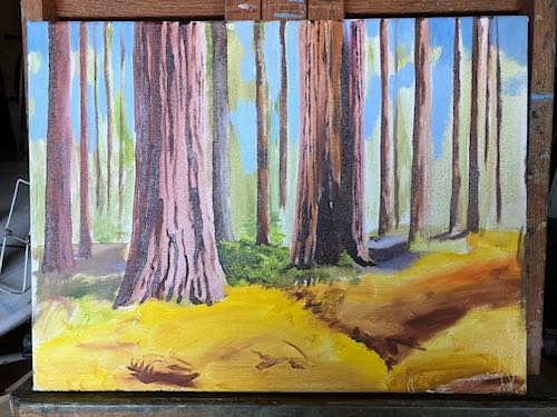
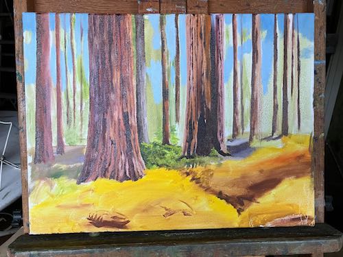
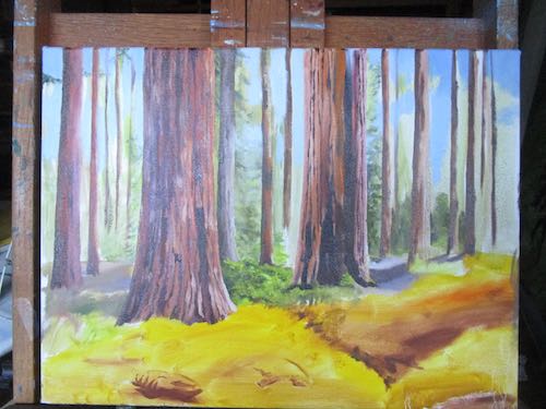
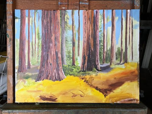
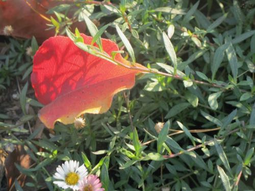
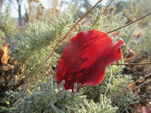
I started this quite awhile ago, working from a photo shared with me by one of my drawing students. The ferns had been nipped by frost, turning them golden.
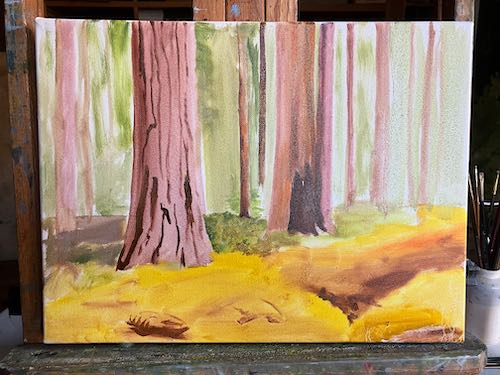
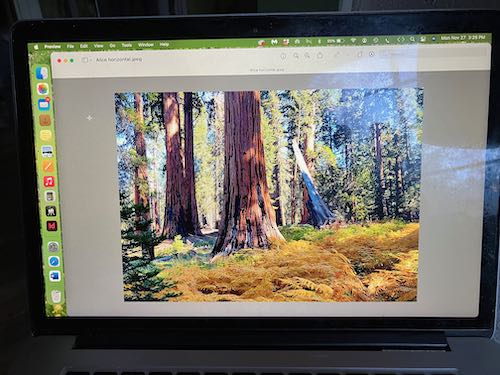
Although I am working from a photo, I am rearranging the trees. Here is a photo of the photo, which I am looking at on my laptop while painting.
My hope is to make those ferns perfect. Just perfect. But there is lots to be painted before I get there.
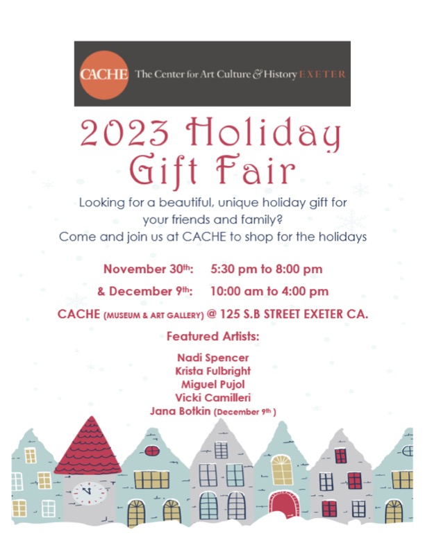
The new paintings won’t be at the Gift Fair but there will be plenty of merchandise to choose from.
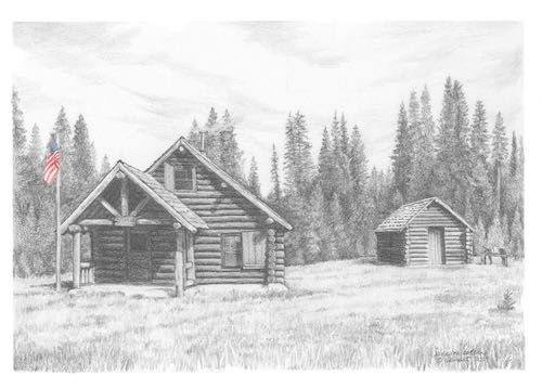
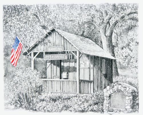
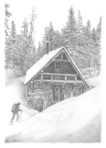
UPDATE: All packages except the Pear Lake Ski Hut have sold.
There are so many opinions about whether or not artists should put their art on sale. I’ve done this in the past with old drawings that are doing me no good in my flat files. I’ve never done it with notecards until now.
Why now? Because when I did inventory of my many designs, there were some that aren’t big sellers and only have a few packages left.
I have minimalist tendencies, and it is an easy thrill for me to get rid of things I am not using. By “get rid of” I mean sell, give to someone who can use it, donate to the local thrift shop (called “The Thingerie” in Three Rivers) or to the Good Will in Visalia (in case the item was a gift from someone in Three Rivers), or if it is truly worn out, toss it. (Yeah, yeah, recycle, sometimes that works too).
The normal price is $10 for a package of 4 cards. The sale price is $6. The sale lasts through the end of the year, for no reason other than the website asks for an end date to a sale.
Will I take these sale packages of cards to the Holiday Gift Fair? Might, might not.
Occasionally I feel the need to blow off some steam. Today is one of those occasions.
A friend once told me that editors are guardians of the language. Someone certainly needs to be—look what is happening to the world of communication.
Have you noticed that everyone is advised to “do research” now? No one I know is actually conducting experiments to learn what works or interviewing witnesses to learn what is true. Instead, we cruise through the internet, looking for opinions and ratings. How did we learn about products, services, current events in the olden days??
When did people stop being crazy about things, or simply enthusiastic, and become “passionate” about whatever topic they are pursuing? Did everyone read the same marketing material, the instruction manual on how to present oneself as sincere, earnest, and genuine? Someone has said that the secret to success is sincerity, and once you learn to fake that, you’ve got it made. Now it seems the secret to success is to declare that one is “passionate”.
When did giving become “gifting”? The verbization of nouns really bugs me. I personally do not “gift” people; I give to them.
Why did we stop graduating FROM places and now simply graduate places? Who started this ridiculousness?
When did “literally” lose its true meaning and come to mean its very opposite, “figuratively”? “I literally shot myself in the foot.” Oh yeah? How are you walking these days? Maybe you should have taken gun safety training more seriously.
Why do so many otherwise well-educated people insist on using the article “an” in front of the word “history”? It begins with a consonant, and the proper indefinite article is “a”. Really, I have noticed that those who have advanced degrees seem to be the most guilty of this. Maybe they think the real way to pronounce “history” is “istory”.
As you can see, I am passionate about language and have been since graduating high school, an historic event now; I literally have lost my mind doing research on the best ways of gifting you, my blog readers, with this vital information.
If you aren’t too disgusted by my diatribe, perhaps you will benefit from this information about the upcoming Holiday Gift Fair. (This is the proper use of the word “gift”.)
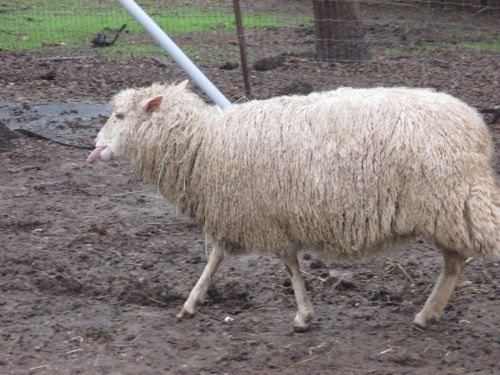
1. There is a new(ish) brand of ice cream called ReThink, made from milk high in A2 protein which is easier to digest. This is the same protein that is in goat and sheep milk. I read about this in the Farm Bureau newsletter (thanks, Mom!) I haven’t tried it; it probably isn’t available in Tulare County.
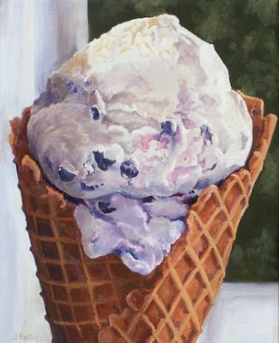
Worth it!, oil on panel, 8×10″, SOLD
2. California Fair is an insurance company that only provides wildfire coverage; if you need more than that (well, duh, yes), you have to find supplemental insurance. And no where in California is it possible to get coverage against snow damage; to add insult to injury, insurance companies will always fight you if a tree damages your home or cabin, blaming you for not removing a diseased tree. (This is why we need to think about good things like ice cream.)
3. The time changes are dangerous, and some big companies do special training (one company calls these “safety moments”) twice a year to help their employees adapt.
4. There is a creepy stalkery to “smart” phones. A friend showed me the icon she chose to represent me in her contacts list and beneath my name was my high school and date of graduation. EXCUSE ME? My friend didn’t know this about me, nor did she enter it into her phone. WHO/WHAT DID THIS??
5. The Beatles have a new song. How is this possible?? Through the magic of technology. You can hear and see it somewhere on the internet but I am not enamored enough by the “Fab Four” to spend time searching it out. The song is called “Now and Then”, and is more multifaceted musically than their simplistic early creations. (I like the Carpenters, Steve Wariner, Casting Crowns [among many others] so what do I know about pop music from the ’60s?)
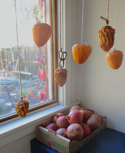
6. I finally made hoshigaki persimmons! They weren’t ready when I took this photo about 3 weeks ago, but they are now and wowsa, are they ever good.
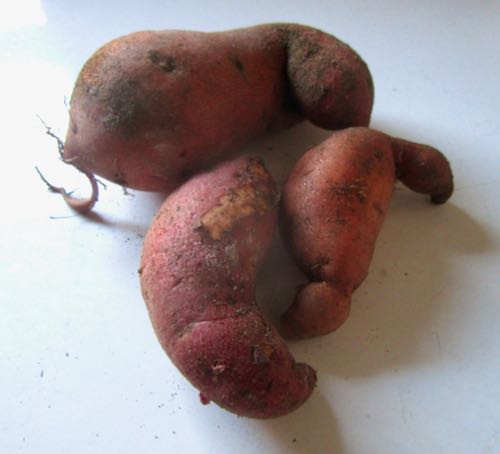
7. I finally dug up my sweet potatoes. Two plants yielded these three winners. I think the size may have been limited by the gopher baskets.
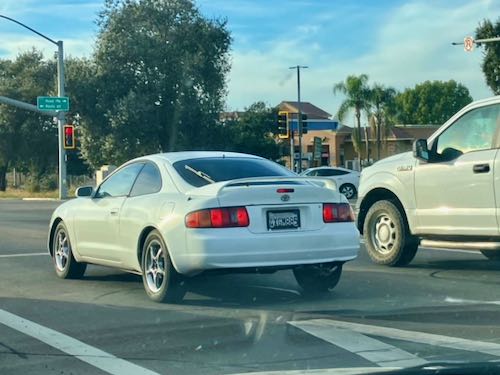
8. My taste in cars is very consistent. While at the 4-way stop a few weeks ago, I spotted a car with a body style that pleased me. I felt happy that it was not a Honda Accord, proving to myself that I can be flexible. I took a photo and sent it to a friend who is very into cars. He told me that it is a Toyota Celica, from the very same era as my current Accord. Oh good grief. (A friend asked me how the car search was going, and I told her that I’m not looking—instead, I upped the towing package on my AAA card.)
9. I finally found a way to delete the Pinterest button off my website homepage. Sometimes if you just click around enough, you stumble across the right method. However, now I think the comments aren’t working. If it ain’t one thing, it’s anuthuh. Why did I delete the Pinterest button? Because I deleted my Pinterest account. I’ve also quit Instagram and completely ignore LinkedIn. There’s enough to do, and I prefer reality to virtual reality. (Surprised??)
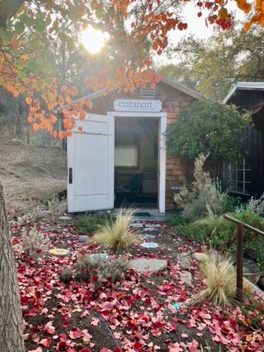
Since I am no longer participating in social media other than my own blog, I will be showing you this little flyer often until December 9.
P.S. The commenting part of the blog has been misbehaving but comments are coming through anyway. So to those of you who soldiered through, thank you!
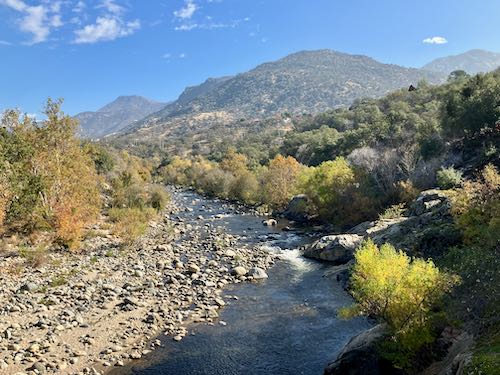
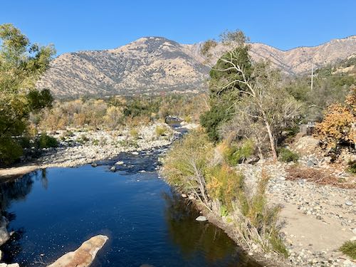
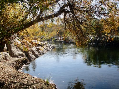
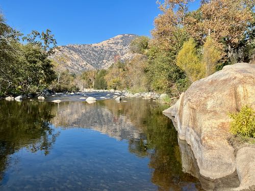
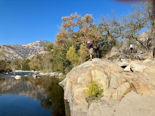
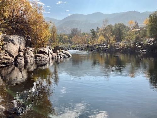
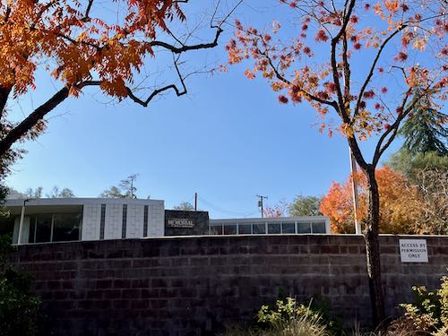
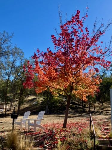
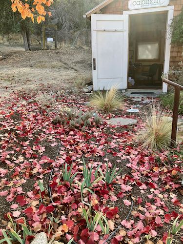
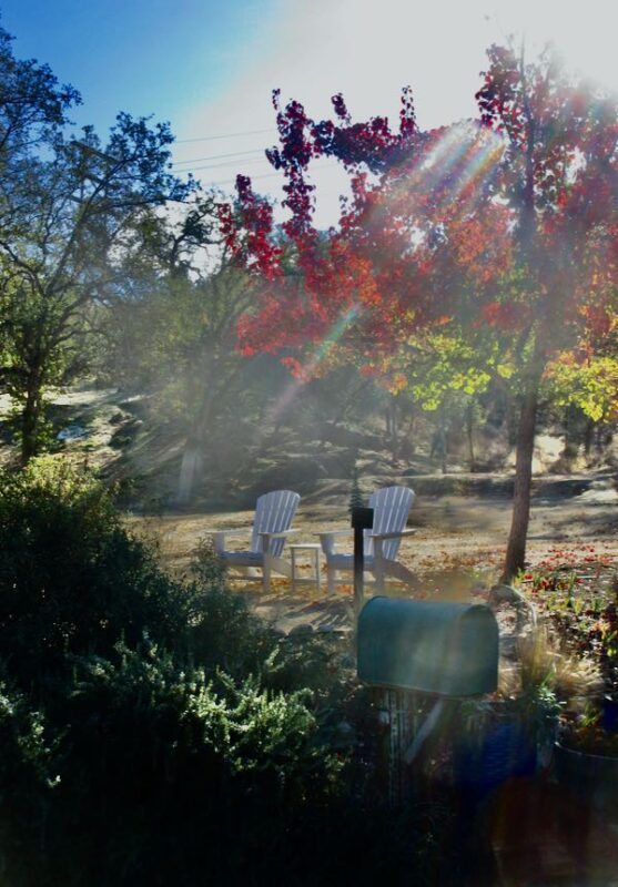
Thanksgiving was a perfect fall day in Three Rivers. We went for a walk to take in the clear air and last hurrah of autumn colors.
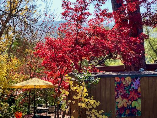
Looking upstream on the middle fork of the Kaweah RiverLooking downstream on the middle fork of the Kaweah RiverNice river spot, and from this angle, the trash doesn’t show.This yard just glows in the fall.Yes, I put my feet in.Trail Guy likes to be perched.I painted this scene not too long ago, but in springtime colors.There was a bit of color remaining at the Memorial Building.
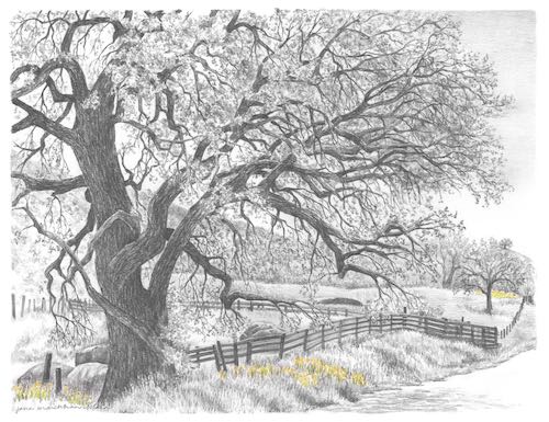
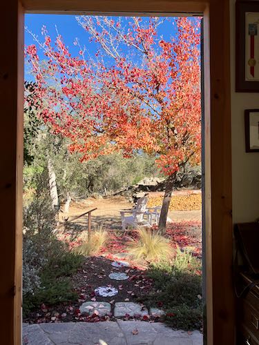
My flowering pear tree was a champion this year.
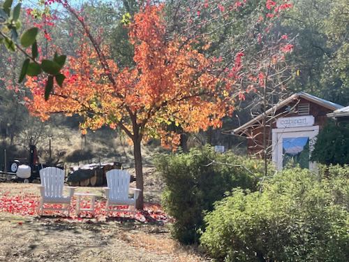
Finally, a reminder for you (and for me, since I don’t get to keep endlessly lollygagging around). Besides, you might like going to Exeter tonight, to their annual city-wide party! I won’t be there but other artists will be at CACHE and all the stores in town will be open and there will be eats and treats. I am a stay-at-home-after-dark-wet-blanket kind of non-party person. But I wasn’t always, and this is a very fun event.
P.S. The commenting part of the blog has been misbehaving but comments are coming through anyway. So to those of you who soldiered through, thank you!
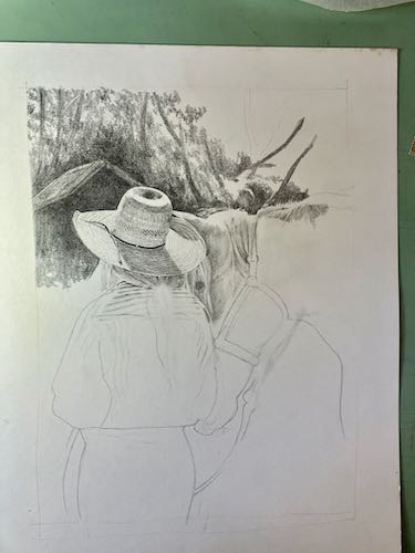
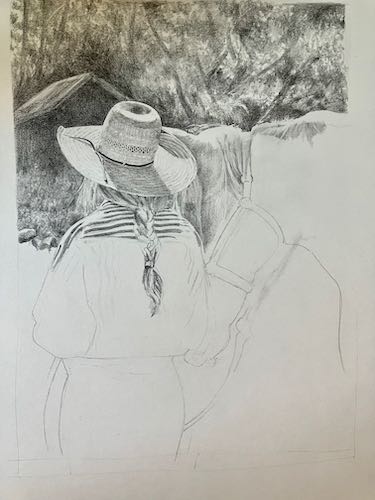
Because I teach people how to draw, it is prudent for me to keep in practice. I have no commissions right now, so this means I can draw whatever I want.
I began a drawing that was full of challenges, showing my students that I follow the same steps that I teach them. Then I had some interruptions to my work life and just set it aside for awhile. When I returned to the drawing, it was hard to focus.
Flowering pear
I pulled out the drawing and decided EVERYTHING was wrong. So I stared out the door for awhile.
Finally I went back to the drawing, following the advice I would give one of my students to see what, if anything was wrong. I discovered one part that was easy to correct, and then decided that I wasn’t focused enough to work on detail. So I went to the blurry, dark, somewhat unimportant background. “Unimportant” in that its accuracy was irrelevant, but important in that it be a support to the main part of the drawing without drawing attention to itself.
I didn’t document the earlier phases of the drawing because it didn’t seem like a potential blog post. The hat was the most important part to me, so I did it first, figuring that if it didn’t look good, I could just toss the drawing without having invested too much time.
You can see a serious erasure under the horse’s chin. That was the easy-to-fix part, and I hope I can bury the messed up part in some background.
I walked back to the house after this bout of serious focused work (fall down laughing). Told you this was distracted drawing, didn’t I?
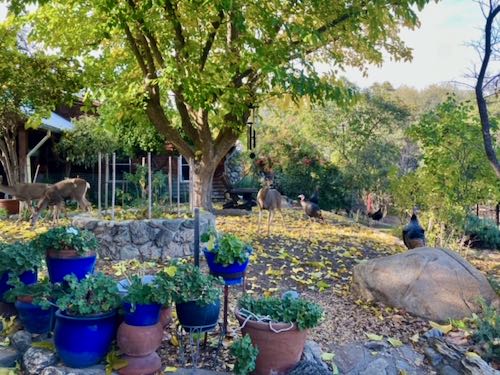
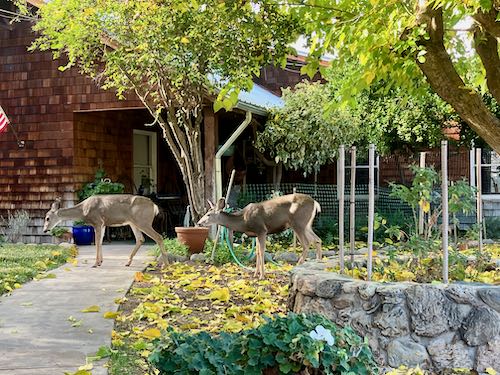
Wild turkeys and deerFearless deer are vacuuming up the mulberry leaves.
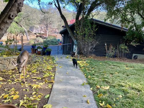
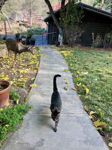
Tucker and the deer don’t really care about each other.
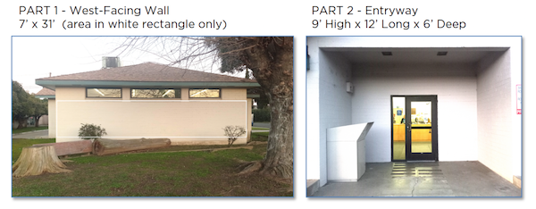
Today I will show you what I submitted for the 2nd mural on the Ivanhoe Library.
For review, here is what the selection committee provided.
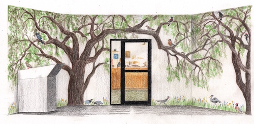
Here is what I submitted for this entry way.
Here is my explanation.
“Mural B shows 2 Valley Oaks, quercus lobata, which is the largest American oak, native to Tulare County. In and beneath the trees are local birds, all seen in and around Ivanhoe, along with a few wildflowers at the base. This could be used as a fun method for children to learn their local birds.
Now, we shall see if I actually get to paint these two murals.
P.S. The commenting part of the blog has been misbehaving but comments are coming through anyway. So to those of you who soldiered through, thank you!
Okay, I’ll quit stalling now. This is what the Ivanhoe Library mural project gave to the potential artists.
First, I introduced myself with this.
“I am very pleased to be able to submit two designs for the library of my youth. I grew up outside of Ivanhoe, attending Ivanhoe Elementary School K-8. I credit my 6th grade teacher, Tom Stroben, with teaching me to draw, and much of my childhood was spent reading books from this library. It would be a huge honor to be selected as the muralist for this Tulare County treasure.”
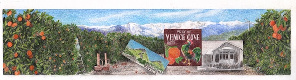
And this is what I submitted for the long wall.
This is the explanation that accompanied the sample. The selection committee didn’t ask for this, but they got it anyway.
West Wall is an orange grove with the mountains in the distance and three insets. The mural shows a picker on a ladder (partially hidden), smudge pots, and a wind machine. In the distance are the Sierra Nevada as the peaks show on a clear day from Ivanhoe. The insets are (L to R) Twin Buttes (a geographical landmark north of Ivanhoe), an old citrus label from Klink Citrus (chosen because of the colorful rooster and the name “Venice Cove”, a nod to another geographical landmark, Venice Hills, east of Ivanhoe), and the old Ivanhoe School Auditorium, which housed the school library in the years I attended school there. (1964-1973).
Okay, I’m going to drag this out for another day. Next post about this project will appear on Monday, November 27.