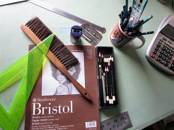
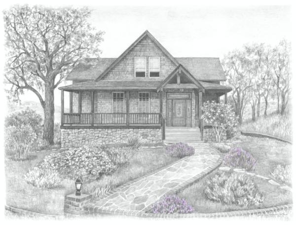
Last week I did some sketching and designing for a very difficult pencil commission. It is breaking a hard and fast rule that I have set for myself, but I can’t figure out how to say no and still help the customer. It’s too scary to show you right now. . . more will be revealed. . .
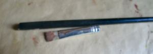
Then I painted hard. How hard?
I painted so hard that my brush snapped. That’s a first for me in 18 years of painting.
These two paintings got moved into the house near the wood stove to dry. There’s more to be done on both, but I am spending my week working on my presentation for How To Draw.
IMPORTANT
Tuesday, November 12, 6:30-7:30, I will give a demo/talk called How To Draw at CACHE. Contact me if you are interested, because seating is limited and there is one more spot.
SIMPLY HOME
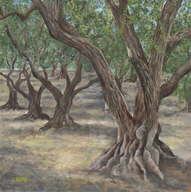
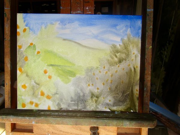
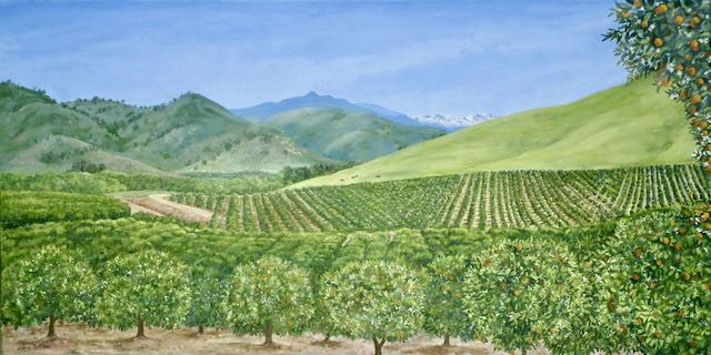
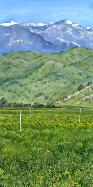
Olive Orchard, 10×10″, $200
CACHE Gallery hours are Fridays 1:30-4:00, Saturdays 10:00-4:00, Sundays noon-4:00.
Last week was a rough one for tech. My blog croaked, which led me to realize that my entire website was AWOL. This led to many phone calls, and a large expenditure. Then, when I had things working again, thanks to Rowland, Mario, Eva, and Ken Joe Sam (Really? No, really??), we had a day without internet, cell service, telephone, or teevee. (I didn’t miss that last thing.)
So, I painted, after spending a bit of time in the studio making plans and taking care of administrative tasks. Those necessary parts of an art business are too boring to tell you about.)
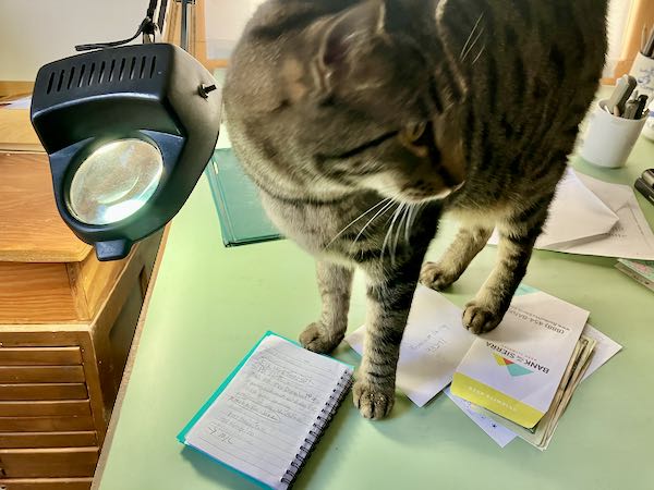
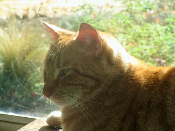
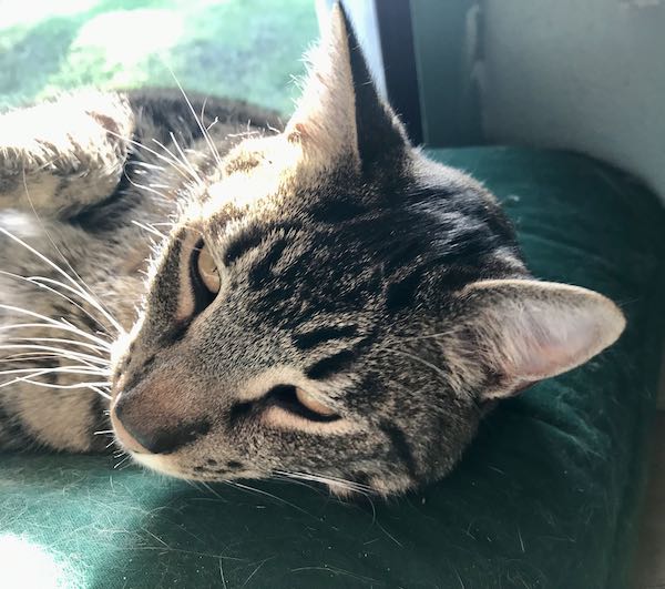
Mr. Antisocial Jackson was suddenly interested in everything I was working on.
This painting is either 11×14 or 12×16, but I don’t remember. I am painting it so that if someone needs to take a painting from Simply Home, I will be able to put something in the hole.
Tucker took a break with me.
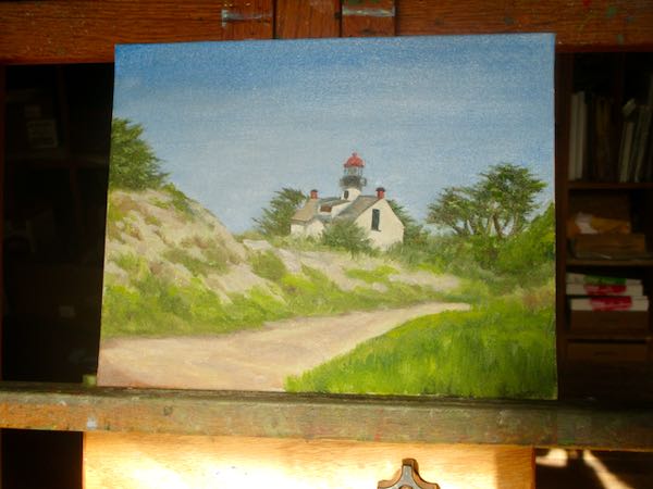
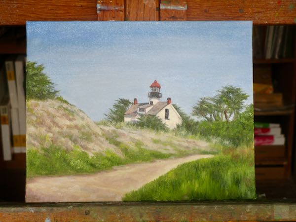
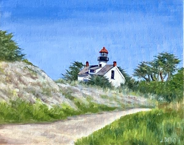
This lighthouse painting, done mostly plein air, still needed to be finished in the painting workshop. (I draw in my studio and paint in the workshop, because painting can get messy.)
It will look better when it is scanned. This was photographed with my inferior phone camera. And as always, it will look better in person.
Pippin was happy to sit behind me while I painted.
REMINDER: Tuesday, November 12, 6:30-7:30, I will give a demo/talk called How To Draw at CACHE. Contact me if you are interested, because seating is limited.
SIMPLY HOME
Homer Barn, 12×16″, SOLD
CACHE Gallery hours are Fridays 1:30-4:00, Saturdays 10:00-4:00, Sundays noon-4:00.
These three turned out pretty well, if I do say so myself, which I just did.
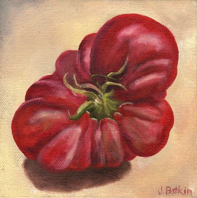
Tom-ato’s Last Mater, 6×6″, private collection
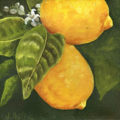
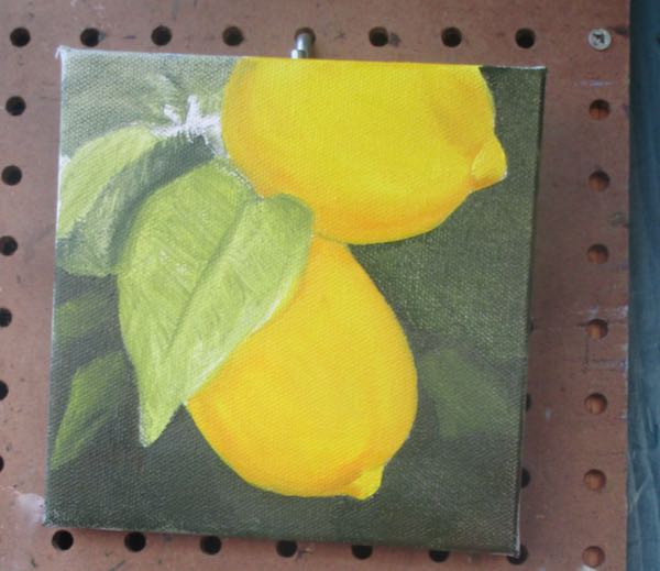
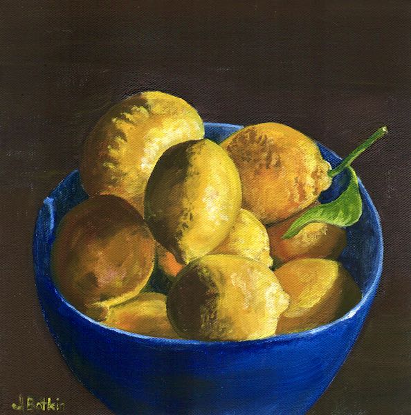
Lemons on the Tree, 6×6″, $65, oil on wrapped canvas
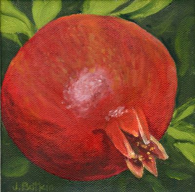
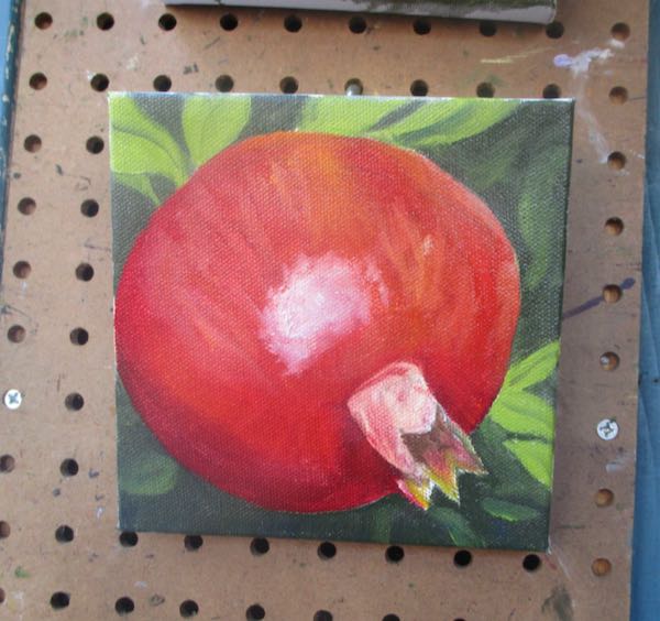
Pomegranate on the Tree, 6×6″, oil on wrapped canvas, $65
Don’t be scared; these will also turn out well.
Simply Home
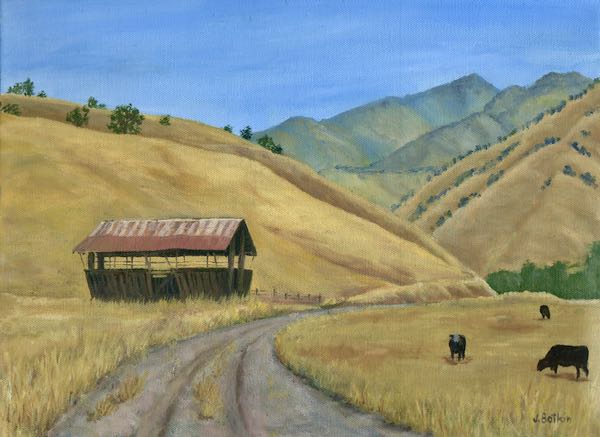
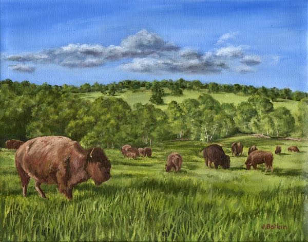
Ed’s Herd, 11×14, oil on wrapped canvas, $300 (This is the only painting that comes from outside Tulare County, but since I met Ed in Tulare County, this qualifies.)
CACHE Gallery hours are Fridays 1:30-4:00, Saturdays 10:00-4:00, Sundays noon-4:00.
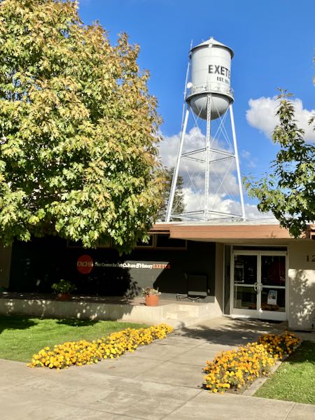
How To Draw, Tuesday, November 12, 6:30-7:30, at CACHE, 125 S. B Street, Exeter. Admission is FREE, but seating is limited, so email me cabinart@cabinartdotnet (do it the real way, not this bizarre spelling designed to thwart spammers).
Most artists paint in their studios. I reserve my studio for drawing and business-ish activities and do my painting in the building next door, a workshop. This is because painting is messier than drawing.
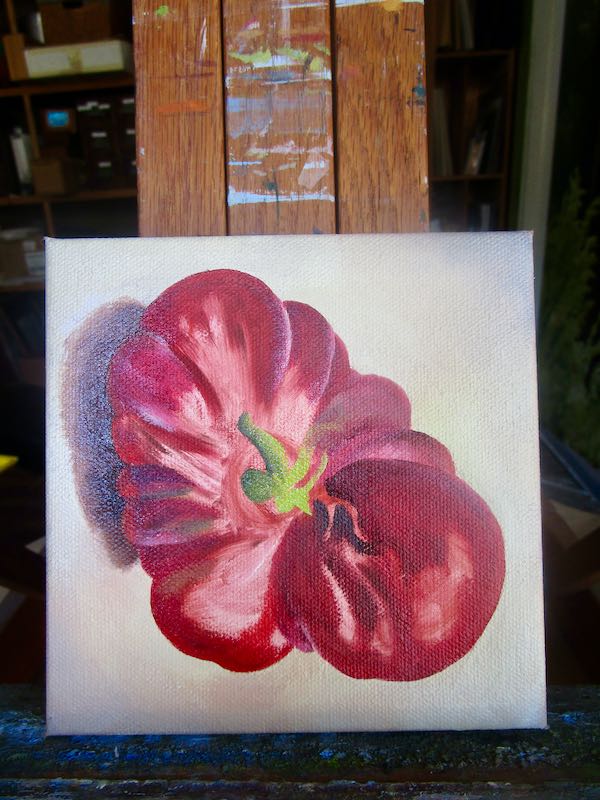
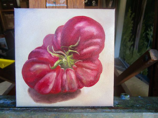
I started with the commissioned piece which is now called Tom-ato’s Last Mater. A man named Tom was known for growing heirloom tomatoes, and this 1-1/2 lb. specimen was the last one he produced before succumbing to a terrible disease. His wife asked me to paint it for her, and I gladly complied.
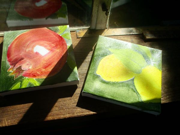
Next I decided to make a couple of small 6×6″ fruit-on-the-tree paintings for the Mural Gallery, which has reopened in Exeter after a summer of revamping, refurbishing, and redesigning. Things have changed since it opened 20+ years ago. Back then, it was called the “Mural Gallery” because only Exeter’s muralists could show and sell there. Now we are old (and some have died), so it has opened up to other artists in the area. In addition, the artists who show and sell there have been asked to work one shift a month. (I had mine on October 24 last month.)
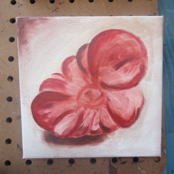
The shapes and backgrounds went quickly on these, and I saved the details for another day.
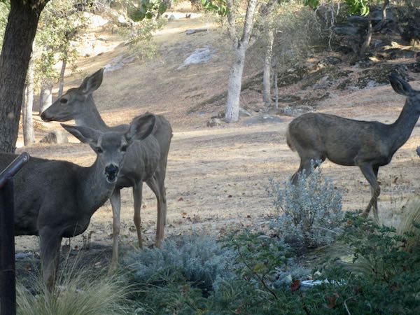
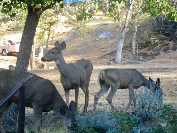
After hanging these on the pegboard hooks to dry a bit, I looked out the window at the studio garden and saw these marauders destroying the foliage. Welcome to Three Rivers, where gardening is war.
At least I have something completed and not destroyed to show for an afternoon’s work in the painting workshop. Yes, I signed it and painted the edges red, so it just needs to dry before getting scanned and then shipped to Florida.
SIMPLY HOME
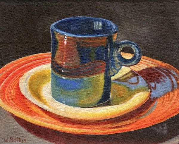
Cabin Dishes, 8×10″, $200 (Yes, oil on wrapped canvas, and yes, there is sales tax.)
CACHE Gallery hours are Fridays 1:30-4:00, Saturdays 10:00-4:00, Sundays noon-4:00.
SOMETHING IMPORTANT: Tuesday, November 12, 6:30-7:30, I will give a demo/talk called How To Draw at CACHE. Contact me if you are interested, because seating is limited.
How To Draw is the title of my upcoming talk/demonstration at CACHE, Center for Art, Culture, History—Exeter!
So many people have an interest in drawing, but it is often assumed that it is a talent which either you have or you don’t.
Is typing a talent? Is driving a talent?
Nope. All these things can be taught, and they can be learned. Sure, some people will type 25 wpm and others will type 90, because people have different interests and aptitudes. Some people will become bus drivers and others shouldn’t be given licenses, but all are driving.
These tools are helpful, but they won’t teach you the basics of drawing.
Some people have had awful experiences with artists posing as teachers. (I had one of those who told me, using these exact words, “Just because you can draw doesn’t make you an artist.” Well, just because you can use words doesn’t meant you can communicate well either, so there.) I want to help those folks.
Jackson wouldn’t put up with that sort of rudeness from anyone.
Some people are learning to paint but aren’t happy with the results. If you don’t know how to get your shapes correct, don’t know anything about perspective, can’t see proportions, and don’t understand values, of course you won’t be happy with the results. I want to help those people.
On top of all those basics, painting requires learning about color.
Some people just love to learn new skills. I want to help those people too.
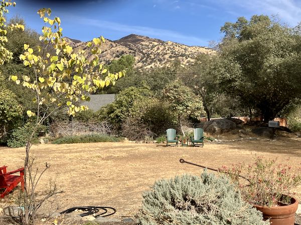
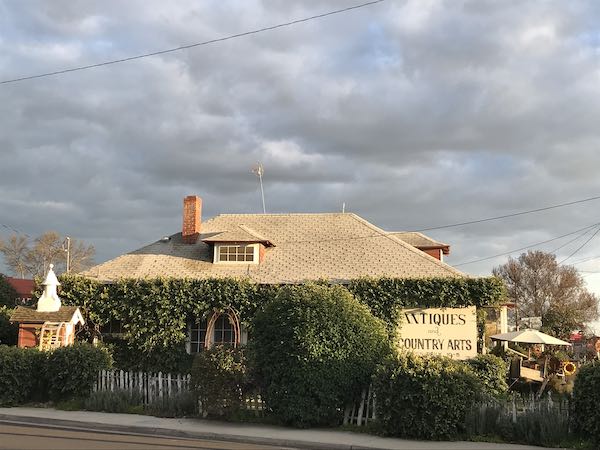
This antique store is across Rocky Hill Drive from CACHE, and the late afternoon light is often just perfect on this picturesque store.
Do any of these descriptions fit you? Want to come to How To Draw?
Nope, you won’t be able to draw like this for quite a few years.
THE THING: Tuesday, November 12, 6:30-7:30 How To Draw at CACHE. Contact me if you are interested, because seating is limited.
While at the plein air retreat, one morning I sat at Eric Rhoads’ table. He told us of a science experiment where 2 identical plants were watered with different water: one with tap water and the other with microwaved water (cooled down first). Within a week or two, the microwave-watered plant died. DIED!! For the umpteenth time, I am so glad I don’t own a microwave.
OBVIOUSLY, I learned a ton about plein air painting. But since most of my readers are non-artists, I won’t bore you with those things. . .
. . .except for one thing about painting: I learned that I do much better when painting plein air alone. No one was critical, no one was rushing me, but when it was just me, alone with my own transportation and own schedule, I enjoyed the process more.
I learned that French easels are the cheap-o version of a mobile easel for brand new painters who don’t know diddly-squat about what they need. Occasionally an experienced painter will use one; fortunately I discovered one of those guys to give my easel to instead of seeking a trash can big enough to accommodate the thing.
Apple sells a thing called an AirTag that you attach to stuff that you tend to lose, and then when you have lost the thing, it beeps or something. Maybe it gives you an address where it was last seen. Pretty clever, but I would look funny with it hanging off my reading glasses.
My favorite blog, The Frugal Girl, recently featured me in a Meet a Reader post. The Frugal Girl is the only place besides my own blog where I am active online. Took me a few years to consent to participate in the meet-a-reader, so I had a lot of time to decide what to include and what to omit. It was fun to interact with everyone who commented.
A friend and former neighbor sent me a link to an article about Three Rivers: msn (whatever that is). It seems to have been written by someone who hasn’t been to our town in about 30 years.
Simply Home
Behind Wutchumna, oil on wrapped canvas, 18×36″, $1500
CACHE Gallery hours are Fridays 1:30-4:00, Saturdays 10:00-4:00, Sundays noon-4:00.
ONE MORE THING: Tuesday, November 12, 6:30-7:30, I will give a demo/talk called How To Draw at CACHE. Contact me if you are interested, because seating is limited.
Because I ran off to Fall Color Week on September 29 – October 6, there was no Learned in September list. After spending an intensive week learning about plein air painting, I couldn’t remember a thing about September. Fortunately, I had already started a list.
September
If you schedule a meeting with someone, perhaps someone at a company to help one choose the best Medicare plan, it is assumed you will be using a cell phone. If you give a landline number because perhaps your cell service is spotty, they will be perplexed as how to help you. It certainly would be helpful if such businesses would say that a cell phone is necessary before one goes to all the trouble to schedule an appointment. (The meeting got cancelled before I learned how the landline would be handled.)
There is a method of healthy* eating called Zoe, a way to learn how to eat for your optimal “gut health, blood sugar, and blood fat”. The website has all sorts of information except it doesn’t tell the price. Nope, you have to “start the quiz” first in order to “choose your plan”. Does that make anyone else nervous? *Who even knows what “healthy” means anymore??
There is too much in the world right now: too many websites, too many opinions, too many podcasts, too many books to read, too much art to see, too many friends to stay current with, too many patterns to knit, too many yarns to try. I cannot keep up, and don’t want to. FOMO is real, but I will NOT cave in to it. (This is not new information, but I feel it strongly right now.)
I read this quote on a site called The Boring Newsletter—Frequently Taxed Questions: “Normal is getting dressed in clothes that you buy for work, driving through traffic in a car that you are still paying for, in order to get to a job that you need so you can pay for the clothes, car and the house that you leave empty all day in order to afford to live in it.” -Ellen Goodman. I don’t know who Ellen Goodman is, but she is right and I am very thankful to be abnormal.
Boring Warning — if you ever need to remove hidden tags on a Word document, there is no way to do them all at once if you have a Mac. Why would anyone need to remove hidden tags? Because Word’s indexing is in combat with Adobe InDesign’s book formatting. They hate each other. They might both hate Mac too. It’s a rough world out there in Puterville.
Mineral King Country, a book by Henry Brown published in 1988, finally landed in my life. I was aware of it but didn’t have a copy. I recently acquired one (thank you, DJ) and read the foreword, preface, and introduction. This book covers Mineral King history between the mining era and the Disney days.
Cerakote cleans foggy car headlights in 3 steps. It is wonderful stuff! Costs about $17 if you are interested. My friend found it at WalMart and I found more on the big A, of course.
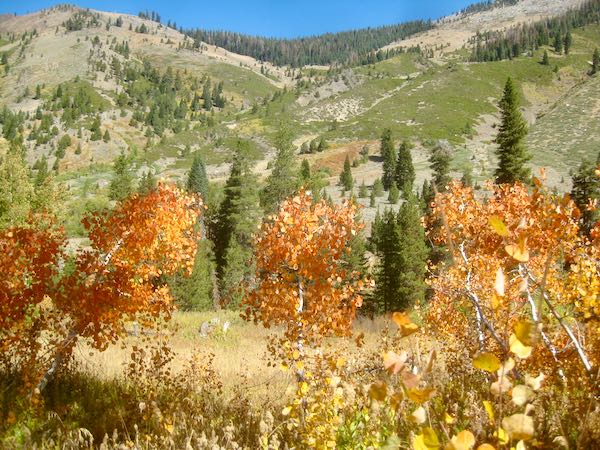
A few repeat photos of Mineral King in September
Simply Home
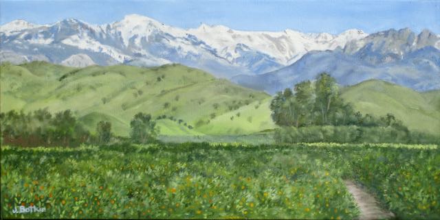
The Best View, oil on wrapped canvas, 10×20″, $450
CACHE Gallery hours are Fridays 1:30-4:00, Saturdays 10:00-4:00, Sundays noon-4:00.
ONE MORE THING: Tuesday, November 12, 6:30-7:30, I will give a demo/talk called How To Draw at CACHE. Contact me if you are interested, because seating is limited.
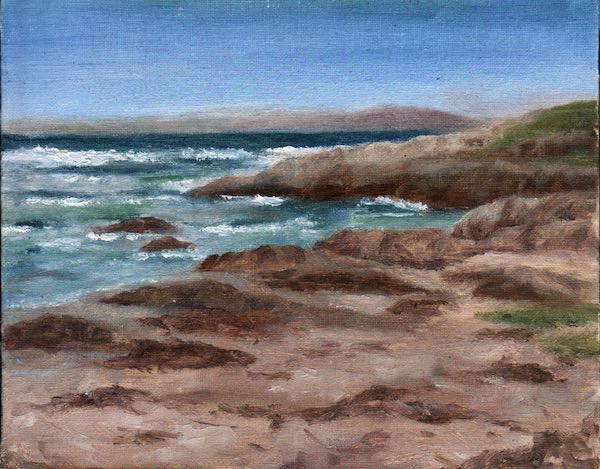
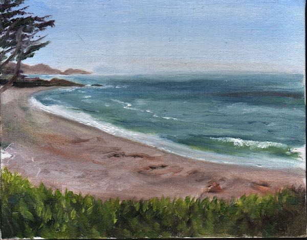
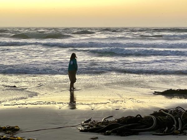
This is Asilomar State Beach, the first place I set up an easel to paint plein air, which means feet in the sand, wind in my hair, hair in my eyes, and easel fighting gravity.
This is my painting of Asilomar Beach, brought into submission in the confines of my painting workshop (i.e. studio).
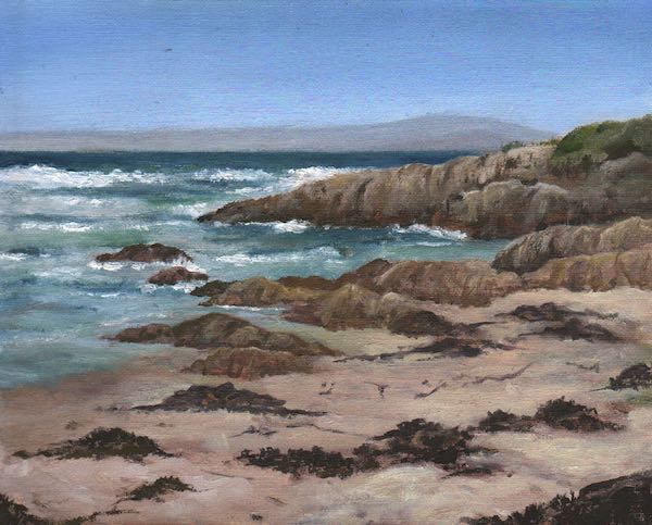
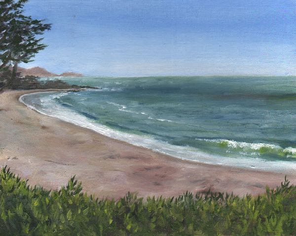
This is Carmel Beach, voted the most beautiful beach in California or the US or ???, as first painted while sitting on a park bench, balancing a pochade box on my lap with my palette of paints on the bench beside, all the while wishing I was down on the sand with my feet in the water, minus the painting.
This is my painting of Carmel Beach, brought into submission in the painting workshop, with the able assistance of some photos where things hold still for a pair of minutes and color can be actually seen rather than squinted and guessed at in the bright sun (or deep shade)
But I’m perfectly neutral on the topic, as you can see.
P.S. At the opening reception of my show Simply Home, an acquaintance of many years said to me, “I’m going to tell you something that will make you mad.” Then he proceeded to say, “You draw better than you paint.”
What would he have said if he’d seen my plein air paintings before I retouched them??
Simply Home
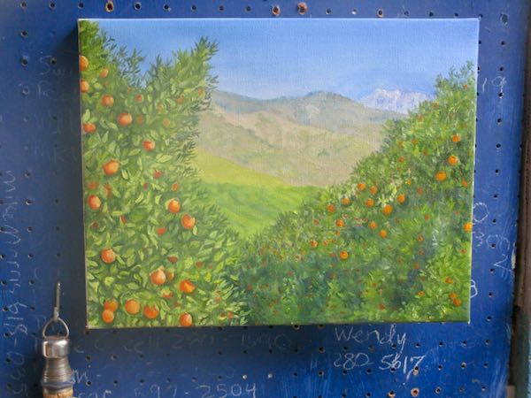
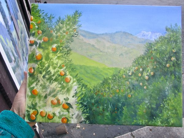
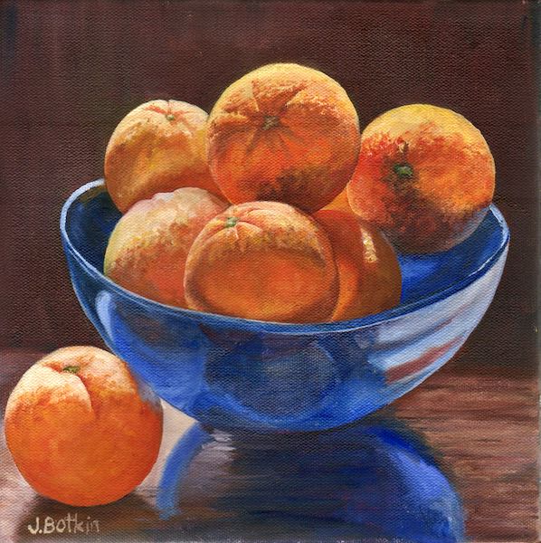
Lemon Cove Oranges, 16×16″, SOLD
CACHE Gallery hours are Fridays 1:30-4:00, Saturdays 10:00-4:00, Sundays noon-4:00.
P.S. This painting is the one chosen for the publicity for the show. Yes, it is oil on wrapped canvas, but I’m tired of typing that and fairly certain that you are tired of reading it too.
The week in Monterey was a great enjoyable time, and also a real learning experience. So many beautiful things to paint, it almost didn’t matter if we drove anywhere or just stayed put.
Plein air has never appealed to me, and it was stinkin’ hard, but I think I got better as the week progressed. I don’t love the process or the results enough to invest in a good easel/tripod set up (those run $700-$1000!) I’m still not convinced that it improves one’s skill; maybe it does if plein air is the preferred style, but honestly, I look at those paintings by people who are a Big Deal and think that someone needs to find a good optometrist.
So, I am fully committed to being a studio painter. It is good to have decided who I am, finally, at age 65, after 18-1/2 years of oil painting. Maybe someday I’ll get a wild hare and try to paint quick, thick, and sloppy slick (but I may not sign those).
However, I don’t consider the time spent painting plein air as a waste of time. It taught me a way to paint a little bit faster, how to focus more on the composition, that my easel was a major annoyance, and now I have the ability to paint plein air, should anyone ask me to do so (more for the process than the product).
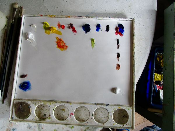
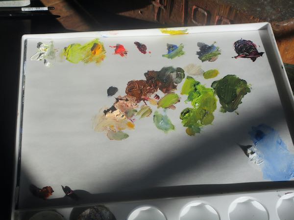
A clean palette without sand and a level place to set it—such a relief.
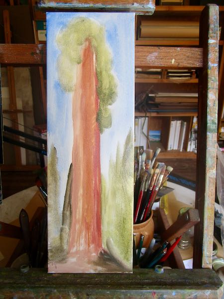
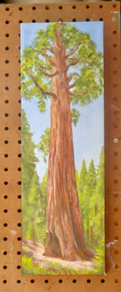
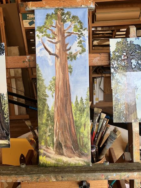
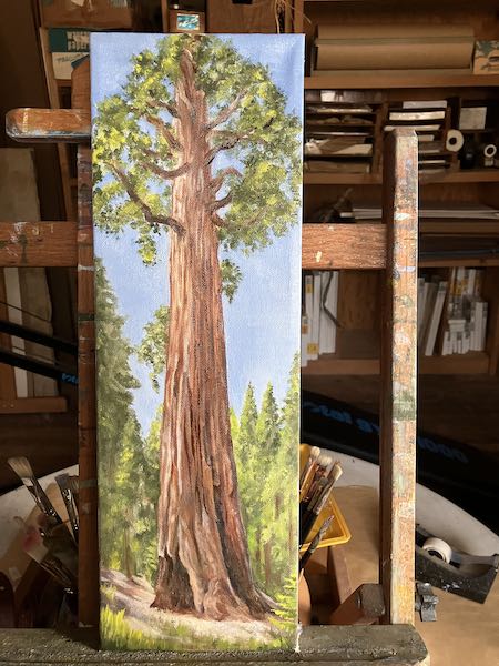
A long-overdue sequoia painting is drying before scanning and delivery.
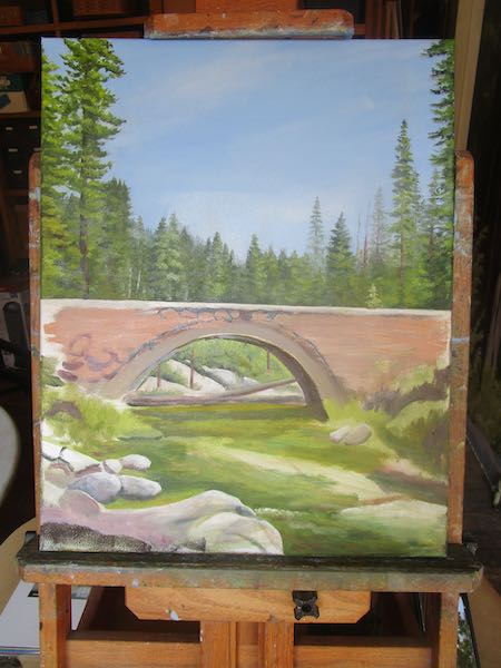
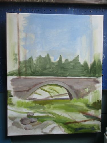
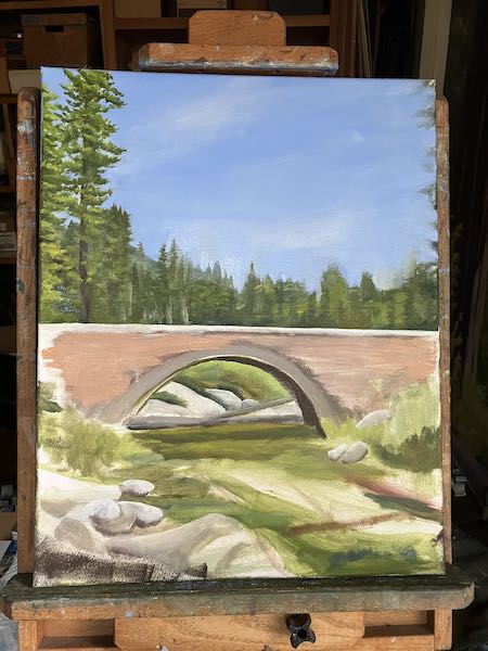
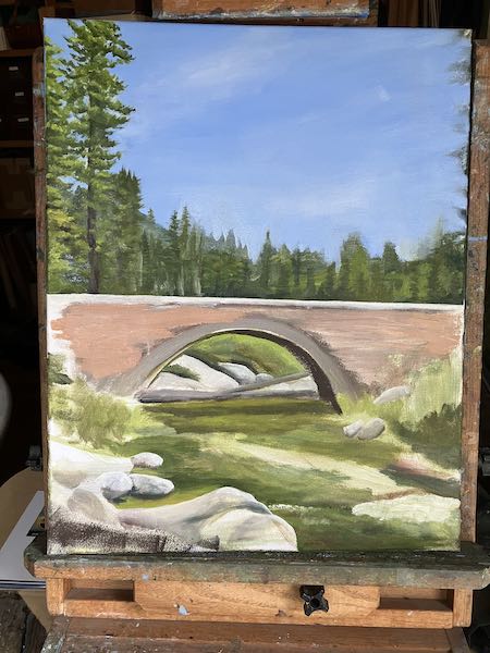
A little more progress on the Marble Fork bridge.
This is a commission of a giant tomato for someone in Florida.
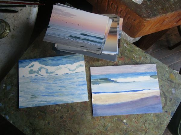
You may have heard me profess my love of the beach in the past a time or two. I ordered a stack of snapshots of the beach and waves, along with some smooth 5×7″ boards (called “gessobord”) to practice painting waves and beach scenes. IN THE STUDIO!! FROM PHOTOGRAPHS!
BECAUSE I AM A STUDIO PAINTER!
So there.
Simply Home
Navel Contemplation, 10×10″, oil on wrapped canvas, $200
Today’s post is a bit behind reality, a peek into what happened before the show was hung or opened.
When I got home from Monterey, I had to dive into getting all my work together to deliver to CACHE, the gallery hosting my solo show, “Simply Home”.
Photo by Liesel Lund, my roomie
More than anything, I wanted to detail and finish those 10 plein air beachy paintings. Alas, even when one is a certified grown-up, one does not get to do just what one wants to do. Part of being a real grown-up is being trustworthy, responsible, and following through.
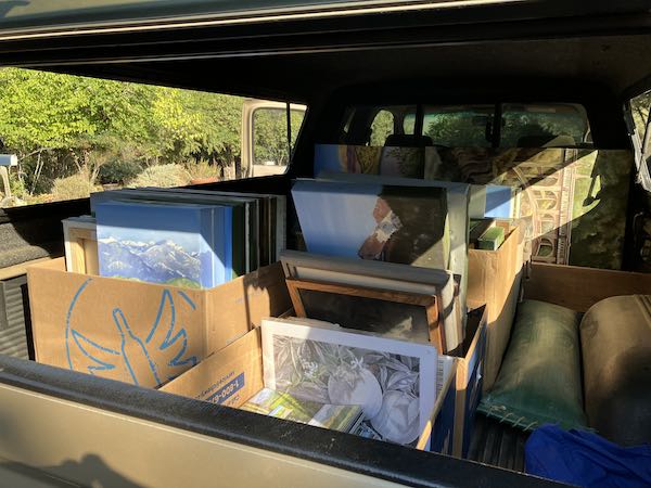
Phooey. So, I boxed up everything, and with Trail Guy’s master’s degree in packanology, we loaded the good pick-em-up truck, and delivered it all to Exeter.
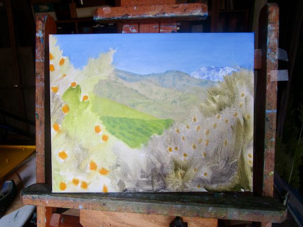
When we got home, I faced some unfinished canvases.
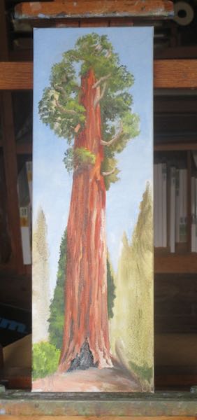
First, there is the fact that Kaweah Arts has sold out of the tall paintings of sequoias and has been waiting for at least one for several weeks. This still is not quite finished here because it needs a signature, the edges painted, to dry, and then it needs to be scanned.
Another painting has been on hold for awhile. Initially I was going to push to get it done for Simply Home, until I realized that if a customer insists on taking home a purchase, I’d better have something ready to plug into that hole.
I started this painting in June.
It seemed daunting until I mixed up the colors and realized that I can DRAW with my paintbrush, using PHOTOS instead of standing outside wishing that the water would just hold still for a pair of minutes.
Yes indeedy, I am a studio painter and probably always will be.
Simply Home
CACHE Gallery hours are Fridays 1:30-4:00, Saturdays 10:00-4:00, Sundays noon-4:00.
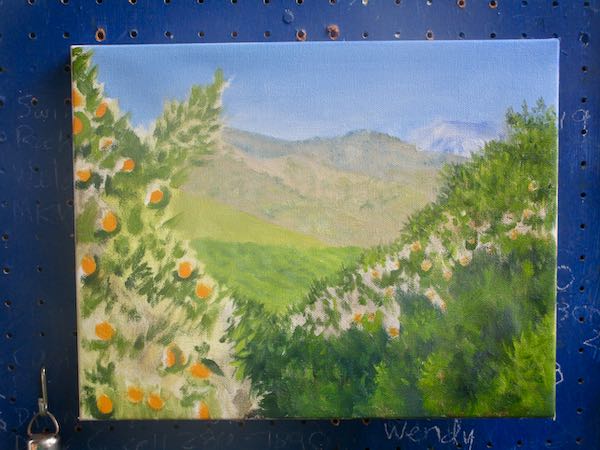
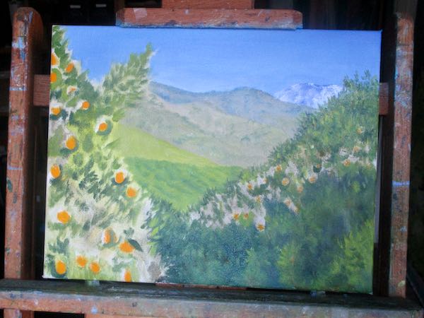
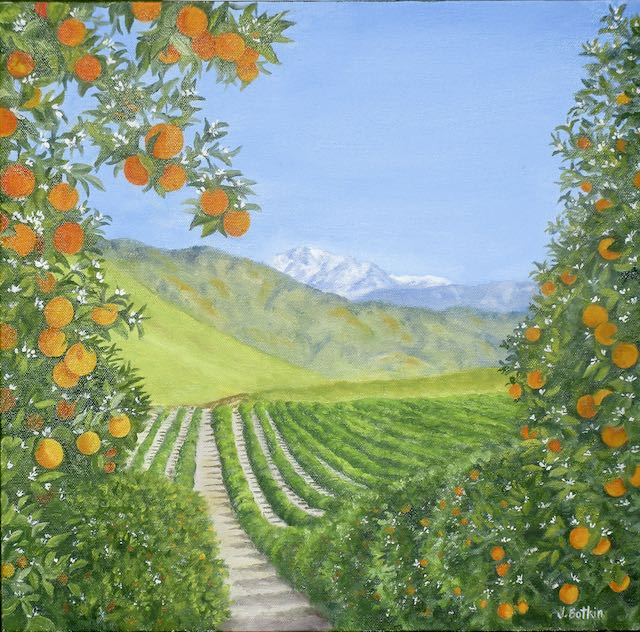
Groves, Hills and Mountains, oil on wrapped canvas, 10×20″, $450