This project progress took place before I started the mural on the Ivanhoe library.
This might be the first time I have ever put a canvas on the drawing table and measured out exactly where everything is supposed to go.
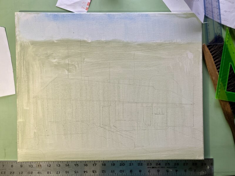
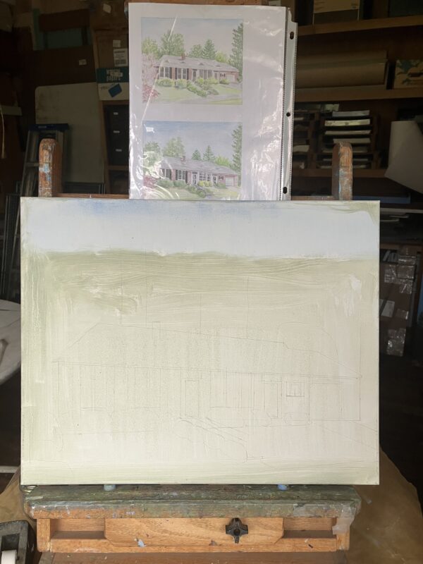
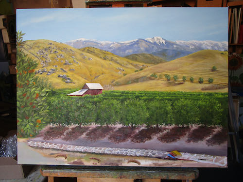
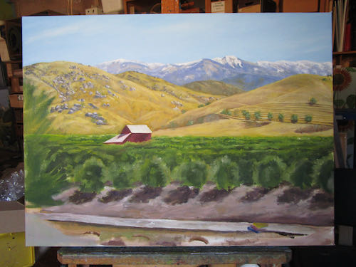
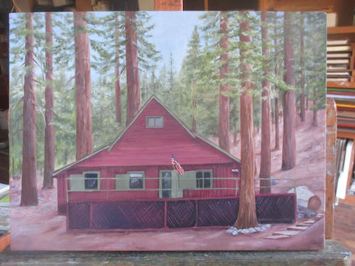
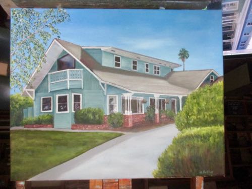
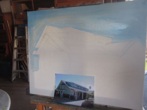
When I had enough pencil guidelines on the canvas, I took it out to the painting workshop and set it up on the easels with the sketch for reference. The hard work of designing from the stack of photos all taken from different angles in different eras of the house was finished, so I needed to trust the approved sketch.
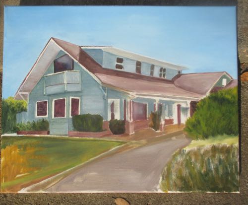
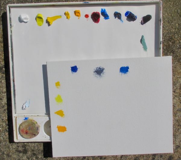
The first layer needs to be thin, or in ArtSpeak, “Paint lean to fat” (this means that the artist should thin the first layer of paint with turpentine and gradually add more oil— “fat” — with each successive layer. (When I first hear this, I was slightly offended, thinking that it was commentary on my body type. . .)
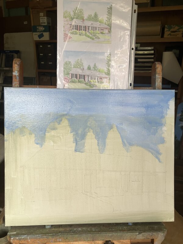
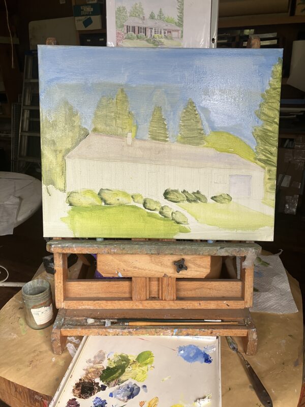
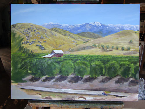
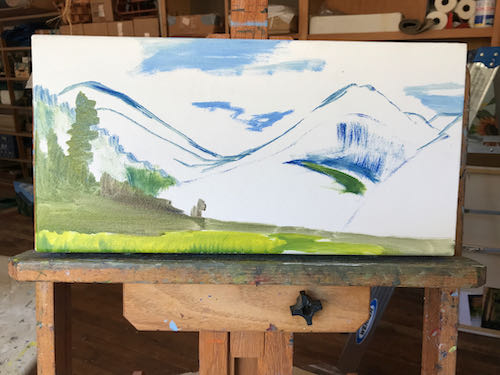
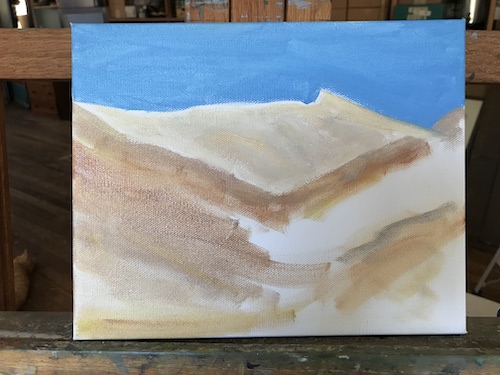
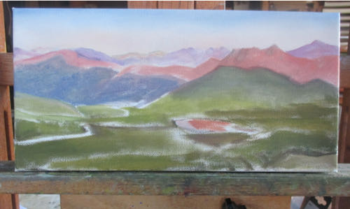
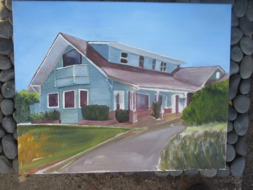
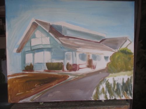
I worked from back to front, which means sky first, since it is the farthest away.
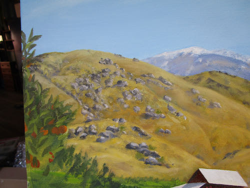
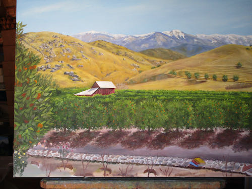
I didn’t get too concerned with mixing exact colors at this stage. . . “Closies count (except in hand grenades and horseshoes.)”
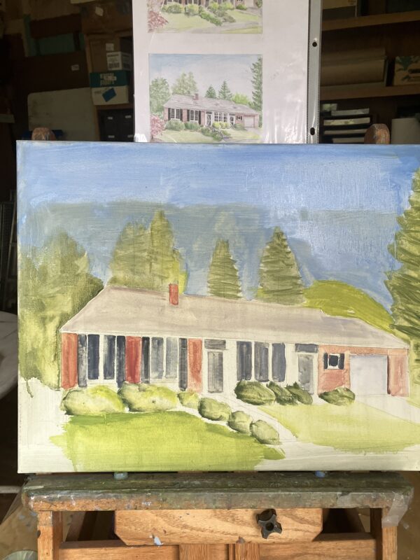
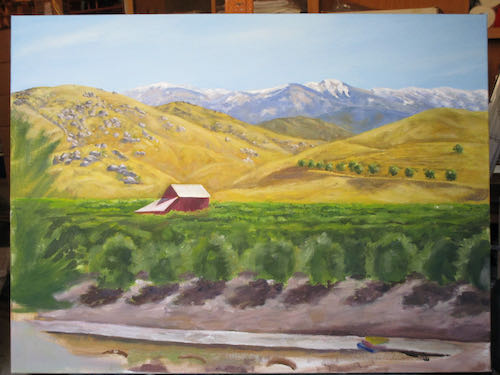
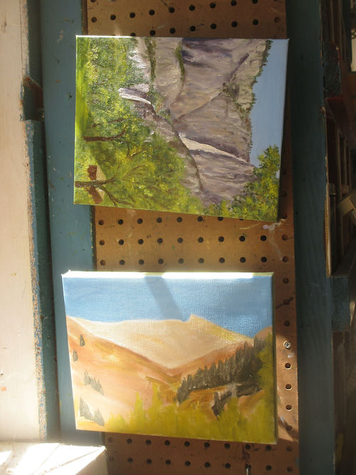
I tried to stay in the lines. This is a new method of painting for me. I’ve done a few of these architectural type paintings before, but this one feels more important to get exactly right. I wonder if it is the long distance relationship; most likely it is the exactitude with which Mr. J. has described so much about this house.
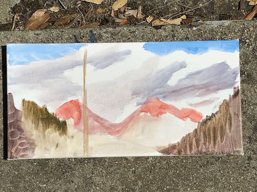
The sky looks as if there is a flat mountain ridge, but that is because I primed the canvas before I knew exactly how this scene was going to be arranged. The many layers will cover that “ridge”.
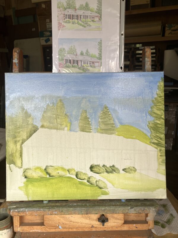
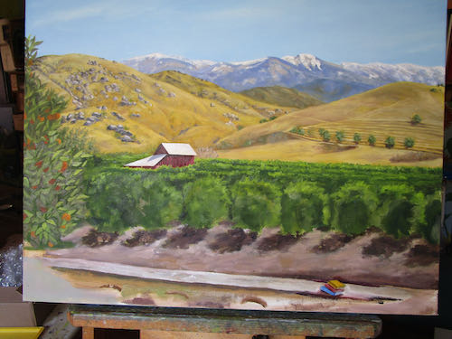
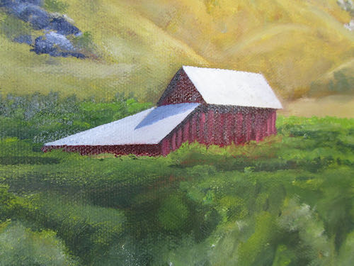
I sent this photo to Mr. J. and he was pleased. It needs some drying time before I cover everything again, with paint that isn’t as thin, and paying more attention to the correct colors and details.
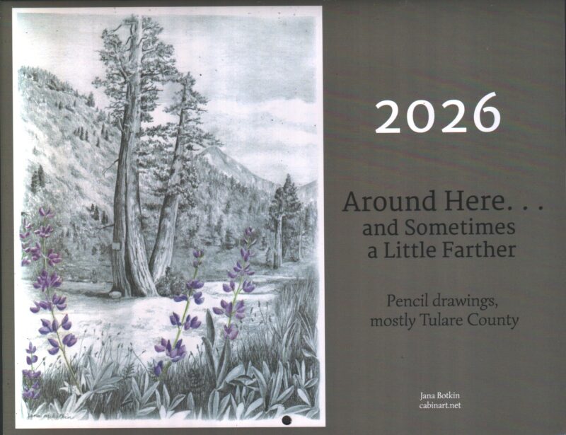
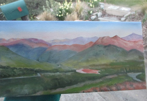
Calendars available here, $25, includes shipping
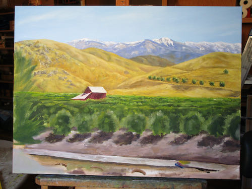
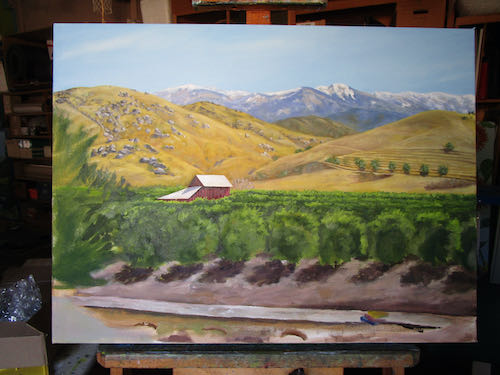
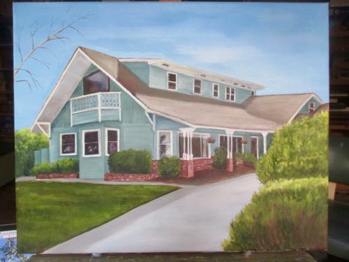
 Some were fixable, some are not. Back on the easel it went with the main problem being the bay window.
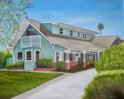
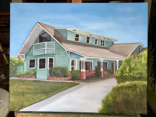
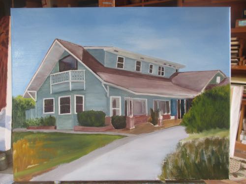
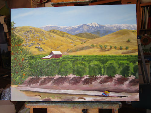
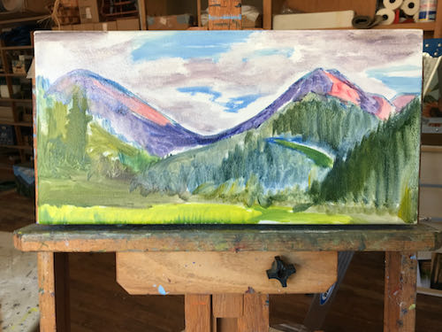
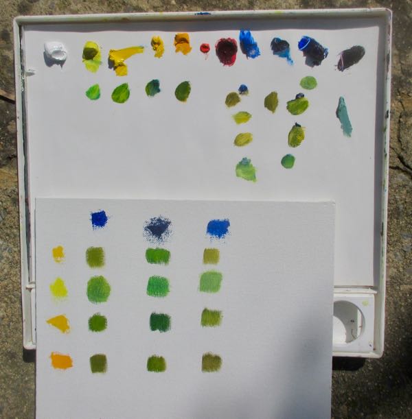 My friend said, and I agree, “More Kelly than lime”. Photoshop Junior used Kelly green, but I wasn’t very careful with mixing in the first pass over the canvas.
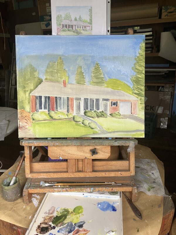
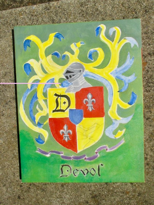 Better, but too wet to continue.