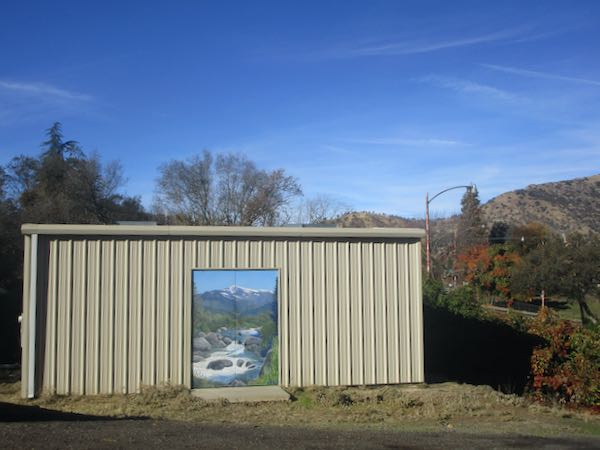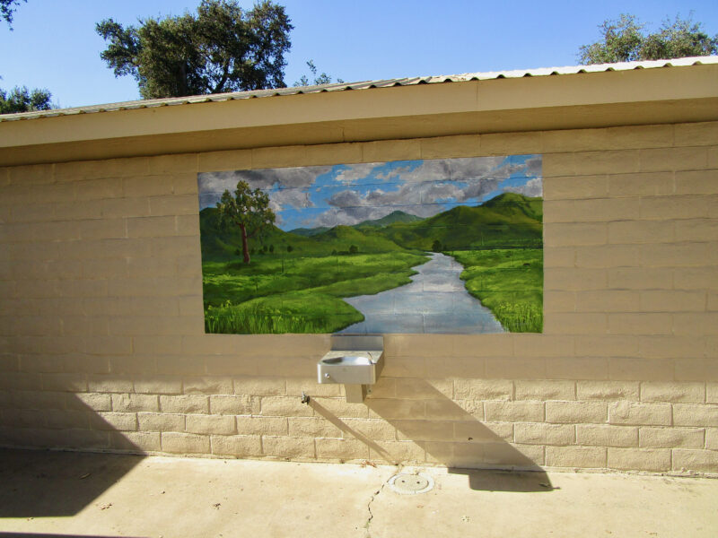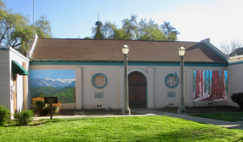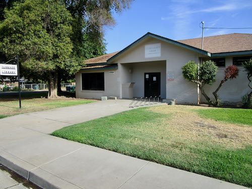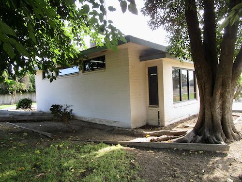
Three years ago, the county allowed elected supervisors to have a bit of free rein on things like murals in their districts. My supervisor asked me to paint a mural on the Ivanhoe library, the beloved library of my youth. You can read about it here, here, here, and here.
If you don’t want to go back and read those posts from 2 years ago, here is the short version. The county reined in the Wild West approach, a committee was formed, and a call to artists went out to submit designs and compete for MY MURAL!
Eventually I got chosen, but they forgot to find the money first. Another 2 years passed, until this summer I was given permission to begin. First I needed to wait for the heat to abate and then for my unbloggable situation to resolve.
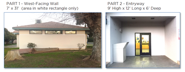
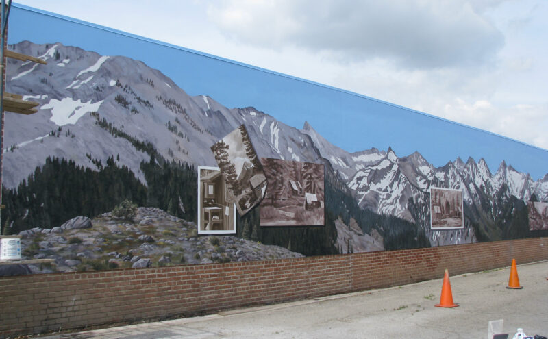
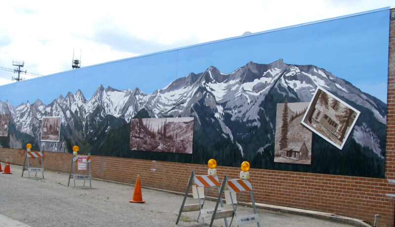
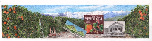
Meanwhile, the committee gathered money, and decided to only have one mural on the West wall, probably because they didn’t have enough money to pay for two murals because the original payment offered wasn’t high enough to entice many muralists (only guessing this from a few conversations I had with some muralist colleagues).
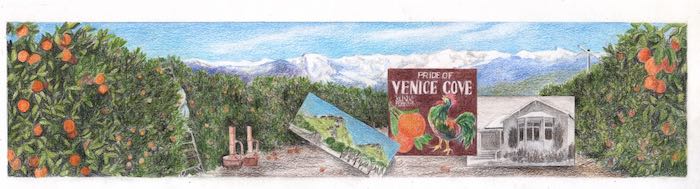
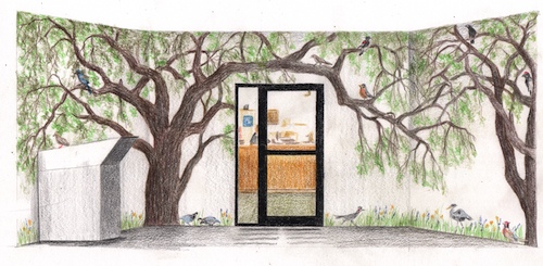
They requested that I make a change on the orange packing label from “Venice Cove” to “Venice Hill”. I was willing to do this, but only with permission from Klink, the packing house. What a surprise—it has merged with 2 or 3 other packing houses and is now called California Citrus or something similar. Not “Klink” anymore?? This hurts my little Ivanhoe heart, but I’ll soldier on.
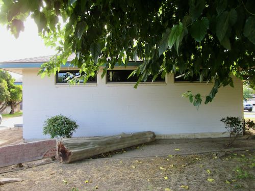
Today I thought I would be working on the mural. However, there is now red tape and bureaucracy to navigate, with many opinions, an anonymous committee, and a college student who wants to intern with me. My hope is to be given access to the building on days when the library is closed. Otherwise, I will only be painting on Fridays, and this could take a very long time to complete.
I am REALLY REALLY REALLY looking forward to finally painting this mural!
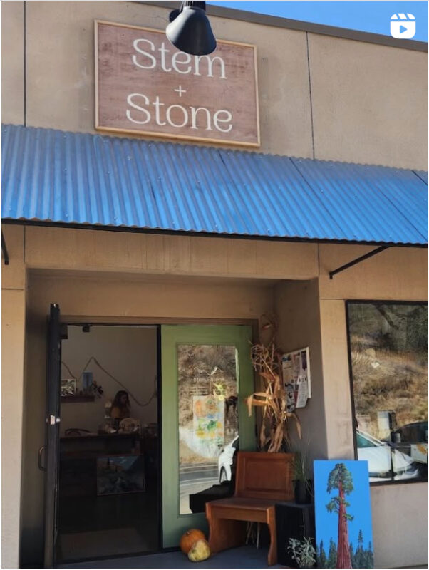
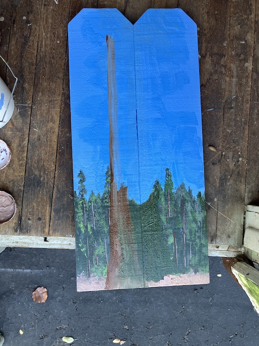
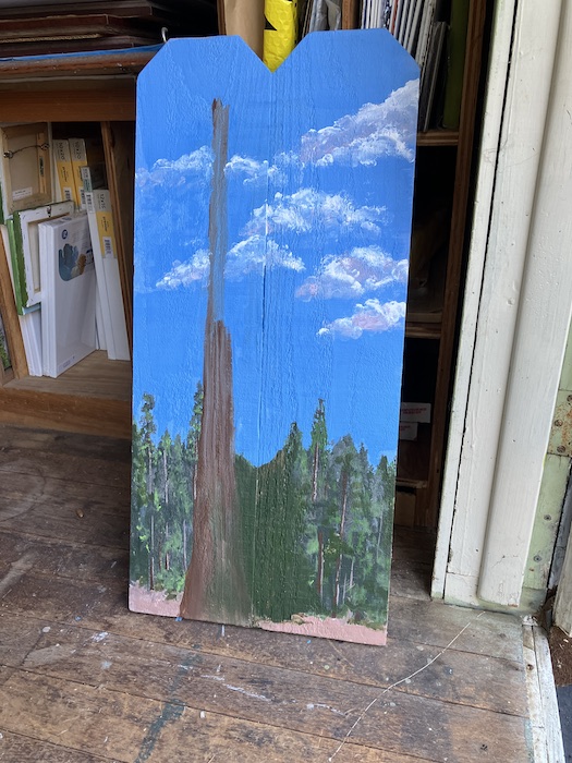
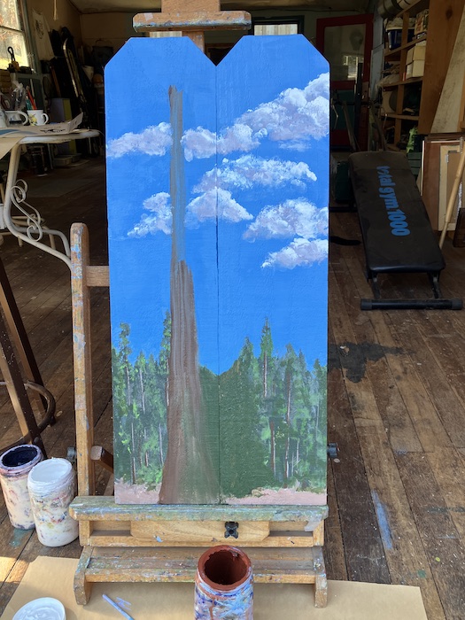
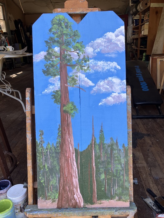
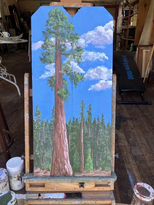
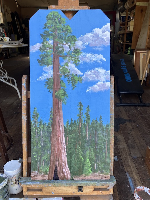
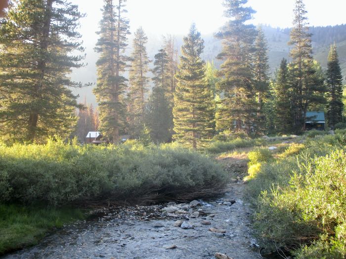
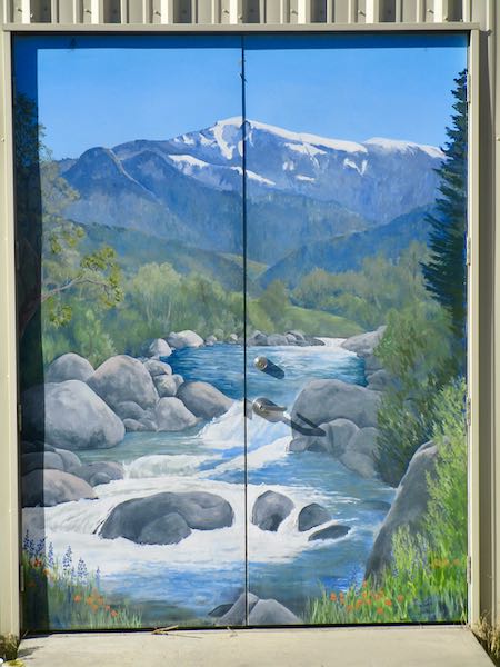
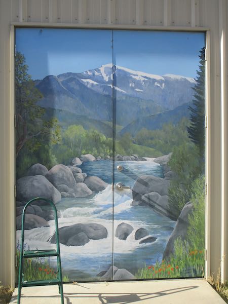
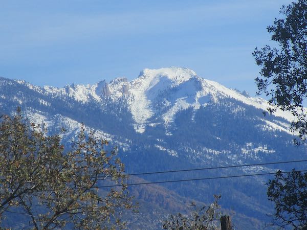
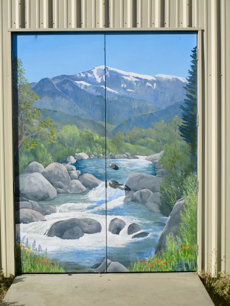
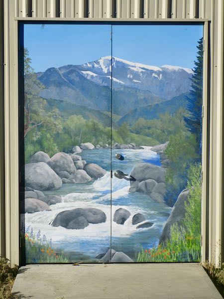
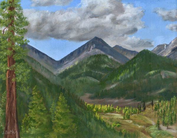
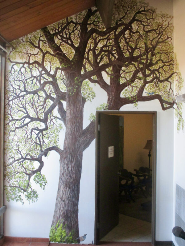
Meanwhile, I continue to work on a couple of commissions, one of which I have been showing to you and one which is still in the design and decision phase.
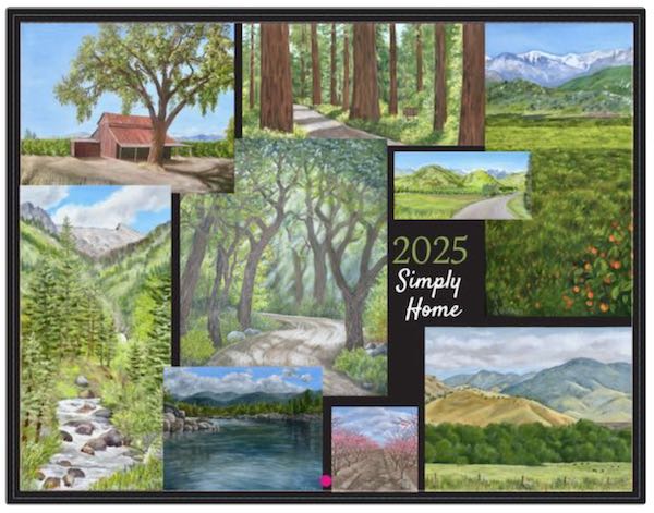
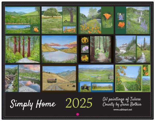
(And I’ve actually begun working on the 2027 calendar. The 2026 is available here or anywhere you run into me if I remembered to put some in Mom’s Car* or whichever pick-‘em-up I happen to be driving.)
*It is a really nice car, and I really miss Fernando. Really. Sigh.