If you receive this in your email and want to see the photos, click on the title “Favorite Internet Places for You”.

There are some places on the internet that are too good to not share with you. It is hard to find well-written blogs with regular posts, blogs without ads or with too much self-focus or excuses for not writing or no posts for months at a time. So many that I used to like have just gone splat or poof, but these have endured.
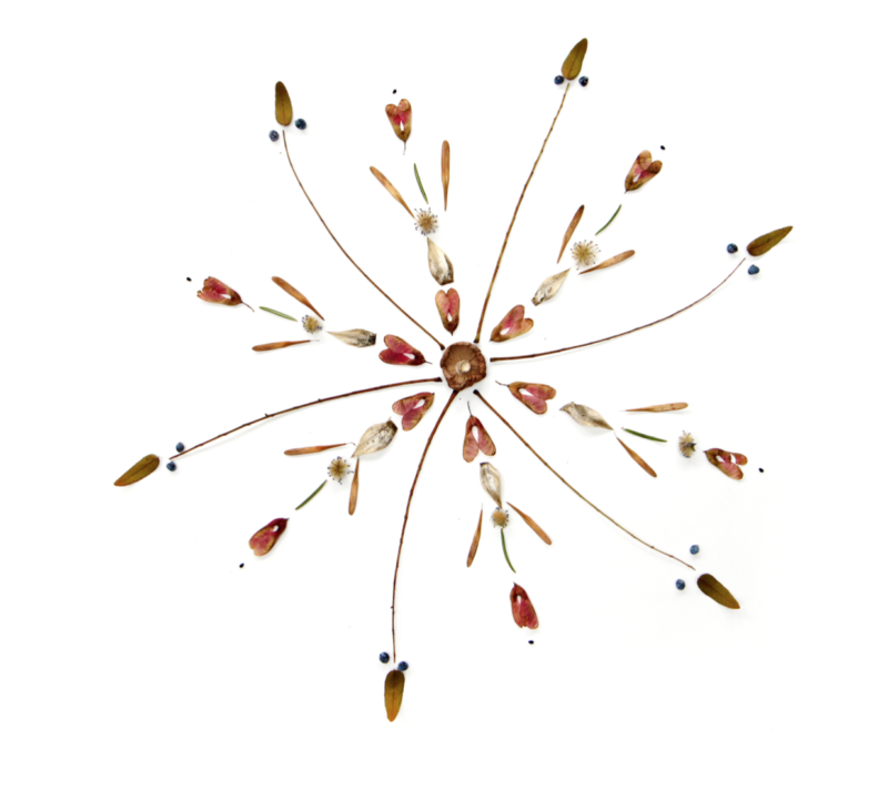
STILL is a blog with photos of natural found objects arranged in patterns. The background is just plain white without ads or words, but if you want to know what you are seeing, you can click on the tiny word “Details” on the lower right. It is simply stunning.
I took this screen shot off the site without permission. (Ahem, STILL blogger, please forgive me, and I hope this results in more followers.)
Tim Cotton Writes is a blog written by a retired policeman in Maine. He tells stories and observations about his life in a manner that feels a bit like Prairie Home Companion meets Mike Rowe (which is where I “met” him). You can read about him on his home page here. (I have his first book The Detective in the Dooryard if you’d like to borrow it.)
The Frugal Girl has become my favorite blog. Kristen is consistent, honest, personal, and responsive to her very active commenting community. She regularly posts lists of frugal things and things to be thankful for, encouraging her readers to do the same. She feels like a friend, and she even answers emails.
Everyday Cheapskate has so many helpful tips about almost every aspect of life. Look under the heading ARTICLES on her site and be stunned by the tremendous amount of wisdom available. Want to clean your shower? Keep brown sugar from going hard? Want to read some “News You Can Use” articles?
GoodReads is not a blog but it is the best place to learn about any book you might want to read, WITHOUT A USER NAME AND PASSWORD! It is also a place to keep track of what you have read, what you are reading now, and what you want to read. (That requires the hated user name and password routine). I use it regularly to decide what to read next and to keep track of what I have read. And you can sign up for give-aways, when authors have random drawings for their books. (I won one once!)
Happy New Year! Consider these sites and recommendations a gift to start your year off with learning and entertainment.


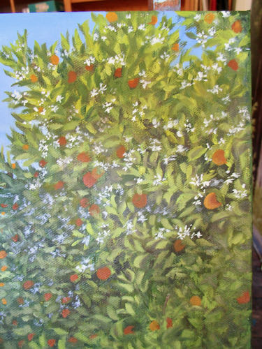
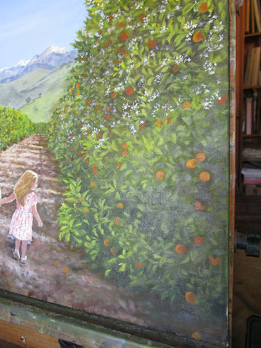
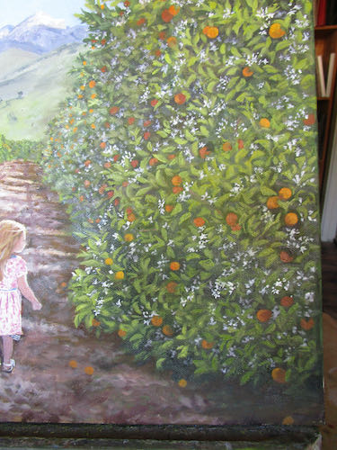
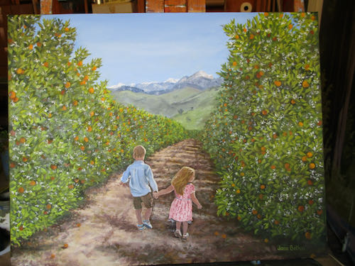
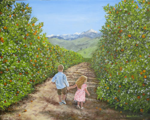
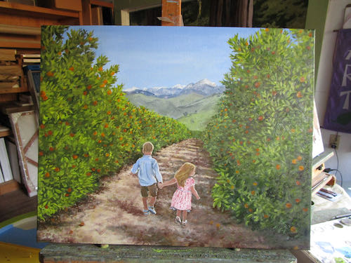 I asked the customer of this commissioned oil painting of an orange grove with his urchins if he wanted a wind machine, and he replied, “No, let’s go old school”.
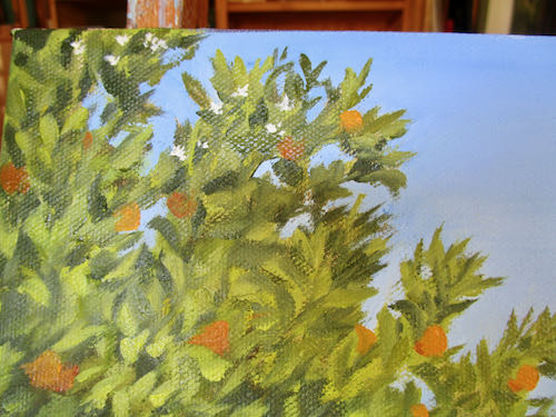
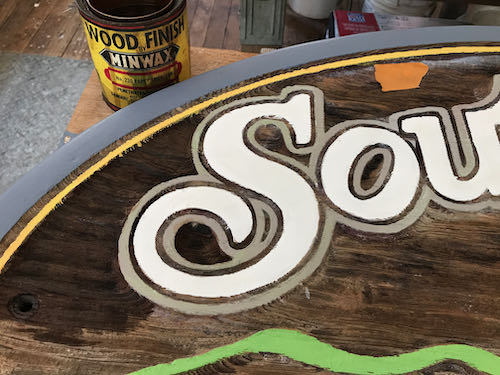
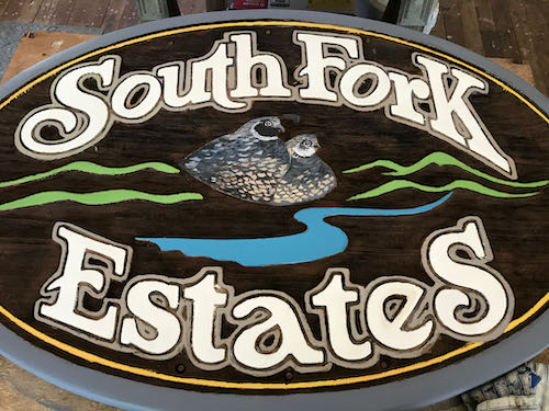
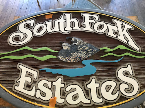
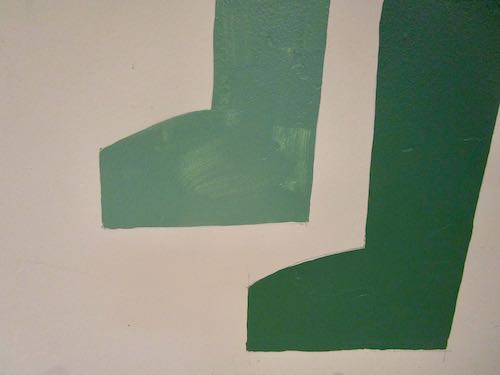
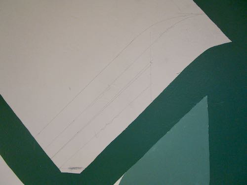
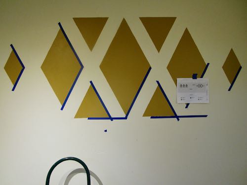
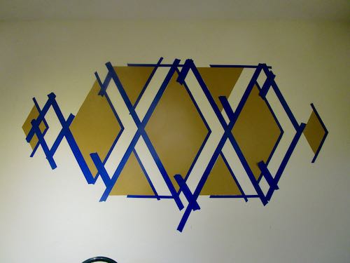
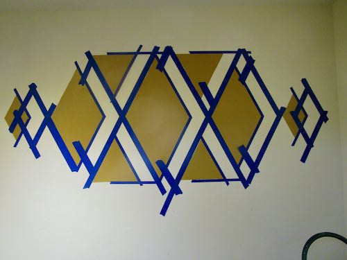
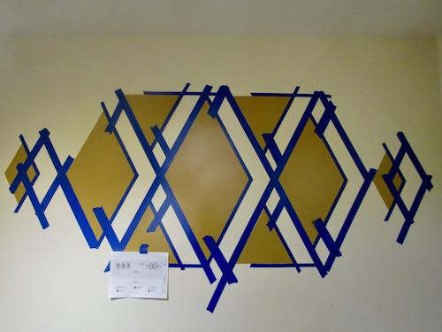
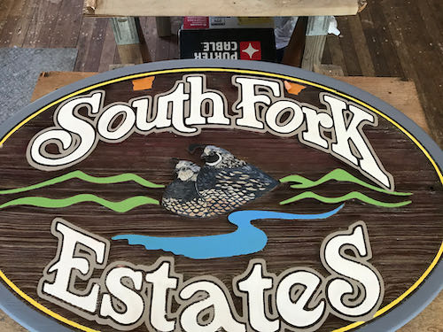 The South Fork Estates sign project was a biggie, one with some unresolved questions, but I did my part and then passed it back to the customer. Being a fine artist (an artist who makes art to put on the walls) doesn’t qualify me to understand the chemistry of paints, sealers, varnishes, stains, or how to treat wood. It is easier to just state that fact up front.