Finally, I got to the actual painting stage of my odd job.
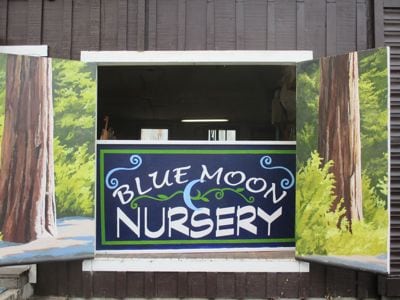
The Blue Moon Nursery got a 4’x8′ piece of very thick plywood, built a frame around it and painted it with multiple coats of white paint. This was a result of walking out to the road and measuring the existing signs. A medium sign looks like an unnoticeable postage stamp when you pass it in a car. A big sign might get noticed. A huge sign is too much for this Central California artist, so we just went with big.
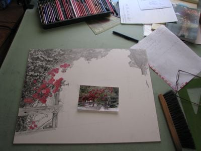
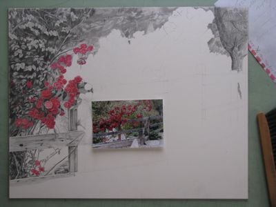
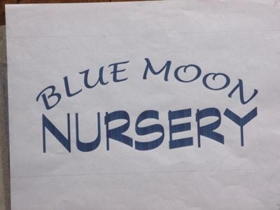
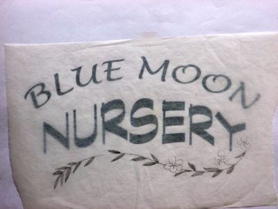
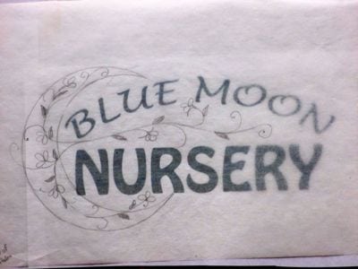
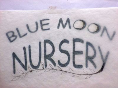
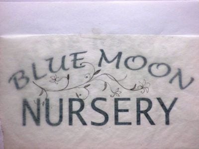
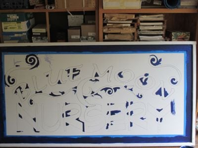
I traced our final design onto a clear piece of plastic and using an overhead projector in three stages of measuring and adjusting. I used a Sharpie marker to transfer the image, along with a square, a yardstick, and a long tape measure. It took a very long time.
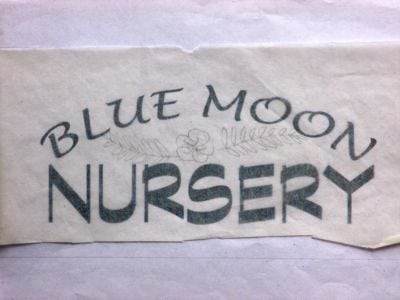
Then, I traced it from Side One onto 2 18″ x 8′ pieces of tracing paper, retraced it with a very black pencil on the back side, taped the 2 sheets to Side Two of the sign, and retraced it over the top with a pencil to transfer the design to the sign. Then I retraced the faint pencil transfer with the Sharpie. This took a very very long time.
Do you need a nap yet? Hang on, color is coming!
After a very fun color mixing session with the owner of Blue Moon, I began painting.
First, a small brush to reach into the pointy places.
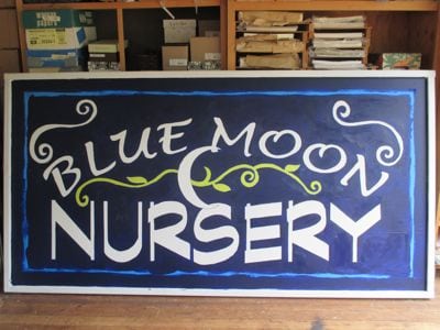
Then, 2 coats of the dark blue. Next the green. Hmmm, we really like the color of the masking tape with the dark blue.
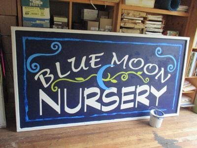
I can mix that color! (This is actually side 2, after we chose a different blue for the moon and the spirals). The new blue called for a new green.
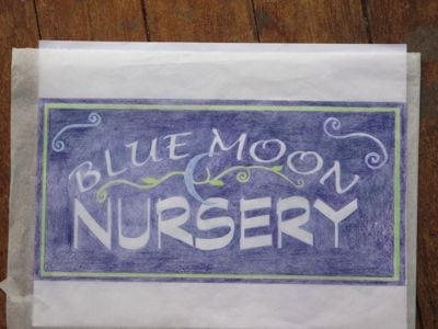
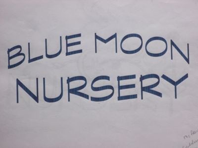
Check out Side Two, with masking tape blue and light spring green!
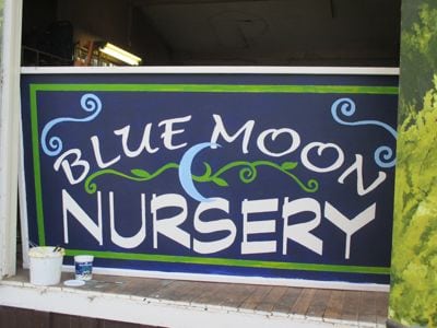
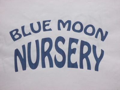
This is Side One, with a darker green and a lighter blue.
Isn’t this cool? The owner of Blue Moon and I both are slightly offbeat, marching to the beat of a different drummer, enjoying variety. (After being friends for 4-5 years, we discovered that we were in the same class in the same high school!)
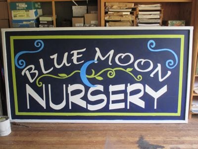
So, we decided to let the 2 sides remain in different (but very close) colors, and then we’ll listen to people’s comments. It is my guess that very few people will even notice the difference.
Thus, I conclude my story of yet another odd job for this Central California artist. It is a pleasure to beautify Three Rivers!
Do you have a preference on the colors on Side One and Side Two? I’d love to hear your opinion!