Planning, Hoping, Dreaming, Wishin’ and Wantin’

If you receive these posts in email and the pictures in the post don’t show for you, tap here janabotkin.net. It will take you to the blog on the internet.

“Planning, Hoping, Dreaming” reminds me of something Beth Moore has said, “Are you wantin’ and wishin’ instead of believin’ and receivin’?”

Indeed.

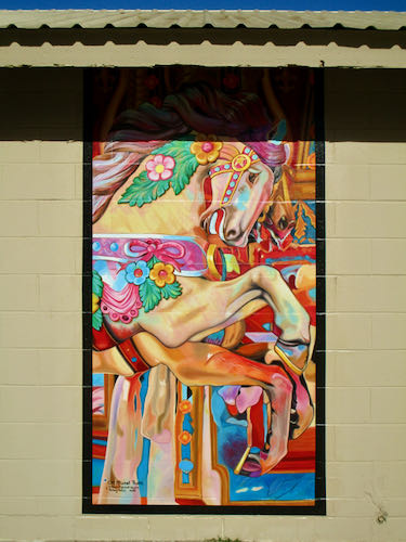
Someone Important told me last August that he was looking for a muralist. He’d been talking to an artist who didn’t return calls and was frustrated by the lack of response. He told me I could have the job.

Coolio.

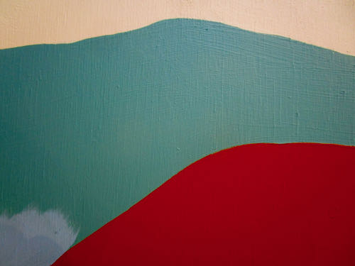
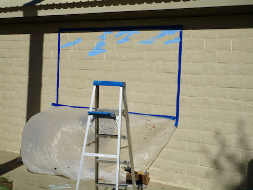
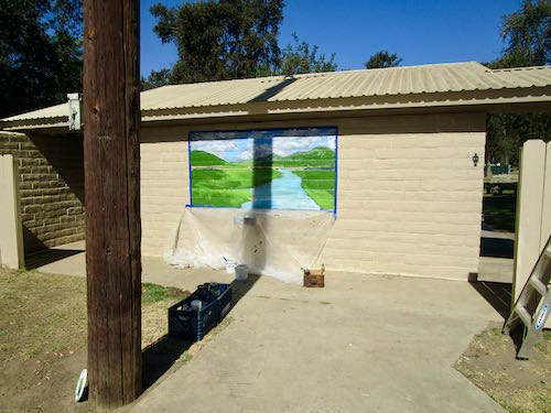
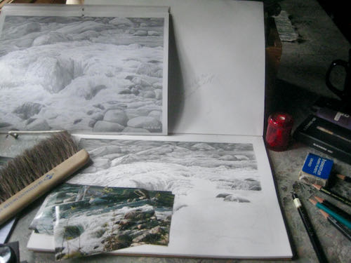
I went to the location, measured, photographed, and discussed the project with the person who worked at the location. Purposely vague here, but more will be revealed.

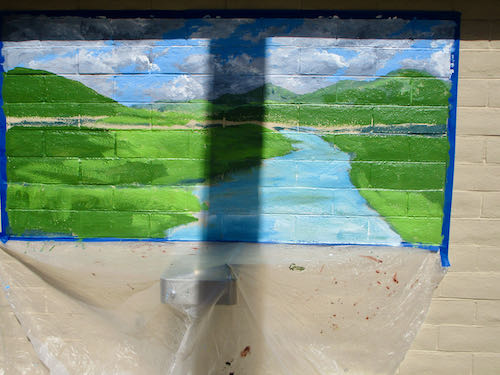
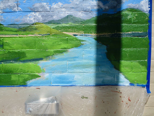
Then I got to thinking, sketching, writing up notes, designing. Oh yes, this could be very excellent!

When I had some good ideas, three, each one a different size and price because I had no idea of the budget, I called Mr. Important Someone. Nothing. Left another message. Silence, or as the current cliché goes, “crickets”.

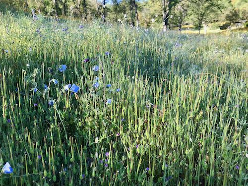
I saw Mr. Important Someone in October, and I whapped him on the arm with the stack of papers in my hand. “Mr. Someone, you have not returned my calls, and I have good ideas to share with you.” 

He had reasons (very busy, because he is Important), and was remorseful, charming, and engaging, which has probably contributed to his being Someone Important.

The cricket fest continued, until April 6, when I got an arts newsletter with a Call to Artists to bid on the project that Mr. Someone had all but promised me.

Sigh.

I am really wishin’ and wantin’, while planning, hoping and dreaming, all ready to believe and receive.

This sort of enterprise is part of the the business of art, lots of conversation until money exchanges hands. The deadline to submit a proposal is April 26; a decision will be reached sometime in May.

Stay tuned. Photos will follow IF I am chosen for the project. (Maybe even if I am not, and then you all can tell me where I went wrong.)

Mural News

The Visalia Times-Delta has an article in the Saturday edition about the Mooney Grove murals. This is the link.  Maybe it works without a subscription. You’ll have to try it. (Thank you, J.C. for letting me know!)


Mural on a South-Facing Wall in September. . . Part Two

When the mural was this far along, I begin having doubts about the wisdom of trying to complete it in one day. However, I knew the forecast was for even hotter temperatures the next day. It was difficult painting, but with my plan of attack, I decided to persevere to the end.

With shade on the sky, it seemed like a good plan to smooth out those clouds over that lumpy surface. I was in the sun, but at least the paint stayed a bit more moveable and smoothable.

Next, the tree. The upper parts were in shade, so it seemed manageable.

The shadow of the power pole is completely off the wall.

I added blades of grass, some yellow flowers (mustard?)and 3 very small cows. Please, may I be excused now?

 Yeppers: signed it, removed the tape and the drop cloth.


There were four other murals planned by other artists all around the park, so I thought I could stagger around to see what had been done. Meanwhile, there was a huge cross-country track meet taking place. I didn’t get a good photo of the crowds of fit young people running past, and I was too beat to wait for a good photo opportunity.

First stop: my murals at the museum on their lovely shaded north-facing wall.

This mural is by Joy Collier. She has worked on it in several three-hour sessions and was quite displeased with the surface of the wall. I agree with her that it would be quite difficult to get a pair of bear eyes looking good with all the lumps and bumps and holes. (I don’t think anyone will criticize these bear eyes.)

It is fun to have a bear in Lion Country.

Mooney Grove Park is so beautiful. The variety and abundance of trees just stuns me every time I walk (stagger) around. They have a TERRIBLE squirrel problem, so I had to watch my step very very carefully.

This one will be a beautifully designed Welcome to Mooney Grove picture in the style of an old fashioned postcard. I met artist Katy Nave Kemalyan earlier in the morning. Later, when I saw her design on the sign with Joy’s bear, I was very impressed with her work.

Colleen Mitchell Veyna and her business partner Kelsey Giles do their painting on some sort of vinyl in the studio and then “wallpaper” it to the wall. Excellent plan in this situation; they have a west-facing wall, like Katy’s. At least they get shade in the mornings! I wonder if there used to be a carousel at Mooney Grove.

The final wall was completely untouched and will be a beautiful poppy scene by Heidi Steinman.

Then I staggered back to my wall to see if it was truly finished. I think yes.

We were paid well, a good thing, because  I stopped for petrol on the way home. I was so stunned that I thought I’d share this photo with you: approximately $6.50 a gallon in Three Rivers.

And thus we conclude another mural at Mooney Grove Park, a jewel in Tulare County.

Mural on a South-Facing Wall in September. . . Part One

This is not ideal for mural painting, particularly in contrast my last experience painting at Mooney Grove on a north-facing wall in February and March.

Realizing that the entire day would have strong hot sunshine on the wall, I determined to finish it in one day instead of the prescribed four. I knew it might possibly take 2 days, but I was focused, locked and loaded, ready to rock and roll, and whatever other cliché you can find.

This will be one day of painting and two days of posting.

First, let me be clear about something: I am Very Thankful to have been chosen to do this job and at the same time, I wished it could have been done at home in my studio with these creatures hanging around. (Pippin is barely visible in the bushes, and Jackson appeared after I took this poor photo).

Alas, sometimes an artist has to go out into the world, kill something, and drag it home to the cave. (Don’t get worked up—it is only a euphemism for doing work away from home.)

Instead, I saw this creature. Mooney Grove is known for its peacock population, although now there are way more Canada geese. Fortunately, they were not in mating season or hanging around my location like the last Mooney Grove mural.

Hello, restroom. I was happy to see some shade. I didn’t know what was coming.

There were domestic geese waiting for me to set up, and very very bold about it. 
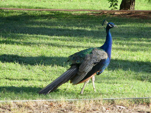
9 a.m. and it was already hot in the sun.
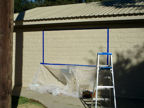
HEY! BUG OFF! 
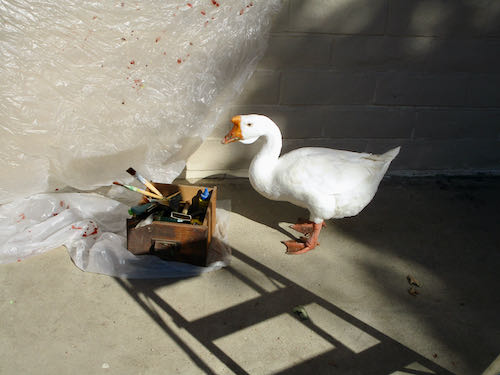
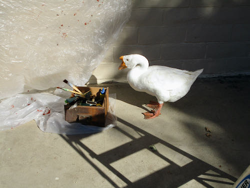
Apparently he had a conference to attend, so eventually he waddled away. 

Let’s get to work. You guys too.

Farthest thing first – the sky. I didn’t have a colored copy of the painting that I submitted to the committee, so I was trying to recreate the scene using the original photos and a very poor pale copy of the painting.

Now it is in total sun, with the power pole shadow working its way across. I decided to put base coats on each segment, then return for detailing, rather than trying to complete each section as I went.

After applying blocks of color to each section and trying to squish the paint into the holes in the concrete block, I had to figure out how to proceed. The plan of attack: stand in the shade, plan the next move, decide the necessary colors, quickly grab the paints and brushes, sprint to the wall, and slam out the next small segment before running back to the shade to evaluate my work and figure out the next steps.

Watch the shadow of the pole move across. I kept dragging my crates of paint to the shadow as it inched to the right.

I ran out of water, and 2 wonderful park maintenance men brought me 4 bottles!! 

I finally realized that I couldn’t hold the palette, brush, and the photo, so I taped it to the wall. Sometimes I don’t want to do that because the tape causes the fresh paint to peel. This paint stopped being “fresh” about 20 minutes after application. 
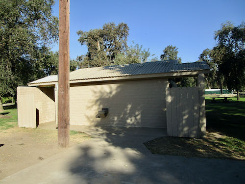
The maintenance men eventually brought this sign.

They also gave me permission to cross out the incorrect title. I didn’t bother with the incorrect dates, but I did add an “L” to Colleen MitchelL Veyna’s name.

Just rewriting this makes me almost collapse from the memory of heat. We will continue tomorrow with the rest of the very hot day of painting a mural on a south-facing wall in September at Mooney Grove Park.

New Mural at Mooney Grove Park

About two and a half years ago, I worked on several murals on the outside of the Tulare County Museum at Mooney Grove Park on the south side of Visalia, California. Each day when I finished painting, I walked around that giant park of a zillion trees. As a muralist, I am always aware of blank walls, and I counted 7 concrete block restrooms, all painted white, all with multiple walls screaming for murals.

I photographed several of the buildings, photoshopped some of my paintings onto the plain buildings, then wrote up a proposal to present to a committee that meets 4 times a year. I also wrote a letter and asked to be on the next meeting’s agenda.

Then, The Plague struck. No response to anything I requested, no followup, nothing.

A few months ago, the Arts Consortium invited artists to submit five designs apiece, each proportioned to fit a 4×8′ horizontal mural. Five artists would be selected to paint a mural on a restroom. I submitted 5 ideas, and included my photoshopped versions for their visualizing convenience. (Always make it easy for the customer!)

Eventually, I got a congratulatory email saying my painting of the North Fork had been selected for one of the restrooms. Not my favorite, but I have painted and sold this scene about three times, so it seemed like a good candidate for a juried situation.

Next, I got instructions that all the muralists would be painting their restrooms on the same weekend, from a Friday through a Monday, and would be finished on that Monday, no exceptions, so there. 

I looked at the weather, saw that Friday would be 104, contacted the nice man at the Arts Consortium and asked for a postponement or to be fired.

Being reasonable, he agreed that paint dries too fast in those conditions and went to the committee making the decisions. 

We were then allowed to pick our own four day block to paint, and I chose September 21-24.

The forms began flying back and forth, along with a visual to remind me which painting had been selected, and a photo of it on “my” restroom wall.

Excuse me??

All-righty-then! So, I will be painting Yokohl Creek, which might indeed be my favorite. (GREEN!!)

Supposed to begin tomorrow, but many of the project details have been fluid, so time will tell. . .

More Cold Water Drawing

This is the first drawing titled “Rock and Roll”, one that appeared in my 2018 calendar, sold, and now has been requested by a new customer as a do-over.

On a rainy weekend in Mineral King, I worked on the new drawing for another few hours.


This time I remembered to bring my Tombow pencils and also the original photos. I try to work from photos so that I am not simply interpreting a previous interpretation. Flowing water isn’t an exact subject, but I want to keep close to the original view because the customer recognized this section of river. If I stray too far, she might say it doesn’t look right.

I wrote a few reminder notes on the facing sheet, and then because of the overcast and rain, it got too dark to see the details, up there in the Land of No Electricity, Internet, or Cell Service. 

Still More Painting in Church

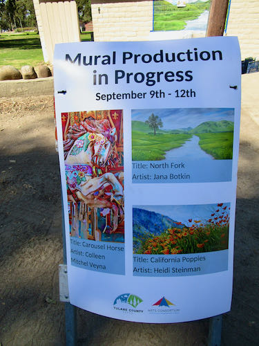
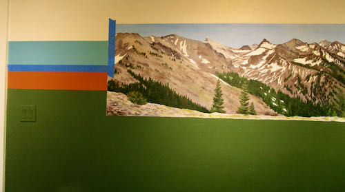
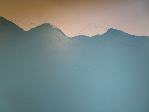
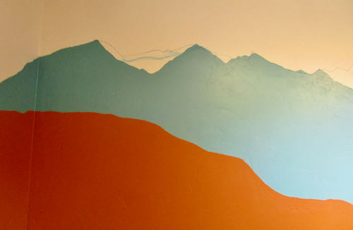
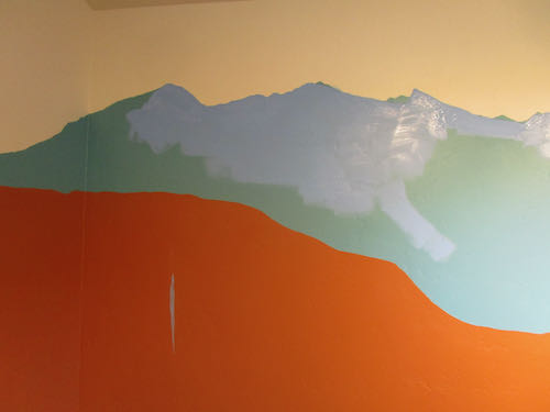
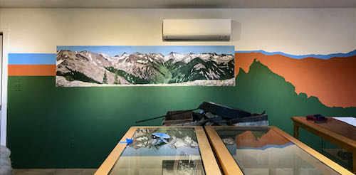
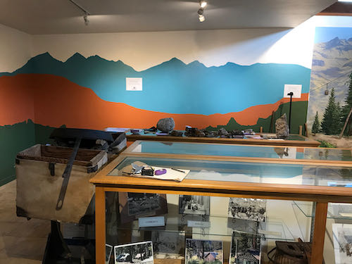
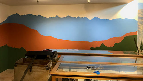
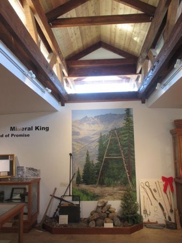
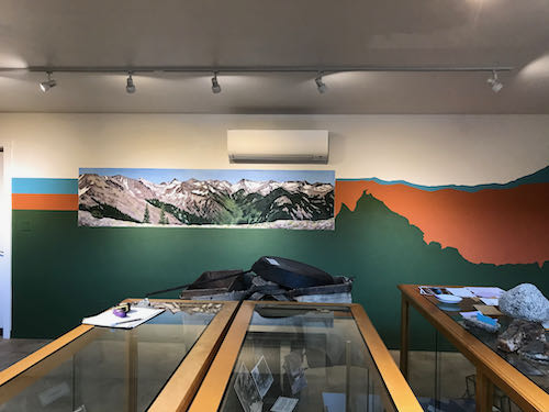
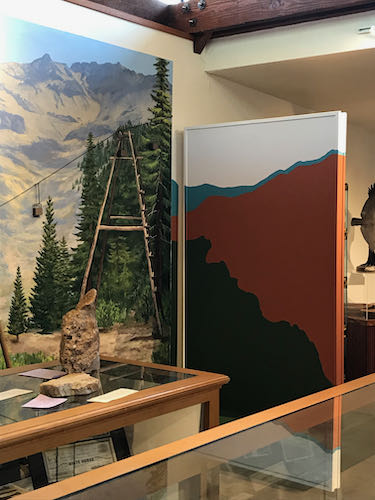
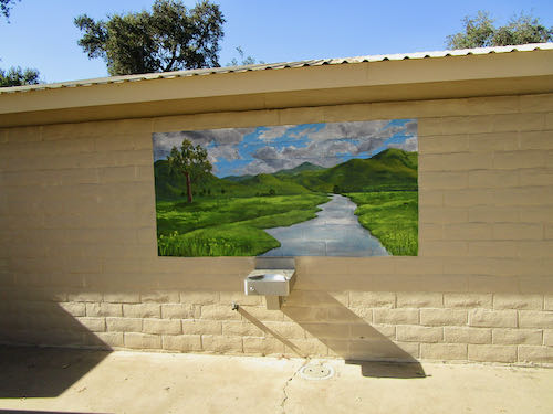
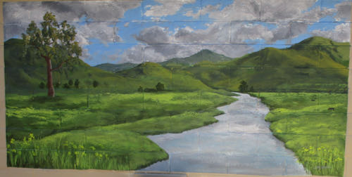
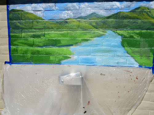
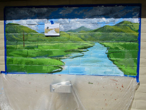
After having the audacity to mess with someone else’s art, I returned to the endless mural at my church. (It would be a real blessing if someone else messed with this one for me.) This blank right side needed to be finished. 

Weird color because the big stage spotlights are on.

I started by defining and filling in the different segments from farthest away to closer (called “planes”, which is a word you might recall from geometry.) 
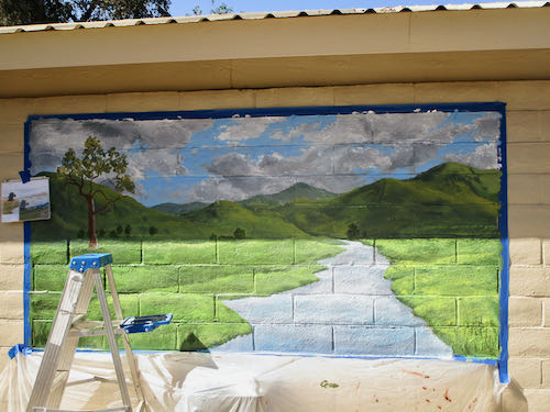
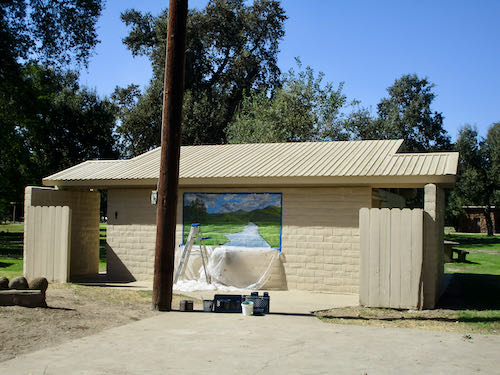
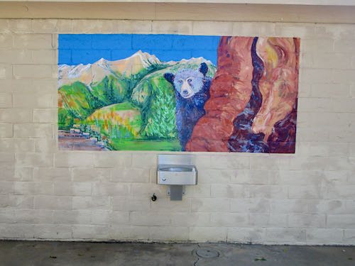
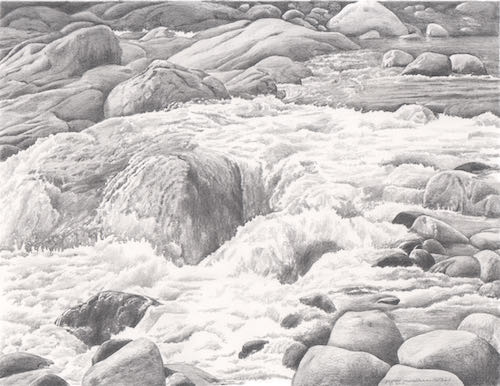
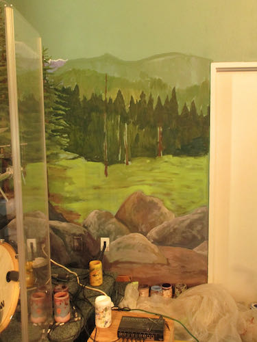
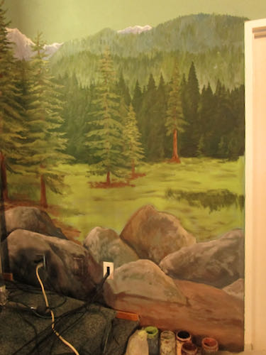
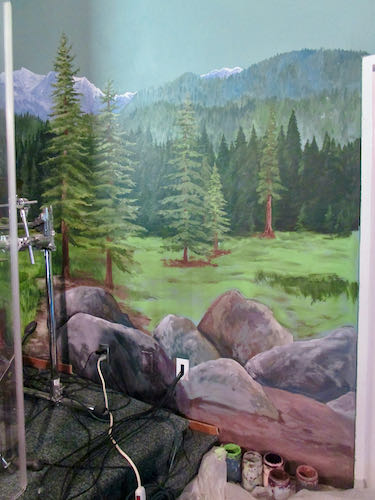
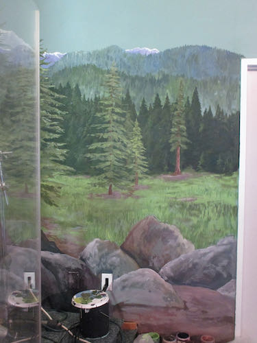
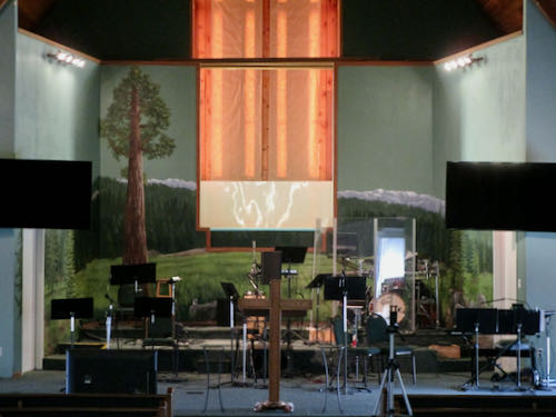
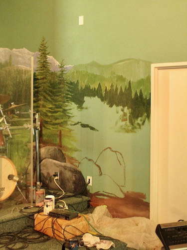
Boulders seemed like a good solution. It is better if the two “wings” aren’t symmetrical, which means that they don’t mimic one another. That wouldn’t look natural, as if it is natural to have a giant mural of a fake Sequoia meadow on the stage of a church. (I love Three Rivers, with all our original authentic uniqueness. Sometimes it seems as if we use our location as permission to be mavericks.)

I found a different setting on my camera to show the colors more true. 
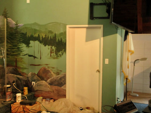
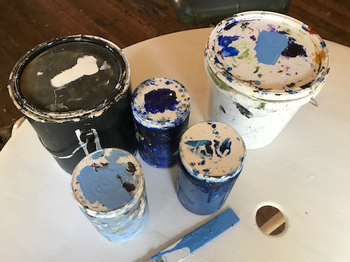
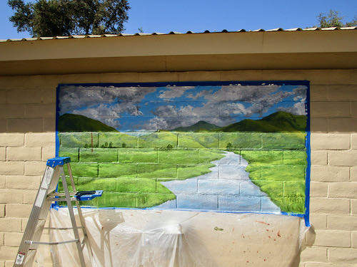
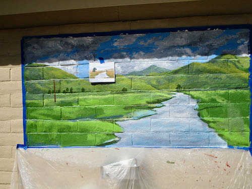
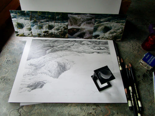
After 5 hours, I dropped off into Idiotland, where I began to get sloppy and stupid. It isn’t good to get sloppy in a place with carpet and painted areas that have no touch-up paint available.

Am I finished?

Maybe, maybe not.

It will probably take a month or two of Sundays before I decide. 

Maybe I just won’t sit where I can see this, and then I won’t pick it apart. It looks fine from this angle.

So there.

I mean “Amen”.

P.S. The drummer gave me a wonderful compliment about the mural extensions. He said they looked so right, so perfectly continued from the rest of the mural that he didn’t notice that they were there.


Messing With Other People’s Art

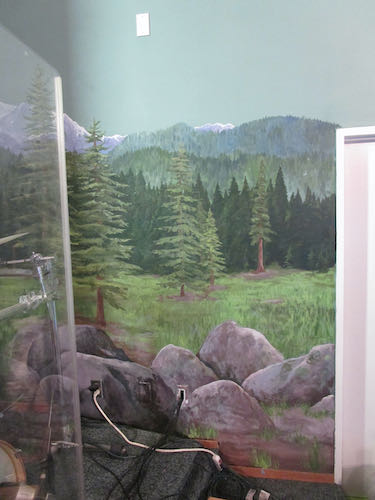
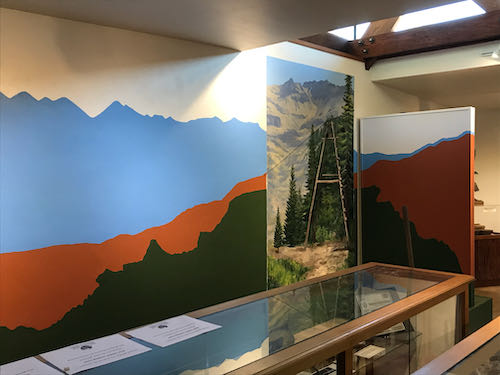
There have been several times in my career when I have been asked to change someone else’s art. I have repaired a torn canvas, changed a boulder in a painting that looked like a skull, fixed a child that looked like a little hunchback, and brightened colors in a dull painting. All these were done without knowing the original artist, and with assurance that the original artist would never know.

The Mineral King Room makeover was a different story. The original designer is highly educated, experienced and respected in The Art World. I am somewhat known in the local Art World, but I try to keep a low profile when it comes to any formal types of situation where I might be outed as a total DBO, mostly self-taught, Tulare County native. (You know how I feel about ArtSpeak. . . ugh.) 

I respect the original artist of the Mineral King Room and understand that she put a lot of thought into the design. The folks who approved the design were awed by her work, and didn’t think that there would be a strong reaction to the teal color and the stylized mountains, which were all effective from a designer’s point of view.

The approvers were mistaken about the reaction, which was strongly against the color and the mountain shapes. This necessitated a call to your Central California artist, who also is the local Mineral King artist.

The designer wasn’t pleased when she learned that I would be giving her design a makeover. (What artist would be??) I don’t blame her, because she chose all the shapes and colors based on her design expertise, to provide the best interpretive background for historic displays. She was professional and polite, while sounding as if she was defending a dissertation, not in a defensive way, but protective and offering the rationale for her design decisions.

My approach, on the other hand, also based on training and experience, is to simply please the customer. (My very wise dad taught me the all important business principle of “You kiss their fanny and take their money”.) We have to think about who the visitors and supporters of the Mineral King Preservation Society are, and what they will understand. The answer to that is that they love Mineral King, not a stylized version of it. (“Nosirree, I’ve climbed Sawtooth, and that ain’t it!”)

This is how the mountains surrounding the Mineral King valley really look.

So, with respect to the designer, who is very good at what she does, I just dove in and “corrected” her work. I don’t mean that it wasn’t good; it just wasn’t right for the audience.

Did Mineral King Need a Paint Job?

Did Mineral King need a paint job?

No, but the Mineral King Room at the Three Rivers Historical Museum did. The blue didn’t match the murals in the room, and the mountaintops weren’t recognizable. (You can see the murals here.)

First, I was determined to mix the right shade of blue using whatever paints I had on hand. Lightfastness isn’t a problem on indoor murals, so I was able to use a can of indoor white paint that came from who knows where, along with my 2 mural paint blues. Mural paints are highly pigmented and that makes them very useful for making my own interior colors.

Second, we taped all the parts that needed protection. (This was not the royal we—I had great help from MKPS Sandi).

Next, I traced the tops of the mountains on the mural showing the peaks surrounding the MIneral King valley. This provided a guide to redraw the peaks to match reality. (This was based on the assumption that I painted the mountains accurately in the mural.)

I drew the mountains on with chalk. (It wasn’t a Mineral King blue either but it matched my painter’s tape.)

Then, I started painting and almost immediately, dripped onto the rust color.

Good thing there is touch-up paint for all the colors involved. 

Here is an example of something weird that I have learned about acrylic paints, as opposed to oil paints: they are LIGHTER when they are wet. Doesn’t make sense, but it is true.

That teal color was great with the rust, but just not right for the subject matter. I told the Mineral King Preservation Society that if they are just going to waste the paint, I’ll be happy to take it off their hands. I’m sure I can find a use for it. (Weird how the rust looks like red here, and the white looks like light tan).

Now look at the room so you can see the corrected peaks and the color that matches the murals. (I’ll show a before and after on the 2nd shot for you.)

Before:

After:

The mountains in the Before photo are more dramatic and more proportionally pleasing. However, the mountains in the After photo are realistic rather than stylized, match the murals and give more display space for whatever will be going on the wall.

Tomorrow I will tell you a few thoughts about this job.

Quick Quick, Can You Help Us?

The Mineral King Preservation Society has 2/3 of a room at the Three Rivers Historical Museum. We call it The Mineral King Room, in spite of sharing it with another exhibit. 

A few years ago I painted some murals in that room.

Recently, the room started getting a facelift, or perhaps “makeover” is a better word. I was at the museum for something, went in the Mineral King Room, and saw the beginnings. My first thought was that it was colorful and spiffy looking; my second thought was that the blue didn’t match the sky in the murals, and my third thought was that the supposed Mineral King peaks did not look like Mineral King.

Several weeks later, another Mineral King person stopped by and said, “That color of blue is doesn’t look like a Mineral King color, and I don’t recognize those peaks.”

Thus, I got a phone call, asking if I could change the color of blue and fix the line of mountains.

Aren’t you just dying to see what I am talking about?

An incidental thought about that blue: it is a great color, kind of a turquoise or teal, something I have quite a bit of in my wardrobe. It just doesn’t happen to match a sky in Mineral King. It might look better with the rust than the sky blue, but reality has to take precedence.