This is my job???

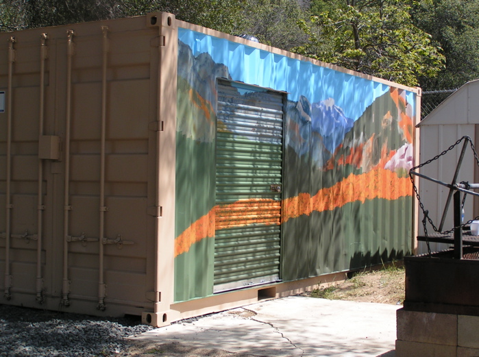
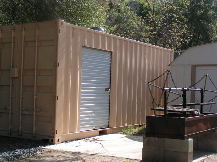
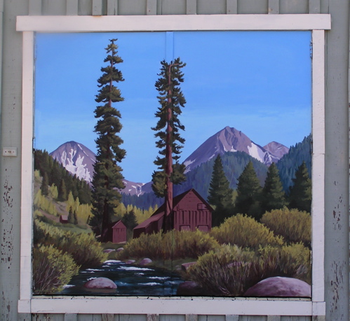
This was a good painting day! It brings to mind the saying, “The worst day painting is better than the best day working”, although I think that was originally about fishing, not painting. And come to think of it, my painting is working!! (in both senses of that statement) Such a great life I have been blessed with!

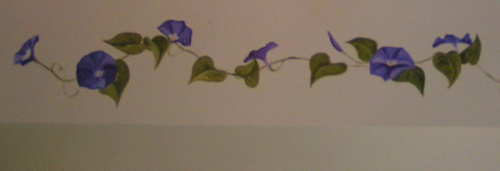
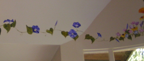
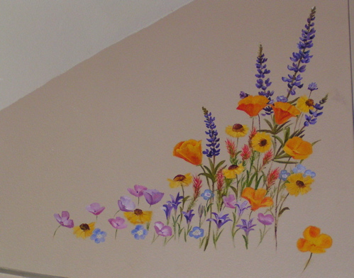
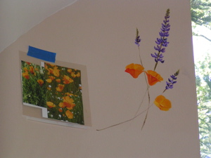
Anyway, here is a new photo of yesterday’s completed left side, (because even my photos were blurry yesterday) and a new photo of today’s completed right side. Oh my, S will be very pleased when she gets home tonight!

pict0005.jpg

pict0004.jpg
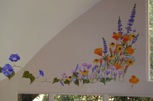
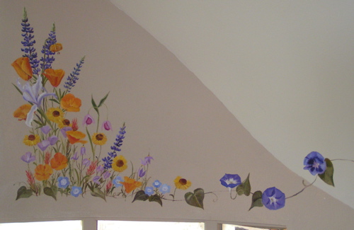
Some of the same flowers here: poppies, lupine, Bigelow sneeze-weed, Indian paintbrush, farewell-to-spring, baby blue eyes; and, some new ones: wild iris, fairy lanterns, and a tiger (or is it leopard?) lily.

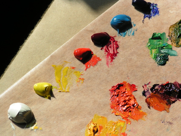
p.s. I only dropped one paintbrush today!

wildflower saga continues

Wow, this was hard today! Look at all the hassles:

1. S was out of water
2. I couldn’t figure out how to turn on her ceiling fan (it gets hot up there in the upper reaches of her dining room!). But it was good I couldn’t turn on the fan, because it would have chopped my head off working on the morning glories!
3. I kept climbing up and down the ladders and the scaffolding because I either forgot stuff or dropped it. (There is no place to put things while standing on a ladder or a platform, so it is a bit of a juggling act.) Plus, I have to climb up and down to see how it looks from a normal viewing position.
4. It was weird trying to see with the glare, the brightness of the windows, needing glasses for the reference photos and also not needing glasses to see where to carefully place my feet on the platform. . . phew! I was glad to come home, until I found that our water softening machine had been blowing gallons of water into the yard for an hour or two.
5. The 5 kittens snuck in the back door while S’s Dad was trying to solve the water problem, and I had to round them up and throw them out!

At least the painting turned out well today!

pict0026.jpg

pict0025.jpg

pict0005.jpg

More greenery has happened at the bottom, and now it is flowing into a row of morning glories. For the farmers out there that read my blog, I apologize for including such a pernicious weed. However, this one won’t spread outside of these walls, and even you have to admit that it is a fabulous color!

Getting a little easier

Today I returned to house of S, aka the Divine Dining Room project. There was black plastic blocking the blinding window light, so it was a little easier to see. However, there were a few distractions as i looked out the window below! (Have I mentioned my Cat Disorder?? Never mind, just try to pretend that I am normal.)

pict0010.jpg

pict0012.jpg
This little guy was calling to me through the window, but I cold-heartedly pretended as if I didn’t know what he wanted. It was an act, it hurt a little, but I am trying to overcome this little problem.

Here is how the wildflowers look now:

wildflowers.jpg

In case you are wondering, these are California poppies, a variety of lupine, Bigelow Sneeze Weed (the yellow with big brown centers), Indian Paintbrush (the red), Baby Blue Eyes (bet you can figure out which one that is), Farewell To Spring (the pink – a clarkia, but I don’t know which variety), and 2 different kinds of brodaiea (or some such collection of vowels. . .) I hope to return to the job on Wednesday. This is a fun fun job! (never mind about the part where I forgot my brushes and had to drive back home before starting this a.m.)

stretching out. . .

It is a common thought that one must stretch one’s abilities by trying new experiences. So, here I go again!

Back in January or so, my good friend S (who declined to be identified as “The Divine Miss S) asked me to paint something in her dining room (which is definitely a divine room!) My answer was a definite “Maybe”! At first we considerered ivy, then looked at some acorns and oak leaves. S wasn’t entirely sold on those ideas, and when I thought about her personality, I realized that what she needs is color, lots of color!

So, we decided that wildflowers were the right choice. First, I had to learn how to paint them, so we waited until I practiced on all those poppies and lupine.

Today I started her divine dining room project. Check this out:

pict0153.jpg

Nice room, eh? (the ladders were for my benefit – S doesn’t normally store them in her dining room)

pict0154.jpg

Whoa, I get to paint up there? The surface is a little rough, and the light coming in the windows makes it a little tough to see the colors I am putting on the wall. (stretch, stretch, stretch. . .)

pict0155.jpg

This is how it looked after a couple of hours of dinking around, arranging materials and supports, and finally making the commitment of the first brush stroke. As usual, more will be revealed, so stay tuned.

Primary Colors

palette.jpg

This is my palette for oil painting. It consists of 2 reds, 2 blues, 1 yellow and white, and all the colors I use are mixed with these 6. Before I started painting, I read articles, looked at books, and quizzed painters I knew. The ones that made the most sense to me were working from the primaries, mixing all their own colors. Several reasons are given: 1. Colors are cleaner, rather than the dreaded “muddy” look; 2. It keeps the palette less crowded; 3. It requires a greater understanding of colors and how they interact in mixing. 4. Less things to buy is a reason seldom given, but it certainly matters to me, because the more stuff I own, the more stuff breaks (or gets lost.)

I think there is a bit of an unspoken snob factor here. There is some pride in being able to turn those basic colors into any color one wants. However, there is a color I cannot mix! So, I gave in and today on the Seatrain mural I used carbazole dioxazine violet. It sounds like something for killing cockroaches, but it was the most wonderful purple in the world!! My friend working on her Master’s of Fine Arts insists the proper word for purple is “violet”, but I am a bit of a DBO. . . after all, I grew up in Ivanhoe! It looks rather blue here, but in reality it is the purplish-blue of lupine and was a great relief from all the orange.

purple.jpg

(in case you are wondering – Ditch-Bank-Okie)

More on the Seatrain

This giant project began with a to-scale sketch made up from about a dozen photos. I started painting at the top and worked my way down. When I realized what this size really entails, I felt like lying down for awhile, maybe even with my thumb in my mouth.

Instead, I called my dear friend Shirley, who had offered to help. Lovely lady, that Shirley! And she can do almost anything and do it well. So, we mixed colors and got that giant container covered, and hope returned.

Here is how it looked after Shirley helped me. She did a particularly fine job on the band of poppies running through the mid-section.

To be continued. . .

seatrain-wshirley.jpg

What is a “Seatrain”?

It is a metal shipping container, commonly seen on the flat cars pulled by freight trains. Cargo arrives by sea in these things, and then gets hauled around the country on trains – thus, “seatrain”. When they are empty, people often use them for storage. They are relatively cheap (so I am told) and they are very unsightly but functional. My church acquired one, and I saw it as an opportunity. (People who do graffiti also see them as opportunities, but I have a bit more class than that.)

Holy guacamole, this is a large piece of real estate to cover with a brush!This is a lumpy piece of real estate to cover with a brush. There is a BBQ in the way, and worse, there is a little shed about 2 feet from the back 1/3 of the thing!

Before I could talk myself out of this, I started applying paint. I had to tell myself to breathe, and I could hear my Dad’s voice in my head saying, “Whatever you do, don’t panic.” He always said it in a quiet monotone that was meant to be calming; however, if he was saying it, I knew there probably was a good reason to panic!

This is how it looks unpainted:

plain-seatrain.jpg

To be continued. . .

Framing Matters

framed-mural.jpg

Check out the finished final finale* of my first mural – now it is framed! Sort of weird what a difference the frame makes, even considering the “high quality” of this particular framing job.

*courtesy Department of Redundancy Dept.

First Murals!

I have been told that murals are The Way To Earn A Living as a painter. . . maybe, but first I need to learn how! So, these are my first attempts, and are at my house rather than out in public.  The poppies came first – a smallish way to learn to use acrylics. Farewell Gap was the goal, and I painted it over and over, progressively larger until I felt ready (sort of) to try it 81″ x 81″.  The first photo show it in progress . . . the second shows how the main one looks with a “frame”.pict0001.jpg first-mural.jpg