Brrr, BRRR, and BRRR! In driving the 35 miles down to the mural yesterday, I learned that the defroster in Momscar* is INSTANTLY effective, and I actually used the seat warmer, which seems like an ultra luxurious feature. Now I just need to figure out which button makes heat land on my feet.
Step by Step on Day Two
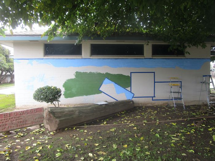
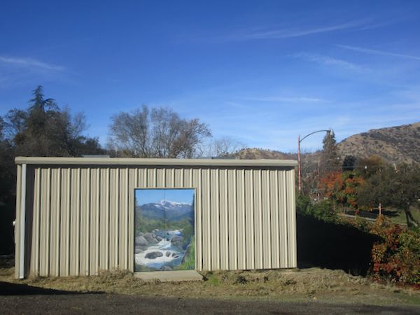
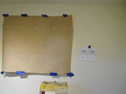
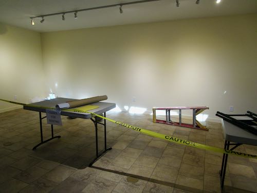
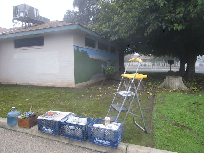
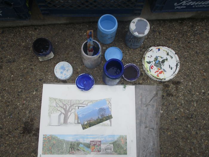
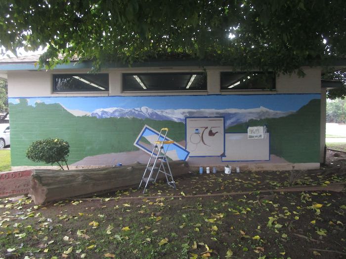
I took MomsCar so instead of just working off the tailgate of the good pick-em-up truck, I unloaded everything on the curb. (This is the curb of the driveway, not the actual road.)
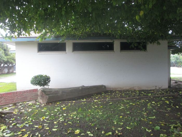
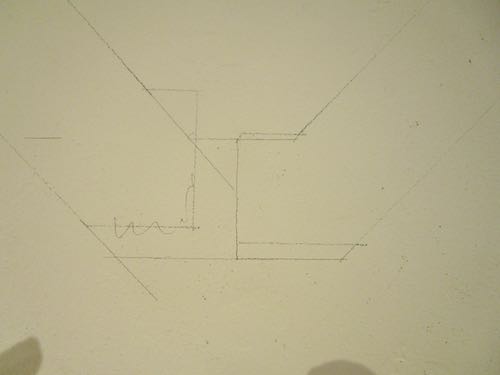
Next, I had to satisfy my curiosity about that box on a pole.
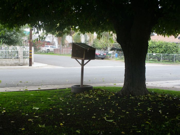

No idea.
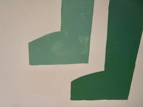
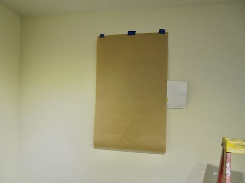
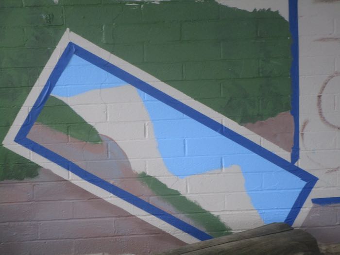
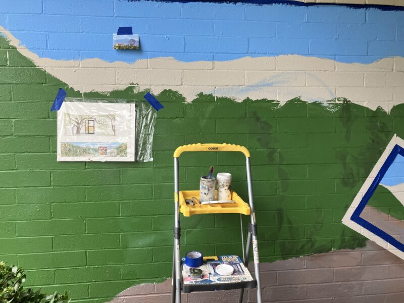
It is overwhelming to look at all that needs to be done, so I just eased into it. First, I removed the tape on the outside of the left inset.
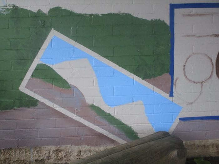
Then I retaped it on the inside of the inset.
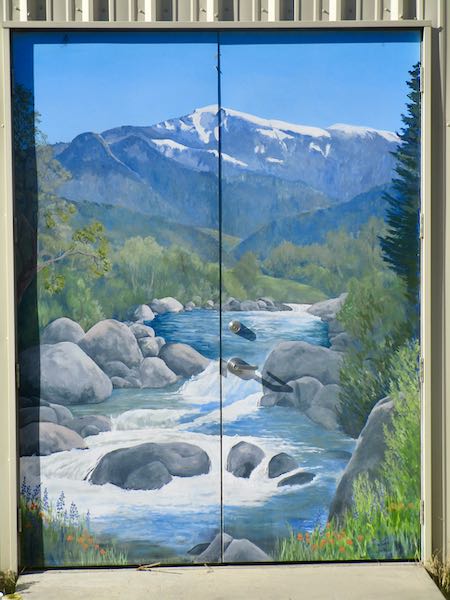
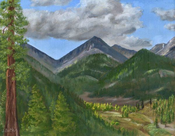
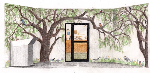
Because I paint from back to front and the sky is mostly finished (might add wispy clouds later), I mixed some “purple mountains majesty” color.
Starting on the left side, working my way south.
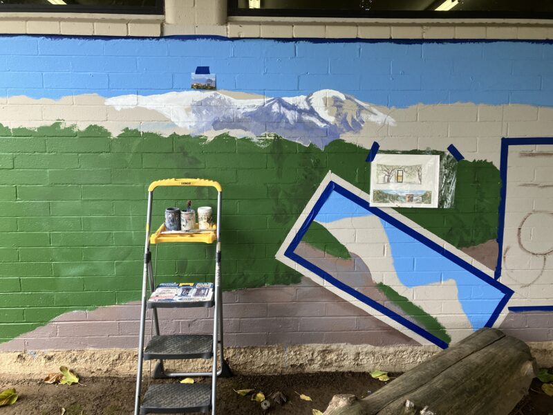
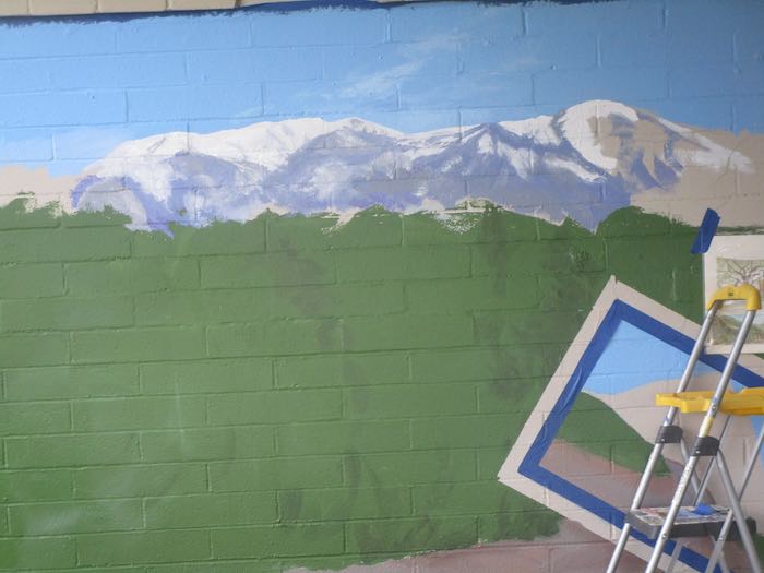

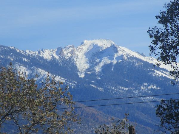
I had to keep standing back to see if it was believable. My goal was to make the mountains accurate, but I can’t seem to get a photo of how the range looks from Ivanhoe because of the overcast. My one good photo only goes from Alta Peak north. So, I just painted a first coat on the second half, getting Sawtooth in place. I will finish the mountains after I get some better photos.
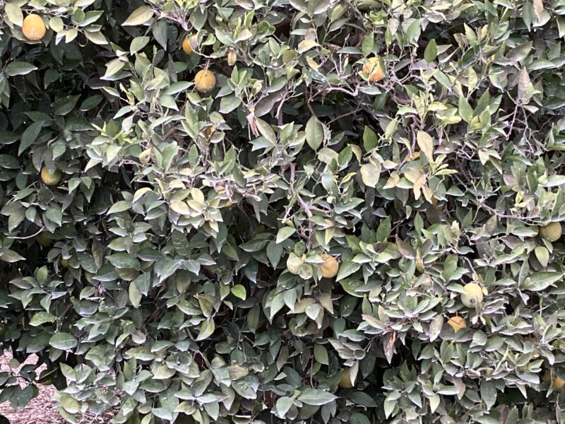
Next, the upper edge of leaves. That was confusing because I am interpreting multiple photos, trying to make it believable. I alternated among 3 greens and used a tiny hint of orange. I’m not sure what the best approach is yet, but I have plenty of real estate in which to solve this problem.
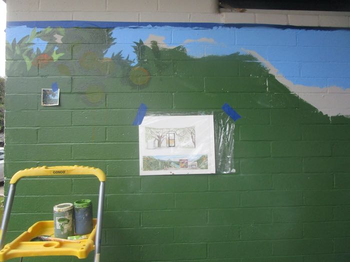
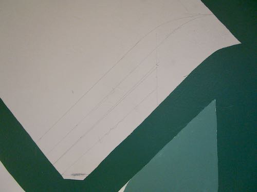
I also placed a few of the closer oranges by circling the placement.
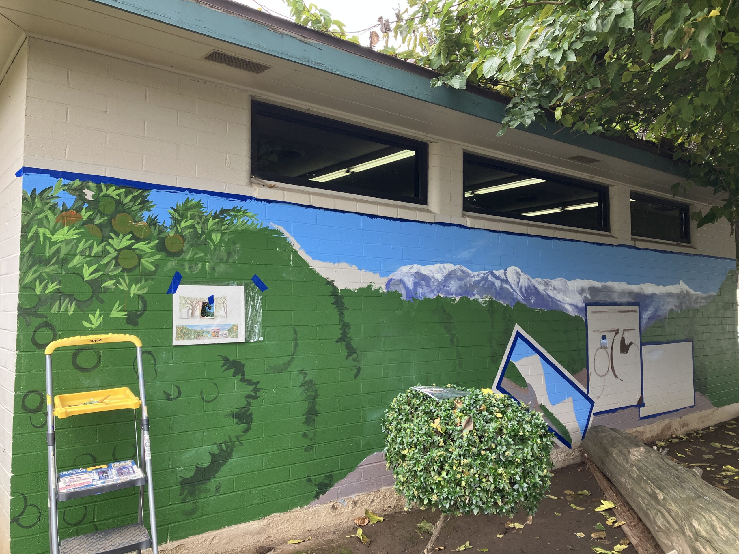
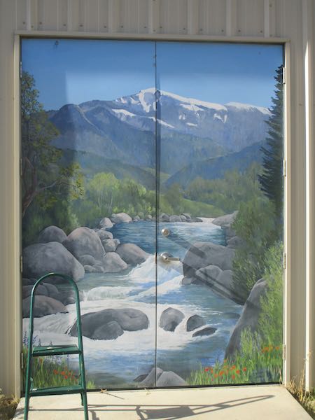
I moved to the upper right leaves, and then I was just too cold to continue. Here is the final shot of the day.
Then I filled in the channel left unpainted by the masking tape around the left inset.
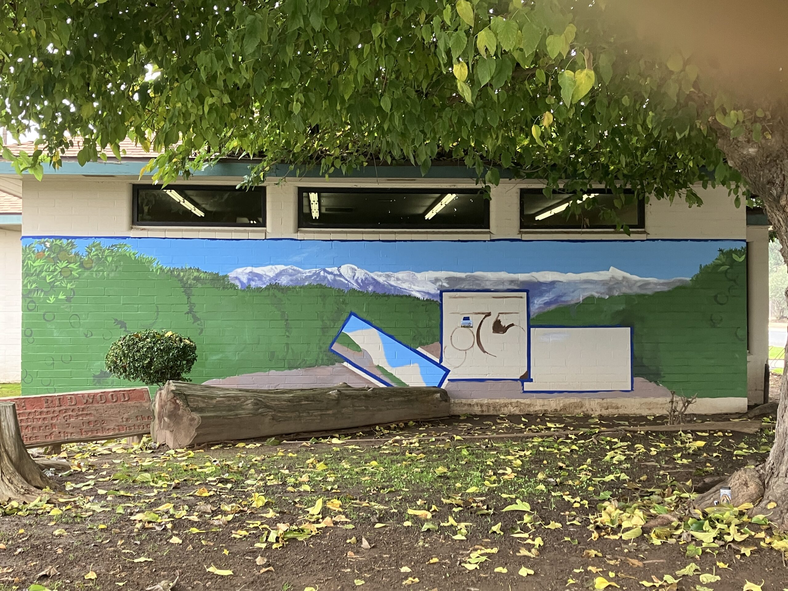
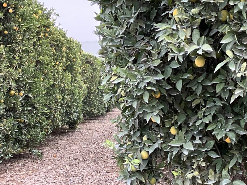
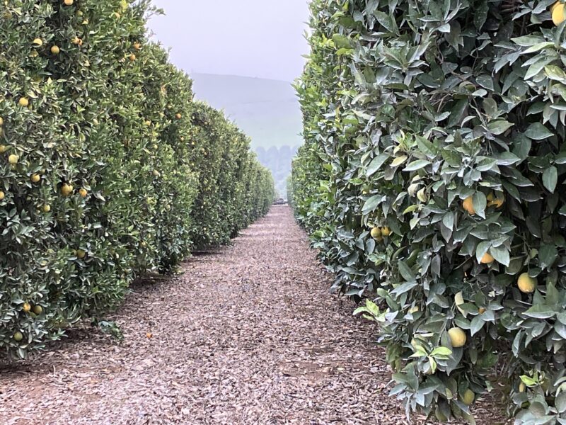
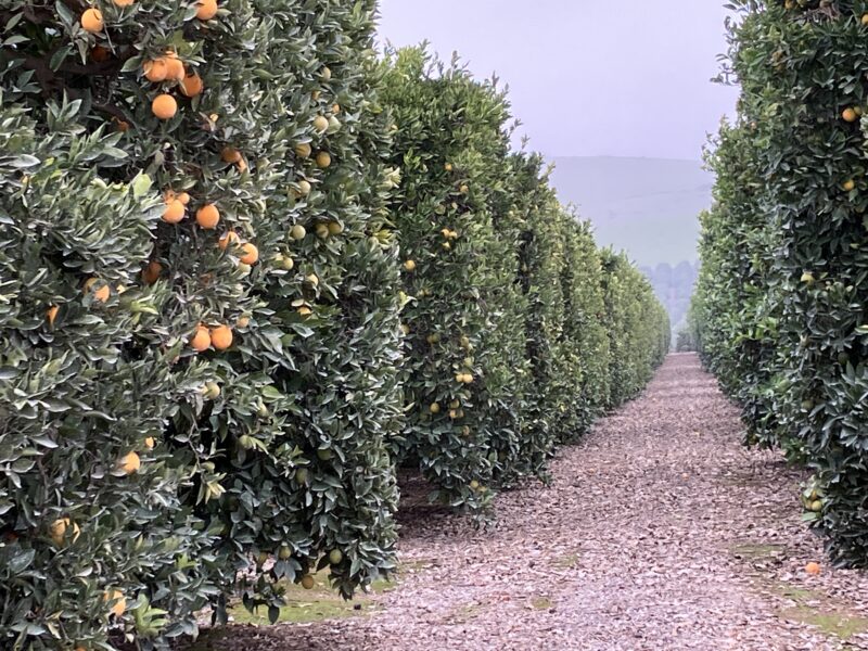
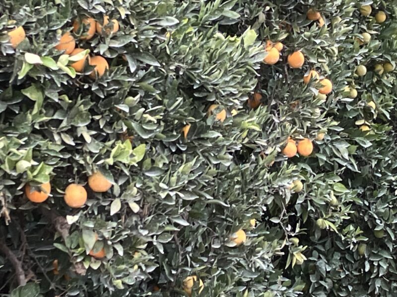
The leaves didn’t look right to me, so on the way home I took a few photos.
*Mom gave me her car, and after a few months of adjusting to the fanciness of a 4-door, 6 cylinder, automatic, I still think of it as her car. Thus, the current name of Momscar.
I have some other obligations and work responsibilities so won’t be back on the wall until Friday.
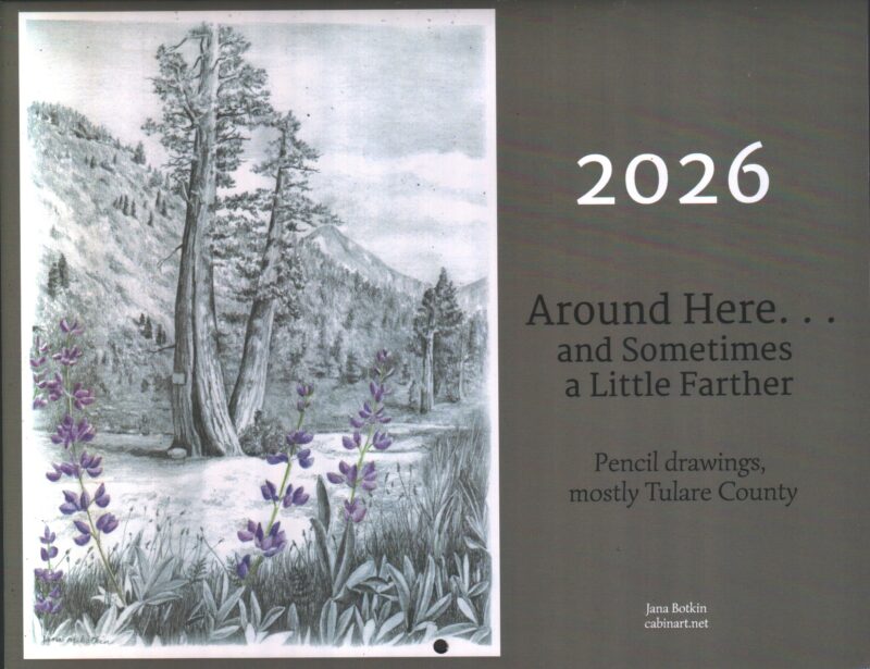
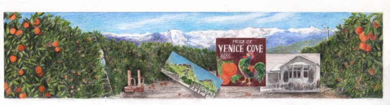
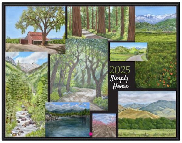
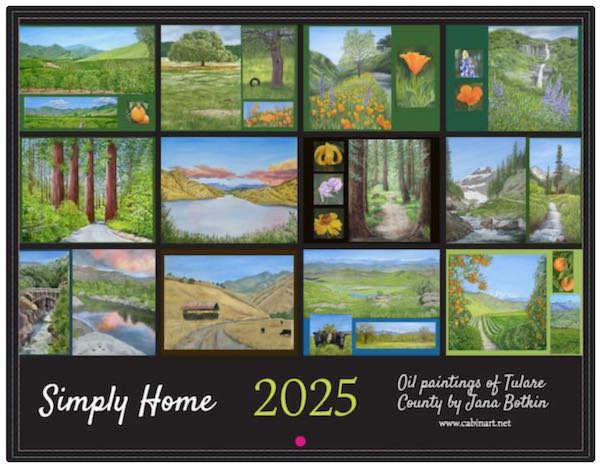
Calendar available here, $25 includes postage (and I’ll eat the sales tax if you are in California.)