Feeling Fruity Around Here

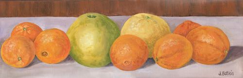
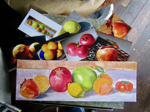
Feeling fruity around here lately. A month or 2 ago, I painted this to decorate a banquet for a citrus marketing outfit.

A friend who has bought more of my paintings than anyone else saw this. She said, “If it doesn’t sell at the event, I want it!”

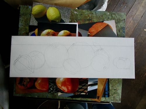
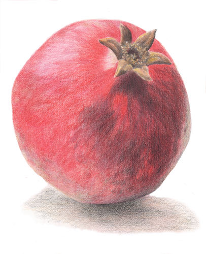
I took the painting to her, and she said, “I’ve been thinking. . . could you change one of these to a pomegranate? And include both kinds of persimmons?”

I said, “Sure, I can do that!”

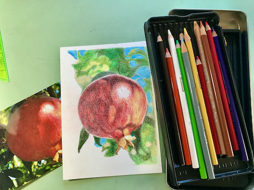
Then I brought it home, thought it over, and decided to do a new piece for her. I dug through my fruit photos, looking carefully at the lighting and angles. Then, unlike my normal approach, I drew it out.

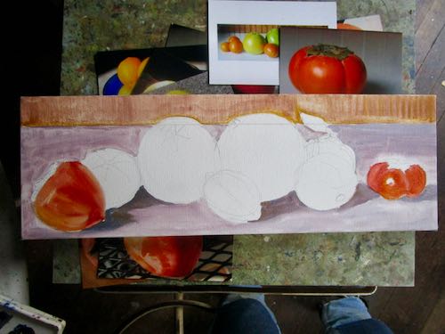
This is going to be good—colorful and well planned.

The other fruit painting I recently painted as a gift, I did without any real planning. I just pantsed it, trying this and that with paint, having fun with color.

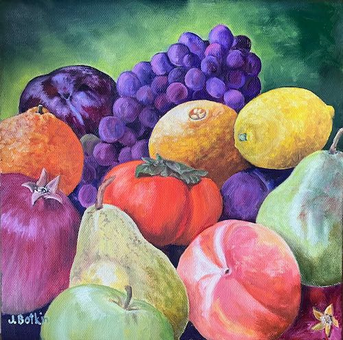
I like it, and so does the recipient. Yeah, yeah, it probably would have been better to plan it. Sometimes I just rebel.

P.S. Good thing I painted a new one because the original, Citrus Row, sold at CACHE’s Holiday Fair!

Perfect Fall Day in Three Rivers

Thanksgiving was a perfect fall day in Three Rivers. We went for a walk to take in the clear air and last hurrah of autumn colors.

My flowering pear tree was a champion this year.

Finally, a reminder for you (and for me, since I don’t get to keep endlessly lollygagging around). Besides, you might like going to Exeter tonight, to their annual city-wide party! I won’t be there but other artists will be at CACHE and all the stores in town will be open and there will be eats and treats. I am a stay-at-home-after-dark-wet-blanket kind of non-party person. But I wasn’t always, and this is a very fun event.

P.S. The commenting part of the blog has been misbehaving but comments are coming through anyway. So to those of you who soldiered through, thank you!

Finishing a Plein Air Drawing

If you receive these posts in email and the pictures in the post don’t show for you, tap here janabotkin.net. It will take you to the blog on the internet.

Plein air means “on location”. Last summer I sat by the stream in Mineral King with a set of 12 colored pencils to see if I could complete a drawing on location.

Not a chance. 

My friend Carrie Lewis posted the project on her blog, and recently someone asked if I would complete the drawing.

Since nothing is pressing right now, I decided to finish the drawing in the studio, but this time using the entire set of 120 colored pencils (Polychromos by Faber Castell)

I’ll just show you the photo, then all seven progressive scans, minus any jibber jabber. (But you can ask me questions in the comments, if you want to know anything specific about the process.)

I am finished and the drawing is done. (Did you know that people aren’t supposed to be “done”?)

This is Vandever, the right half of Farewell Gap in Mineral King, as seen by the Honeymoon Cabin from the gnarly juniper.

Make me an offer! The highest bidder (if not too insulting) before March 31 will be considered. The unframed drawing is approximately 6×8″.


New Cards

If you subscribe to my newsletter, you learned that I have some new cards for sale, and this post will be a refresher for you.

What do you do when it rains day after day?

Besides being a looky-loo at all the flowing water around Three Rivers, apparently I sit around designing and ordering new cards. Then I fold and package them, in three different assortments.

Bigger than my normal little notecards, these glossy cards are 4-3/4 x 7-1/2″, a package of 4 cards with envelopes for $20.

Three assortments:

  1. Tulare County: Citrus Cove, Citrus & the Sierra, Farewell Gap at Dusk, Honeymoon Cabin (1 each of 4 pictures, with envelopes)
  2. Citrus Groves: Citrus Cove, Citrus & the Sierra (2 each of 2 pictures, with envelopes)
  3. Mineral King: Farewell Gap at Dusk, Honeymoon cabin (2 each of 2 pictures, with envelopes)

If you order, I will pay the postage.

BUT WAIT! THERE’S MORE!

I also put together packages that have four cards with envelopes, all the same design. This is NOT on the website, so if you have a particular favorite and would like a package of just that design, let me know via email or phone or old fashioned mail or catch me somewhere in Three Rivers. Same price.

Primarily Speaking


The primary colors are red, yellow, and blue. I paint with 2 versions of each of these three colors plus white.

Some say white is the absence of color, some say it is the sum of all color, some claim it is not a color. Doesn’t matter – it is impossible to mix colors without it.

The primaries keep appearing in my life. Early in my painting career, I took half a semester of painting at College of the Sequoias. We were given the assignment to copy one of the old masters. I chose Vermeer, and later realized the primaries figured in large in the painting.

I liked painting this so much that I painted another one.

Salt & Light, or Reading Rabbit, oil on board, 11x14"
Salt & Light, or Reading Rabbit, oil on board, 11×14″

Our next assignment was a still life, and I brought these items. Still life paintings usually consist of things like a vase, a lemon, a rose, and maybe a skull. No thanks.

primaries

I noticed these gas cans while walking through a town in Alaska.

My flower pots often end up with primary colors without planning. Now I do it on purpose, but it used to just happen subconsciously.

Recently, the primaries plus white appeared in my yard. Apparently in addition to liking the primary colors, we like to sit.

2023 calendars, Mineral King HIKES, all sold out.

Experimenting with Alien Pencils

As a professional artist, it is important to keep my work consistent and to meet deadlines. This doesn’t leave much room for experimenting, something that I view as a luxury for hobbyists. Hobbyists can do anything they choose, whatever inspires them, no deadlines, no need for a signature look (called a “voice” in Art Speak).


A number of years ago, a drawing student/friend gave me a super generous gift of some pencils that I had never heard of. “Graphitint” by Derwent are water soluble pencils, described as having “a hint of earthy color”, but are neither graphite nor colored pencils. After making a chart to see what this “hint of earthy color” looked like, I tried a bit of water on the swatches, drew a small picture, decided it was hideous, and just put it all away.

Recently my friend Carrie Lewis asked me to write another article for her digital magazine, Colored Pencil Magic. At first I told her that I had already written everything I knew about colored pencils. Then I remembered my Graphitints, right there in my stack of colored pencil boxes and tins.

I couldn’t very well write an article stating I had tried them ten years ago and then shoved them aside. 

So, I decided to learn more about these alien pencils. I chose a photo to work from and started another chart to pick the right colors and get a feel for them.

What alien creatures – soft like 6B graphite, but still different than colored pencils. I thought back to a great drawing teacher I’d had who only let us use 6B pencils, keeping a super sharp point. That gave me the confidence to dive in here. After all, it’s only paper, and I do know how to draw.

It was enjoyable, because I listened to Peggy Rowe read from her book Vacuuming in the Nude and Other Ways to Get Attention, (on her son’s blog “The Way I Heard It”). And it was enjoyable because I love to draw, even with alien pencils.

Enough. Many layers, like colored pencils. Lots of ad libbing, along with severe editing, and this little 5×7″ drawing with alien pencils was finished.

Looking For Color While Two Shades Under

A friend’s dad once described himself as being “two shades under” when he wasn’t fully recovered from some bug. 

While I wasn’t fully recovered from my bug, I felt good enough to briefly toodle around the yard, enjoying some color, some sunshine, some outdoors with tiny hints of green popping forth. Although it was mostly red that I was seeking, it was the green that I found the most life-giving. 

That sounds all woowoo. What I mean is that I love seeing Three Rivers green instead of crunchy brown and dusty.


Then I went back inside and created my own bright spots of color. These were 2 small paintings begun last year, set aside, and forgotten. Worked just fine to set up in the dining area of the house and put in a few hours of productive labor.

Of course it must be said that these will look better when dry and scanned, and even better in person. They are each a 5×7″ panel that will be sold with a mini wooden easel for $60 (yeah, yeah, plus tax, sorry, take it up with Sacramento).

Testing my Skills with a Sunflower

While you were reading about Mineral King, I may have been cowering in the air conditioned studio, testing my drawing skills with a sunflower. 

Does that make you curious?
My Kansas artist friend Carrie Lewis gives a colored pencil drawing challenge each month in her magazine Colored Pencil Magic.

The last issue had a few references to me, so she sent me a copy of the magazine. I proofread for her, and then asked permission to take that month’s drawing challenge, working from a sunflower photo that she provided. Of course it was a sunflower, the state flower of Kansas.

I cropped it significantly, because there was an odd-shaped scrap of good paper ready to go. (That means easy to grab.) I didn’t spend a ton of time drawing it because a sunflower is a forgiving shape, and I just wanted to start coloring. (Serious colored pencil artists call it “painting”, but I just can’t bring myself to call it that, not being serious about colored pencil and being an actual painter.)

I rotated it around multiple times, both while working on the shapes and while coloring. My printer is a bit weak, so I worked from Carrie’s photo on the laptop. See? Weak.

Yellow isn’t an easy color for me to use, probably due to the fact that I rarely draw (or even paint) yellow things, so I don’t know yellow colored pencils very well. Hence, a cheat sheet.

When it was finished, I scanned it.

Then I got the bright idea to test my drawing skills, since I accidentally drew it almost the same size as the weak print. Can I actually see proportions and shapes correctly? To find out, I traced the print and then laid the tracing over the completed drawing. 

Not great, wouldn’t work on something that really mattered such as a building or a face, but it’s not too bad for just sort of throwing it together while cowering in the air conditioning.

Next time, maybe I should warn myself that there might be a test and then try harder.

P.S. Thanks, Carrie!


Is 12 Enough Colors for these Little Projects?

If you can’t see the photos, go here: cabinart.net/blog. I wonder why colored pencil manufacturers chose to put twelve colors in their starter sets. Why not ten? Why not fifteen?

I wonder why they chose the twelve that they chose. Why this red and not that one? Why these particular blues? And greens?

Life is full of unanswered questions.

Here is my colored pencil drawing using only twelve Prismacolor colored pencils.

Here is my colored pencil drawing using only twelve Polychromos colored pencils (made by Staedtler).

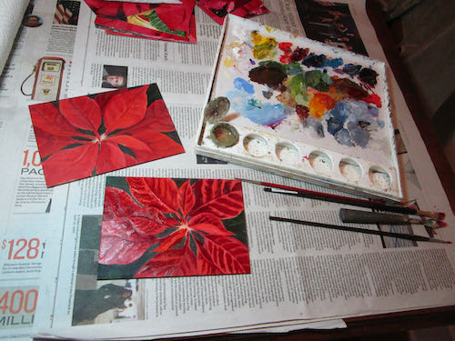
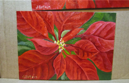
Wait until you see what I tried next. . .


Is 24 Colors Considered Cheating?

If you can’t see the photos, go here: cabinart.net/blogBefore I started that sunflower drawing with 12 colored pencils, I started another drawing with a box of 24. This is because the box was handy, most of my sets of 12 were down the hill at the gallery where I teach drawing lessons, and I didn’t feel like looking up the 12 on the internet and digging through 4 mugs of pencils, along with 2 boxes PLUS a deluxe boxed set of 120. Who wants to dig through boxes and mugs and the interwebs when one could be drawing instead?

Told you I had a lot of colored pencils. . . I gave another deluxe boxed set of 120 to my nephew, and also cleared out many of the doubles and triples and then just gave them to any of my drawing students who wanted them AND left a bunch in Exeter for anyone to borrow. 

Where were we?

Oh. The drawing with the 24 colors. It was fun but not as fun as having to figure it out with only 12 colors.

It wasn’t as challenging as if there were only 12 colors, but less challenging than using a set of 240. I sort of quit. “Sort of” because I can go back to it if I want to.

But I don’t for now, because I want to draw some demonstration pictures for a new article for Carrie Lewis’s blog about using only 12 colors. (Good thing she isn’t sponsored by colored pencil brands who want to sell those giant boxed sets of 120 colors.)