Who Died?
Summer fun – 13 things I live by
Thank you to Cheryl Barker of Cheryl’s R&R blog for this idea. Today in the interest of summer fun, here is a list for you about me, the only subject in which I am really an expert.
- If it isn’t chocolate, it isn’t worth the calories. (Milk chocolate is for children, and chocolate is never white.)
- The more stuff you own, the more stuff breaks. (and gets lost)
- In decorating, choose what you love rather than what is in style.
- In clothing, choose what looks great on you and what you look great in rather than what is in style.
- Life is too short to dry dishes, iron jeans, or paint nails.
- I’d rather drive a used Honda Accord than a new anything else. (‘cept maybe an Acura!)
- ditto for Mac
- Spend less than you earn.
- Never pass up an opportunity to travel.
- Always bring knitting.
- Have your colors “done”, and use them.
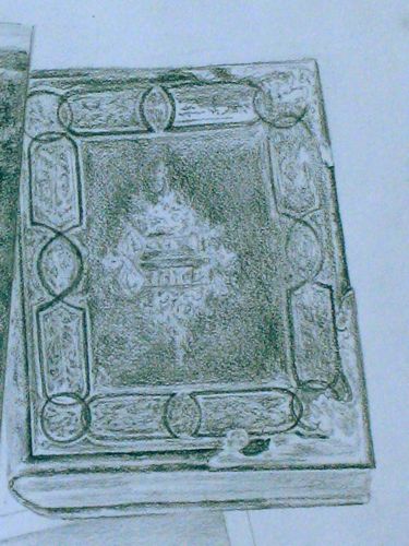
- It is better to be really good at one thing than mediocre at many. (That is why I used pencil as my only medium for years.)
- Never stop searching for the perfect denim skirt. (Where are you, O Perfect Denim Skirt? One day you will be mine!)
Now it is your turn! What are some of your personal maxims? Hint: If you comment here on the blog instead of emailing me, everyone else will get to learn from you too.
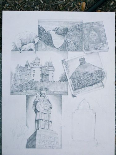
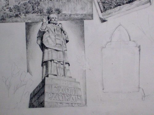
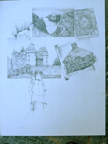
And more on the collage
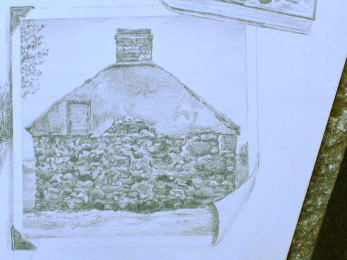
Cottage Collage, continued
Weird color – working late makes for some odd photography.
Same cottage, gable end.
Sometimes, I impress myself! Of course, the magnifying light is my Best Friend.
Land of Fruit and Nuts
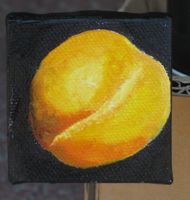
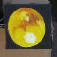
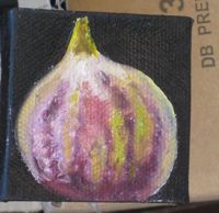
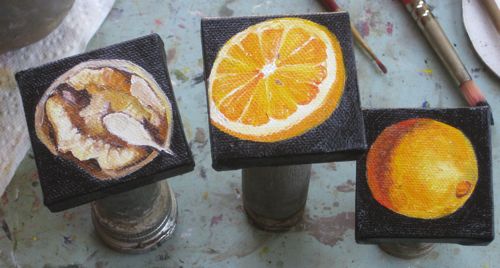
Ever heard California referred to that way? My Customer-Friend/Friend-Customer has chosen the top seven fruits and nuts, the kind that are produced for food, to be painted by me for the purpose of meaningful kitchen decor.
Here, alphabetized for your remembering ease, are the top seven: Almond, apricot, fig, lemon, navel orange, valencia orange, walnut. More of these are produced in California than anywhere else in the world. (Care to verify that, Mr. Customer-Friend/Friend-Customer? I KNOW you are reading this!)
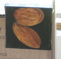
After I painted the almonds, I ate them. I am not, nor will I ever be, Lord willing, a starving artist!
These are still drying after which they will be retouched, signed, and dry again. Then they will be varnished and dry again. THEN they will be shipped.
Too Much
Ever heard of De Quervain’s Tenosynovitis? Wish I hadn’t. It means I did too much of something. A right-hander did too much with her left hand. Now my left thumb is in a weird splint that removes the opposable function of my thumb.
It is temporary. I said, ‘IT IS TEMPORARY!” This second shout is in case the splint is muffling the ears on my thumb and it hasn’t yet heard that it needs to heal quickly.
Perhaps having 2 opposable thumbs is really over rated.
A Customer-Friend (or is that Friend-Customer?) asked for seven 2″ square paintings. He knows a lot about a lot of things, and likes his art to have significance. Because of this admirable quality, he researched the 7 top fruits and nuts produced in California and chose them to decorate his kitchen. (I know some really interesting people, by the way.)
My normal way of holding the mini-canvases on my left-hand is currently unavailable. (My normal way of doing many things is currently unavailable but for purposes of the blog I’ll just stick to the subject of painting.)
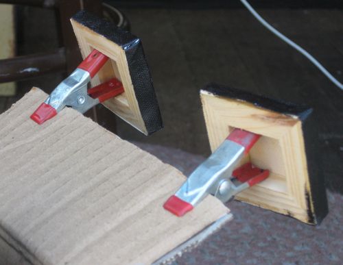
There are many little items in the workshop where I paint because I share the space with my Always-Prepared husband. These little clothes-pin-like items worked perfectly, but alas and alack – a lack of enough of them drove me to improvise.
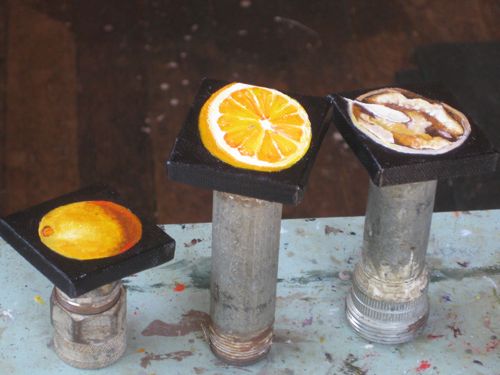
I don’t know what these pipe thingies are but they fit just perfectly into the back of the canvases and my 4 non-splinted fingers wrap around them just fine. As an added bonus, they are free standing.
An added benefit of the little clothes-pin-like items is that I can pinch them onto the edge of a cardboard box flap. (American ingenuity at work on a Chinese box)
The paintings are not finished – they need to dry, get retouched and signed, dry again, get varnished, dry yet again and get shipped.
Images of Home or The Bridges of Tulare County
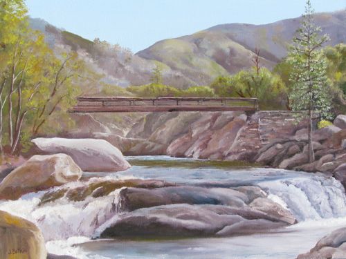
There are about 2 weeks remaining for the show, Images of Home, at the Tulare Historical Museum. Here are 2 more pieces that I painted specifically for the show.
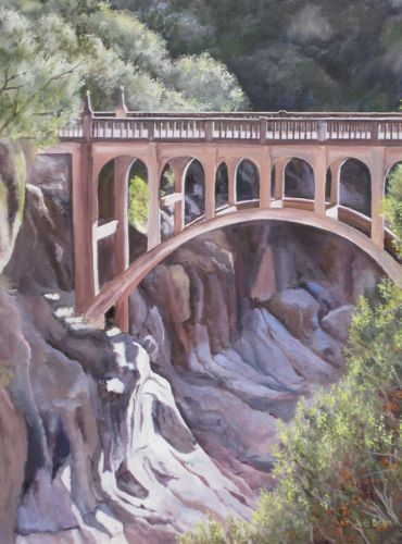
Buckeye Bridge, 16×12″, oil on wrapped canvas, $250. (just sayin’)
Michael said this is really the Paradise Bridge. I believe him, because he helped to build it. Since it is located just beyond the Buckeye Campground in Sequoia National Park, I think of it as the Buckeye Bridge. Hence, the name. My painting, my name. However, if you wish to buy it and the name is somehow a hindrance to the process, it can be changed very simply! (again, just sayin’)
Oak Grove Bridge IV, 18×24″, oil on wrapped canvas, $500
This is my favorite bridge. Did you know that?
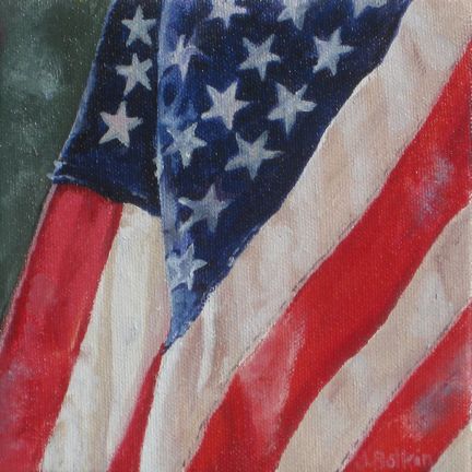
God Bless America
Images of Home
The show at the Tulare Historical Museum will be hanging through July 16. The museum is at 444 West Tulare Avenue, open Thursday-Saturday, 10-4. I think everyone who works there is named Linda, so if you want more info, call 559-686-2074 (but listen carefully if you call in case there are other names involved.)
Please, someone tell me if I am sounding pushy. Seriously and honestly speaking, I would like anyone with an interest in Tulare County’s beautiful places or my art or who would like to just hang out in someone else’s air conditioning to see this show before it goes away!
And, Cousin Maggie lives very far away and requested to see the paintings.
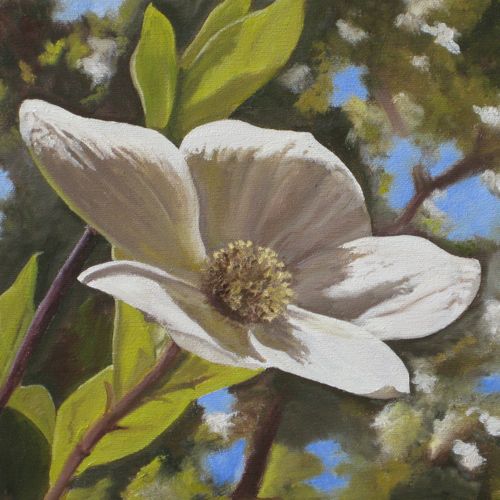
Dogwood, oil on wrapped canvas, 10×10″, $120
A friend saw this at the show and wanted to know more about this gorgeous flower. 2 weeks ago we took a trip to Giant Forest to see them in bloom. That is late, but this has been a strange year. We had such a great time climbing Moro Rock and exploring around Crescent Meadow that I forgot to take any new photos of dogwood blossoms! Cousin Maggie, do you remember my dad annoying your folks by referring to the dogwood as “fried egg plant”? Why anyone would want to annoy your sweet parents is a puzzle to me!
This one is sold, but if you are totally in love with it, I can paint it or another similar scene for you. Just being conversational and friendly, not pushy! (Didn’t want you all to think I succumbed to the pressure of those pushy art marketing articles.)
