Painting Subjects That Sell in Tulare County

If you want to earn your living as an artist, it is important to paint things that people want to buy. I think of these subjects as Because People Like It. In Tulare County, there are some stand-outs, and I try to keep them on hand in various sizes.

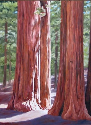
  1. Sequoia – the Big Trees, park attractions like Tunnel Log, Moro Rock, Crescent Meadow and Tharp’s Log Sunny Sequoias XXV
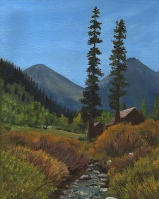
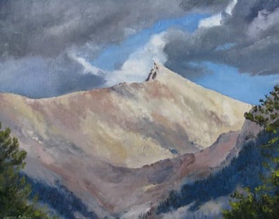
  2. Mineral King – Farewell Gap, the Honeymoon Cabin, the Crowley Cabin, and Sawtooth. There are some other Mineral King subjects that sell occasionally and I add them in for variety – Timber Gap, a foot bridge or two, trails, Vandever, views around the valley.Farewell Gap XVII
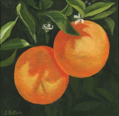
  3. Citrus – oranges off or on the tree, orange blossoms, and the occasional lemon or tangerine/clementine/mandarin1439 Blooming Oranges 2
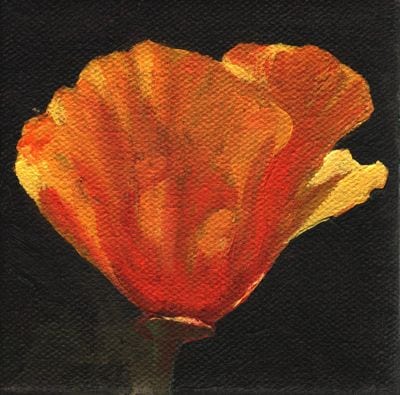
  4. Poppies – in fields, by themselves, in groups, against a blue sky, against a green background, lots and lots of California’s state flower.poppy IV
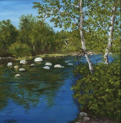
  5. Three Rivers – the Kaweah Post Office, the river (any fork will do), views of Kaweah Lake, views of Alta Peak with Moro Rock, and the Oak Grove Bridge (this might be due to my biased view of this Tulare County Treasure).1448 KaweahR VIII

Sold Sunflowers

Remember I talked about painting things just because I love them? That is a different category than painting something because it sells.

Sometimes, the things I paint for myself sell quickly. This is a mixed blessing – WAIT! I wanted that one! Oh. That’s right. I paint to sell things. It beats getting a job.

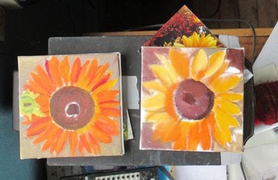
A friend/customer stopped by one afternoon and fell in love with the sunflowers.

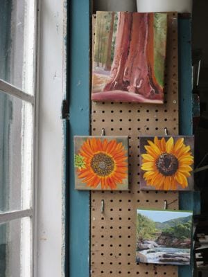
This is how they looked at the time of her visit:

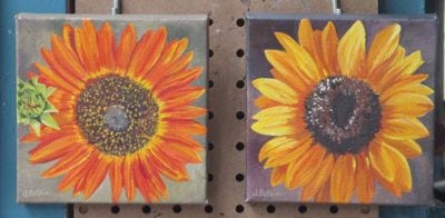
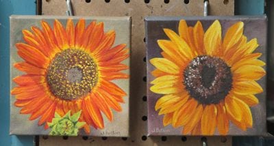
sunflower oil paintings

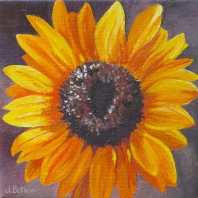
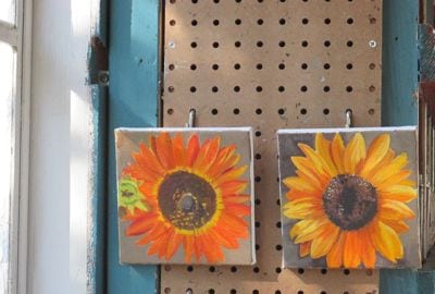
Together we evaluated them. We agreed that the yellow one is brilliant, and that the orange one doesn’t quite have the pizzazz.

It didn’t matter to my friend because she wants to buy them both. I told her I’d study up on the orange one – probably just needs more color and contrast, the usual things. (Other common things that are lacking are sharp and fuzzy edges or needing more detail – it isn’t all color and contrast).

Her husband called me to say he wants to buy them for her for their anniversary. I delivered the yellow one wrapped, and when the orange one is dry, it will join its brother.

IMG_0957

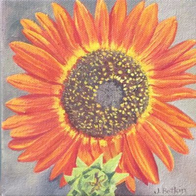
First, let’s get that hanger problem fixed. The mini green sunflower belongs at the bottom edge of the painting, not on the side. Since I paint these 6×6″ oils while holding them in my hand and rotating them around and around, sometimes they get sideways. I reattached the hanger, painted out and repainted my signature.

Done yet? After a few more layers of a brighter yellow, I think I will stop now.


IMG_0962

Okay, now I think this one is worthy of joining the yellow sunflower!

IMG_0949_2


Sunflower Paintings

Today, let’s review sunflower oil paintings.

sunflower paintings in progress

I am painting them because they look happy. The category is Because I Want To.

sunflower paintings in progress

Painting happens in stages.

sunflower oil paintings

These may now be finished, or may need a couple of touch ups before letting go.

Go ahead, admit it – they make you feel ever so slightly happy when you see them!

P.S. I have little bitty sunflower plants in my garden and am hoping they survive deer, drought, pill bugs and gophers so they can bloom and bring happiness.

Opening Weekend in Mineral King

Memorial Day weekend is the unofficial start of summer and of Mineral King time. Thus, you get to read (or skip reading) about Mineral King on Fridays on my blog.

This year we had May weather in March (and February and April too), so we got March weather in May. The weekend in Mineral King was cloudy, cold, overcast, foggy and rainy, with intermittent hopeful spots of sunshine.

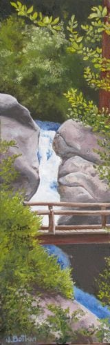
My friend Tracy and I went to the Silver City Store to conduct a little business, which is a euphemism for deliver new oil paintings. Here is one that I am particularly fond of:

Below Atwell

Below Atwell, oil on wrapped canvas, 6×18″, SOLD

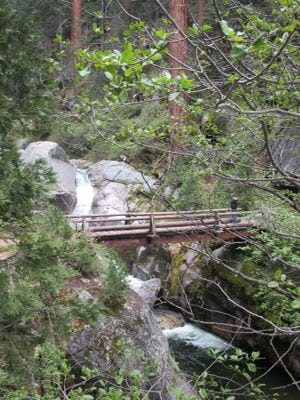
Tracy couldn’t remember ever seeing this sight, so we headed on down to Atwell Mill to take the gentle and scenic walk to the footbridge on the East Fork of the Kaweah (on the Hockett Trail for those of you in the know).

IMG_0993

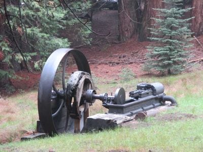
First we passed this thing. It was some sort of an engine that ran the machines for turning redwood trees into lumber.

IMG_0994

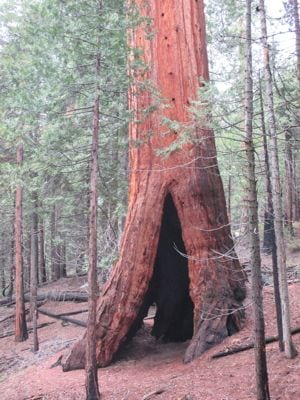
This is one of the giant sequoias that escaped the loggers’ attention. Maybe it was too far from the lumber mill to bother with.

IMG_1000

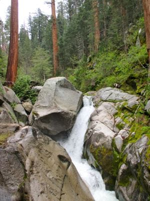
Here is the falls on the East Fork of the Kaweah River below Atwell Mill.

IMG_1002

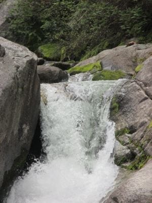
It is powerful and a bit intimidating even in a low water year. There was a little girl crossing the bridge with her parents and brothers, and she was shouting, “I’m going to fall, I’m going to fall!” They hustled her right across, and then she recovered enough for me to take some nice family photos for them. They had their dog with them and were quite surprised to learn that dogs are not allowed on the trails. Guess they didn’t see the many signs.

IMG_1003

No matter where I stood on the trail, I couldn’t find the exact view of my painting. Guess I took some artistic license. This is good to know, because it says I am not a slave to my photos.

Come back next Friday for more pictures and chat about opening weekend in Mineral King!

One Bridge, Two Paintings

1521 Paradise bridge

Buckeye Bridge 3

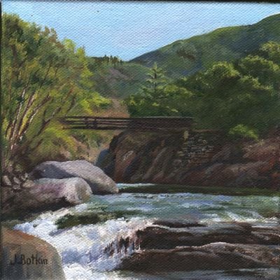
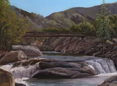
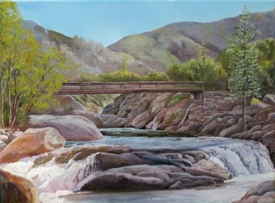
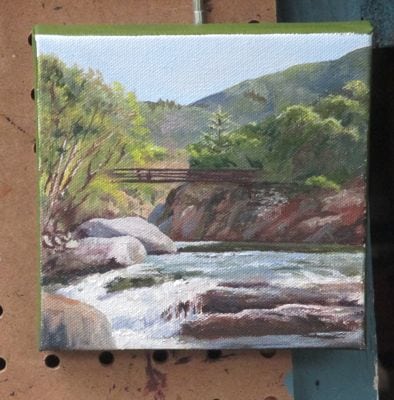
After finishing the 6×6″ painting of the Buckeye Bridge AKA the Paradise Bridge, I studied it along with the 12×16″ version. Why was the 6×6″ more appealing?

More contrast. Brighter colors. These are the usual reasons.

Now, the larger painting has brighter colors. When it is dry, I’ll rescan it and then we can compare apples to apples, or bigger paintings to bigger paintings, to be literal about it. (This is just photographed while wet on the wall rather than wreck my scanner by putting oil paint on the glass. I’m just cautious like that.) When it is dry, I’ll scan it so we can truly compare the before and after.

buckeye bridge


One Bridge, Two Friends, Two Paintings

A few years ago, I was hiking with a friend. She wasn’t familiar with the foothills of Sequoia National Park, so I took her to see the Buckeye Bridge. She exclaimed, “Oh my, that is so beautiful! If you paint it, I will buy it!”

Being a realist (both as an artist and in life), I recognized the exclamation as an emotional reaction to beauty, a momentary response rather than a commission to paint.

I also recognized the scene as a potential subject, so I painted it.

Buckeye Bridge 3

Buckeye Bridge, 12×16″, oil on wrapped canvas, $225

When my friend saw the 12×16″ oil painting, she asked how much. I told her the price of $225, and she got all quiet. Then she said, “Oh. I thought it might be around $75.”

Ahem.

Doesn’t matter. I used the painting in my 2015 calendar of paintings called “Beautiful Tulare County”. Another friend who shares my love of art and this area, got all excited when she turned to the May page of her calendar. Her friend’s dad helped to build that bridge, and she commissioned me to paint it 6×6″ as a gift for that friend.

buckeye bridge painting

It is almost finished – maybe a few more little touches and then a signature.

I paint better now. The original painting will get moved into the category of “Do Over”, AKA “I Paint Better Now”. Or, perhaps I photograph better now?

What Shall I Paint?

Have you ever wondered how an artist decides what to paint?

Me too.

What I paint falls into 4 categories:

  1. Things I know will sell
  2. Things I want to paint
  3. Commissions
  4. Reworking old paintings

Category #1 includes Sequoia scenery, anything Mineral King, citrus, the Kaweah Post Office, the Kaweah River, the Oak Grove bridge and poppies.

sawtooth XI

Sawtooth Peak, 8×10, sold (Mineral King)

Category #2 can be flowers, fruit, an experiment, something with great light or a color that makes my heart sing, a gift for someone, or something so beautiful that I cannot resist.

Category #3 is anything a customer has requested, usually paid for up front, and sometimes working from his photos.

IMG_0951

Sequoia painting in progress, sunflowers because I want to paint them, Buckeye Bridge as a commissioned piece.

Category #4 happens when I look objectively at a painting that’s been hanging around for awhile (literally) and decide that I paint better now.

Lake Kaweah

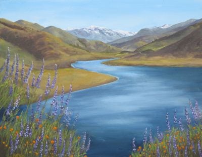
Lake Kaweah, or perhaps Kaweah Lake, 16×20, $350, repainted, revised, and revisited more times than I can remember. The constant improvement is bound to catch the eye of a customer. Oh – it is called “Lake View VII” on my website!

Blue Moon Sign in Situ

(Happy Birthday, Ann!)

“In situ” means in position. Isn’t it fun to learn new expressions?

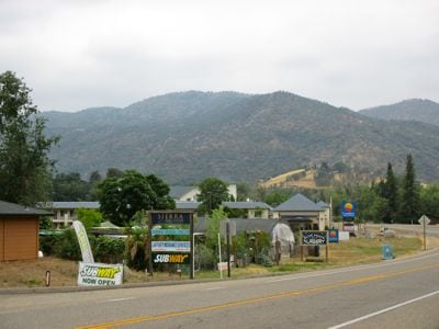
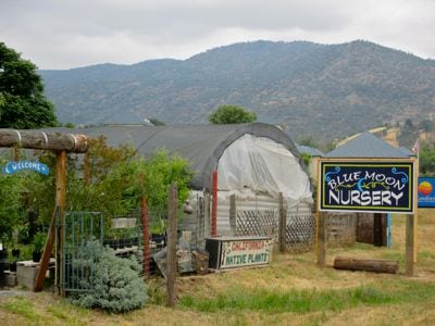
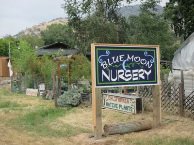
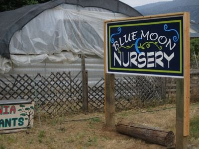
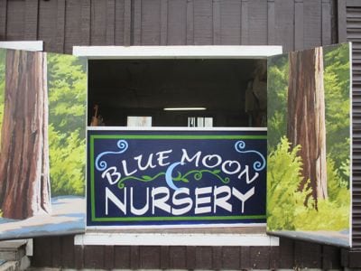
The question that nagged me during the entire process of designing and painting the Blue Moon Nursery sign was this: Would it be able to complete with all the signage along that stretch of the highway in Three Rivers?

See? A whole messa signs! But, I can spot ours. . . can you?

IMG_0970

blue moon nursery

Here is the light blue with the darker green.

IMG_0978

This is the darker blue with the light green.


IMG_0979

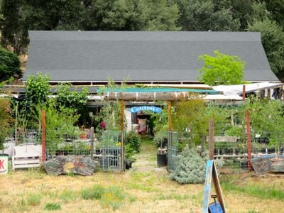
Let’s go inside the nursery.

IMG_0973

IMG_0980 IMG_0982 IMG_0983 IMG_0984 IMG_0985IMG_0988 IMG_0989 IMG_0991 IMG_0987 IMG_0986

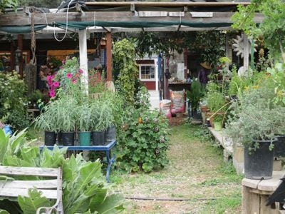
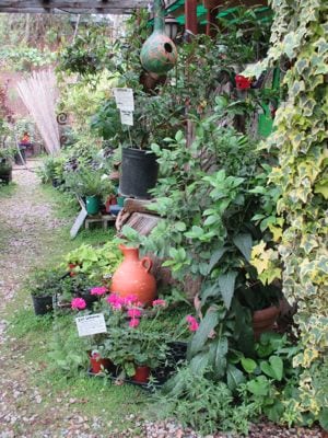
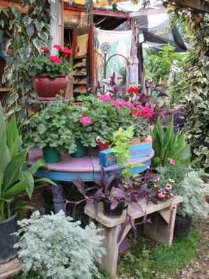
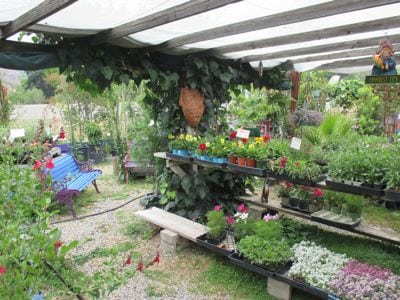
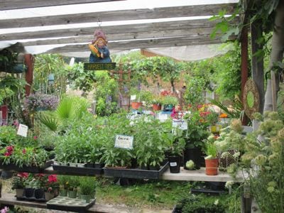
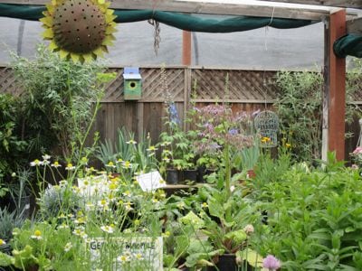
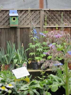
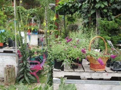
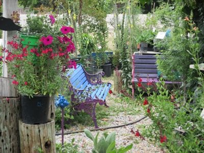
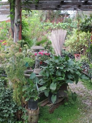
Blue Moon Nursery in Three Rivers is a charming place with a variety of plants, including natives and drought tolerants. Check out Seger’s blog and find the hours here: Blue Moon Nursery.

Odd Job, Chapter Four

Finally, I got to the actual painting stage of my odd job.

The Blue Moon Nursery got a 4’x8′ piece of very thick plywood, built a frame around it and painted it with multiple coats of white paint. This was a result of walking out to the road and measuring the existing signs. A medium sign looks like an unnoticeable postage stamp when you pass it in a car. A big sign might get noticed. A huge sign is too much for this Central California artist, so we just went with big.

I traced our final design onto a clear piece of plastic and using an overhead projector in three stages of measuring and adjusting. I used a Sharpie marker to transfer the image, along with a square, a yardstick, and a long tape measure. It took a very long time.

Then, I traced it from Side One onto 2 18″ x 8′ pieces of tracing paper, retraced it with a very black pencil on the back side, taped the 2 sheets to Side Two of the sign, and retraced it over the top with a pencil to transfer the design to the sign. Then I retraced the faint pencil transfer with the Sharpie. This took a very very long time.

Do you need a nap yet? Hang on, color is coming!

After a very fun color mixing session with the owner of Blue Moon, I began painting.
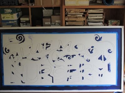
IMG_0933

First, a small brush to reach into the pointy places.
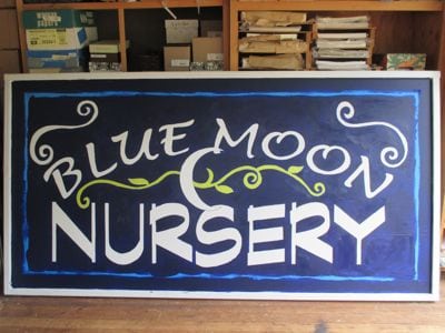
IMG_0944

Then, 2 coats of the dark blue. Next the green. Hmmm, we really like the color of the masking tape with the dark blue.
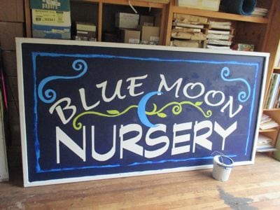
IMG_0945

I can mix that color! (This is actually side 2, after we chose a different blue for the moon and the spirals). The new blue called for a new green.
IMG_0946

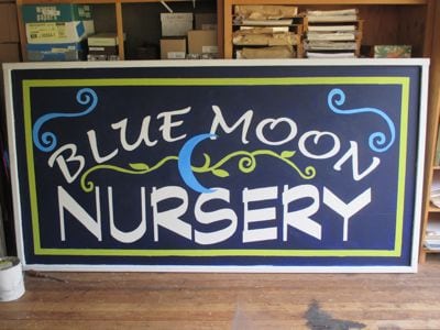
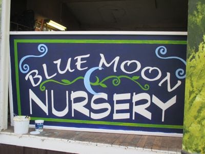
Check out Side Two, with masking tape blue and light spring green!
IMG_0947

This is Side One, with a darker green and a lighter blue.
IMG_0948

Isn’t this cool? The owner of Blue Moon and I both are slightly offbeat, marching to the beat of a different drummer, enjoying variety. (After being friends for 4-5 years, we discovered that we were in the same class in the same high school!)

So, we decided to let the 2 sides remain in different (but very close) colors, and then we’ll listen to people’s comments. It is my guess that very few people will even notice the difference.

Thus, I conclude my story of yet another odd job for this Central California artist. It is a pleasure to beautify Three Rivers!

Do you have a preference on the colors on Side One and Side Two? I’d love to hear your opinion!
Odd Job, Chapter Three

My odd job of painting a sign for the Blue Moon Nursery in Three Rivers progressed through the decision making progress.

IMG_0935

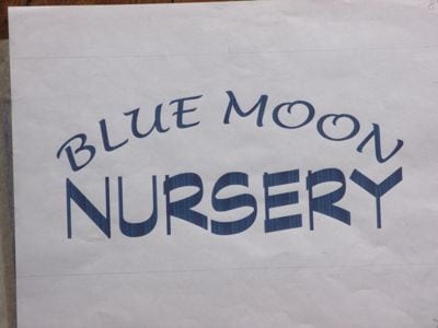
This combination of type was our first choice. The style of Blue Moon is a little hippy-dippy, loosey-goosey, whimsical (sorry, can’t think of a rhyme for that word). “Nursery” looks solid, professional, steadfast, here to stay.

IMG_0936

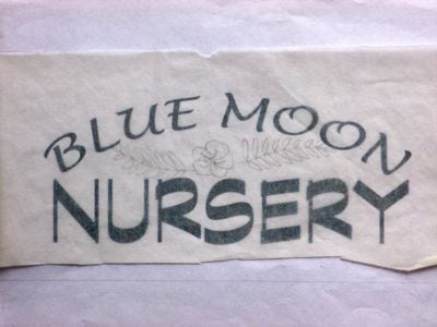
It needs some decoration, but this wasn’t the right one.

The owner and I decided on the best combination of type and decorations, and then got to the part we both love (both avowed color junkies).

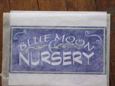
IMG_0934

We both love the dark purply-blue, the high contrast with the white lettering, and it is a given that the growy needs to be green and the moon needs to be blue. Color is sooooo fun.

Now what? How will I get this colored sketch onto a 4′ x 8′ board??

Stay tuned!