


Available here
Also available at the Three Rivers Historical Museum, Silver City Store, from me if I put them in my car, or Amazon.
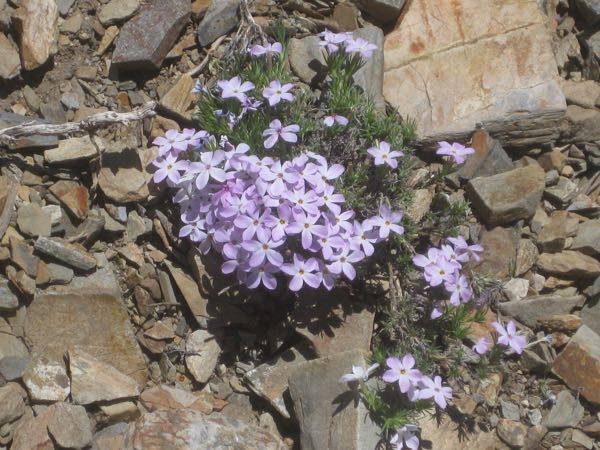
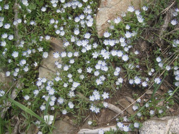
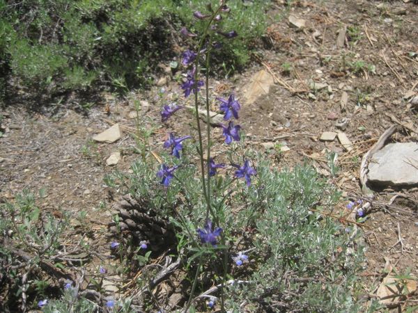
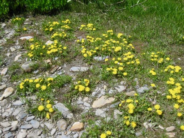
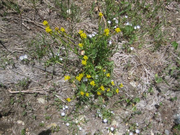
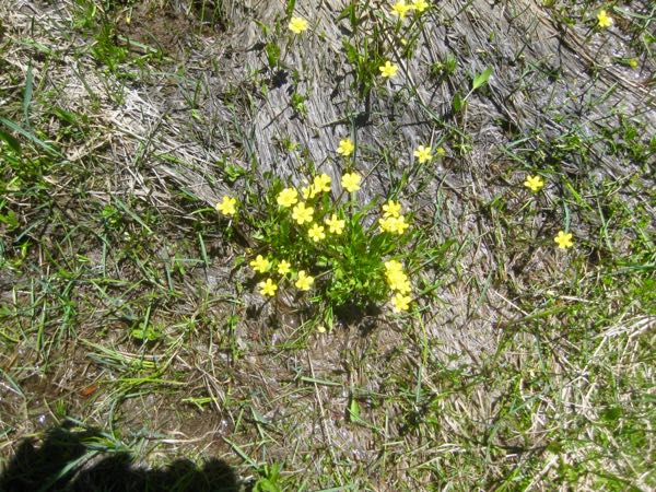
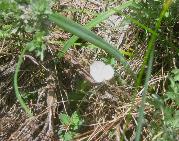
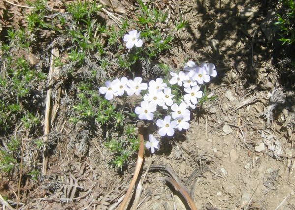
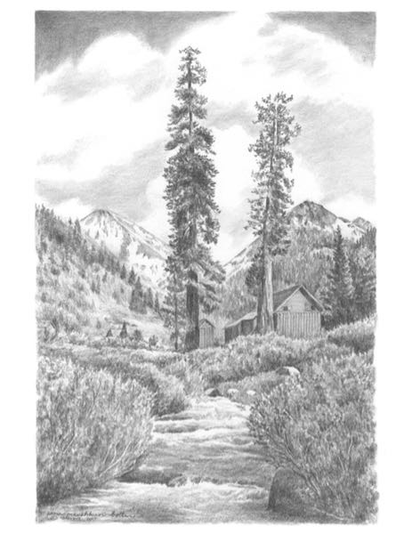
Mineral King Wildflowers is the name of the book I published in March of this year. In it, I said that most of the wildflowers in Mineral King hit their peak in July. This year it might be even truer, because the June flowers are still blooming in July. But perhaps the July flowers will not happen until August. More will be revealed in the fullness of time. Here is what was in bloom last week.

Tomorrow is Independence Day. I will be silent on the blog, but will return for July 5, more Mineral King wildflowers.


There are always trade-offs in life. Tomorrow you get to see which wildflowers were in bloom in Mineral King last week.
P.S. When you comment on the blog, I have to approve the comment before it appears. This doesn’t mean that your comment didn’t “take”; it means I am not near a computer to release your comment. Thank you to those who go to the trouble to comment; I appreciate you sharing your thoughts!
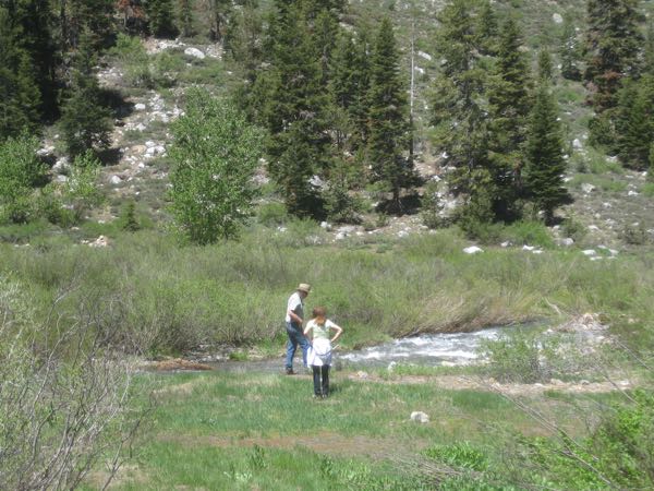
It has been an unusual year for Mineral King. Due to a heavy winter, a road trip to the Phoenix area, and a family emergency, I didn’t make it up the hill until last week. Trail Guy has been there and brought me his camera so I could experience Mineral King via photographs, the same way you get to experience it. (I think this can get stretched into several posts. Yea.)


Back atcha, tomorrow. (I miss Cowboy Bert. He often ended phone calls with that articulate message, “Back Atcha”. Heavy heavy sigh.)
P.S. When you comment on the blog, I have to approve the comment before it appears. This doesn’t mean that your comment didn’t “take”; it means I am not near a computer to release your comment. Thank you to those who go to the trouble to comment; I appreciate you sharing your thoughts!
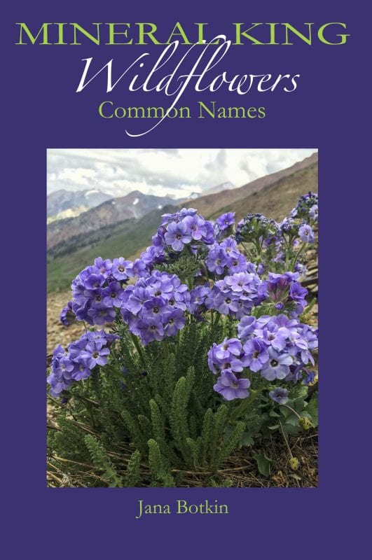
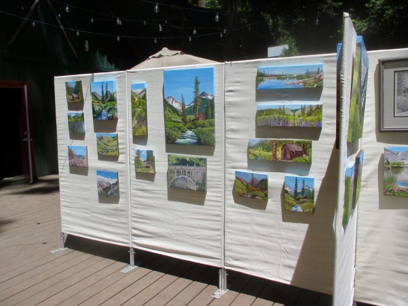
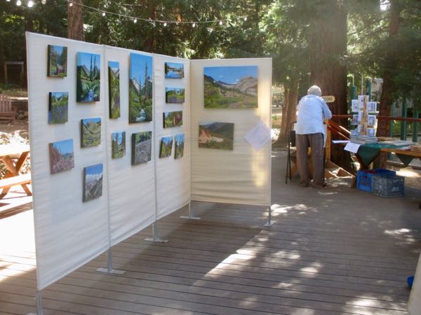
Featuring the oil paintings and pencil drawings of Jana Botkin and the photography of Brett Harvey
P.S. When you comment on the blog, I have to approve the comment before it appears. This doesn’t mean that your comment didn’t “take”; it means I am not near a computer to release your comment. Thank you to those who go to the trouble to comment; I appreciate you sharing your thoughts!
When my students finish a drawing, I take it home to scan and convert into a file that can be used for printing as cards or prints to share or sell; sometimes it is just so they can have a clean record of work completed. Sometimes it takes a few hours of computer work, but I love and appreciate my students so much that I just consider it part of taking lessons.
Here is a recently completed pencil drawing, before the computer work.
Lessons are suspended for the months of July and August; we will resume on the day after Labor Day. It is possible that I will have a few spaces available if you or someone you know is interested. (Tuesday afternoons, Exeter’S Courthouse Gallery, $55/month.)
P.S. When you comment on the blog, I have to approve the comment before it appears. This doesn’t mean that your comment didn’t “take”; it means I am not near a computer to release your comment. Thank you to those who go to the trouble to comment; I appreciate you sharing your thoughts!
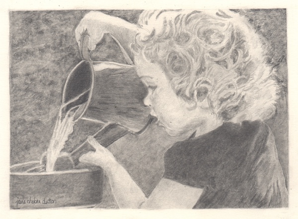
After finishing the pencil drawing of the irresistible subject, I didn’t want to stop drawing. I used this desire for drawing to get another pencil drawing finished.
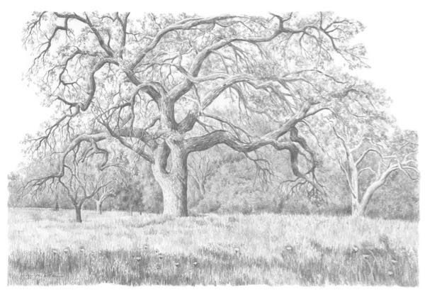
Why did I wait so long to work on this? I think it is a good drawing, and if one of my students did this, I would be very proud of them.
Speaking of such pride, I’ll show you one of my student’s work tomorrow.
P.S. When you comment on the blog, I have to approve the comment before it appears. This doesn’t mean that your comment didn’t “take”; it means I am not near a computer to release your comment. Thank you to those who go to the trouble to comment; I appreciate you sharing your thoughts!
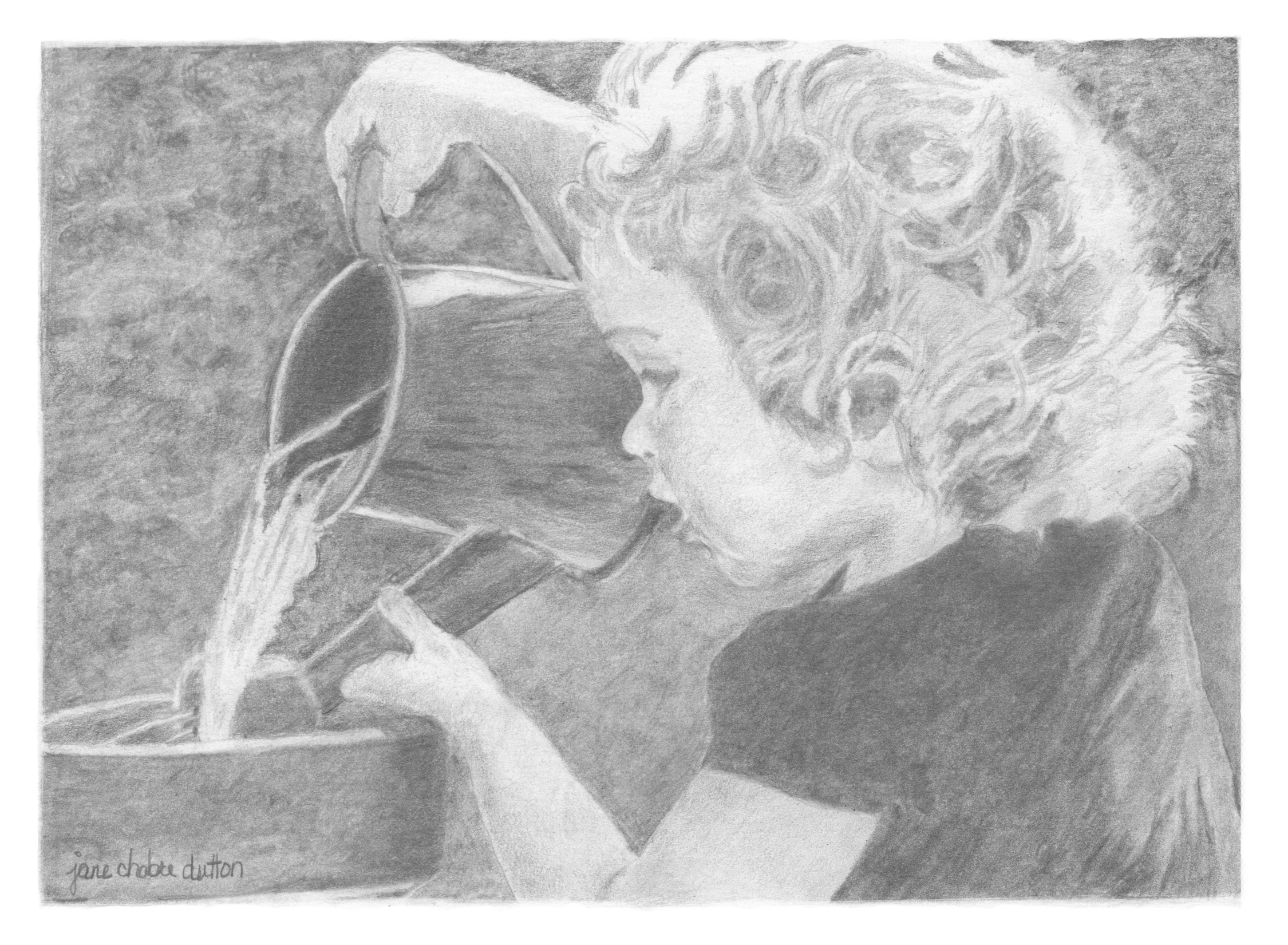
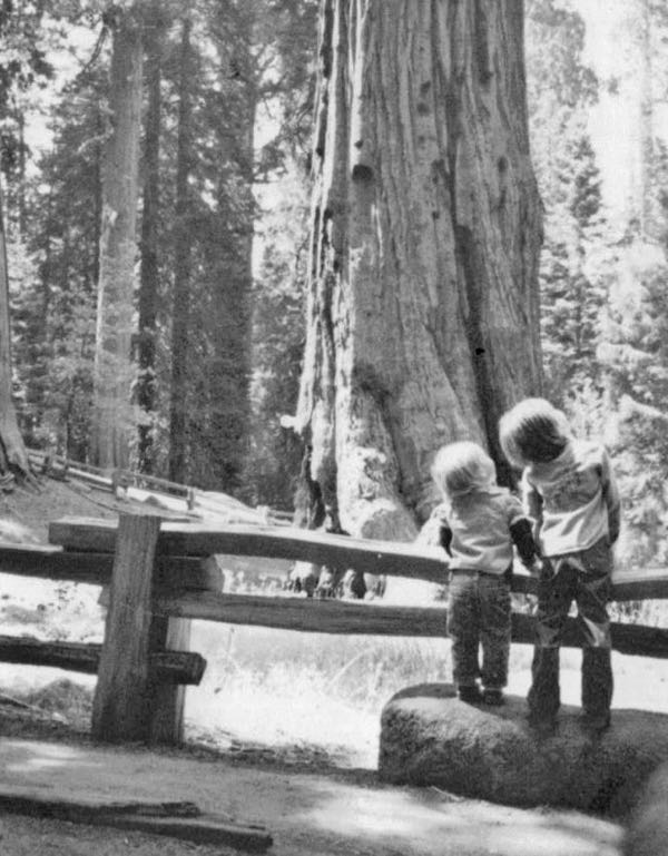
One of my drawing students brought in a very faded snapshot from about 40 years ago and asked if I thought she’d be able to draw from it. I asked her to scan it and email it to me so I could improve it for her (using the baby version of Photoshop).
I didn’t save the original version of the photo to show you, but here is the new and improved version.
As I worked on the photo, I had an overwhelming desire to draw it myself. I asked my student, who graciously replied, “Sure, but I want to draw it too. Is that okay?”
My response was something like, “Of course it is okay, but I don’t want to make you feel bad when I finish it in 2 days instead of 2 months!”
We both laughed, and then I realized that if I draw it first, it will be a helpful tool for her to use along with the photo. It is easiest to draw from other people’s drawings, second easiest to draw from black and white photos, third easiest to draw from color photos, and hardest to draw from real life.
Actually, it is probably hardest to draw from memory, but since that doesn’t happen in my life or my classes, that never crossed my mind until now.
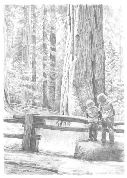
Irresistible subject, yes?
I am a sucker for a nice tin box of colored pencils, especially if it is a brand I haven’t tried before.
One day no one showed up for a drawing lesson class.

No worries, I had a new box of colored pencils to try.
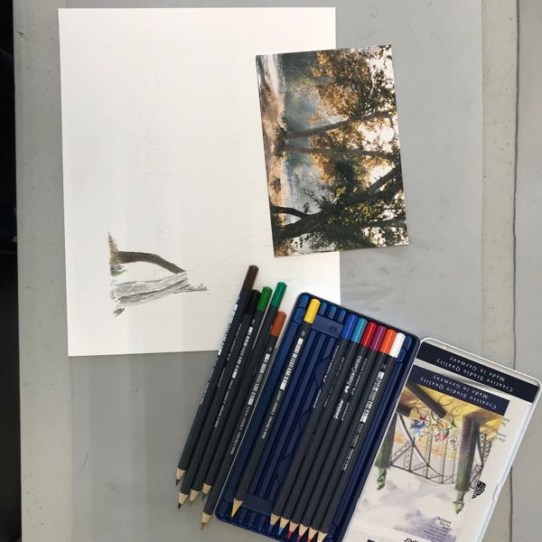
My favorite colored pencils are Polychromos by Faber Castell, and I couldn’t figure out why they, Faber Castell, produced a new type of pencil. The colors of Goldfaber match the colors of Polychromos, but these pencils have a narrower barrel than a normal pencil, and Polychromos have a wider barrel than normal. Other than the size, the descriptions are identical.
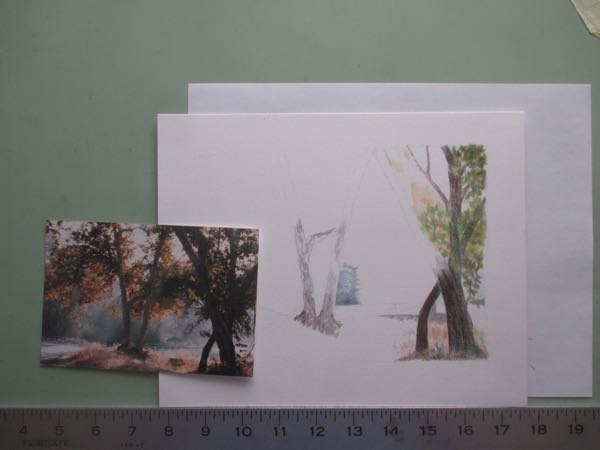
I worked awhile on this piece later at home, and my conclusion was that my wrist hurt and I don’t love this piece enough to sacrifice my wrist.
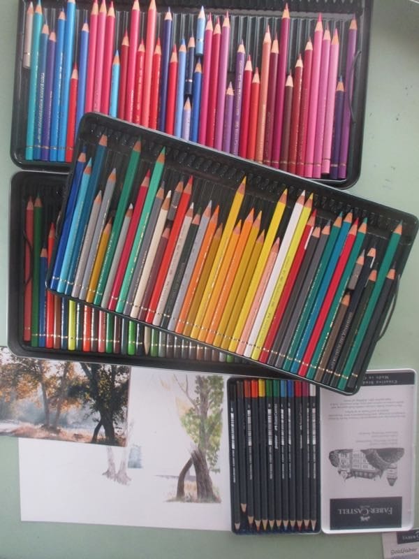
My next thought was that it might be helpful to also work on the piece with my Polychromos set, but then I concluded that it wasn’t a true comparison because my real set has 10 times as many pencils.
My final thought was that I’d rather be drawing in pencil, so that’s what I did next.
I’ll show you tomorrow.
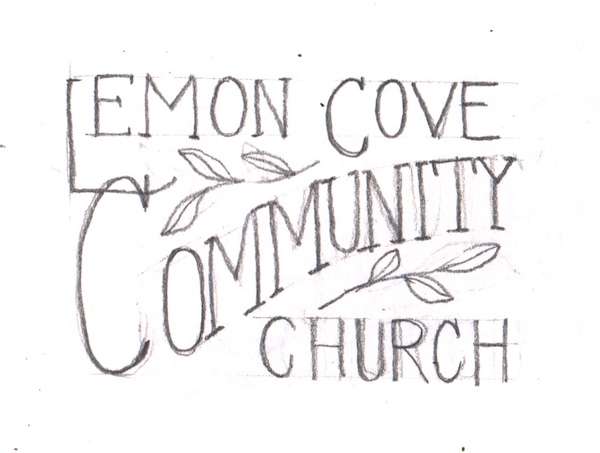
A side job is something I consider work, but not my main deal. Logo design is not my strong point, but sometimes I get asked to make a logo. Usually I have one good idea, and then the rest just get worse with every attempt. When I was asked last fall to design a logo for a church I used to attend (the only reason I have ever left a church is for geographical reasons so we were on very good terms, nothing awkward or difficult), I said I’d try.
I spent quite a few hours sketching out ideas, refining them in pencil, rejecting the weaker ones, holding on to the stronger ones, until I had 3 that I wasn’t too embarrassed of. They know I can draw, know I have a soft spot for their church and wouldn’t produce something second rate, so I wasn’t too worried about the rough presentation.
The pastor took them to a council, and they selected this one:
Oh boy, next I got to figure out how to turn my scribbles into something print worthy, using Photoshop Elements.

The council began making suggestions, and I froze. (Design By Committee is what produced a camel when a horse was desired.) They were kind and didn’t have a deadline, so I worked and worked to incorporate their wishes, which were a cross (to be expected in a Christian church) and some color.


I called this one #4, but it might have been closer to #20. They are happy, so I am happy. (I don’t want to look at it too long, or I’ll keep finding ways to “fix” it.)