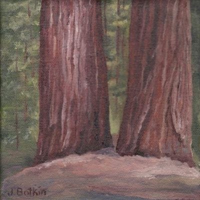
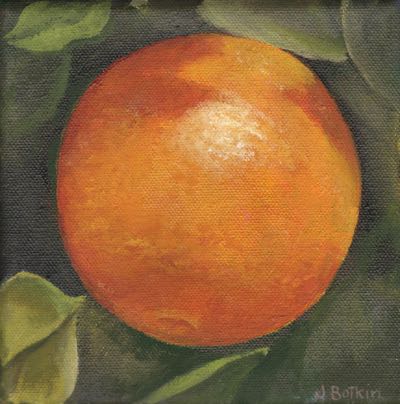
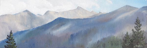
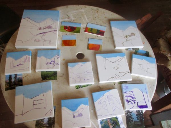
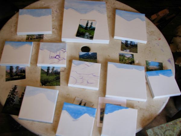
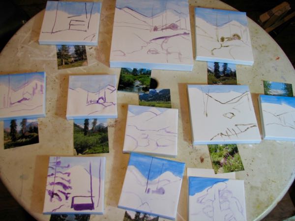
January was a productive month, all standard subjects that show off the beauty of Tulare County. November and December were good months, and my inventory got depleted. (This is a good thing.)


There were actually FIFTEEN MORE, I am not kidding, FIFTEEN! But, they were too wet to scan at the time of this blog post. . . maybe that means they aren’t really finished.
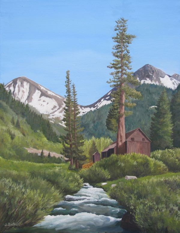
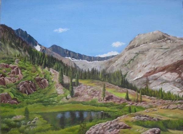
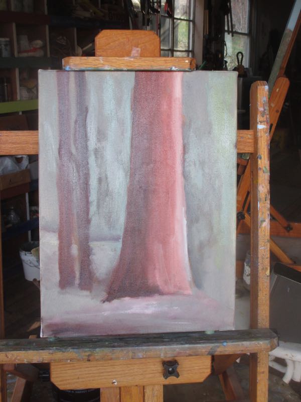
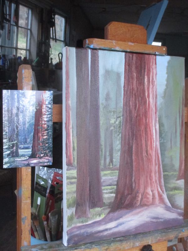
In case you think I am super-human, remember that the three largest were begun in December. I only FINISHED them in January.
I need a nap.

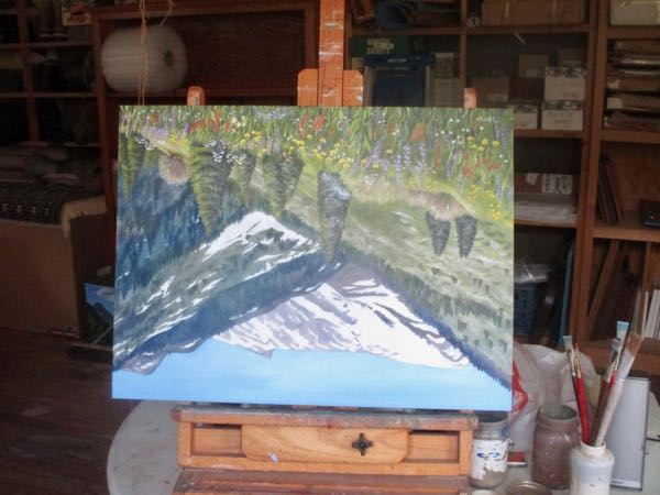
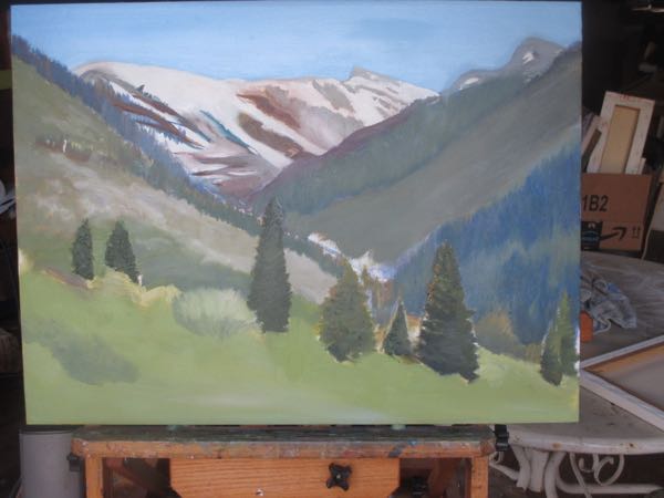
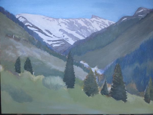
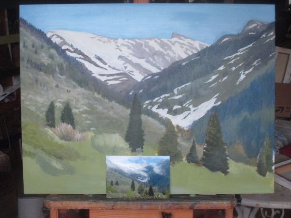
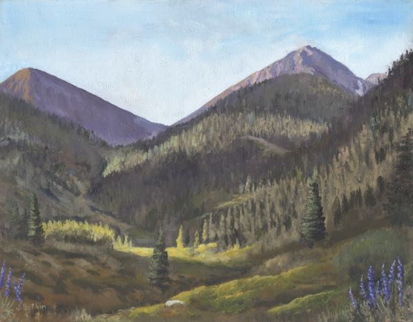
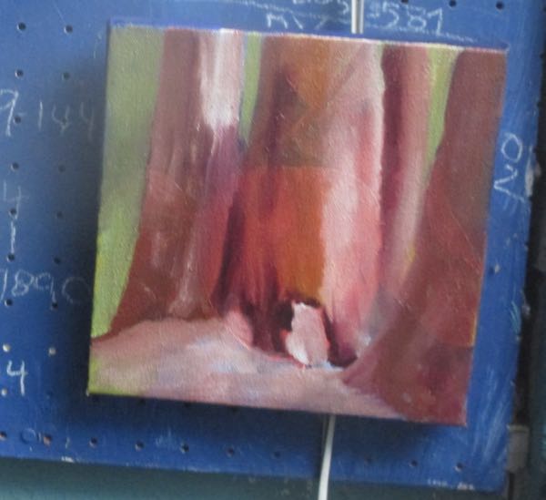
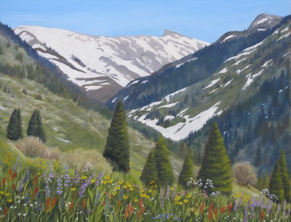
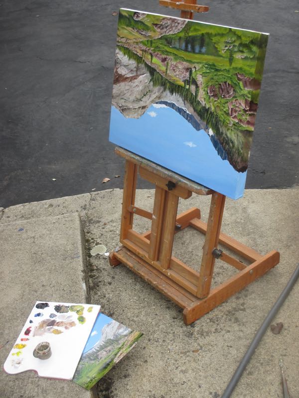
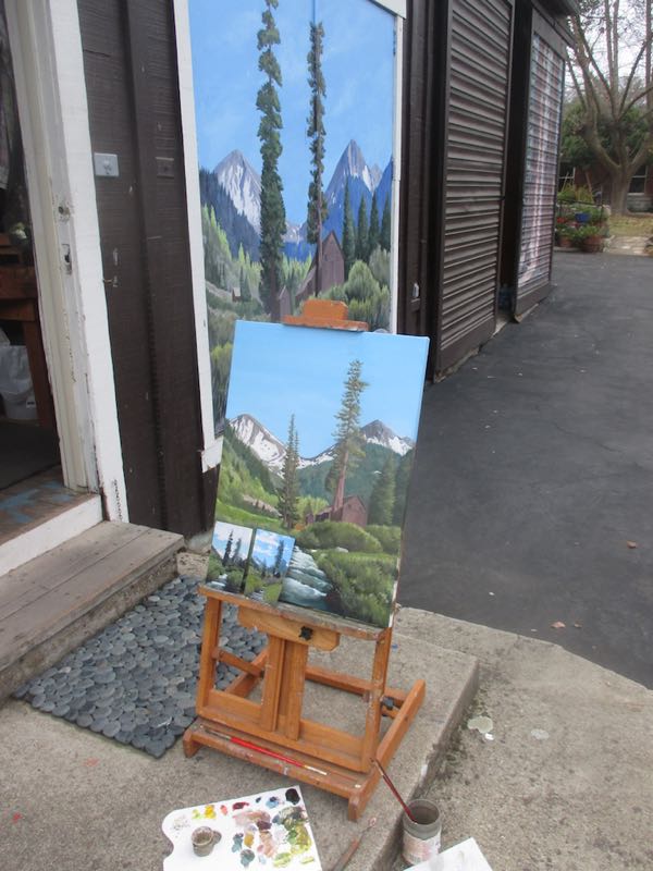
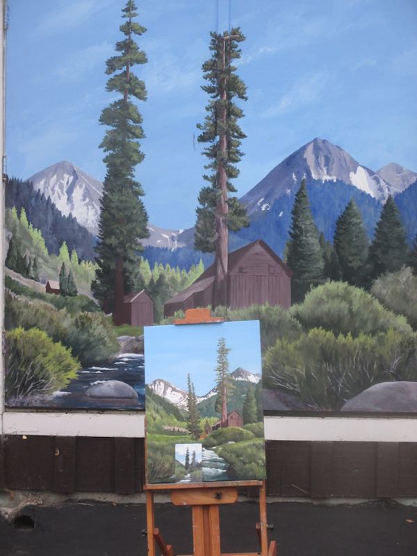
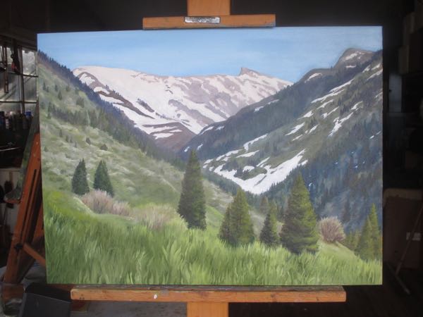 When all those green grasses are dry enough, I will add wildflowers. Then I will probably revisit some of the upper parts, add a few more details, correct some more color.
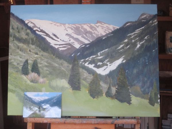
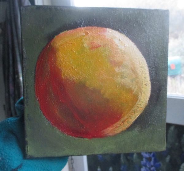
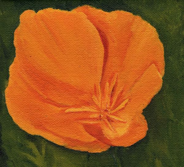 BECAUSE POPPIES SHOULDN’T HAVE SQUARE CORNERS!!
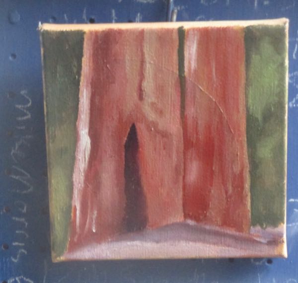
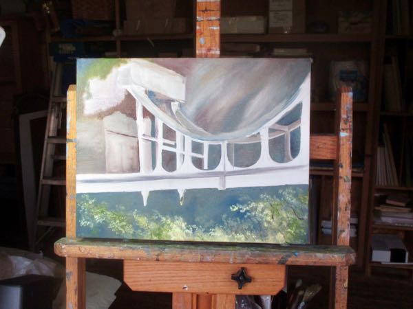
 BECAUSE IT DIDN’T HAVE ANY FLOWERS!