Finishing a Painting in Mineral King

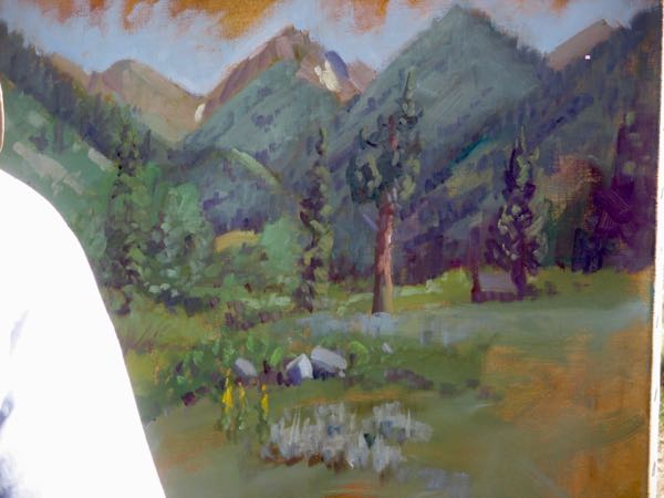
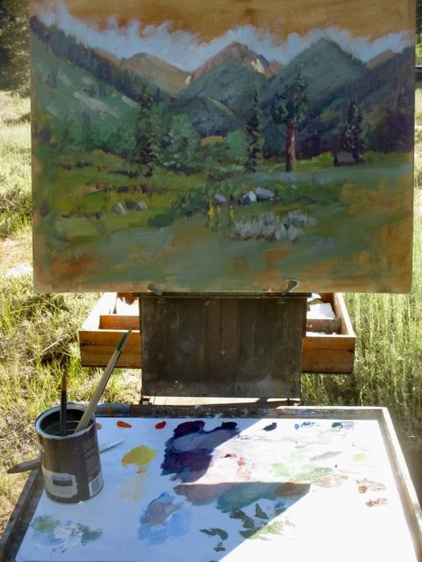
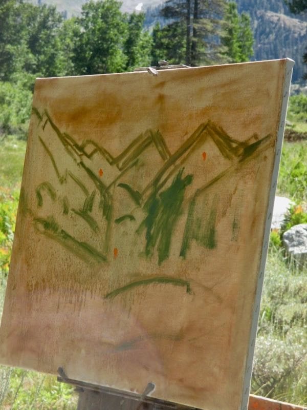
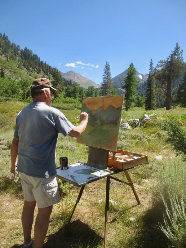
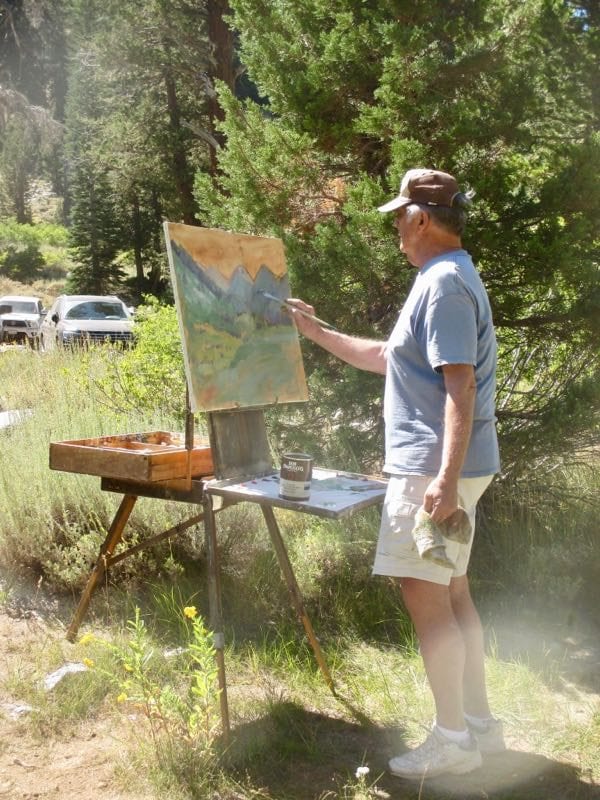
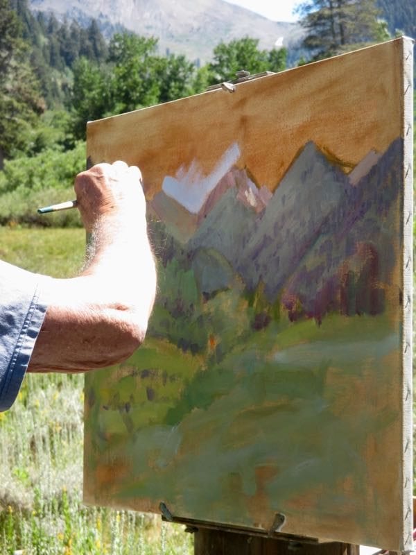
I set up the easel in the backyard of the cabin and worked on the painting from memory and the “visual notes” I had made the day before. That’s what Marty Weekly did, so I figured it must be a good plan.

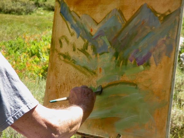
Wait! He didn’t set up in my backyard; he took it home to finish in his studio. His plan was 2 sessions, using little examples of colors and textures that he placed on the canvas during his plein air session.

Not done.
Done, but not signed. I forgot to bring my signing tool.
The obvious Mineral King solution was to use an old square nail.

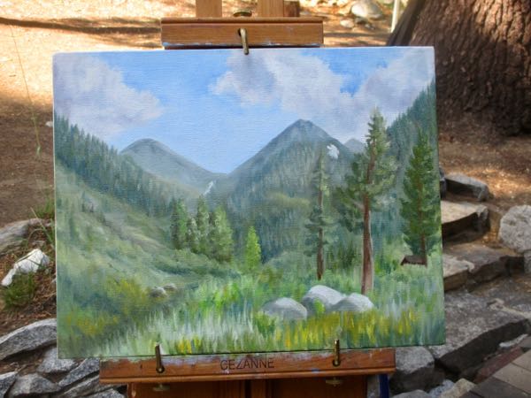
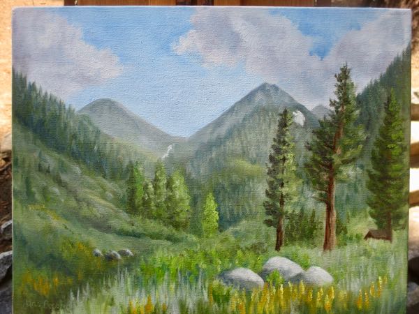
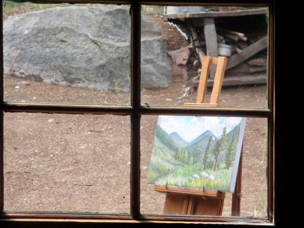
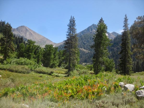
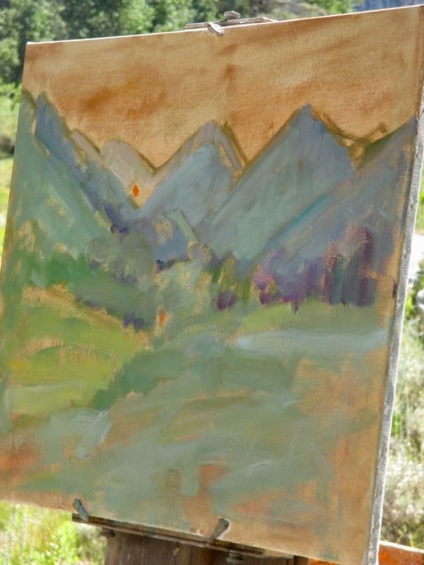
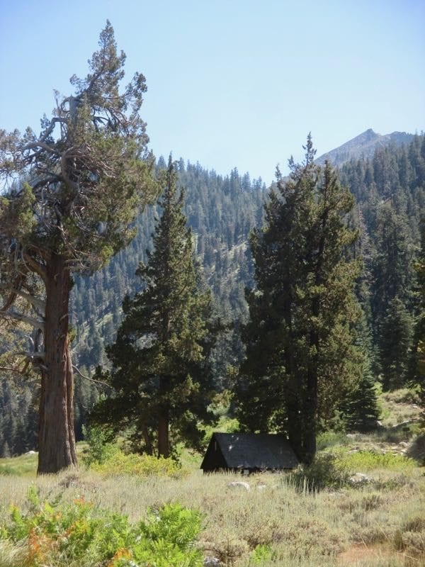
It made me happy to look out the window and see a plein air painting that I liked. Being familiar with the scene, having seen Marty’s way of tackling it, and adding the details I love all made the difference in my confidence and ability.

Of course, if it doesn’t sell in about 15 minutes, I will be questioning my confidence and ability.

And there was a third session to paint the edges.

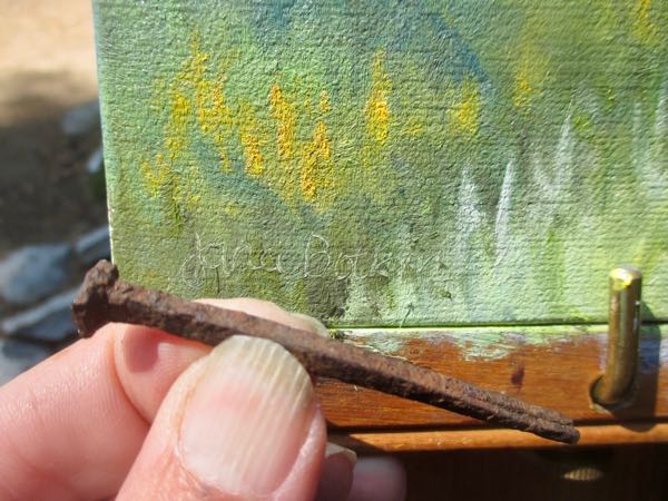
There will be a fourth session to write the title on the back and add a hanging wire.

A fifth session will be after it is dry: scanning the painting.

But wait! There’s more: it will need varnishing.

Mineral King Valley, 11×14″, $300 (+tax – welcome to California)

Watching a Master Paint in Mineral King, Part 4

This is the scene we were viewing.
This is the painting at the end of the afternoon.

Watching Martin “Marty” Weekly paint plein air in Mineral King was a huge privilege and a great learning opportunity. It is one thing to take a workshop in Georgia, where everything is unfamiliar. It is another thing to watch someone paint a landscape that I know very well, so I can understand how decisions are made to include some items and simplify or ignore others.

Here are some of the many things that Marty taught me in the 3 hours we stood there together:

  1. If your brush feels comfortable, try the next size up. (Why? I try to do this so that I get the painting finished in a timely manner, but I think Marty does this so he doesn’t get overly detailed.)
  2. Cobalt blue with white mades a very accurate sky color.
  3. All paintings look terrible in the beginning, even if you are as terrific as Marty Weekly!
  4. Adjust the parts of your painting to suit you and make the best composition possible, while retaining the recognizable characteristics of the scene.
  5. No one finishes on location; almost every plein air painter knows there will be finishing required in the studio.
  6. Turpentine from the hardware store is good enough – no need to pay for overpriced art supply turpentine.
  7. There is a brush cleaner available from the hardware store that will salvage any dried-out brush (I can’t wait to try this!)
  8. Try Permanent Rose instead of Alizarin Crimson for one of the mixing reds. (Why? I have this color, so I will find out!)
The sky can be finished in the studio, along with the various vegetation in the foreground. We talked about Goldenrod, Sage, and Asters, which are all present in September; he made visual reminders. We also talked about the stream, getting at least the lay of the land so there is a sense of the stream.

I am looking forward to seeing the finished painting! Since the intended recipients are friends of mine, I will ask to see a photo, and hope I can show you.

Watching a Master Paint in Mineral King, Part 2

As Martin Weekly set up his painting, I stood in the shade of the juniper, took photos, and just listened and watched. As a Questioner, I bit back many questions, and waited for him to either talk to himself or to address me directly. He shared a tremendous amount of experience and information, which I wrote down when he was finished for the afternoon.

The second roughed in sketch.
Blocking in begins.

There is great comfort in knowing that even the work of a master begins looking scribbly and worrisome.

See those bright orange dots? That is the way Marty checks his values (the darks and lights) because orange is a strong middle value. He can compare any color to see if it is darker or lighter, because a painting needs all the different darks and lights to be good.

This is the scene we were viewing, but of course our eyes take in so much more when standing on location than can be captured by a camera lens.
Marty sees colors differently than I do.
We joked about how paintings look so dreadful in the beginning stages. I always say, “Best viewed from the back of a fast horse”, and he said, “Might look good at midnight with the lights out while wearing sunglasses”.
To the right side of the scene is a weirdly shaped juniper tree and the Honeymoon Cabin. I wondered if he would include those 2 signature items that tell exactly where we are.
It was time for sky so the top of the peaks could be defined. Marty uses a different color of blue than I do for skies, and I thought it was perfect! Why haven’t all the various instructors I’ve had ever mentioned Cobalt blue for skies?? Everyone else swears by Phthalo or Cerulean blue!
We talked about the weird juniper, and Marty thought about it. He decided to not have any trees shooting up above the line of the peaks. This was a concept I never considered; I thought if you made the trees too short, the perspective would look wrong. Not so when Marty does it!

To be continued tomorrow. . .