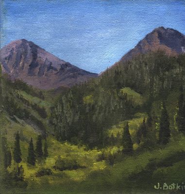
Last year I did an oil painting of a standard Mineral King scene, Farewell Gap. It didn’t sell.
No big deal. I took it to shows and put it on my website. It didn’t sell.

What gives? I took it back to the Silver City Store this year and everything has sold so far except that painting.
Finally, I showed it to my friend Tall Cathy, who has been going to Mineral King her entire life, which is about 10 years longer than my life, plus she started at an earlier age. (i.e. Tall Cathy is a bona fide Mineral King Expert.) I asked her, “What’s wrong with this painting?”
She said, “Little Florence is too low”.
I said, “Shoot. I was afraid of that. Guess I’ll take it back to the studio and redo it.”
Little Florence is the peak on the left side of Farewell Gap, and it is lower than Vandever, which is the peak on the right side. Sometimes when you see it from a place other than the bridge, it looks very much lower. With 20,713 photos on my computer, I’m not going to look for the exact one I used for the painting. You can see the concept here:
Aside from the fact that normal people don’t lie in the grass to take photos, this is not the normal way that normal people view when they normally view Farewell Gap from the bridge. (There – have I successfully destroyed the word “normal” for you?)
Here it is in its new and improved version. Last year I photographed my paintings. This year I scan them. The color isn’t true either way. Look at the heights of the peaks – this is more of what people expect when they think of Farewell Gap.
Do you agree with this?


9 Comments
I’m not sure why, but I like the second painting better (subliminal message maybe?) I think they are both amazing though. Hopefully this time it will sell!
Shannon, umm, because it was improved? 😎 These little paintings have to be done quickly because I make so little money on them. So, when I get a chance to fiddle around, they do get better. I do a better job with each pass over the canvas. . . more work equals better results. Sort of a duh thing. . .
Jana,
Interesting that people could sense that it didn’t feel right. It’s true that your second version of it displays a higher mountain on the left. I liked how the second version of the painting feels heavier, more realistic, with the darker shades, colors, and contrasts. Perhaps that’s just the scanner?
So you have friends called Trail Guy, and Tall Cathy? 🙂
Smiling from petite Jennifer in Minnesota,
Jennifer Dougan
http://www.jenniferdougan.com
Nice to hear from you, Jennifer! It is interesting that even though it was technically and proportionally correct, it wasn’t what people are used to seeing. The more the contrast, the higher the visual impact. Of course, it could just be my scanner and the random settings I punch in when I can’t tell what is what on my screen.
My husband Michael is “Trail Guy”; before he retired, I referred to him as “Road Guy”. And there are several Cathys in our cabin community, so this helps us know which one we are referring to. I like to protect people’s identities here on the World Wide Web, so it is fun to do names.
One of my favorite writer/blogger friends calls her children Eldest Supreme and Tired of Being Youngest. 😎
Well, I haven’t seen Farewell Gap in person, but I definitely like the new version best. And I agree that it is improved! 🙂
Thanks, Cheryl. I would love to hike Farewell Gap with you someday, and show you The Big Trees too. It is the contrast that helped, plus the balance is a little better. Sometimes I am too much of a literalist and forget to take artistic license.
Hi Jana,
Yes it does look a bit more even, but I think the change is that you have more contrast in this painting than the early one. I love contrasts, they seem more alive. But you are the artista!!
Hugs,
Melissa
Melissa, contrast is the ticket. Of course, it could just be my scanner. . . And you are an artist too, so there. (Did you call Peter yet?)
Wow! Good call by Tall Cathy on id’ing that one! I LIKE the new and improved version – color and all!
Comments are closed for this article!