Happy Birthday, SD, DV, MW, and RT!
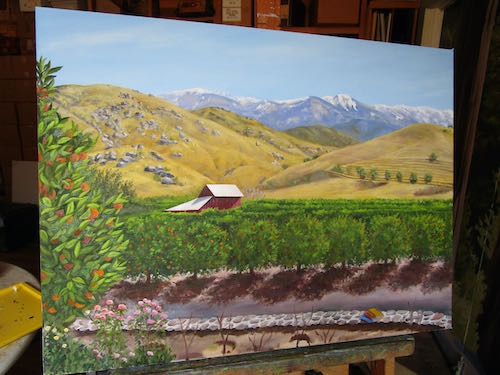
Is Chapter 8 the final chapter? Probably not. This is so important (and has no deadline) that I want to spend time studying it, mulling it over, adding little touches, and taking it to the nth degree. This is one way I learned to paint when I took 1/2 a semester at the local junior college back in 2006 until I got sick of the commute and the rap “music” and the fact that the class was supposed to be in photorealism but the professor dismissed photorealism as “smoke and mirrors”, saying anyone could learn the tricks, but then he didn’t teach any.
Never mind. Where were we?
I started the roses in the foreground and really like the way they glow against the color of the road behind them.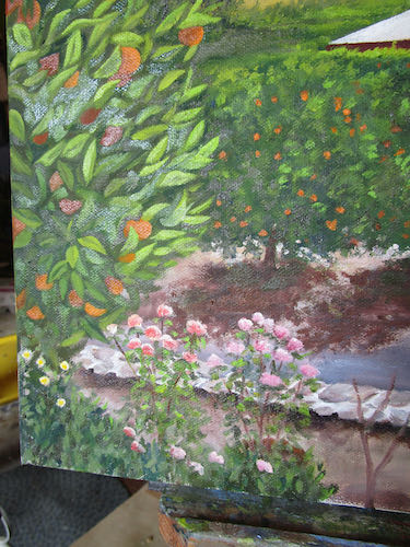
This looks weird: one trick to know if a painting has enough contrast is to look at it in black and white. I will do this with the entire painting before declaring it finished, but for now I wanted to appreciate the roses and rock wall.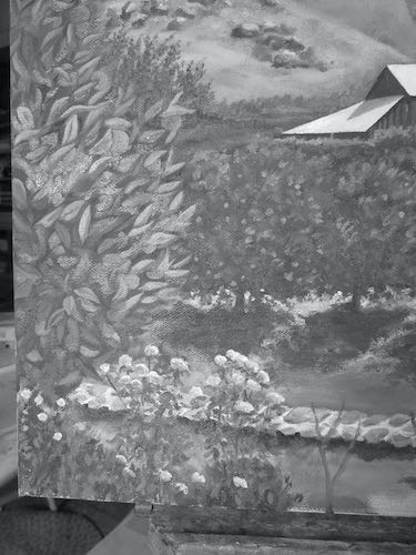
The rose garden grew, and it was very satisfying. (deer don’t eat roses in an oil paint rose garden).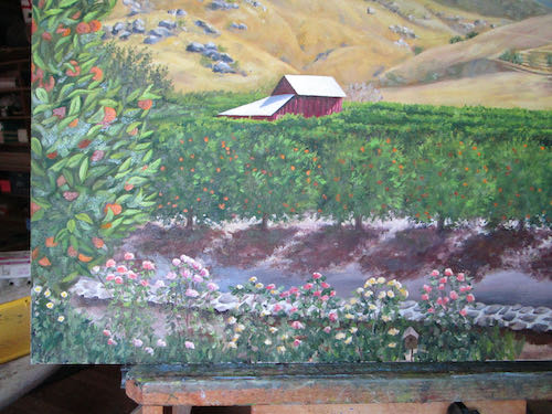
Hey! There are books on the wall! Yeppers, it is for the library. They look better than this now, but I didn’t photograph them again for you. (No, I will NOT be putting titles on them!)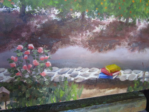
Now what are you doing, Central California Artist?
Glad you asked – I am painting the edges.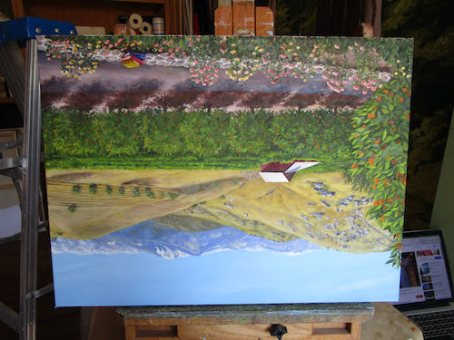
It is hanging to dry: look how it changes depending on the time of day it is photographed. When I decide to be really and truly finished, I will photograph it outdoors in the sunlight.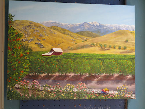
6 Comments
Awe, c’mon, put titles on those books! I’m sure your blog readers could come up with some very “unique” titles! Heh.
Sharon, if this was pencil, I would consider putting titles on the books but I just don’t have that amount of skill with paint.
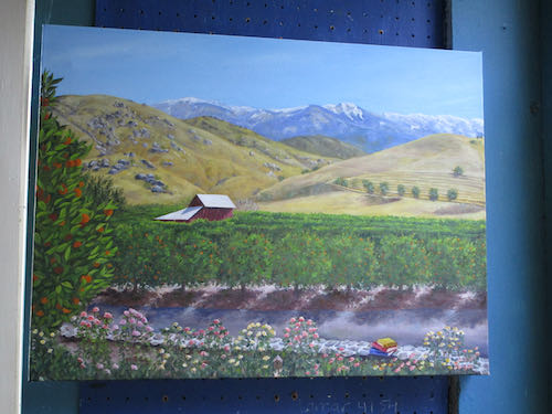
It turned out great!!! I love it……glad you took a picture in case someone……like me, may want something similar in the future.
Thank you, Anne! I don’t consider it finished yet so will photograph it again when I finally stop messing around with it.
Lovely! I’ve enjoyed watching the painting morph through the process. Question: Why are the books primary colors? I assume it’s so they will stand out, but my eye finds them a bit jarring from the muted tones of the rest of the painting. What if they were more dusty colors? Not intended as criticism. Just curious.
Interesting comment, Melinda. They are primary colors because sometimes I robotically follow my reference photos without thinking. I will definitely take your idea under advisement. They are a bit jarring, so I have to decide if this is a good thing or not. Thank you!
Comments are closed for this article!