Inspiration, part 1

vase-2.jpg

Sometimes people ask what my sources of inspiration are. Most are probably asking about what gives me ideas for drawing – that is simple. My life experiences give me those ideas. When I was a kid, a teen and even a young adult, it was a challenge to decide what to draw. As I aged, the number of choices grew, and now, by the time I have sorted through all my ideas, there is hardly any time left to draw or paint!!

So often I have read biographies and artist’s statements that say “I have always been fascinated by light and shadow” or perhaps by “reflection” or “movement” or “textures” or “shapes”.

For me, the answer is simpler, and perhaps a bit of a cliche. It is BEAUTY! I am inspired by beauty! Sometimes it is natural and other times man-made, sometimes it is rustic simplicity, the way colors look together or the patina of age. Most often it is the way sunlight makes a normal object look beautiful. Once I had a job in a kitchen at a summer camp, and my coworkers would laugh at me when I would notice the beautiful color of iced tea, or the way the colors in the salad complimented one another. (But I am not scarred by the ridicule, so there!)

Now I think back to how I noticed colors, and wonder why I chose graphite pencil as my medium? Life might be full of surprises, but it definitely is full of questions!
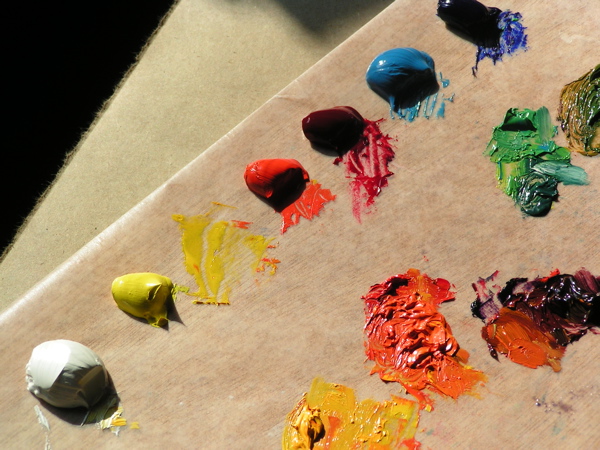
Primary Colors

palette.jpg

This is my palette for oil painting. It consists of 2 reds, 2 blues, 1 yellow and white, and all the colors I use are mixed with these 6. Before I started painting, I read articles, looked at books, and quizzed painters I knew. The ones that made the most sense to me were working from the primaries, mixing all their own colors. Several reasons are given: 1. Colors are cleaner, rather than the dreaded “muddy” look; 2. It keeps the palette less crowded; 3. It requires a greater understanding of colors and how they interact in mixing. 4. Less things to buy is a reason seldom given, but it certainly matters to me, because the more stuff I own, the more stuff breaks (or gets lost.)

I think there is a bit of an unspoken snob factor here. There is some pride in being able to turn those basic colors into any color one wants. However, there is a color I cannot mix! So, I gave in and today on the Seatrain mural I used carbazole dioxazine violet. It sounds like something for killing cockroaches, but it was the most wonderful purple in the world!! My friend working on her Master’s of Fine Arts insists the proper word for purple is “violet”, but I am a bit of a DBO. . . after all, I grew up in Ivanhoe! It looks rather blue here, but in reality it is the purplish-blue of lupine and was a great relief from all the orange.

purple.jpg

(in case you are wondering – Ditch-Bank-Okie)

It’s All Good

redbud-08-1.jpg

redbud-08-2.jpg

_828-poppies-iv.jpg

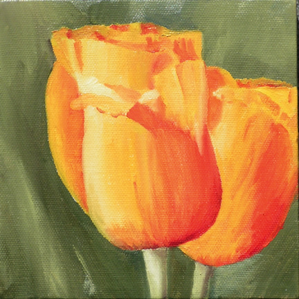
And the winner is poppies in Subject Matter, and 6×6″ in Sizes! I knew that. People are still spending, but spending cautiously.

But, it isn’t all about sales. Many contacts were made, a portrait commission in pencil may be on the way (there i go again, counting chickens before they hatch!), 2 small oils were commissioned, and the best part of all was seeing Bob and Florence! Sometimes, work just HAS to be put on hold when dear friends from the the past appear.

The second best thing was when Robin brought me a Dr. Pepper, but she sorta owed me because she ate my lunch. For me, the definition of a “starving artist” is one who is too busy working to eat. Wait! maybe the best part was seeing my mom yesterday! Or, was it when my sister and family surprised me today. In the current slang, it’s all good!