
Random Wednesday
- After much discussion, the title “One With The Rod” has been changed. It is now “One With The Stream”. While playing horseshoes our friend Mort says, “I’m one with the pit”. I took the saying to my studio, but felt more at one with the pencil than with the paper. Since a fishing pole is an arm extension, I thought it was fitting that my husband would feel one with his fishing rod. Not so! He is “One With The Stream”.

- This is how Zeke looked through my steering wheel as we waited for his vaccination turn at the pet clinic on Saturday. He was happy to sit on my lap and get combed while we waited, but it took some persuasion to get him to climb up after I opened the cat carrier. This little upsetting situation had to be repeated 2 more times. We were not having fun.

- The 8 Hidden Gardens paintings have been delivered to the gardener extraordinaire for first pick before they all go public. ‘sides, I didn’t photograph them all yet, and 2 aren’t even signed! Here is one:

- On a recent walk, a dogwood in bloom had blossoms with 5 petals and 6 petals. I think that is peculiar. Does anyone out there know anything about this behavior??

Morning walk in Three Rivers
Kind of handy to be able to combine exercise with gathering inspiration for new work, wouldn’t you say? Here are some of my usual scenes and thoughts (although I’ve been told my thoughts are rather unusual, and occasionally downright weird.)

The beautiful wooden garage doors, the arched gate and the odd coincidence of star jasmine blooming next to a star always catches my attention – one day I will see how to turn it into a painting or drawing.

Pink Lady Banks roses in the sunshine! We had yellow on our shed at our old house – it might be all that keeps the shed from collapsing. We have white in the herb garden. They grow super fast. Just telling you that in case you have a shed that is about to collapse.

Did you know that new grape leaves have brownish-red in them? Apparently some do. If I painted it this way, it would look as if I am trying to force in a color that isn’t really there. Other artists can get away with stuff like that. I am known for authenticity (or just being literal).

This one little piece of river brings to mind the beach. I miss the ocean. When I lived there, I missed the mountains. It would be WONDERFUL to find a place to sell my work on the coast. I have a place, but the work isn’t selling very well. I hate that. Time for happier thoughts.

I just love the red and white with the blue car in the background. Roses have been spectacular this year. Tomorrow’s post – roses!

There are many many more flowers in bloom besides roses. These were particularly stunning today.

Mr. Burns used to be a regular on this walking route. He had binoculars and knew all the birds. All of them. He died last week and now his gate is closed. Sniff.

Mid-May and the sycamores are only now leafing out!

Brian and Cheryl planted a new Japanese maple. Their old one seen in the background has caused great admiration, many photos and a little envy in me. Maybe I should just get the name of the variety and try NOT TO KILL ANOTHER ONE!!


The welcoming committee. And thus, we conclude our morning walk in Three Rivers. Am I inspired? More will be revealed. Back to the easel. p.s. This is a California artist’s thoughts. Just sayin’. . .
Odd jobs, odd artist
Some days are completely full of random tasks. Wednesday was just such a day – there was a long list of unrelated items that needed completing, and it rained. (random, see?) One of the list items was to paint a sign that says Pet Clinic. I spent a ridiculous amount of time messing around with typestyles, looking for little images of cats and dogs, realizing that I have a ton of cat photos from which to work. trying to design something, deciding it wasn’t really worth all the time because it is just a favor, and finally just doing this:

That is little Butch on the left and Dancer the Jack Russell terrier on the right. There wasn’t enough paint to coat the entire background, and I just couldn’t figure out what I was trying to do. It’s sort of obvious.
Then I did a few more errands, kept running into friends and then a friend/customer that I’d been trying to connect with. Ended up delivering 8 paintings to her house, so that worked out well. But, when I got home, I looked down and discovered this:

The Real California
This week you’ve seen some beautiful green and flowered photos of Three Rivers. These are the sights that inspire this California artist, and I love sharing them with you.
While I am working in the green hills, my other half is at a higher elevation with an entirely different climate and color. Every work day, he puts on green pants, drives an hour up a gnarly road (or more, depending on conditions and an endless construction project) and climbs into a yellow machine to fight the white snow. (See how I think in colors?)


He doesn’t always work alone. And in case you are wondering, the square thingie on the back of the Big Yellow Machine on the right is called the doghouse.

That’s our friend John up on the snow bank. He is the co- owner/publisher/reporter/photographer of the local paper. He went along to photograph the snow removal operation.

Salvage Job
Remember the painting accident a few weeks ago? (Oops, on February 16) I’m trying to salvage things. Here are 3 items that I am getting as a result:
- I’m using the canvas frame and some canvas from Mr. Stroben to stretch a new canvas. So far it has involved carefully removing the ruined canvas, finding the piece of new canvas, ironing it flat, laying the ruined canvas on the new and cutting a pattern. Next I have to find the staple gun.
- A blog reader named Michelle sent me to a site that had a beautiful tote-bag made of a painting. Hmmmm, I just tossed 2 ragged and stained tote bags. Perhaps it is time to sew a new one using the semi-finished painting of my favorite bridge! I seriously dislike sewing. Knitting is an entirely different process and much more rewarding. But to sew a new tote bag would definitely would be making lemonade out of lemons.
- The ruination of the painting caused me to begin a new painting of the bridge. Will it be better? That’s not a question that can be answered, because the first one will never be finished.

If I knew how to draw on a blog entry, I’d make a red arrow and a circle to show you where the rip is. It is a vertical thing in the lower portion, providentially leaving the bridge itself available to be reborn as a tote bag. I asked my very gifted older sister, She-Who-Can-Sew-Anything if she had a pattern for a tote bag. Instead of jumping in with an offer to sew one for me (I am an eternal optimist!), she told me to look on the Web. Sigh.
Broken Sleeper
My sleeper is broken. In the olden days of my life, 9 hours a night was a requirement. For the last several years, I feel lucky to get 8. What does one do in the middle of the night if sleep won’t happen? I think, I pray, I plan, and sometimes I just give up. Library books, knitting, and the internet are all good quiet occupations for those wee hours. Looking at the art of those I admire is one way I try to not just veg-out, because it is a given that I will be fairly useless during the day after one of those super-early mornings. I hope that by looking at the art of the Big Boys and Girls, something helpful will get absorbed into my memory. These are the artists I am currently watching:
June Carey – I saw a piece (reproduction) by her at The Wooden Indian in Visalia and never forgot her light, the lay of the land, the subjects, the realism combined with impressionism, the brilliance of her colors. She paints orchards, vineyards, hillsides, all with purple shadows on the roads, high contrast, fuzzy edges, perfect proportions, a building or two, Italy, Sonoma (or is it Napa?) and has typos all over her incomplete web pages. Who cares when her paintings just stop me in my tracks? Maybe I should sell my car and buy one. . .
Morgan Wiestling – “First Dance” was my first vision of this man’s mind-blowing fabulousness. It was at Masters of the American West in 2008, and it almost made me flip over the handlebars because I stopped so suddenly. My hand had to mechanically reach up to close my mouth, because my jaw truly fell open in awe. I don’t know where he gets his material – maybe he hires models and stages his scenes a la Norman Rockwell. Maybe he finds old photos and recreates the scenes in color. Maybe he is just a freakin’ genius! His edges are a little blurry, the light is subtle, the colors are muted and yet everything almost looks photographic in its proportional perfection. No maybe about it – he must be a genius!
There is something both encouraging and discouraging about viewing work of this caliber. The negative side of my brain says “Give up, you Poser because you are already 51 years old and aren’t even 1/100th of the way of getting to where these folks are and besides, you quit school and didn’t even go to a real art college”. The positive side of my brain says “WOW oh WOW, I’m just sure if I keep painting the subjects I love that one day my work will grab people as this work grabs me”.
Perhaps instead of producing 100 paintings per year at a very low price, I should paint just 10 and price them at $6,000-10,000 each. What do you think??
Get real, Toots.

Doesn’t this look like something June Carey might choose to paint? maybe if it had a house or a barn. . .
Drawing or Art?
Fifth in the series “Thoughtful Thursdays”
In college, an art professor said to me, “Just because you can draw doesn’t make you an artist”. I was devastated, insulted, dismayed, shocked, and any other adjective you can think of for the situation – how dare he say that to me!! Now that I have the advantage of life experience and wisdom, I know he was right, even if it was an insensitive and snotty remark. His point was that there is more to making art than simply drawing.
Master of Fine Art, or MFA, is the highest degree possible in art. My college professors may have had their MFAs but mostly they walked around the room while taking a break from their own work, and offered criticism and snide remarks (”Just because you can draw. . .” or “You need to work on composition”) without ever bothering to actually teach, to demonstrate or share information.
I have been teaching people how to draw for 16 years without an MFA. Drawing is a skill, and in teaching the skill, many other things about art can be shared. We talk about different styles, ways to set up a drawing from the beginning, ways of arranging the elements in a drawing, and lots of technique. First I show how, then I explain why.
Through the years, only two of my students that I can think of have pursued art as a career. Everyone who has stayed long enough to learn to draw has learned to draw, and they each have drawings they can proudly show off to prove that they know how to draw. Even without going into art full-time, learning to draw has give each one confidence.
A year or 2 ago I saw 3 former drawing students. Louis was in the Navy, Stephanie was thinking about occupational therapy, and Mark was a cowboy. Drawing lessons were not a waste of time for any one of these wonderful young folks – they learned to draw (duh), learned to communicate with people of all ages (that is the way my classes are arranged), explored a type of art in a comfortable environment, got to display their work in a show or two, developed a bit more confidence, and made new friends.
I enjoyed every moment spent with each of these people and love seeing how they are turning into adults. We have an easy friendship that transcends age and that has lasted through time and changes. They can draw; are they artists? I think so! And I am an artist in addition to being a teacher and being able to draw, so there, you Snotty Professor who is now probably just a retired teacher!

The Beach House, graphite, 10×8″
private collection
Keeping Up With the Jones
Ever wonder what an artist does on a day off? I only know what one artist does on a day off – that would be me. First, I experience a tad bit of anxiety about not working when there are deadlines and lots of work right here at my home studio. In a concerted effort to not work, I read some knitting blogs instead of websites about how to use Facebook to benefit my business. Then I decide that it would be rude to work when Michael is off and at home; besides, during the week when it is sunny out, I keep wishing I could be out in the yard.
After all this reasoned thought, I was ready to face the day. We spent the morning pruning and hauling brush and being amazed at the vast quantities of materials that grow in our yard and aren’t edible. . . which is why they grow here and aren’t consumed by deer and gophers. After a short lunch break, Michael suggested a walk. I’ve been watching our neighbor’s dog and the poor beast is lonely, so I thought we should go visit him.
 This is Berkeley Jones, adopted from an animal shelter about 9 years ago and given his unusual moniker by 2 sweet little girls, one of whom will be getting married next summer.

There was more incentive to check on Berkeley than simple concern for his well-being; he has a beautiful back yard!

We walked back home with a profound sense of gratitude for life in Three Rivers, in the sunshine above the fog of the Central Valley, walking distance from the river, surrounded by great friends and beauty in every direction. (Never mind about the weak water system in our neighborhood which caused us to abandon 75% of the lawns that came with our house; that looks like a crummy lawn in the photo, but it is a weed patch now.) We were also inspired by the very fine manicured oaks in Berkeley’s yard so we spent another couple of hours in the yard when we got back home, trying to keep up with the (Berkeley) Jones!
The Rules
This is the 4th in the series entitled “Thoughtful Thursdays”. These are reprints of articles written by me for the local newspaper called The Kaweah Commonwealth with a few modifications for a wider audience.

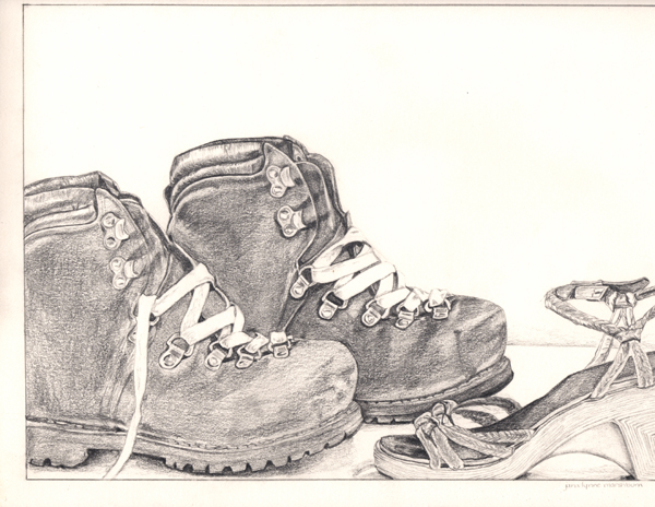
This was drawn using the entire range of pencils available.
There have been many art teachers in my life. Each one seems to have hard and fast rules that they insist apply to and be followed by everyone, or at least by all their students. Since I teach drawing, I understand this, but I try to clarify the reasons for my rules so that the students can decide for themselves.
One colored pencil teacher said to ALWAYS put the darkest color as the bottom layer and work up to the lightest color. (Gary Greene) Another said ALWAYS start with the lightest color as the base and then add layers in order of increasing darkness.(Ann Kullberg) I have done both on the same drawing and gotten the same result! Other times, there is a difference, and I don’t know why.
Several colored pencil teachers have said NEVER USE BLACK. If you want darkness, build it up by layering the darkest colors. When I do that, it rarely looks dark enough but instead, looks as if I layered the darkest colors because I couldn’t find my black pencil. When asked about this bad black pencil theory, a different teacher of colored pencil simply said, “If you aren’t supposed to use black, why do they manufacture it?”
Some of the painting teachers I have listened to say “NEVER use white alone”. (What color is one supposed to use if white is the needed color??) Most say, “NEVER use black”. I spoke to a professional painter whose paintings sell for more than my car is worth. He told me of his layering process and it included black paint!!
The best drawing teacher I ever had only let us use a 6B pencil, which is very soft and dark. We could not smear or blend with any tool, including our fingers. His premise was that if you could learn to control that one pencil, you could make any pencil do anything you wished it to do. He was right, but then it took me years to be able to use the entire range of pencils available because his idea was so deeply etched into my head.
This is a piece done under the guidance of Professor 6B.
Many of my students ask how to hold their pencils. I show them how I hold mine, and tell them to try it, and also to try anything that feels comfortable to them. As in handwriting, everyone has a different look to his drawings. The point is that there are many places in life where there are rules, but in art the only absolutes are determined by the results you desire.