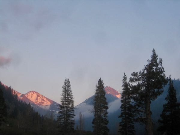
Remember that long list of things to do a few days ago?
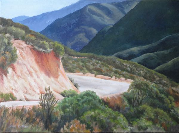
I began with the oil painting commission of Homer’s Nose/The Oak Grove Bridge because it wasn’t too hot yet in the painting workshop with the swamp cooler running, there will be a check when I am finished, the heat is coming and will dry my beginning layers, and it had been a long time since I had done any painting.
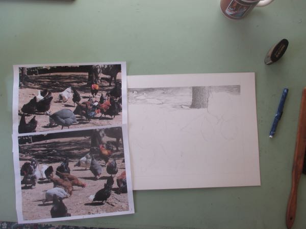
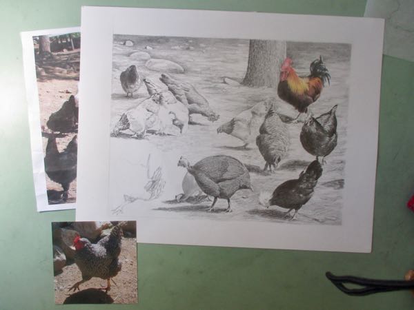
When the day heated up and the decisions on the painting felt overwhelming, I switched to the studio where I draw.
In spite of having an October deadline on the calendar, I chose to work on it. Drawing calms me down, reminds me that I am a capable artist, and it feels better to inch toward a large distant goal than to just procrastinate.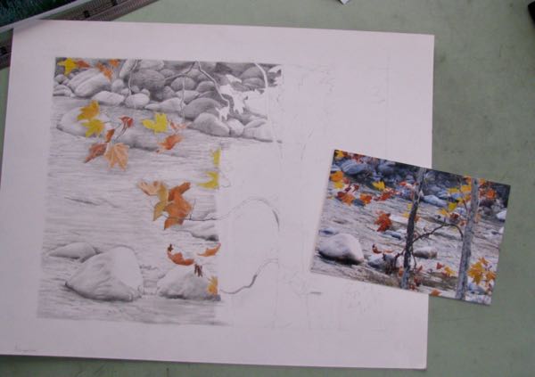
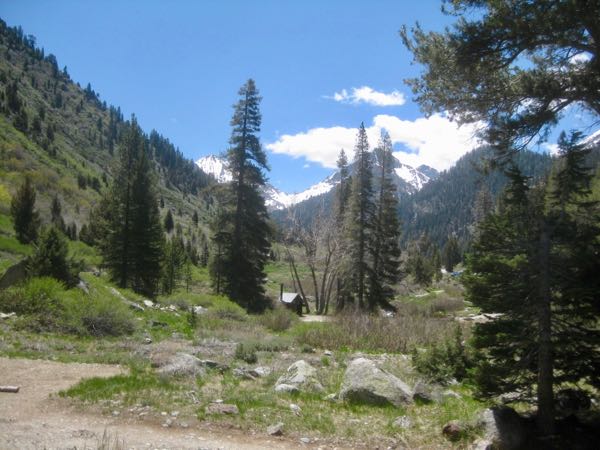
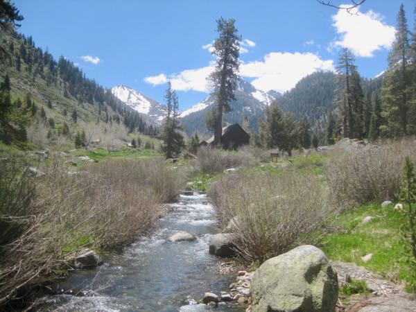
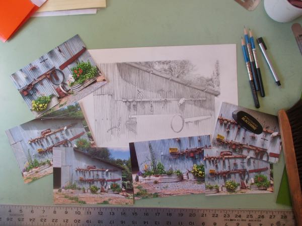
This gave me confidence to tackle a pencil drawing commission that is definitely too hard for me. The customer requested a pencil drawing of the Mineral King Pack Station. After learning why he wants the drawing, we determined that the pack station as it looked in the 1980s would be most appropriate. He had no photos. I asked around for about 6 months and finally found someone with photos from that era. Alas, they are almost illegible.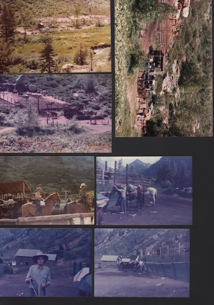
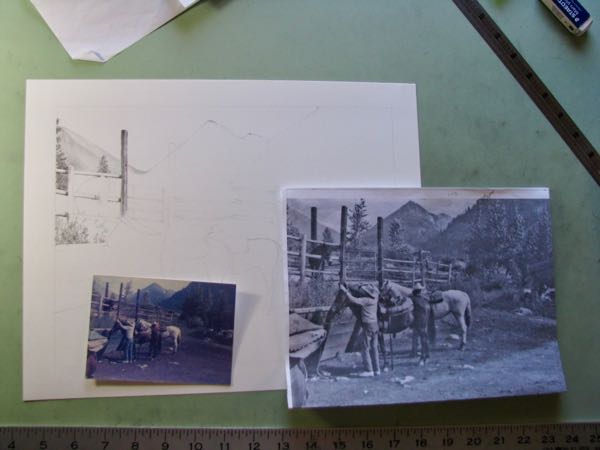
After showing the customer and discussing it further, we determined that only one of these has enough information to be of any value.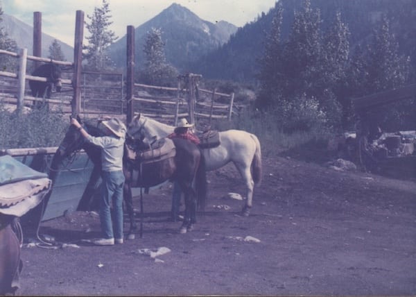
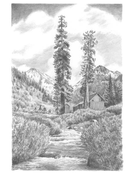
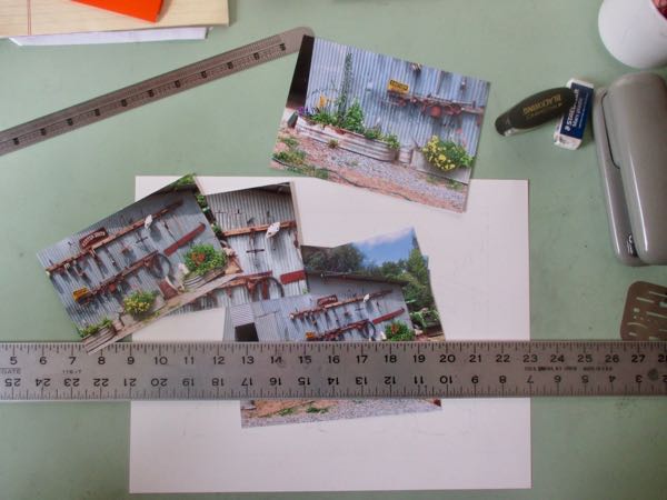
Whoa. This is going to be crazy hard. I did a little cropping, a little measuring, a little pre-sketching, and finally decided to begin shading the things I know how to do.
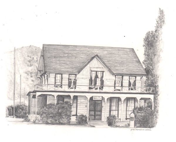
Today’s painting for sale is not a painting for sale – it is an advertisement.
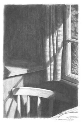
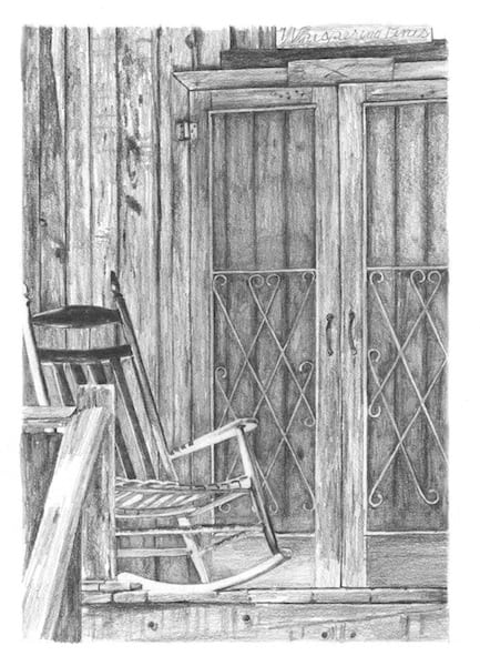
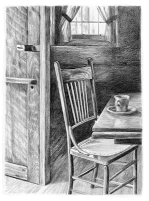
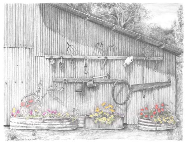
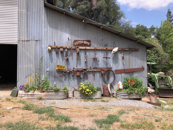
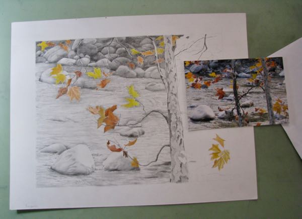
 One of the things I continually tell my drawing students is, “Pick something you love because you will be staring at it for a long time.”
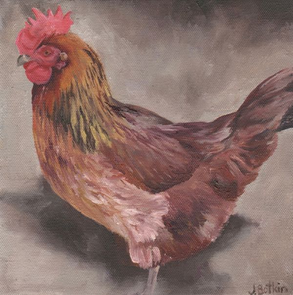

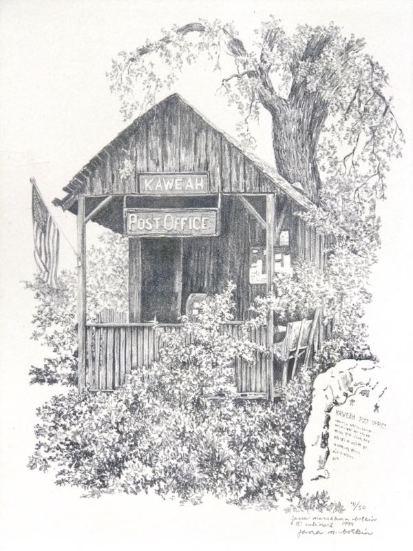
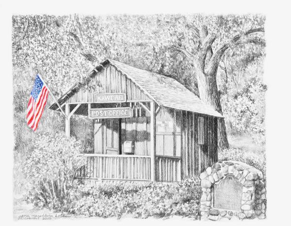
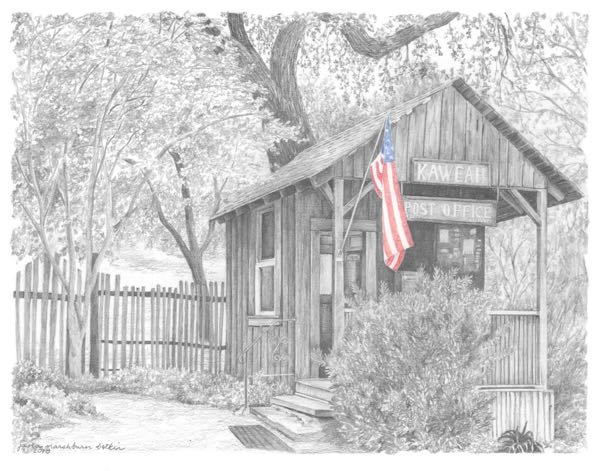

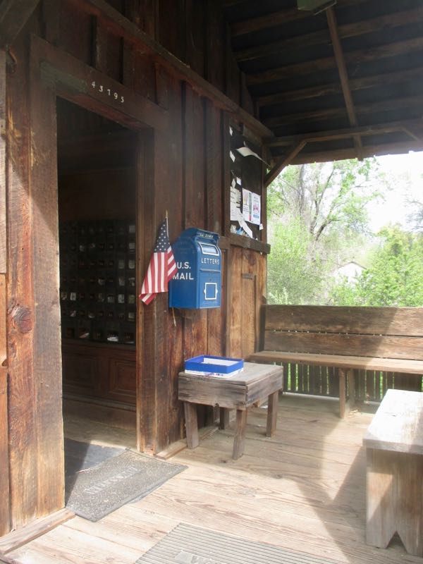
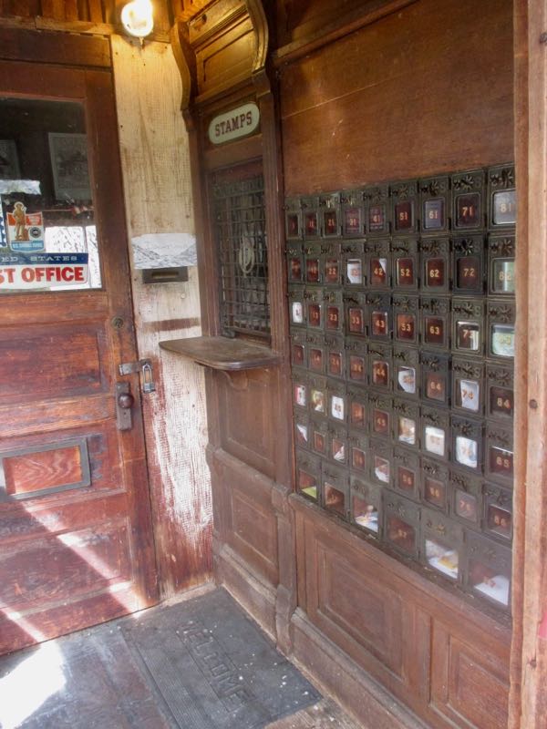
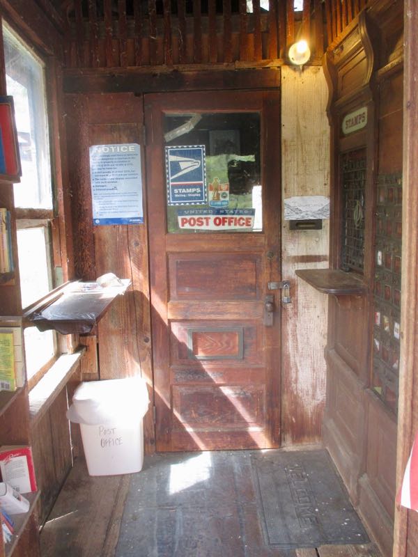
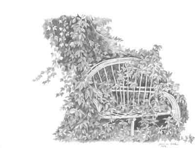
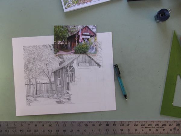 While working on the umpteenth pencil drawing of the Kaweah Post Office, I was struck by how stupid it is to guess at what is around and behind the little building. Why am I struggling with an incomplete photograph when all I have to do is drive about 4 or 5 miles and see the thing in person??
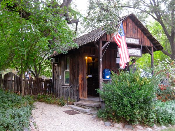
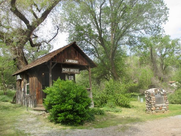 Would you look at that? It is gone! But wait! I think I see it. . .
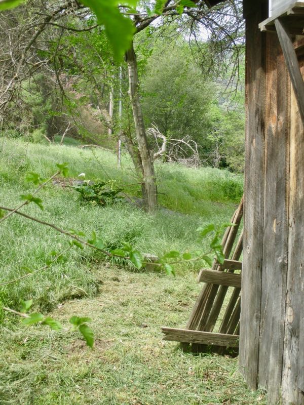
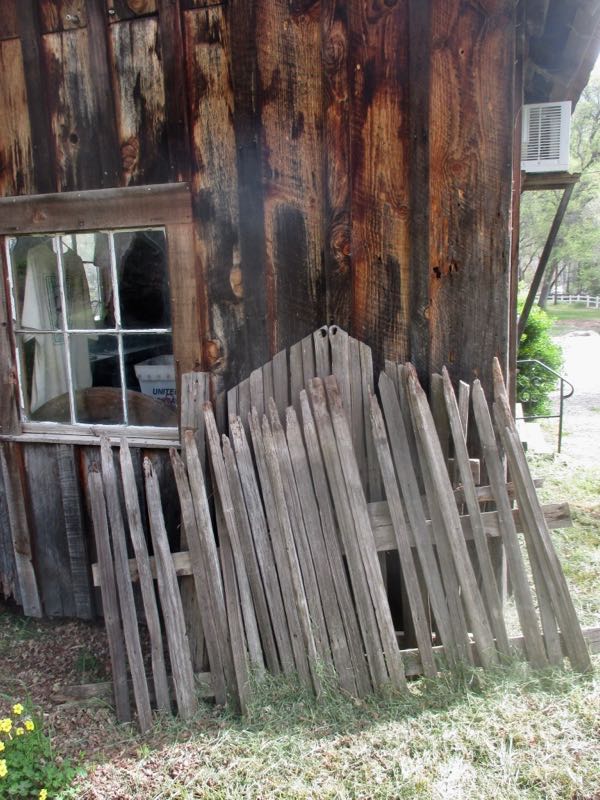 That’s no help. Guess I’ll just stick to my old photo. The background works, just sort of scribbling in blurry curly growing symbols.