A friend introduced me to his cousin. We became instant friends. Let’s call her Jane, because that is her name.
My friend and Jane’s shared grandparents had a wonderful home in the country south of Farmersville (Yes, that is the name of a town here in Tulare County. Wanna make something of it?) They both thought it would make a great drawing or painting, so I went there to take some photos.
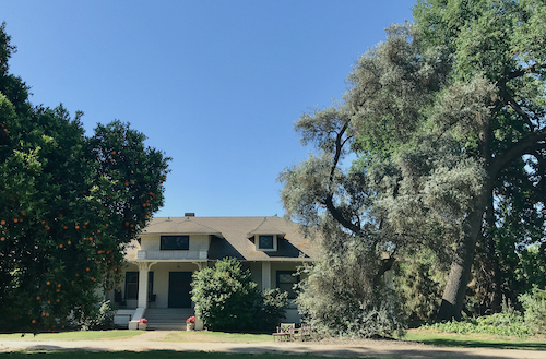
I love the style of this house! I took many photos, from every angle possible.
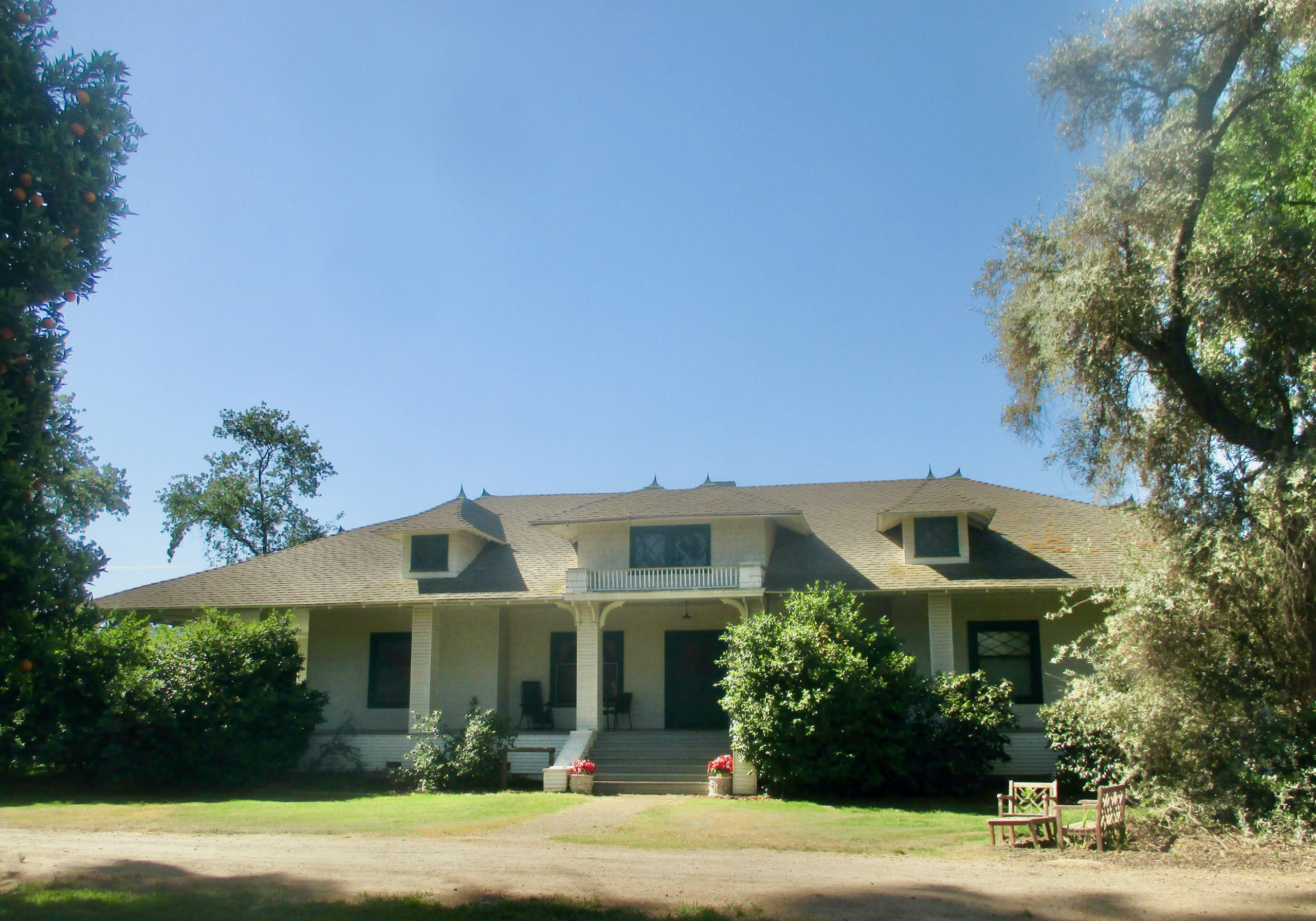
Want to guess which one I liked best?
Want to guess which one Jane and her husband liked best? (They are my customers for the project.)
Want to guess which medium they chose?
“Medium” means the substance from which I will make the art – pencil or oil paint, in this case.
6 Comments
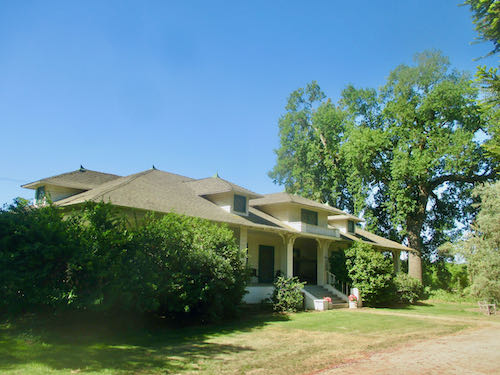
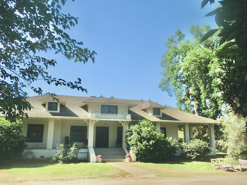
If the point is to show the house, I would think #4 a better choice, especially if you “prune” the camellia bush some. I don’t get why both you and the client liked #3. Also, when was this house built, do you know? I love the little balcony on the second floor.
I got no problem with Farmersville! There used to be fruit stands there (probably still are) when I was living in the area and I remember I got some really delicious Elephant Heart plums there in the summer. I love those plums, and they are hard to find here.
Marjie, I don’t know why #3 is so appealing. It is one of those instinctual responses to a visual stimulus, perhaps.
The house was either built in 1914 or 1919 – can’t remember! Get this: the little balcony and the dormers are FAKE!! There is no second story to the house. That blew my mind because I had the idea that fakery was from our era, not the olden days.
Those Elephant Heart plums – aren’t those the ones that are green on the outside and deep maroon on the interior? I haven’t seen those for years, and I do stop regularly at the fruitstand on Caldwell just east of Lover’s Lane.
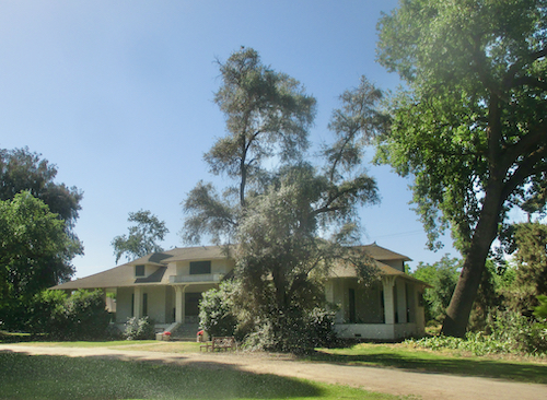
#4 because the trees on either side frame the image of the house nicely. Or maybe #3.
#1 because it shows most of the house. Or maybe #4.
Pencil (with just a splash of color here and there) because it seems to be your most popular medium for structures/buildings.
How did I do?
Sharon, #3 it is, and in pencil. Not sure where a splash of color belongs, because nothing stands out except the fake faded poinsettias by the steps, something the customer request that I leave out.
So, is #3 the one chosen by both you and Jane? It does make for an interesting angle, not your usual full frontage view.
Maybe you could add an American flag? That’s your usual go-to for the color splash. But you’re right–not the faded out points at the bottom of the steps! Different flower, maybe? All a part of the design process!
I liked #3 best and was thrilled when Jane picked it too, without any prompting on my part.Maybe the camellia to the right of the steps will be in bloom.
Comments are closed for this article!