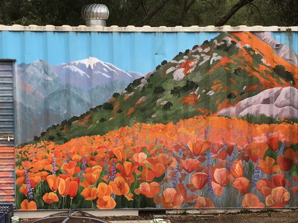
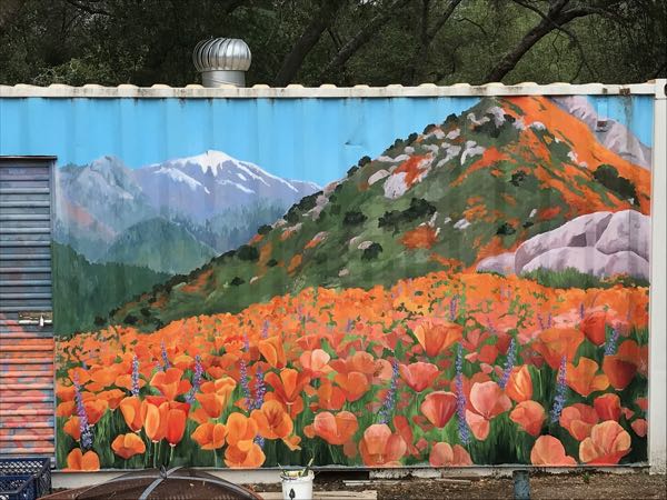
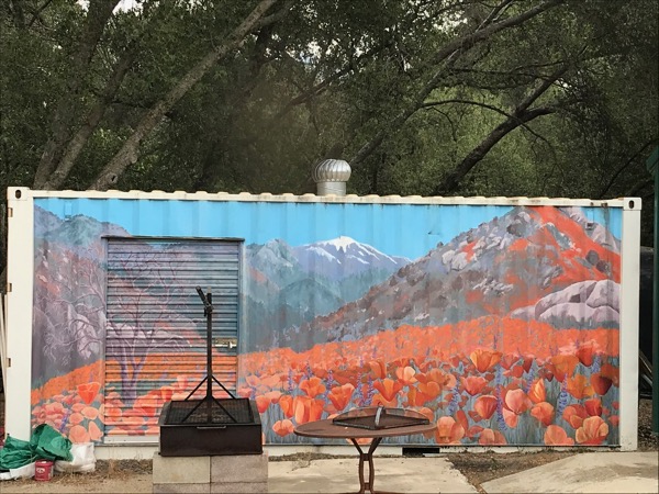
We have had weird unusually cool weather here in Three Rivers, and I took the opportunity to continue working on the faded poppy mural.
You can see the lower section needs refreshing.
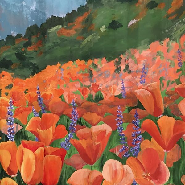
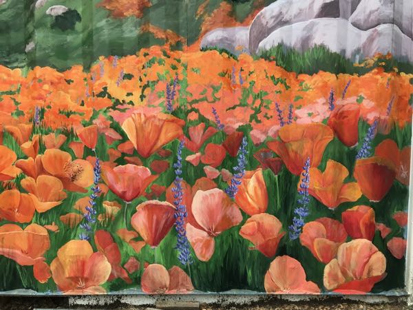
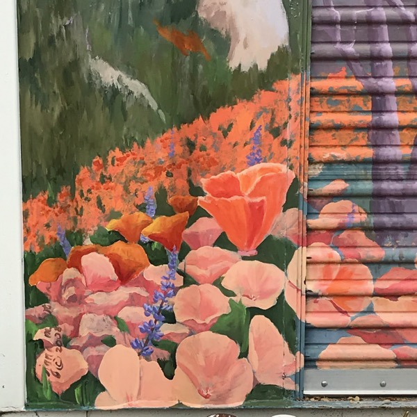
I started with green among the lower poppies. You can see that the middle ground of poppies is pinkish.
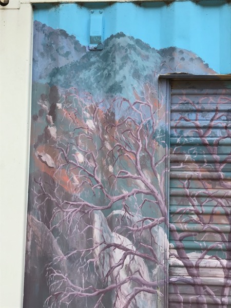
The lupine haven’t faded, so I am working around them. I did add some white tips to the blossoms on the far left in this photo.
I keep backing up to see if it looks as messy far away as it does from up close. The way a mural can look so terrible up close and so tight and photographic from a distance never ceases to amaze me. Feels magical.
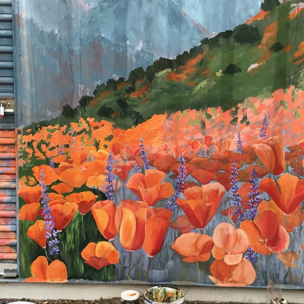
Now I have added green to the lower right AND greens to the next layers of hills, fading as they move back. (If you are interested in ArtSpeak, this is called “aerial perspective”.
I worked more on the poppies, all the while lamenting how much was left to be done and getting COLD in May!! The pinkish colored ones haven’t been retouched yet.
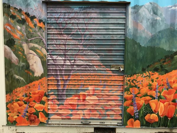
There are some poppies remaining, along with the dreaded door. A friend (a very important person) really likes the tree, so I will retouch it on the left side and probably tackle the dreaded door, as long as the weather cooperates.
A list of what remains to be done, depending on the weather and my availability:
The dreaded door
The tree
Pinkish poppies, both close and far
Adding more popcorn flowers (or painting out the ones I just added)
More grasses to overlap the poppies
The lowest horizontal edge, which is currently covered in dirt and splatters from the rain.
Brightening the lupine, just because I love those colors and want more, more, more
I think that the distant Alta Peak and Moro Rock, along with the rocks on the hillsides can be left. Their fading makes them look farther away than they did when I first painted the mural, which is the way it is supposed to look.
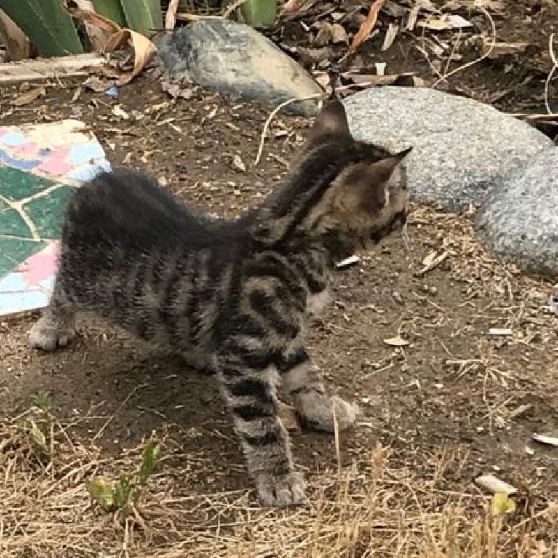
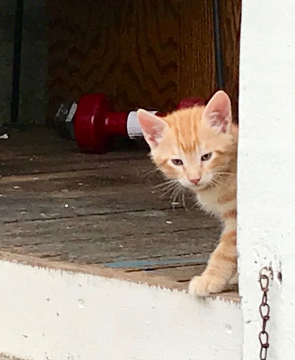
This is KitCarson, who always goes first, like his mama, Scout.
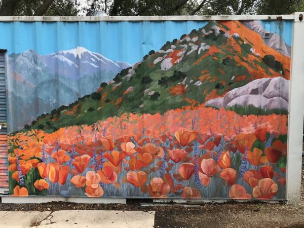
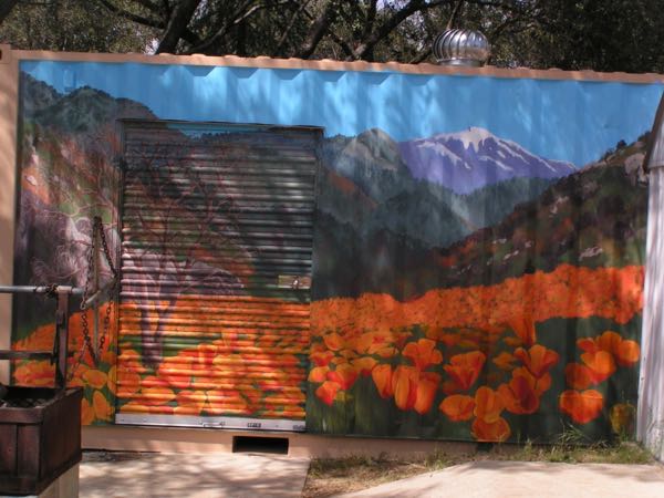
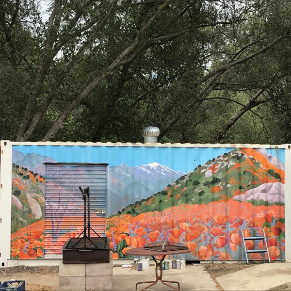
The first public mural I painted was in 2008 on a Seatrain storage container at my church. 2008 was a “super bloom” year of poppies, and we were in love with those flowers.
Seatrain in 2008
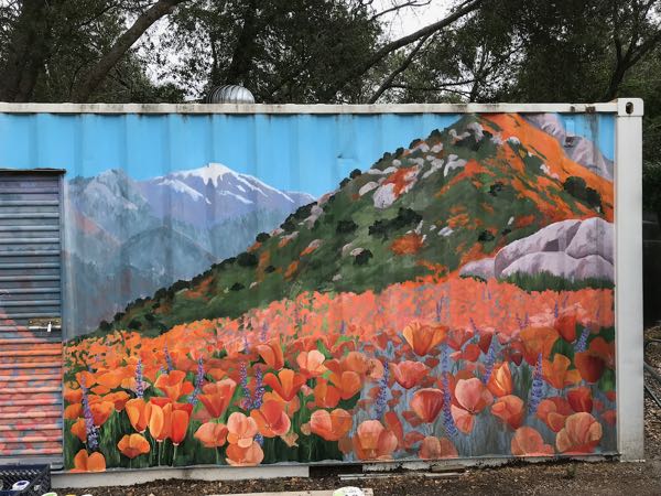
Eleven years have passed, and most of the yellows have disappeared from the mural. Yellow+blue=green, so the greens are blue. Yellow+red=orange, and the orange is now pinkish. Any yellow in brown is gone, leaving lavender or gray. The results are rather dull. It isn’t in a high visibility area, and because the darks and lights (“values”) remain, it looks okay (from the back of a fast horse.)
Faded.
But in my opinion, it either needs to be refreshed or painted out completely.
Terrible looking poppies.
Dull looking hills above.
Better, and now you can really see how faded the old poppies are.
It was harder than I expected. I had forgotten how quickly acrylic dries on the palette, on the surface and in the brushes, how difficult it is to control the edges and the blending with that mural paint. So, I abandoned the left side and went for broader areas in the background.
Backing up to get a better view helps.
I enjoyed listening to the river in the morning, and I was thankful for the cloud cover. But after 6 hours of painting, I decided that was enough for a day. Maybe if there hadn’t been a weed-eater going in the background, I would have lasted longer.
This project is going to take much longer than I expected. I might just ignore the door and leave out the tree.
Since April of 2008, I have been posting to this blog, in an irregular fashion at first (I knew nothing about blogging), and then consistently 5 days a week.
Current blog wisdom from the Internet-Know-It-Alls is that 5 days a week is too often. Since I am not seeking a multitude of “Likes, Followers, or Friends” (none of those words really mean what they appear to mean), current blog wisdom doesn’t drive much of what I do.
Instead, I have the distinct privilege of knowing most of my readers, or at a very minimum, having met them in real life. Some subscribe (the means for that is on the main blog page that gives excerpts from each post), some check in occasionally. All are welcome.
If you choose to subscribe, enter your email address. You will receive an email with a link to click or tap on to confirm your subscription. Then you will receive an email of the current blog post each time I put something on the blog.
Many of my readers aren’t very techie, and might be a little nervous to click on things. (If that is you, today’s Blog Idea might be a little too much for your careful self, but there is nothing to worry about because you can’t wreck my blog or your device by clicking here.)
See the little triangle to the right of the words “Select Category”? If you click or tap on that arrow, you will see a list.
My Blog Idea is that you can go to a particular category that interests you and see a whole lot of information on old blog posts. Some people only read my blog to learn about Mineral King, others read because they want to know about drawing or murals or oil painting or lessons or Three Rivers, and a small handful read my blog because they are related to me.
I have noticed that if reading my blog on a cell phone, the category list doesn’t appear. There must be a way to see the list, but that is beyond my current abilities.
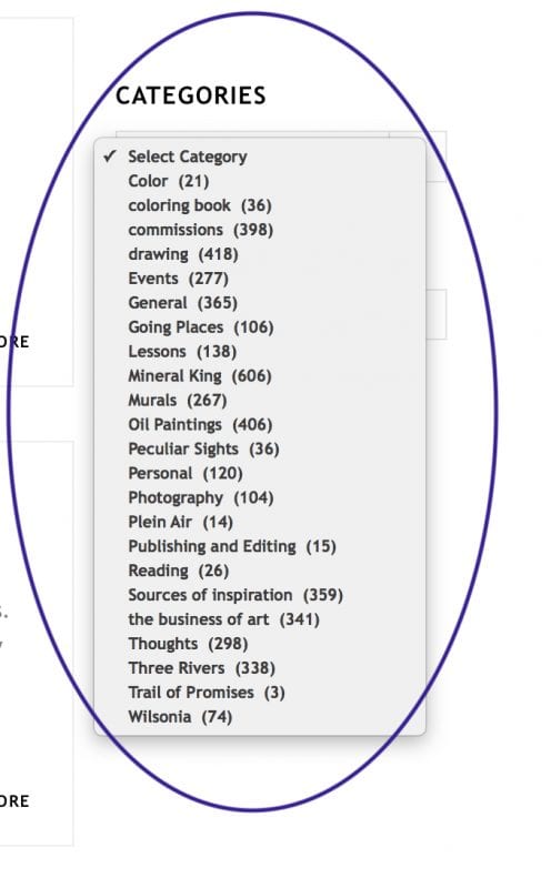
This is the list of categories of blog posts. Some of the posts fall under more than one category. The number in parentheses is the number of posts within the category. If you click on a particular category, you will be taken to those posts.
“General” is a category automatically assigned if I have neglected to uncheck that box while posting. If I had nothing but time on my hands, I’d go back through the list and change the categories on those posts, but I’d rather be showing you how to enjoy the blog or telling you about current events in the life of this Central California artist. (But wait! What category does this post belong under??)
THANK YOU, BLOG READERS, NO MATTER THE REASON FOR SHOWING UP HERE! (unless you are trying to sell me something like fake brand-name purses or sunglasses or your “grow-your-subscriber-list” services –all y’all can just go bother someone else)
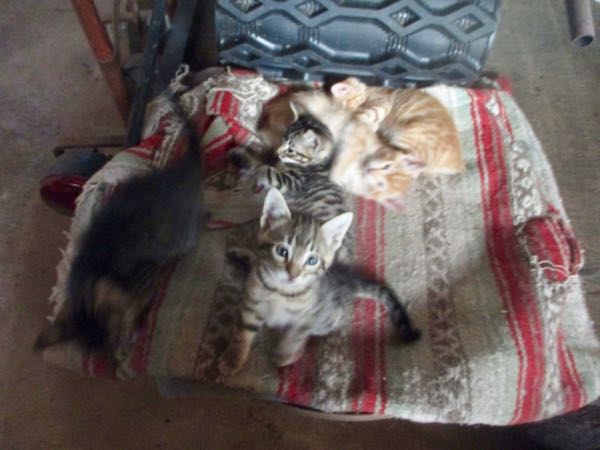
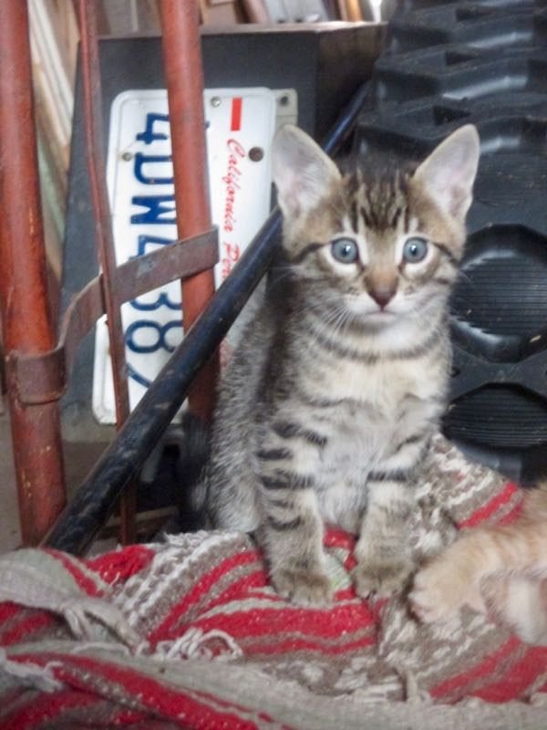
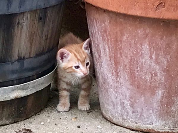
Still piling together at 6 weeks, but very very active.
I can’t tell them apart from just their faces yet.
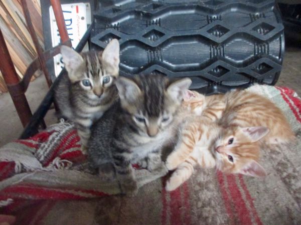
This might be Georgia. She looks like Samson when we got him. Same family line, but new blood from the papa.
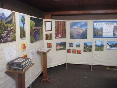
The Perfect Gift Boutique at the Three Rivers Arts Center, November 2007
There are several different kinds of shows for artists to participate in.
The elegant type at an art gallery – a dress-up indoor event, usually with wine and hors d’oeuvres, often shared with other artists and usually preceded by a postcard mailing. These range anywhere from a nice opportunity to a Big Deal, depending on how shiny the floor is and how far apart the art is spaced on the walls. There is no entry fee, you have to be invited to be a participating artist, and the gallery keeps a percentage of the sales.
The arts and crafts fair. These tend to be outdoors, have an entry fee, and attract all manner of folks. Some are looking to spend money, and some are just looking to spend a little time. The sales can vary with the weather, the amount of publicity, or just economic times. A show can be wonderful one year and a dud the next, and it is hard to predict in advance.
Setting up art at some sort of an open house, a reception, a dinner or an annual meeting. Unless the artist is the featured speaker, I have found these to be a waste of time. Exposure is only important for a little while when starting out; after a while, a person can die of exposure. (We need sales to stay alive.)
As a regional artist, I do local shows, so I know a high percentage of the folks who visit. It is like a reunion/party combined with being tuned in to people who actually want to buy something. There is a balancing act between chit-chatting too much and missing sales as a result, or just zeroing in on potential customers and not having time for friends.
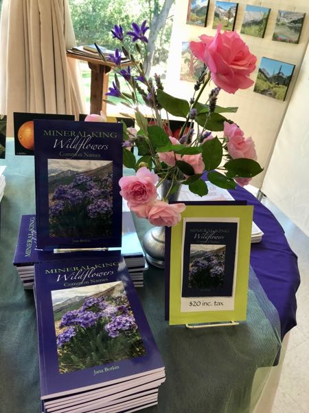
The items that sell well vary from year to year. Back in the 1990s, it was all about cards and reproduction prints. Learning to oil paint in 2006 opened up an entirely new avenue. A few years ago, coloring books were the hot item. This year at the Redbud Festival, Mineral King Wildflowers was the star.
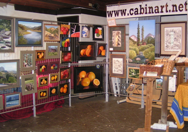
And look at my booth 10 years later than the photo above:
Perfect Gift Boutique, November 2017
Gilligan or Ginger? (at 6 weeks they are venturing outside)
Sometimes I have the overwhelming need to share some beauty with you that is not of my making. (I hope you know me well enough to not take that sentence as if I believe all my art is beautiful. Gotta stay real and humble here.)
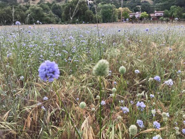
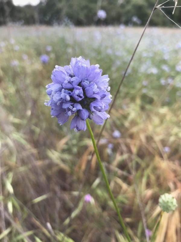
What is this new-to-me wildflower, across the road and downstream from Reimer’s (the candy store in Three Rivers)?
So glad you asked! It is Globe Gilia.
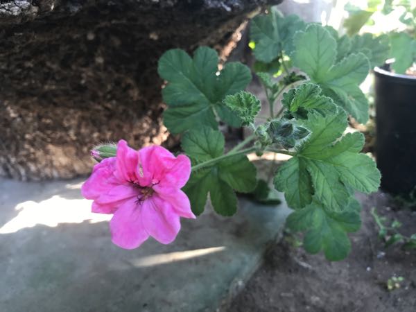
The plant I pilfered a cutting from last summer in someone else’s yard is in bloom!
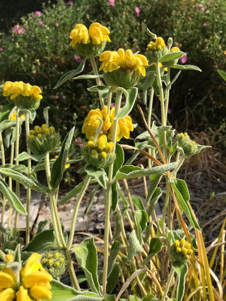
The Jerusalem Sage is in bloom!
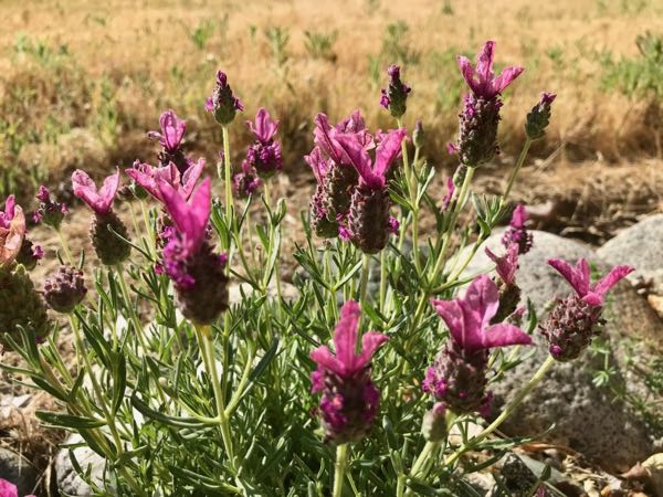
The Spanish or French Lavender is in bloom; I’m inclined to think of it as Red-Violet rather than Lavender.
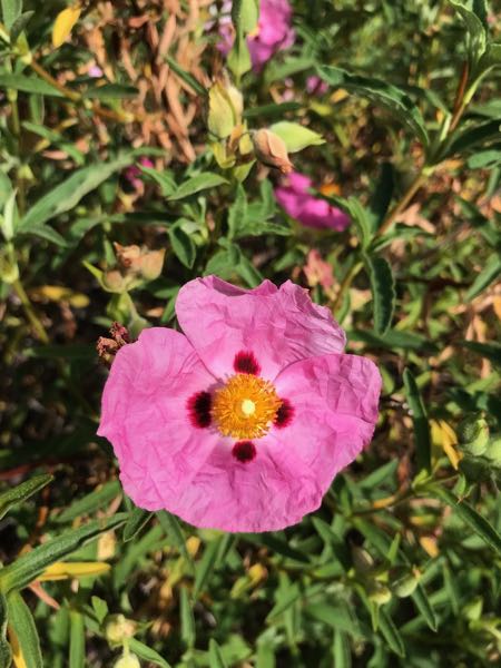
The Rock Rose is in bloom!
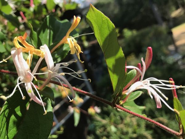
Look at the Honeysuckle! Too bad you can’t do a scratch-and-sniff on your screen.
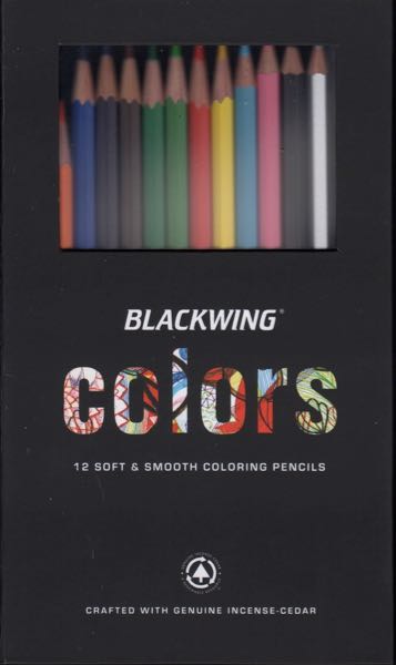
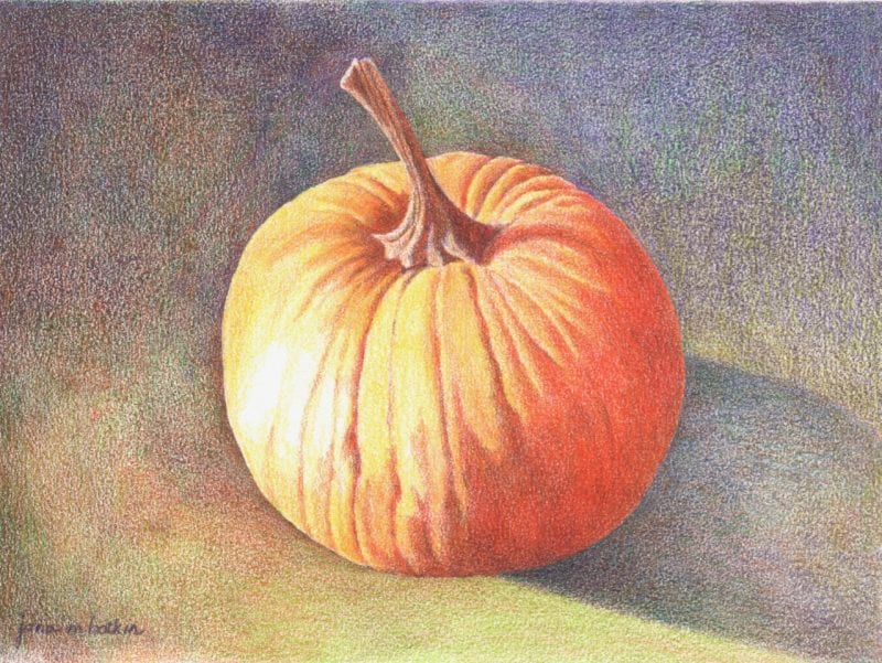
A year or so ago I bought some new colored pencils. Blackwing manufactures something called “Blackwing Colors”, and I am a sucker for new pencils. With the box of 12, I did this 5×7″ drawing.
Melon, Gourd or Squash? 5×7″, colored pencil on paper.
I posted it on Instagram (if you like Instagram and want to follow my very occasional posts, I am JanaBotkinArt) and also emailed it to Pencils.com (where I bought the pencils). Someone from there emailed and asked if they could use it on their blog. I said okay, and then nothing happened.
Last week I got an email from someone at a magazine called “Colored Pencil Magazine” (How’s that for over-the-top creativity? I think they were going for easy-to-find-on-Google rather than cleverness, which is probably smarter than being cute and calling yourself something like “Cabinart” which no one can remember.)
I am writing to let you know that we are interested in using your Pumpkin piece as an example of Blackwing Colors in the June 2019 issue of COLORED PENCIL Magazine in the Spotlight section.
Being a sensible person (in spite of making a mistake in naming my art business something that no one can remember), I said yes. Then I looked at their site and see it is both online and in print. I’ve never heard of this magazine before.
I wonder if it will be wise to show colored pencil work when I am now primarily an oil painter? I wonder if it will be wise to show colored pencil work when using colored pencils hurts my wrist? I wonder if it will be wise to show colored pencil work when it rarely sells? I wonder if it will be wise to show colored pencil work when I prefer graphite (ArtSpeak for regular pencil)?
Life is full of unanswered questions. I think this falls in the categories of It Never Hurts To Try, and We Regret More of What We Don’t Try Than What We Do Try.
As usual, more will be revealed in the fullness of time.
Three things happened in drawing lessons last week that made me smile or laugh. Maybe they will also affect you thus.
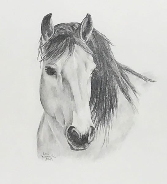
A drawing student finished this picture.
Nice work, Lou!
2. A drawing student said to me, “I can’t stand to draw”. I was horrified, until I realized that she meant she could no longer stand up while drawing because her feet hurt more while standing than her back hurts while sitting. We laughed for awhile on that one.
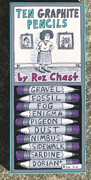
3. A drawing student brought me a present.
A box of pencils!
They are probably all HB or #2, and I will use them up gratefully. Plus, I will save the box and fill it with drawing pencils.
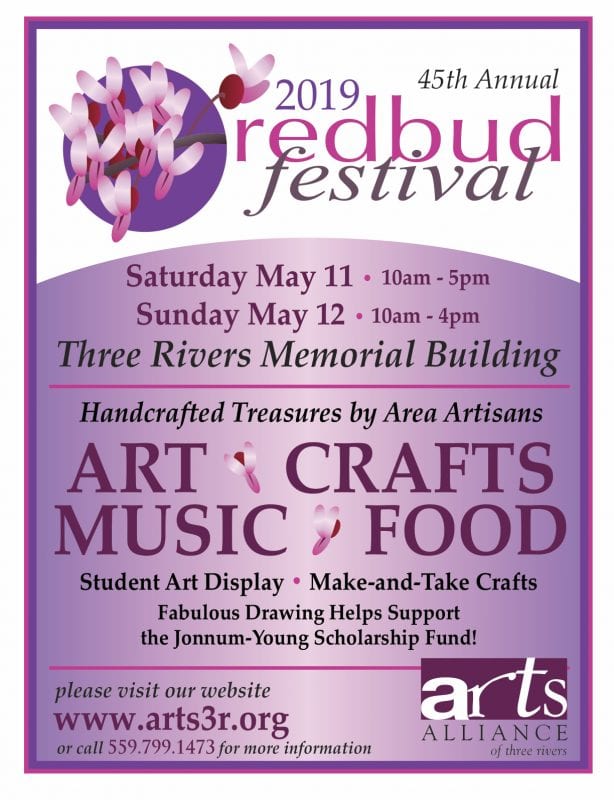
Here are the promised 7 observations and thoughts about the 45th Annual Redbud Festival in Three Rivers.
There weren’t very many vendors and visitation was low except for one exciting surge. I don’t worry about low attendance, because it gives me more time to learn who people are and to spend time hearing their stories.
Mineral King Wildflowers sold very well. People like the newest thing.
The coloring book fad is definitely fading.
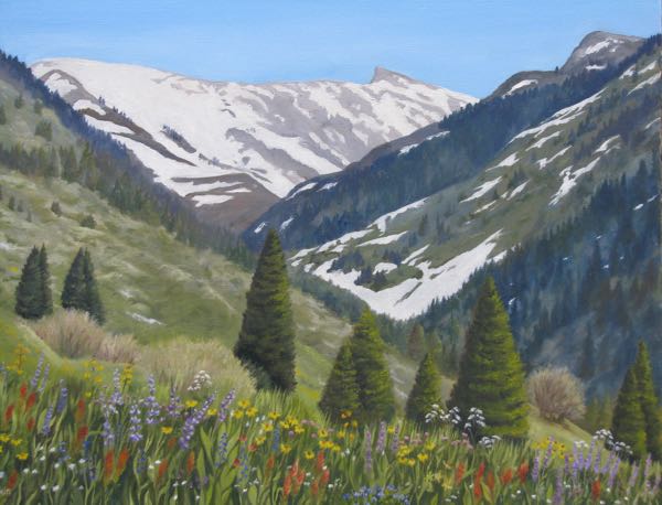
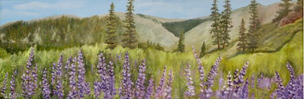
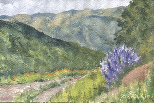
This year’s big attention-getting painting was Sawtooth with wildflowers in the foreground. People loved it. And, when it was their favorite painting, they bought a package of notecards of Sawtooth drawn in pencil with colored wildflowers in the foreground. Say what??
The Show Special* was a good idea – 5 of the 8 paintings sold.
More people liked my old detailed layered style of painting than the new, painterly style (except for the Show Specials).
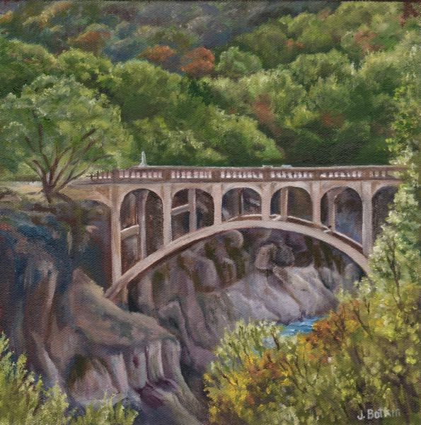
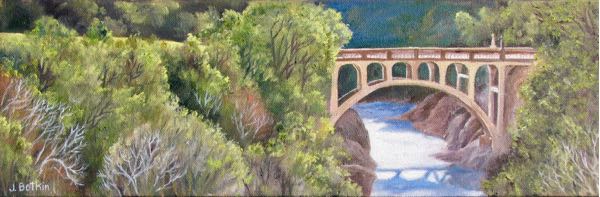
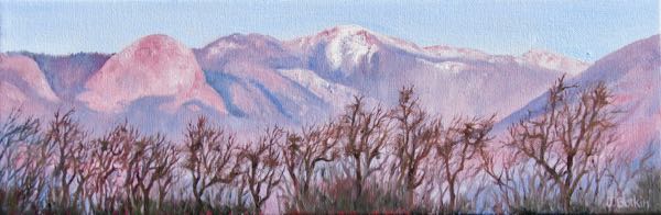
Funny story: I NEVER break down my booth ahead of the end, and if someone wants to linger and shop, I wait for them. A man spent a fair amount of time in my booth at the end, trying to decide between 2 paintings of the Oak Grove Bridge (my favorite subject to draw and paint). Back and forth, lots of questions, look, look, look, the 6×18″ or the 10×10″. He was very appreciative and complimentary, definitely wanting to take home a painting. His girlfriend came into the booth, and pointed to the one called “Alpenglow on Alta Peak” and said “I like that one!” Suddenly he said, “I’ll take that one”, pointing to the Alpenglow. Decision made.
This one? (Oak Grove Bridge XVI)
Or this one? (Oak Grove Bridge XVII)
Nope, this one! (Alpenglow on Alta)
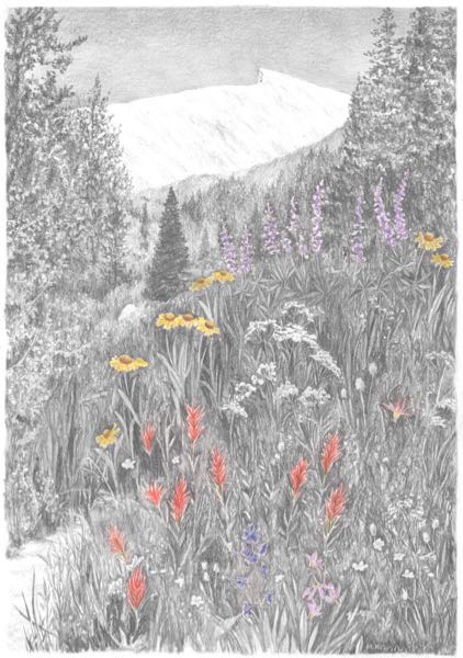
They loved the 18×24″ oil painting Sawtooth XXIII. . . .
. . . so they bought these cards.
Sold
Sold
Sold
Sold
Sold
Sold (not a Show Special)
Sold (not a Show Special)
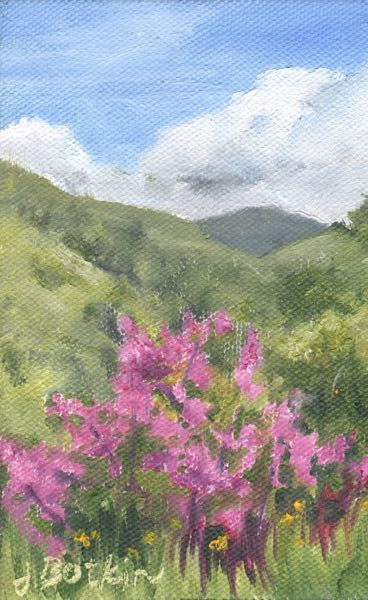
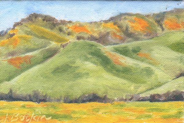
*Show Specials were 4×6″ paintings done in the alla prima style of wildflower scenes, offered for $40 instead of the normal $50 for that size.
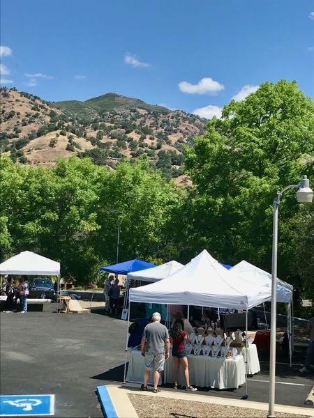
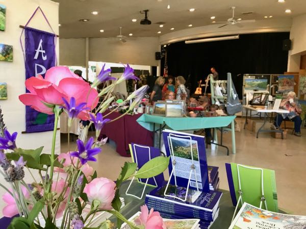
The 45th Annual Redbud Festival in Three Rivers took place on a very nice day, not crazy hot or cold as we’ve experienced some years. Today I’ll show you the beginnings of Saturday.
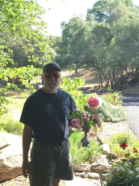
Trail Guy and I filled a vase of flowers from the yard before heading out to walk the 1/4 mile to the Memorial Building.
There weren’t as many outdoor booths as in previous years.
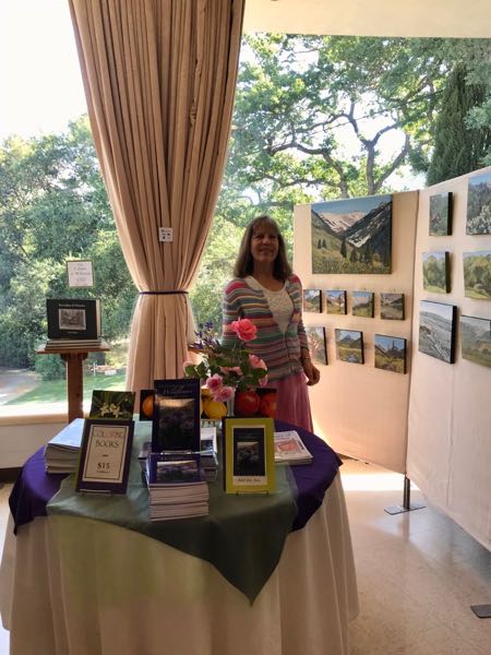
I felt happy with my booth and displays.
Clearly, flowers make me happy.
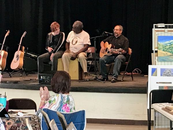
There was live music, most of it too loud for conversing with guests, but when Buddy (center) played a drum piece for me, I didn’t mind! (We used to be neighbors, and still are friends 20 something years later.)
Tomorrow I’ll tell you a list of 7 observations and experiences.
There will be 4×6″ original oil paintings at the Redbud Festival, priced for $40 each instead of $50 as a SHOW SPECIAL! Here are 2 samples of the 8 available paintings: