Poppies aren’t literally hot; this is my version of “Strike while the iron is hot”. What does that actually mean? I think it has something to do with blacksmithery—taking action in a timely manner.
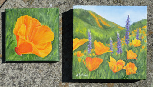
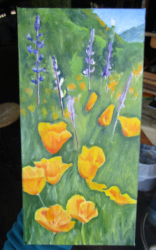
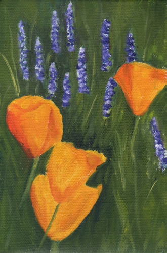
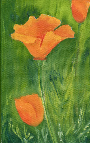
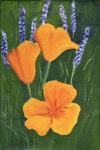
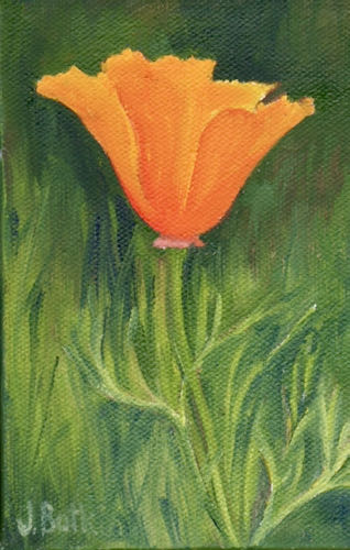
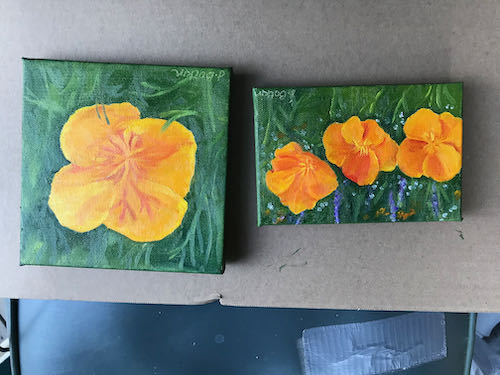
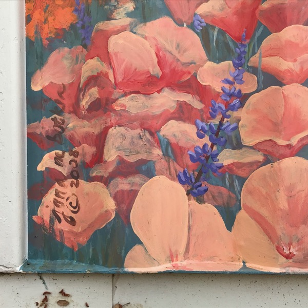
These four oil paintings of California poppies sold immediately.
The poppies are out in abundance, and interest in them is high. Gotta paint poppies now! These will have to be done quickly and possibly delivered while still slightly wet if I am to tap into the season of interest. Let’s get those canvases ready NOW.
These two (6×6″ and 4×6″) are now available at Kaweah Arts in Three Rivers (unless they sold over the weekend).
This 8×8″ needs some more touching up and a signature.
Chop-chop, Central California artist!
And here is a thought: I do not remember poppies in abundance like this when I was kid. Is it because: a. they just didn’t bloom this way; b. my family wasn’t “into” poppies and wildflowers; c. I was oblivious?
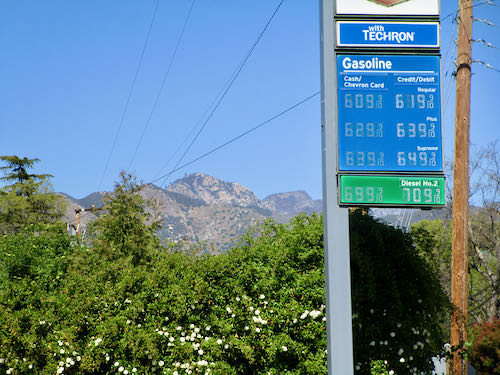
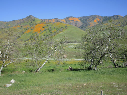
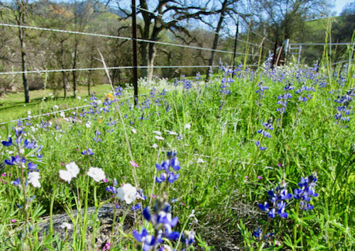
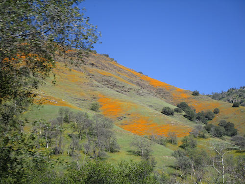
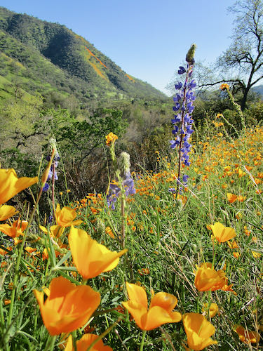
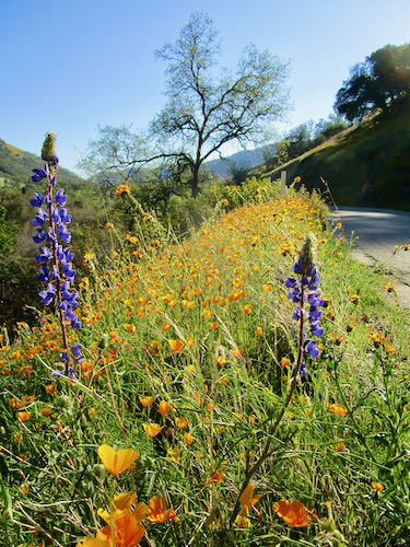
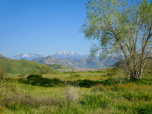
The poppies and other wildflowers were at at their peak on March 11. Three friends and I took the afternoon off to go fill our eyes.
First, we had to empty our wallets to fill the gas tank. Welcome to Three Rivers.
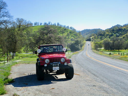
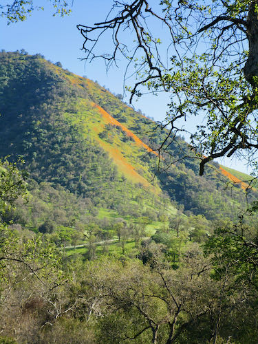
Then we headed down around the lake, and up Dry Creek Road, all within eastern Tulare County.
This last photo shows Terminus Dam in the distance, which creates Kaweah Lake. The flowers weren’t fabulous right there at the Dry Creek Preserve, but it was clear and green, which is pretty fabulous on its own.
We never did get out amidst the flowers but stayed on the shoulder of the road, and actually did no trespassing whatsoever.
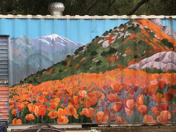
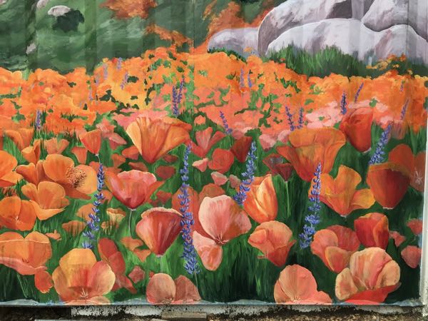
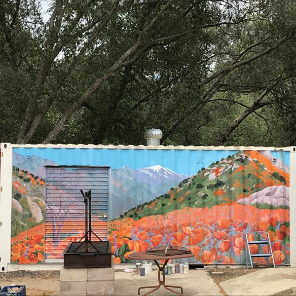
We have had weird unusually cool weather here in Three Rivers, and I took the opportunity to continue working on the faded poppy mural.
You can see the lower section needs refreshing.
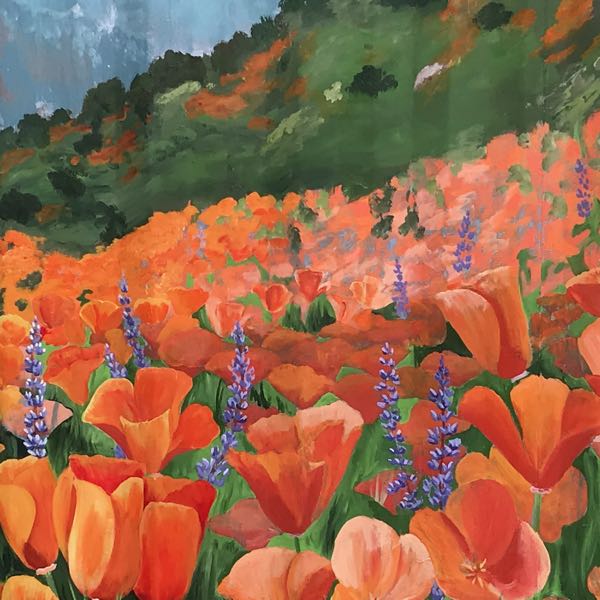
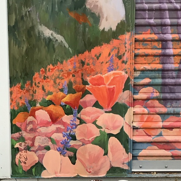
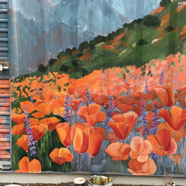
I started with green among the lower poppies. You can see that the middle ground of poppies is pinkish.
The lupine haven’t faded, so I am working around them. I did add some white tips to the blossoms on the far left in this photo.
I keep backing up to see if it looks as messy far away as it does from up close. The way a mural can look so terrible up close and so tight and photographic from a distance never ceases to amaze me. Feels magical.
Now I have added green to the lower right AND greens to the next layers of hills, fading as they move back. (If you are interested in ArtSpeak, this is called “aerial perspective”.
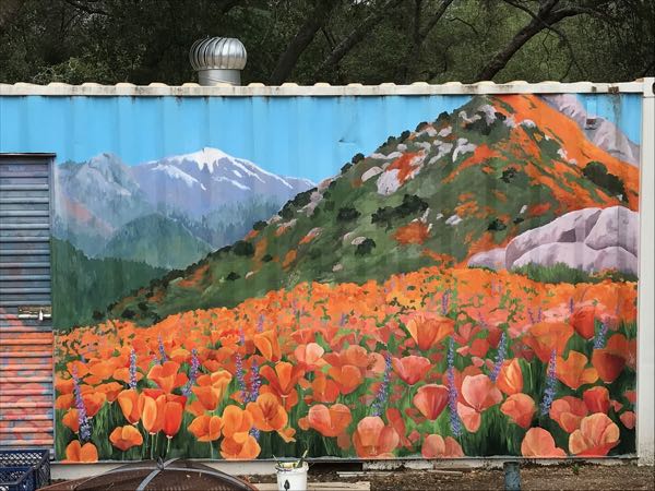
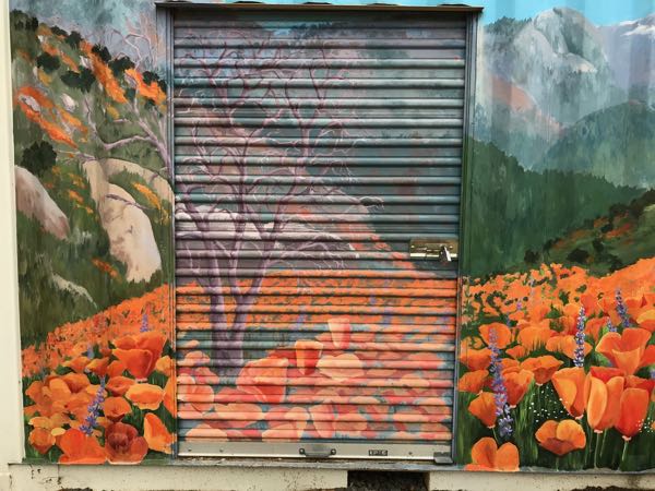
I worked more on the poppies, all the while lamenting how much was left to be done and getting COLD in May!! The pinkish colored ones haven’t been retouched yet.
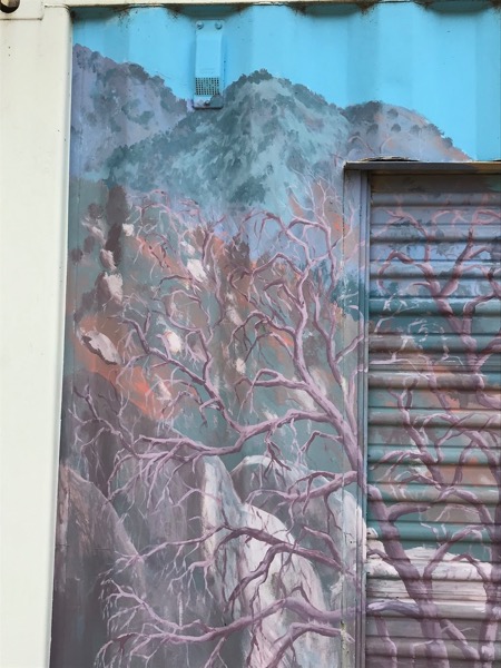
There are some poppies remaining, along with the dreaded door. A friend (a very important person) really likes the tree, so I will retouch it on the left side and probably tackle the dreaded door, as long as the weather cooperates.
A list of what remains to be done, depending on the weather and my availability:
The dreaded door
The tree
Pinkish poppies, both close and far
Adding more popcorn flowers (or painting out the ones I just added)
More grasses to overlap the poppies
The lowest horizontal edge, which is currently covered in dirt and splatters from the rain.
Brightening the lupine, just because I love those colors and want more, more, more
I think that the distant Alta Peak and Moro Rock, along with the rocks on the hillsides can be left. Their fading makes them look farther away than they did when I first painted the mural, which is the way it is supposed to look.
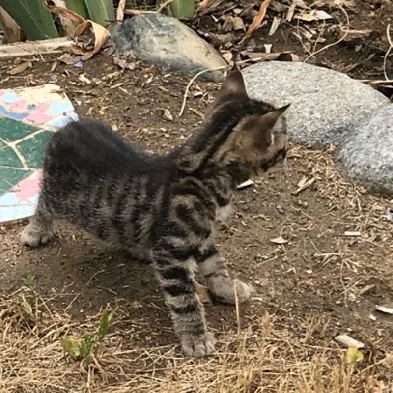
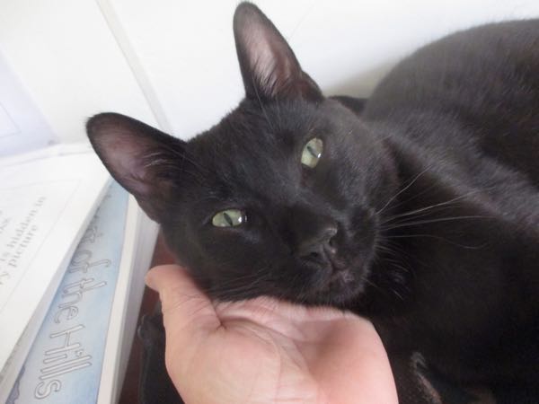
This is KitCarson, who always goes first, like his mama, Scout.
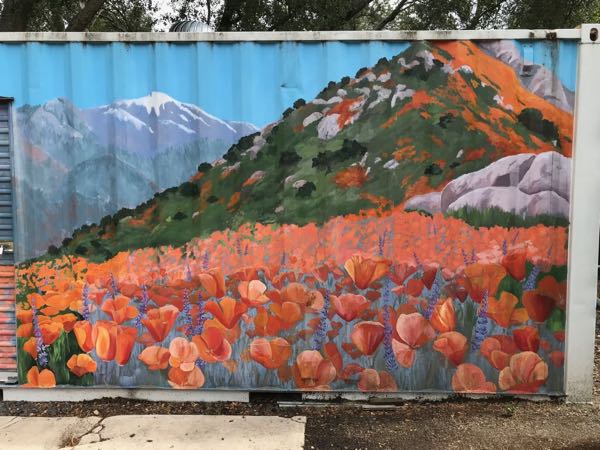
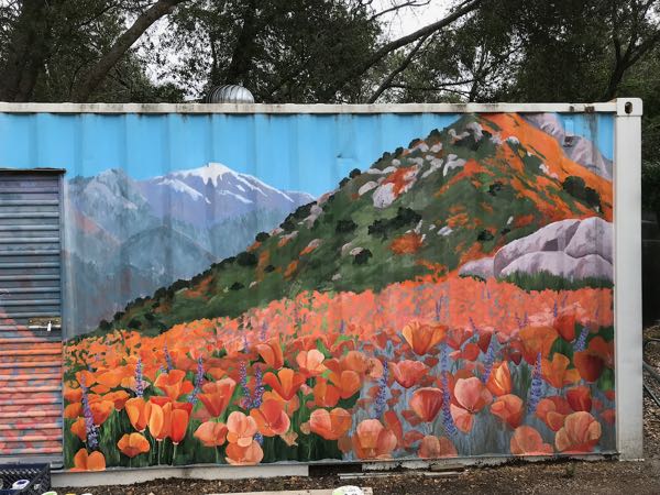
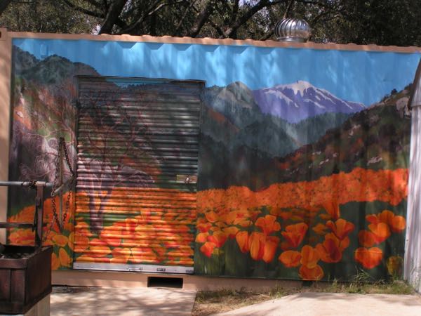
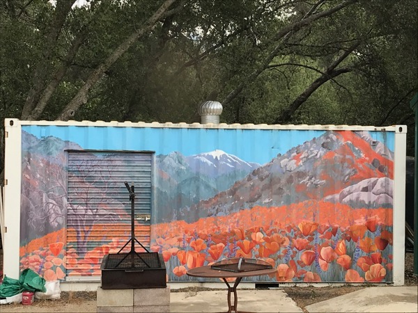
The first public mural I painted was in 2008 on a Seatrain storage container at my church. 2008 was a “super bloom” year of poppies, and we were in love with those flowers.
Seatrain in 2008
Eleven years have passed, and most of the yellows have disappeared from the mural. Yellow+blue=green, so the greens are blue. Yellow+red=orange, and the orange is now pinkish. Any yellow in brown is gone, leaving lavender or gray. The results are rather dull. It isn’t in a high visibility area, and because the darks and lights (“values”) remain, it looks okay (from the back of a fast horse.)
Faded.
But in my opinion, it either needs to be refreshed or painted out completely.
Terrible looking poppies.
Dull looking hills above.
Better, and now you can really see how faded the old poppies are.
It was harder than I expected. I had forgotten how quickly acrylic dries on the palette, on the surface and in the brushes, how difficult it is to control the edges and the blending with that mural paint. So, I abandoned the left side and went for broader areas in the background.
Backing up to get a better view helps.
I enjoyed listening to the river in the morning, and I was thankful for the cloud cover. But after 6 hours of painting, I decided that was enough for a day. Maybe if there hadn’t been a weed-eater going in the background, I would have lasted longer.
This project is going to take much longer than I expected. I might just ignore the door and leave out the tree.
Is it gardening when I am planting flowers with my paintbrush? Is it gardening when I am painting wildflowers?
It doesn’t matter – sounds good in a blog post title and sort of works.
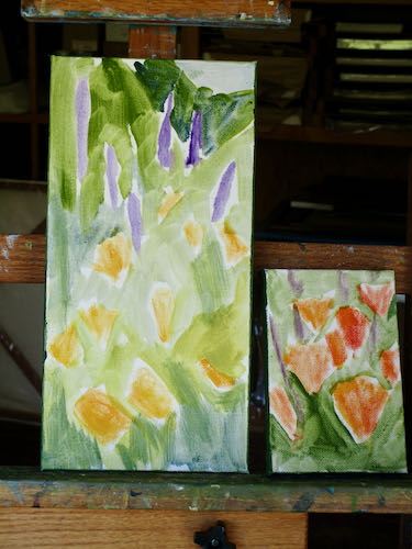
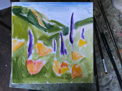
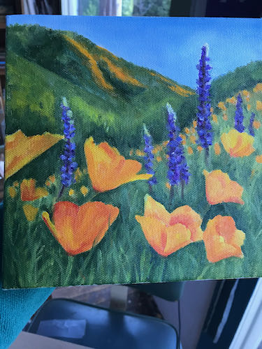
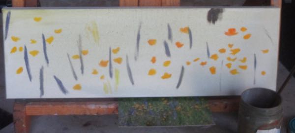
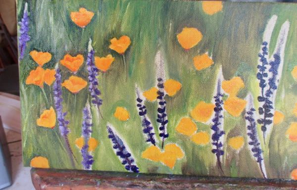
This is one of the popular 6×18″ sized canvases, begun with a few spots and slashes of color. I showed you these first 3 pictures in a post earlier this week.
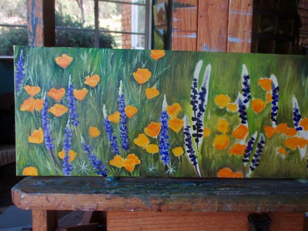
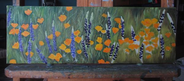
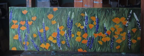
Now for the more recent progress of this oil painting of poppies and lupine:
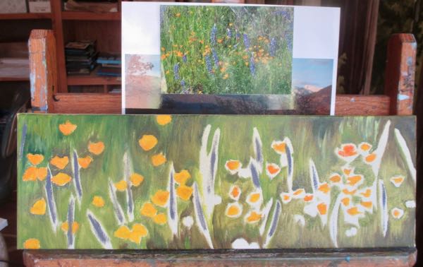
There needs to be grasses across some of the flowers for it to look real, but I can’t do that while the paint is wet or the grasses will be orange and purple. There is a messy poppy in the center (from left to right but sort of higher than center from top to bottom) that demonstrates the folly of this maneuver.
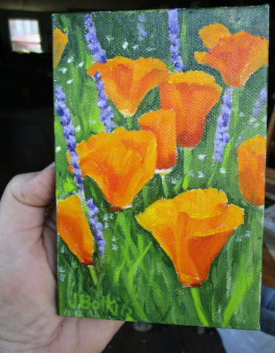
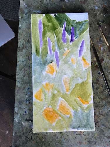
Now it is finished.
Foothill Wildflowers, 6×18″, $150 plus 8% sales tax in California
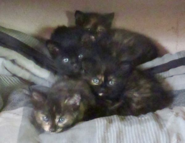
And, I know you are dying to know the state of our cat situation.
Piper is happy and oblivious to the fact that we have just completely altered his life.
How have we altered Piper’s life? Look what we did yesterday:
We went to the ranch expecting to choose two kittens and brought home FOUR.
Three tortoiseshell females and one solid black male. OH NO! HOW WILL WE TELL WHICH ONE IS PIPER WHEN THE NEW ONE GROWS UP??
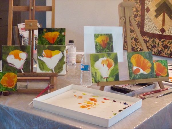
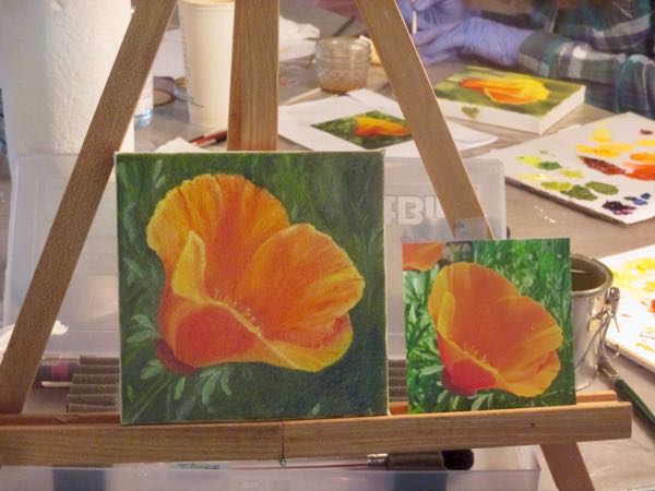
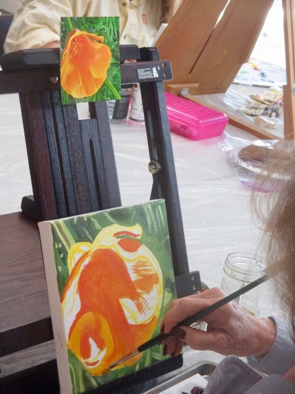
Occasionally I have a chance to teach a handful of people what little I know about oil painting. I have only been painting for 12 years, so while I feel qualified to share what I know, I don’t think of myself as a qualified oil painting teacher.
There are 3 women about 2 hours away from Three Rivers who have been learning to oil paint by various methods and by painting together. They invited me to teach them what I know. One was my dear friend, The Captain, who successfully painted a pomegranate with me about a month ago.
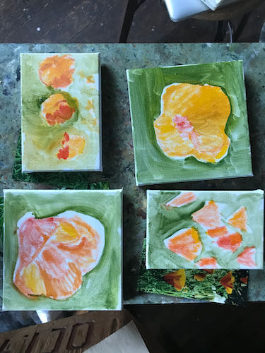
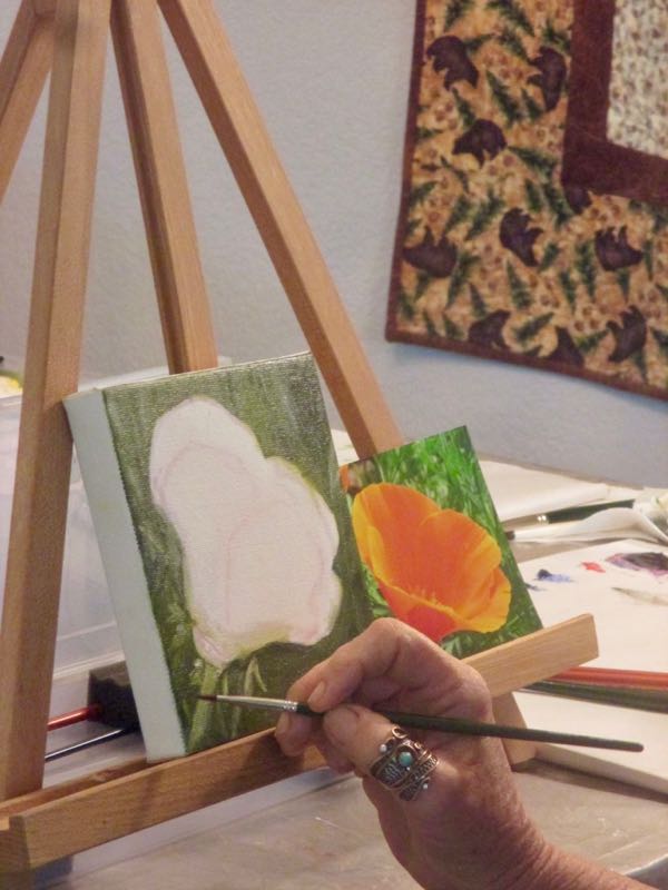
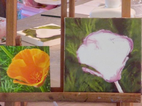
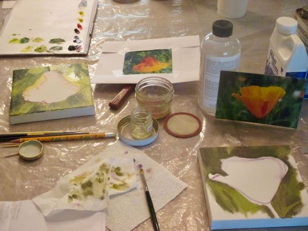
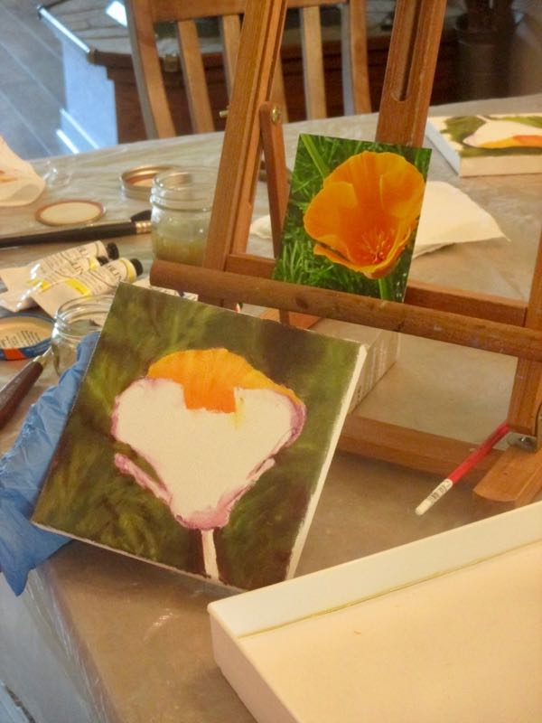
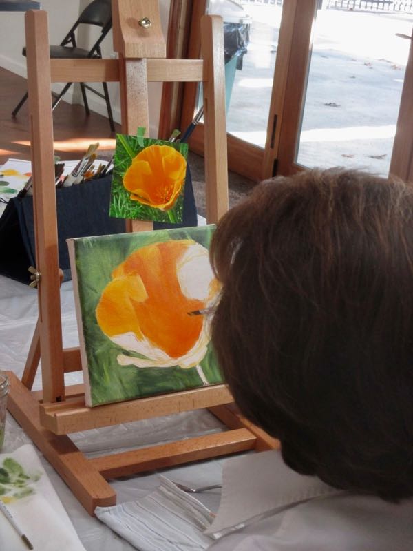
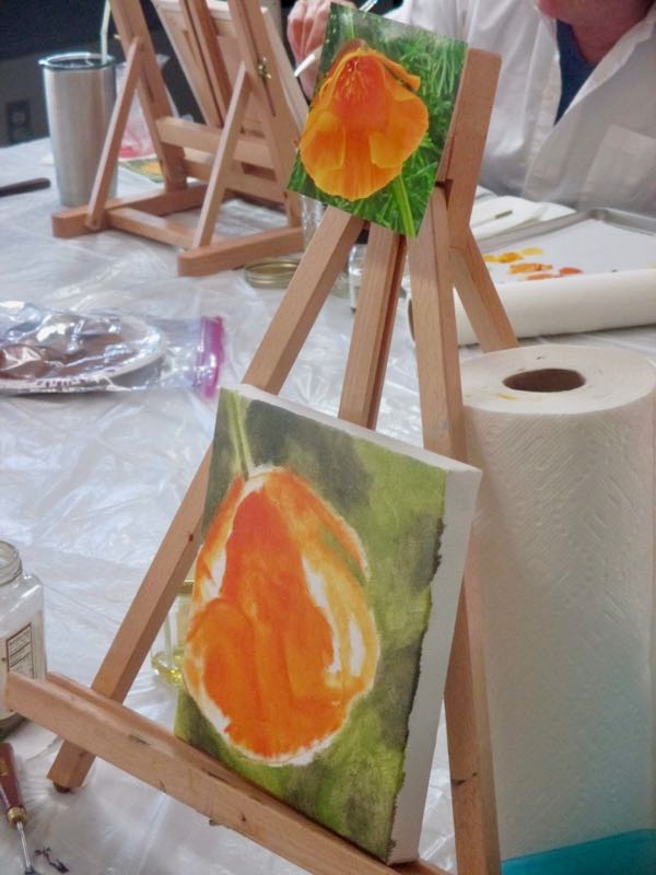
This time we painted poppies, each person working from a different photo, but all mixing similar colors and tackling the project in the same order, but at differing individual speeds.
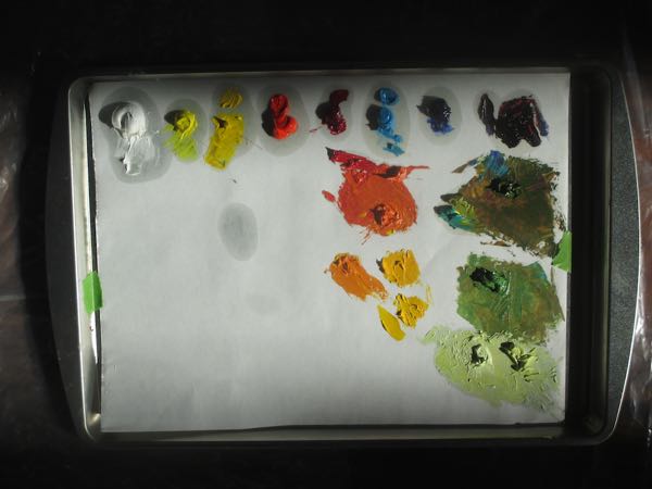
We squeeze out our double primary palette colors and mix up three shades of the background greens.
We draw the approximate shape of the poppy on the canvas, rotating the canvas and photo to view all the shapes from every angle and learn how to erase.
The background gets painted first, working first with the darkest colors and moving lighter.
We mix 3 shades of orange for the poppies.
We paint the poppies.
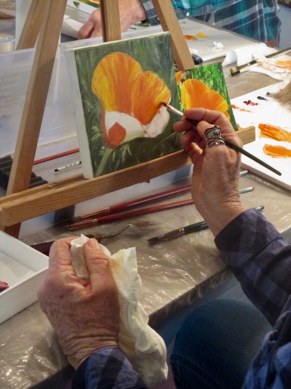
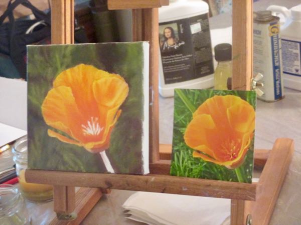
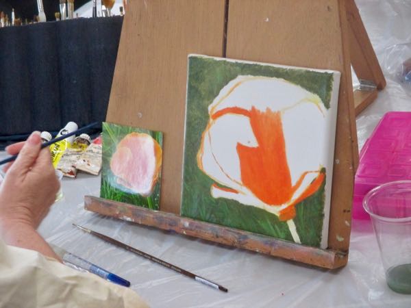
We let it dry overnight (only sort of dry – this is oil paint!) and then repaint the background for better coverage and more detail.
We repaint the poppy for better coverage and detail.
We evaluate one another’s paintings, congratulating the others on their success and belittling our own efforts (sad, but true).
We exclaim over the fun, the success, and say that we need to do this again.
In the 24 years I’ve been teaching drawing lessons, I’ve never given lessons in December. But, some of my advanced students beg, plead and cajole until I cave in and give oil painting workshops during my “time off”.
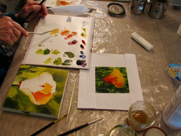
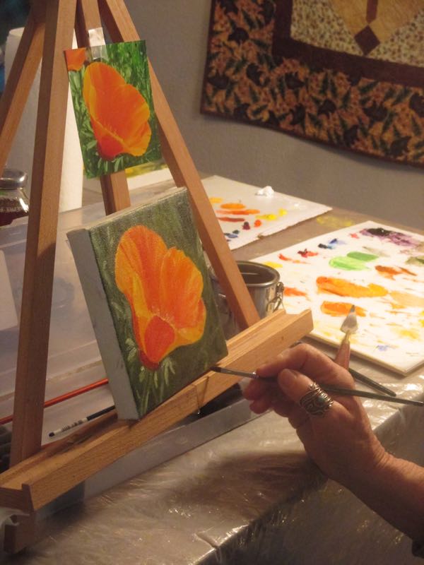
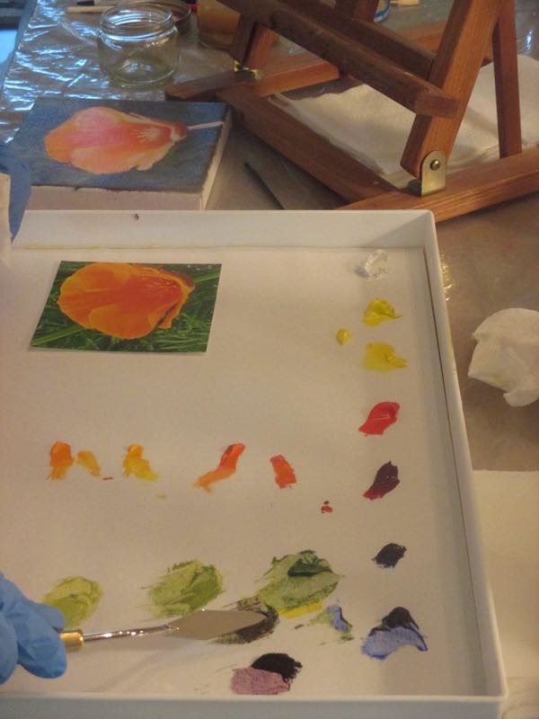
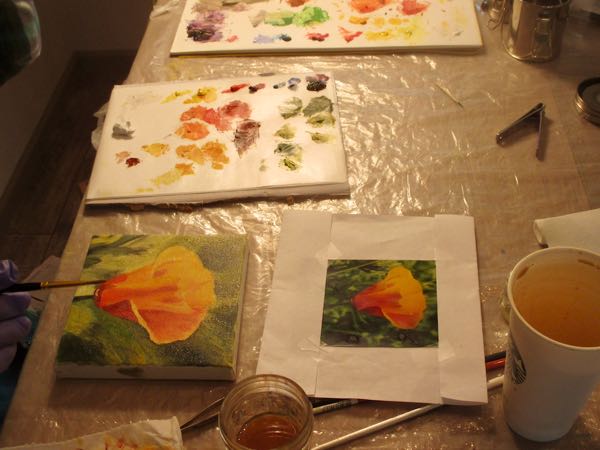
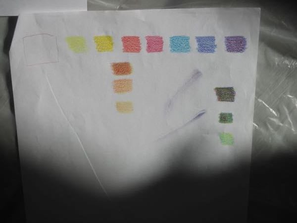
We start off with a little lesson in color, using the double primary palette. This means 2 yellows, 2 reds, 2 blues and white. The color at the far end is a mixture of the bluish red and the reddish blue, which becomes the color used for darkening. I used colored pencils to demonstrate this (I love to draw, you know!)Then it was time for everyone to squeeze out the paints. We spent about 1-1/2 hour just discussing and mixing colors. My method is to mix 3 levels of orange and green, dark, medium and light. Orange and green were needed because the subject matter was a California poppy.
First, I had them draw the general shape of the poppy on the canvas. Second, they painted the background. I didn’t take photos until the orange started going on.
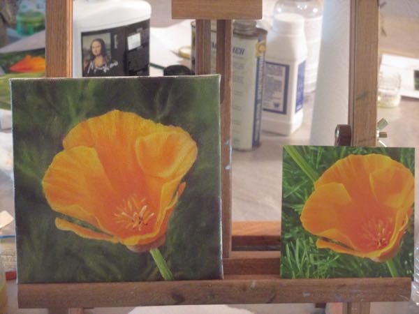
A weird thing happened: I handed each participant 3 different photos, and each person chose the very same one, all without talking to each other or seeing the others’ choices! At the end of our session, this is where everyone was on their painting.
On day #2 we will do the second layer and the detailing.
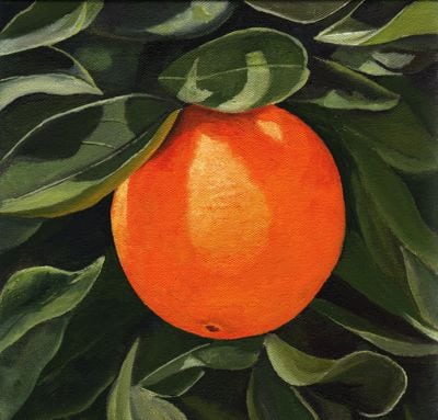
One might think that this Central California artist’s favorite color is orange. One would be wrong, but one would be forgiven for making that assumption.
Due to her continual paintings of oranges and poppies, this would be a logical guess. But, if one thinks about Central California and what we are known for here in Tulare County, then one would come to an understanding of the apparent excessive use of the color orange.
Here are the latest oil paintings in the continuing saga of this Central California artist’s representation of the best of Tulare County.
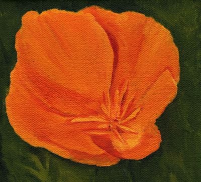
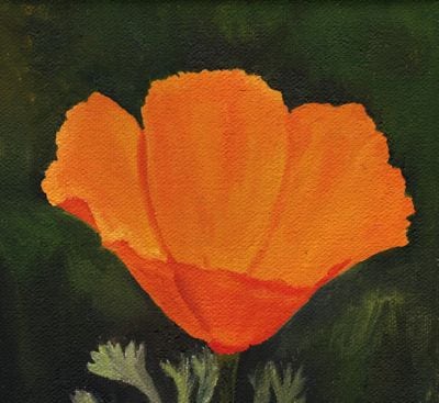
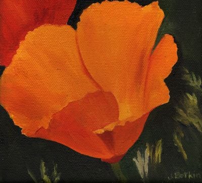
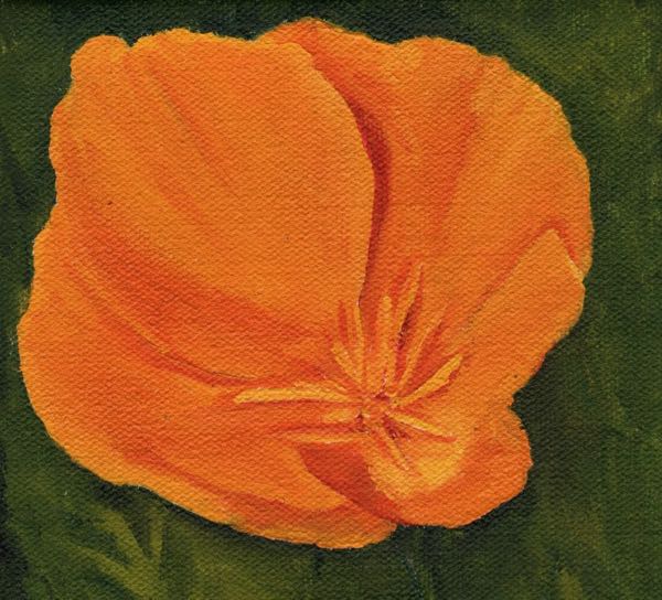
Poppy #46, 6×6″, oil on wrapped canvas, $60
Poppy #45, 6×6″, oil on wrapped canvas, $60
Poppy #44, 6×6″, oil on wrapped canvas, $60
Orange #126, 10×10″, oil on wrapped canvas, $175
These paintings are all available through this link: oils
 There needs to be grasses across some of the flowers for it to look real, but I can’t do that while the paint is wet or the grasses will be orange and purple. There is a messy poppy in the center (from left to right but sort of higher than center from top to bottom) that demonstrates the folly of this maneuver.
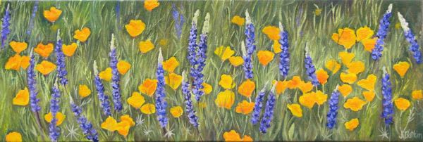
 BECAUSE POPPIES SHOULDN’T HAVE SQUARE CORNERS!!
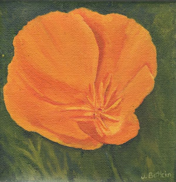
 BECAUSE IT DIDN’T HAVE ANY FLOWERS!
 Then it was time for everyone to squeeze out the paints. We spent about 1-1/2 hour just discussing and mixing colors. My method is to mix 3 levels of orange and green, dark, medium and light. Orange and green were needed because the subject matter was a California poppy.
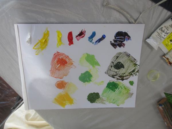
 At the end of our session, this is where everyone was on their painting.
 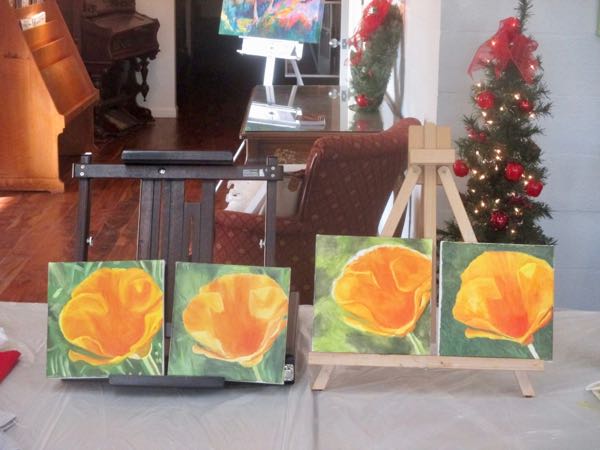 On day #2 we will do the second layer and the detailing.