Cabinart = Art of a Cabin

Drawing cabins in pencil is the way I started my art business. Now I spend 90% of my artmaking time as an oil painter, so when I get asked to draw a cabin, I am really happy about it!

Someone from Minnesota found me on the internet and asked if I could draw her parents’ cabin in spite of not having clear photos of the entire structure. I told her to send them to me, and I’d see if I could make sense of the photos.

Want to see the pictures she sent?

I knew you’d be interested.

These presented a real challenge. I did three little sketches and emailed the potential customer. She was delighted, and asked me to wait for an answer (yep, dealing with a deadline here) because she needed to consult with her sister.

Which one did they choose?*

Tune in tomorrow. . .

*If you read my blog on April 11, you know the answer to this question.

Fast or Good?

My drawing students are used to hearing me tell them, “You can be fast or you can be good; I get to be both.” Everyone still laughs, in spite of the obnoxiousness of the second part.

This is an indisputable truth, when it comes to the highly detailed, accurate type of drawing that I teach.

Alice worked on a drawing of her Desert Painted Sheep, nicknamed “Oughtie”, for several years. (Hey Alice, I didn’t mean THAT S L O W!) But things take as long as they take*. She was very meticulous about every shape, every texture, every value, and she did a fantabulous job.

I didn’t take any photos of the process, or more accurately, I don’t remember if I took any photos of the process. We discussed various background ideas, tried some different textures, and ultimately, she decided that the drawing is finished.

During the process, I learned that goats’ tails go up and sheeps’ tails go down. She made some good friends to play pickleball with. (My drawing students have varied interests and are some of the nicest people you could ever spend time with.)

Here is the final outcome, scanned, but not yet scrubbed up with Photoshop (the junior version).

The artist forgot to sign the drawing before she sent it home with me to scan, so she emailed me a few signatures. I chose one and placed it on the scrubbed-up scan.

My classes are full but you are welcome to get on a waiting list. If there are four people waiting who can all meet at 1 p.m. on Tuesday afternoons, I will add that 1 p.m. class.

*How’s that for a quotable truth?

Drawing in Pencil for the Joy of It

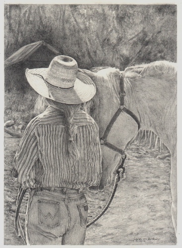
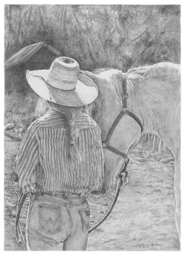
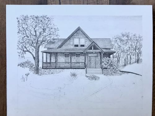
A few months ago I started this pencil drawing, simply for the joy of drawing (and to prove to my drawing students that I can draw). I worked from photos that I took in Mineral King last fall. The light, Audra’s hat, the lack of dealing with a face or an actual complete horse all caught my interest, along with the dynamics between the woman and the horse.

This horse was the last one to get loaded for transport down the hill. Audra was so patient, just waiting for this recalcitrant horse to follow her into the trailer. “Recalcitrant” because he spent most of the summer outside the corral with a couple of mules. The others just watched while staying in the boundaries. Then, sure enough, this guy was not interested in joining the herd to head down for the winter.

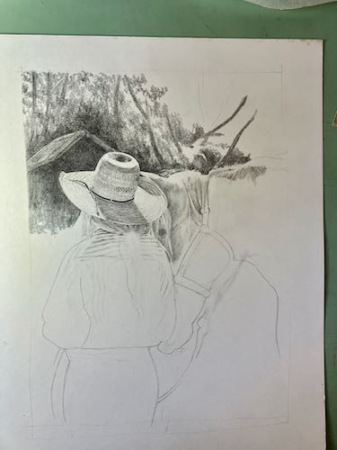
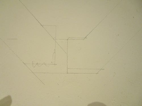
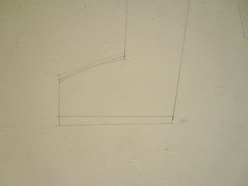
Because the hat seemed to be the most important part, I started with it. If I can’t get the most important part to look right, there’s no need to waste time on the rest of the picture.

I had a little bit of difficulty with some of the shapes, so I made corrections and showed those to my students to demonstrate how to repair problems (and to stay humble). But I didn’t photograph the corrections—they were for my drawing students to learn from. (Do you want lessons? I have a waiting list, and you are welcome to get on it!)

Drawing lessons were suspended in December, because that’s the way we roll. I was occupied with many things, some work-related (painting, blogging, participating in a little bazaar, resupplying my vendors, filling calendar orders, sending Christmas cards to my students, sending out 2 newsletters—are you on that subscription list? —planning a solo show for Autumn 2024, ordering supplies, doing some year-end bookkeeping) and some non-work-related (you don’t need a list of this stuff).

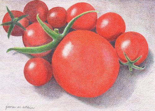
As you have recently read here, I was a little flummoxed by how to proceed on several paintings, so I used the excuse that it was too cold to paint in the workshop and went into the studio to finish this drawing. (I love to draw in pencil—did you know that?)

Because I wasn’t showing my drawing students along the way, I didn’t photograph or scan any of the rest of the steps.

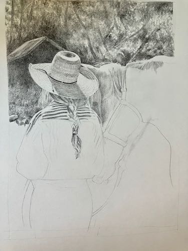
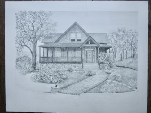
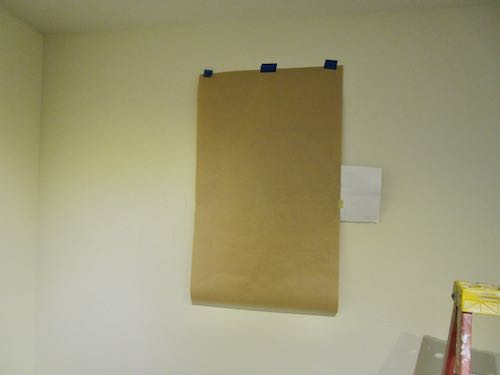
Here it is almost complete. “Almost”?? Yeppers, because when I scan it, the white paper scans as gray, and the pencil has a brownish cast.

This is unacceptable, so I use Photoshop Junior (actually Photoshop Elements) to erase the margins.

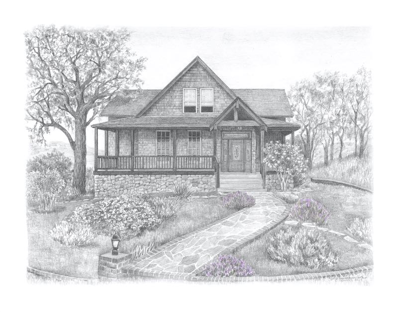
The drawing is simply titled “Audra”, not “A Girl and Her Horse” (she’s a grown woman and it ain’t her horse), not “Big Hat, No Cattle”(no cattle in Mineral King because it is National Park, not National Forest) or “Wranglers Are For Women Too”. . . wait, that one is pretty cute. Maybe it should be called “Wranglers Aren’t Just For Cowboys”.

Nah, the hat is more important.

Victory Tomatoes

My drawing of tomatoes is completed. Carrie Lewis asked for a paragraph of 100 words or less to accompany the drawing. Here is what I submitted.

Gardening feels like a war. We planted many tomatoes in an enclosed area, protected underneath from gophers, on all sides from deer, and over the top from birds*. We faithfully watered and fertilized all summer. Finally, in mid-October, we began getting tiny cherry tomatoes, many no more than 1/2” in diameter. Every tomato felt like a victory, so I took photos of them as proof that we had actually grown some food.

This was not for a competition. It is just a submission to Carrie’s magazine (digital rather than print) called CP Magic, which is all about colored pencil. Colored pencil is not my main medium, as you know, but Carrie is a friend, and I wanted to participate simply because sometimes it is fun to try different things.

*After I wrote this, I realized that we had left the tomatoes exposed to the birds. I meant to put mesh on top but just never got to it.

Happy Birthday, Trail Guy! (all those years are also a victory)

Suddenly Felt Like Drawing

If you receive this in your email and want to see the photos, click on the title.

My friend Carrie Lewis is fully immersed in colored pencil. At the end of December, she put out a call to artists for their best colored pencil work from 2023. I realized that I had done none all year, but suddenly, I had an overwhelming desire to work in colored pencil. It might have been related to working on multiple paintings that felt too hard for me, wanting to do something easier.

After looking through my photos for something that I could easily complete in the one week remaining in 2023, I chose this photo of our little tomatoes. (Small garden, small crop, even smaller fruit).

I chose Strathmore 500 series Bristol vellum paper. (Won’t mean a thing to most of my readers, but it helps me remember in case Carrie wants to know). In looking at my extensive collection of colored pencils, I decided to keep things simple, so I chose Blackwing Colors, a set of 12. Yeppers, only 12 colors. (For a short time, they offered a set of 24, but as a never-early-adopter of anything, I missed it.)

First I drew the tomatoes. In keeping with the desire for simplicity, I didn’t draw all of the tomatoes in the photo, so it was ready for color very quickly.

To make the darker and shaded reds, I used purple and brown beneath the red. To brighten the red in some places, I used orange and pink beneath the red. I used many layers of red in both instances, keeping a very sharp point (on all the pencils).

It didn’t take long to for the red pencil to get used up. Of course, if the last 3 inches hadn’t been broken inside, I could have kept using it. I don’t remember dropping it, but I could have. New pencils are always a bit of a thrill. (Don’t tell me to get a life—this is my life and it’s a fine one!)

Better add the shadows so the ‘maters aren’t just floating. I used purple and brown, but I may try that silver pencil (or is it gray?) over the top to smooth it out. Later.

That was decent start. The daylight was running out and my feet were cold, but I did one more little thing before calling it a day: I smoothed and sharpened all the edges of the tomatoes.

What’s left: finish the background, correct the color on the stems, fill in tomato color more to get rid of the white specks, sign, and scan.

Drawing Sequoia, Not Just Chit-Chatting

Yesterday I showed you some oil paintings of Sequoia, the non-Mineral King part of the park. Today here are some pencil drawings (I LOVE to draw—did you know that??)

These don’t have sizes and prices. Some are sold, some might be framed, and most are probably just in a flat file in my studio. (If you want to buy any, email me at cabinart AT cabinart DOT NET—written this way so robots won’t bother me any more than they already are—and I will see if I can find the original for you.)

One or two might be available as a reproduction print. (Since I am old now, according to The Beatles, I can’t remember.)

Four Guardsmen (minus the smaller foreground trees that block these giants
Clover Creek Bridge, a fabulous structure NOT built by the Civilian Conservation Corps, one of about 3 pretty bridges in Tulare County. YOU CAN LEARN MORE HERE: Tulare County Treasures
Crescent Meadow
This was an experiment, and it became a blog post for my friend Carrie Lewis’s website.
This was a commission, a combination of Sequoia and Kings Canyon, showing various seasons.
This was a commission for my UPS driver, whom we saw in the Park last week. Great guy!
The Marble Fork of the Kaweah flows through the Lodgepole campground.
The Parker Group in Winter
There are impressive views of Moro Rock from the lower parts of the Generals Highway.
“Two Big” (I like this title!) This one was recently completed, is 11×14″, and can be yours for a mere $200!
I drew this from a photo shared with me by one of my drawing students (THANK YOU, JANE!). It is titled “Viewing the General”.

Gollll-eeee, I do love me some pencil. And sometimes I just cannot fathom that Sequoia National Park is visible from my house!

Fast or Good?

My drawing students get to hear me say this regularly: “You can be fast or you can be good; I get to be both.”

Now I am working on a drawing that is very very important to me, and I am choosing to be good, but S L O W.

What’s with all the pressure? This is a house I met once and immediately admired, belonging to my closest friend in the world at the time.

I began this commission pencil drawing in September.

I got this far and decided that it needs to fill the paper more, because I don’t want to just fill the bottom inch with gravel. So, I have erased the lower parts and will stretch the slate and brick walkway farther down the paper.

The shrubs are being placed willy-nilly as I see fit, because I am working from about 5 different photos, all taken at different times of the landscape development. As long as there are lavender shrubs with color at the end, my dear friend will be happy.

This is the absolute best I know how to do.

About That Museum Wall Design

The exhibit is on the north interior wall of the Mineral King Room in the Three Rivers Historical Museum. (Really, shouldn’t this be called a “history” museum rather than a “historical” museum? This bothers me. The museum isn’t historical; however, I didn’t name it and can read their sign and website and then call them what they call themselves.)

  • The exhibit is called Native Voices.
  • The designer chose the colors.
  • The designs are from Yokuts baskets.
  • I will freehand the design rather than tape.
  • It will take a lot of time to paint out the drips, wobbles, and graphite smudges, but less time than taping and then hoping everything stays in place when it dries and the tape is removed.
  • I only traced the main designs and will have to figure out how to do the “shadows”.
  • I would dearly love to know how the designer thought I’d get the designs onto the wall.

This last picture shows the design with its “shadows”, along with three of gray people-ish shapes to give an idea of how the finished wall will look. On the left is The Gathering, in the middle is Quail (but the lighter versions won’t be included), and on the right is Rattlesnake.

Transferring Designs to a Museum Wall

The quail design had to be repeated, this time higher and to the right. I was on a roll, had this thing figured out!

Trail Guy stopped by to see how things were going. His timing was excellent, and he helped me place this design higher on the wall, measuring and leveling.

It was too big for the kraft paper, so I only drew half of the design, thinking I’d just flip it over and finish it. However, I had to “scab” another piece of paper and finish the drawing, then trim it when we flipped it over. I was thankful that he was still outside, reading through the exhibit on the New England Tunnel and Smelter Company (a Mineral King exhibit).

After tracing that pattern, called “rattlesnake”, I went home for lunch. Tony’s Taverna has a food truck outside the museum, and I know the food is terrific, but I am too frugal to spend $20 for lunch when my kitchen is less than 2 miles away.

After lunch, I returned to finish the final design, which I called “little men” but learned is called “The Gathering”. This one had only one little man traced, and the plan was to keep moving the pattern over until all three were in place.

Oops. There was a mistake. I fixed it, repaired it on the wall and on the pattern, and then worked the little man across the wall. I didn’t tape the bottom of the pattern, because I had to keep lifting it up and crawling beneath it to place the graphite paper, three positions for each little man.

When I thought I was finished, I could see some problems with the little men’s feet not lining up. This is something I could fudge into place (what a weird use of the word “fudge”, but I bet you know what I mean).

Finally, here is a weird thought. As I was figuring out how to do this, I realized that I learned these skills from my mom. When?? Where?? When?? I don’t know, but I feel certain that I must have watched her create a pattern and transfer it somewhere, sometime.

Thanks, Mom!

Designs on a Museum Wall

I enlarged these designs onto kraft paper, ordered some very large sheets of graphite transfer paper, gathered a few tools, and drove to the Three Rivers Historical Museum. My job bosses had prepped the wall for me, and they also blocked it off in a very serious manner, along with providing a ladder and a couple of tables. (They are TERRIFIC to work for!)

I had previously tested some carbon paper to see if I could transfer through the kraft paper, but had to go searching at Blick Art Materials for some large graphite sheets. There were two to choose from, and instead of accidentally ordering the wrong one, I bought both.

We measured the wall very carefully to mark the center and then figure out where the first design was to go. Then I taped the smallest design up, trying to see through the kraft paper to place it exactly on the mark I made, adjusting it until it was level.

The design was drawn in pencil, so you can’t see it on this photo. I kept the bottom untaped so I could lift it up to place the graphite paper.

MASKING TAPE WOULDN’T STICK TO THE GRAPHITE PAPER!!

The museum came to the rescue with old-fashioned brown masking tape instead of the easy-removing blue type.

This design is called Quail, taken directly from a Yokuts basket design. I used a straight edge and traced over the pencil lines with an obsolete tool from the olden days of phototypesetting that my students and I refer to as a “spatula”. (Too hard to explain.)

Squint hard, and you can see how it landed on the wall.

What next? I’ll show you in two days.